Home Owners’ Loan Corporation Grades
and their Relationship to Racial Demographics
Kate Hahnenberg, Andrew Modrowsky, Sommaya Haque, Muhammad Jee, Elizabeth Hamad
5/5/23
A Window into Homeownership History
The History
- Lending Practices: Influenced the growth of American cities by grading communities based on perceived risk of mortgage lending
- Risk Assessment: Gathered a city’s demographics, property values, and other factors, to assign a letter grade from “A” (lowest risk) to “D” (the highest risk).
- Mapping: Created hundreds of these maps around the US and this method, which came to be known as redlining.
Motivations
- Historical Preservation: Desire to preserve the history of the HOLC, document its impact on American cities and contribute to a historical record.
- Advocacy and Activism: Gain nuanced understanding of how data can both perpetuate and address social injustice, by contextualizing it within the history of racial inequality in the US.
- Policy Implications: Help identify areas where interventions may be needed to address ongoing disparities in lending.
Introduce the data
Created by the editors of FiveThirtyEight, an opinion poll analysis site.
The data uses modern 2020 Census data and aligns it with redlining maps and HOLC grades created by the Home Owners’ Loan Corporation from 1935 to 1940, provided by the Mapping Inequality Project.
Each of the 551 rows represents one case that has a given metropolitan area and an assigned HOLC grade, and the rows each contain data about the population that occupies that HOLC-graded metropolitan area.
Highlights from EDA
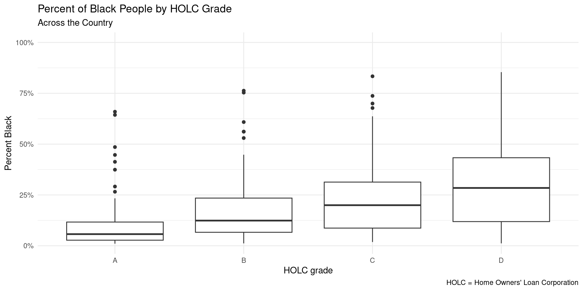
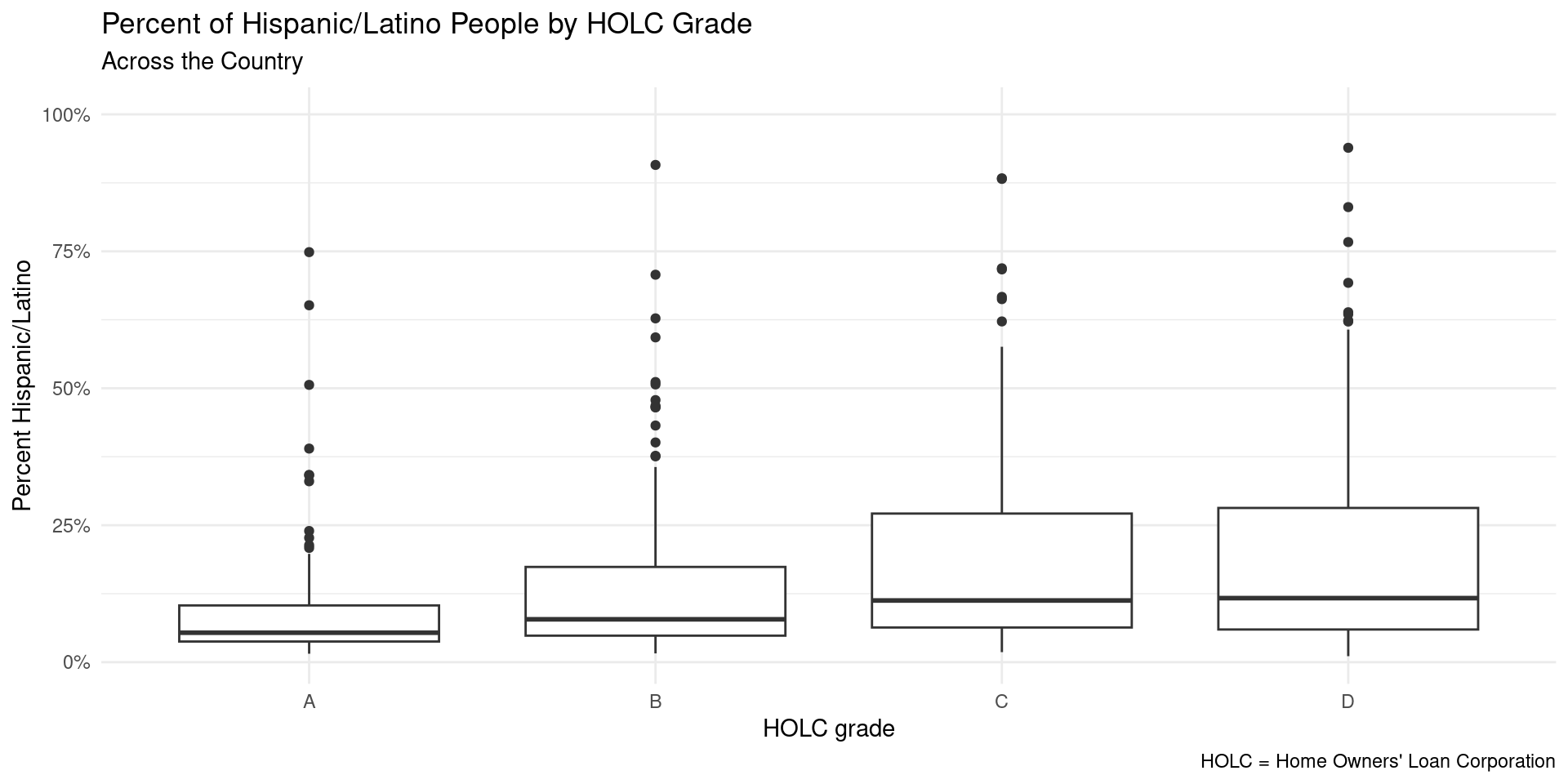
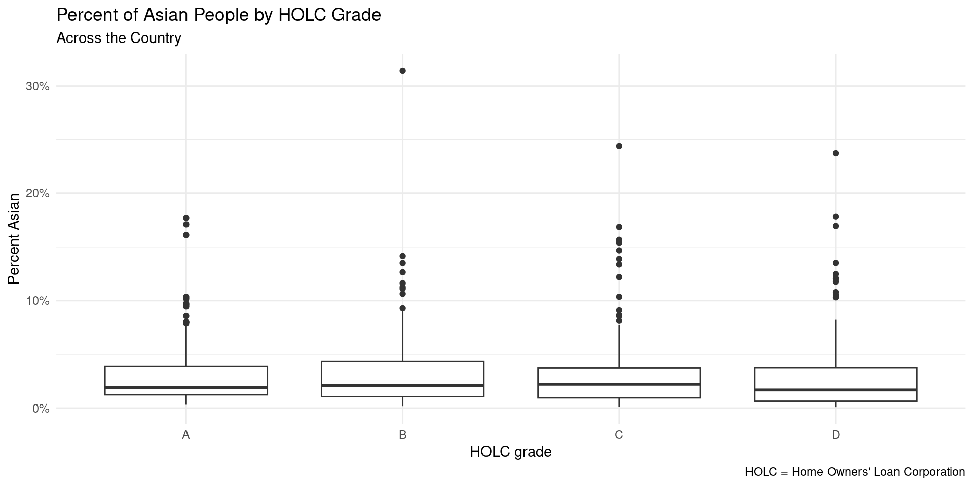
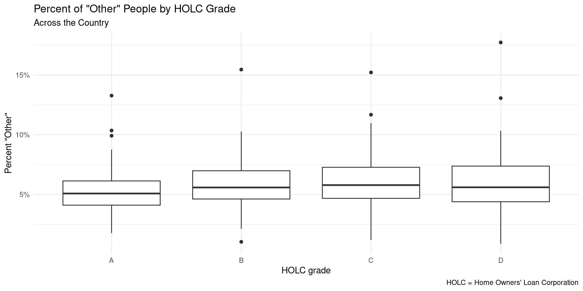
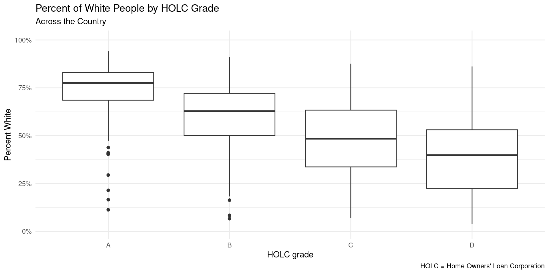
The percentage of people who receive each HOLC grade changes depending on the racial group.
Evaluation of Significance Part 1
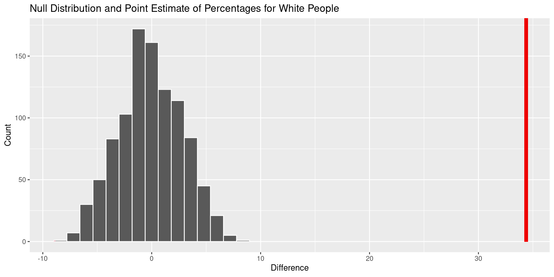
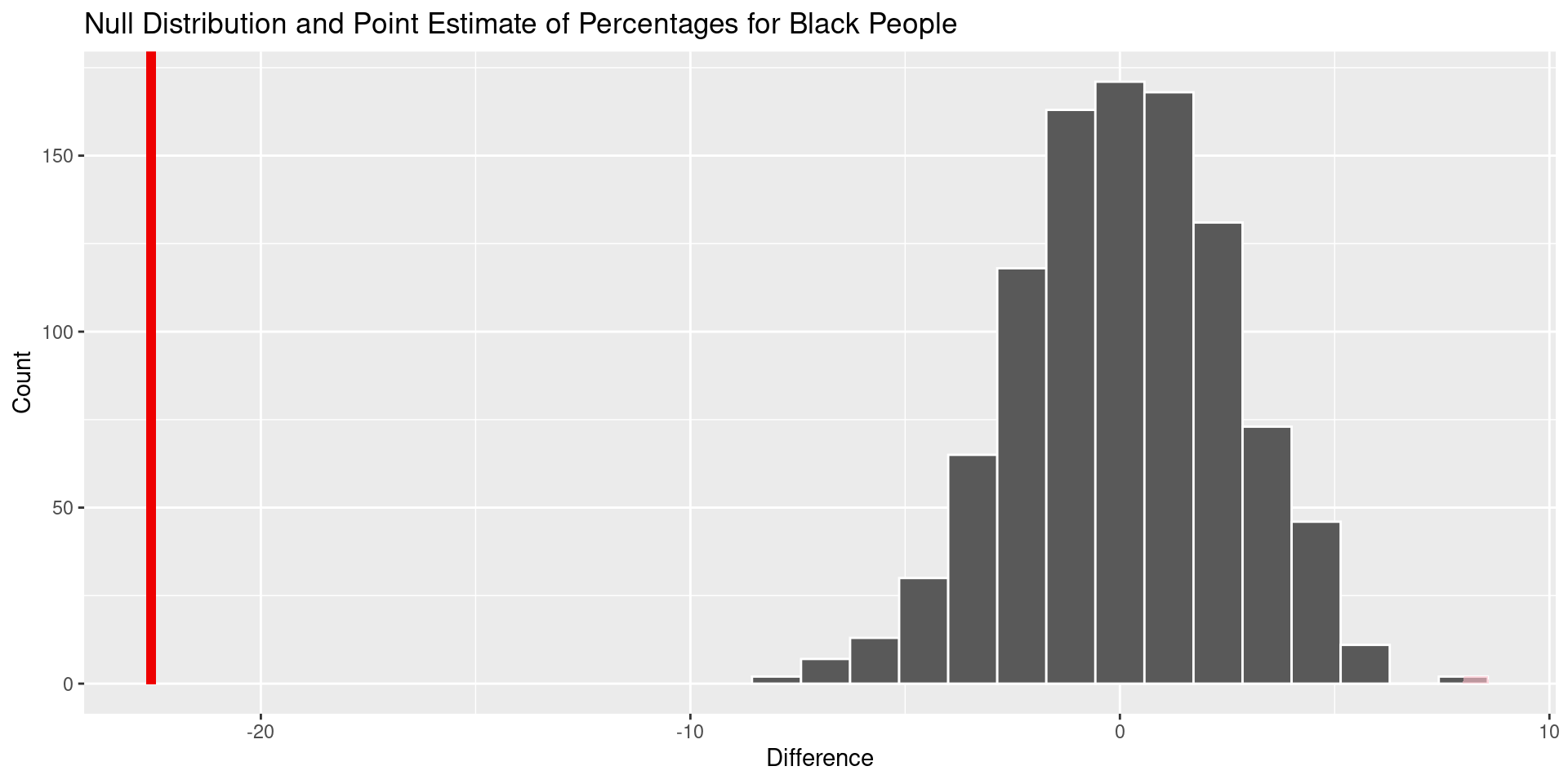
- Here, we analyzed the significance of the difference in percentages in each of the five racial groups in the two most polarized “HOLC” grades, A and D.
- We tested the Null Hypothesis:
\(H_0 : \mu_A - \mu_D = 0 ~ percent\) - Being that there is no difference in the mean percentage of those who identify as a certain race living in areas with HOLC grade A and living in HOLC grade D
- And the Alternative Hypothesis:
\(H_A : \mu_A - \mu_D \neq 0 ~ percent\) - Being that there is a difference in the mean percentage of those who identify as a certain race living in areas with HOLC grade A and living in HOLC grade D
Evaluation of Significance Part 2
- In evaluating this, we found that we could reject the null hypothesis for 4 out of 5 of the racial groups, which all had p-values below 0.05
- 3 of these groups (Black, Hispanic, and “Other” Race) were statistically significant in that they most likely had higher percentages of people living in areas with a HOLC grade “D” than “A”
- People who identified as White were statistically significant in that they most likely had a higher percentage of people living in areas with a HOLC grade of “A” rather than “D”
- We were not able to reject the null hypothesis for Asian people, where there was little difference between the percent who lived in areas with HOLC grade “A” vs “D”.
Conclusions + future work
There is a clear relationship between the racial makeup of an area and the HOLC grade that it receives.
White areas often receive high grades while areas that are predominantly POC receive lower grades.
The HOLC grading system reinforces racial segregation and inequality, leading to ongoing systemic inequality in housing.
Further work could include investigating the impact of redlining on education for POC in areas with low grades.
Additional studies could include analyzing how health services differ in areas of low grades compared to areas of higher grade.