Introduction
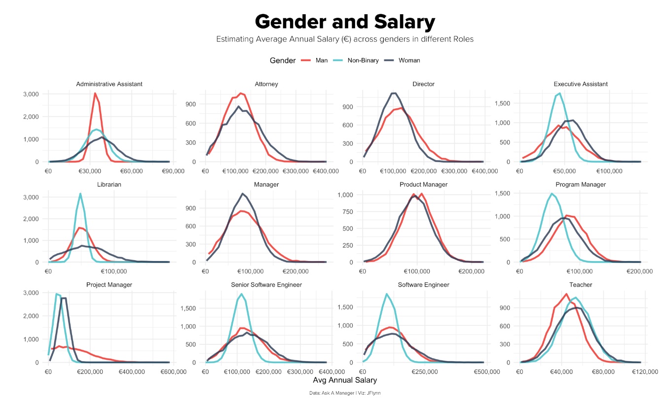
This chart was created by @fmtycho for the TidyTuesday challenge on May 20th, 2021. The original post can be found here: Gender and Salary. The creator aimed to show annual salary differences across different roles. The chart is meant to emphasize differences in pay across the genders man, woman and non-binary. The question which it attempts to answer is: what is the relationship between annual salary, job title, and gender?
Critique
This chart makes use of a nice color palette, but decided to map it unnaturally, coloring women as navy, men as pinkish-red, and non-binary as blue. This makes it confusing to the viewer because we would expect men to be blue, women to be red, and non-binary to be navy. However, the three lines are easily distinguishable on each chart. The axes are also all nicely labeled using currency notation and numbers with commas. Overall, I like the simplicity of the faceting by job title and coloring by gender, and I think the creator does a good job of presenting multi-dimensional data in a digestible format.
However, the y-axis is not labeled, but if we assume it is a frequency count, the choice of a line chart is still confusing, as count is a discrete variable. A better representation of one continuous and one discrete variable could be a barchart or a boxplot. Additionally, while it is easy to compare pay by gender within each role, it is difficult to compare salaries across roles because the x scales are un-aligned. In terms of representing the data, the creator does not denote what career stage these salaries pertain to with the exception of “Senior Software Engineer.” Differences in level should be consistently denoted or not denoted at all. This chart could be improved by aligning the scales, standardizing type of role, and considering a different geom to represent the distributions.
Extension
Discussion
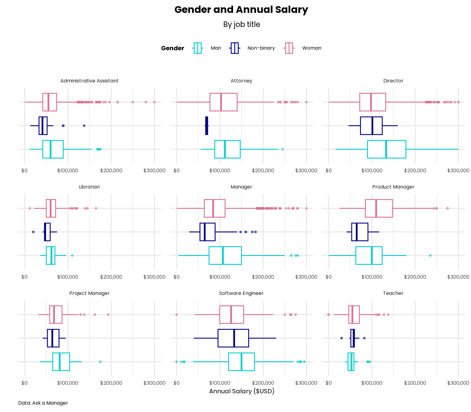
Using a boxplot allows the user to see differences in overall salary trends for each gender. It is easy to now compare median salaries and common ranges in salary. Additionally, we can see that there are a number of outliers which could have greatly skewed the average salary, which indicates that this metric might not be the best way to represent the actual trends.
One change in terms of data that I made was focusing on salaries reported in USD rather than Euros because more than 95% of the original dataset consisted of answers using USD. I would argue that this in itself is more effective than the original because it attempts to encapsulate trends from a larger part of the dataset. In terms of aesthetics, I updated the color palette to be a natural mapping that is intuitive for the user with men as blue, non-binary as navy, and pink as women. I also added a y-axis label to ensure that the user will not have to guess what these values represent.
NOTE: One limitation to my redesign is that I attempted to recreate the data cleaning that the designer did to label the types of roles on the original chart. My attempt is not a reflection of the actual number of entries in the dataset that belong to these roles, so the conclusions that I have drawn based on data may be an oversimplification.