Introduction
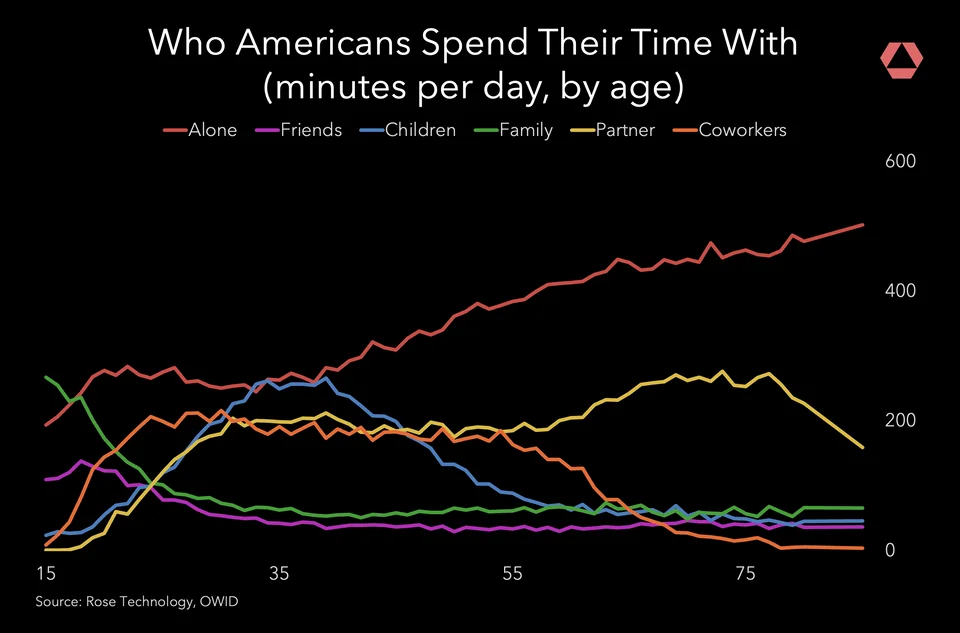
This linechart was created by @rosetechnology on Reddit and shows the types of people that Americans spend their time with at different ages. It attempts to answer the question: how do our social interactions evolve over our lifetimes? The designer aims to answer this question in terms of how much time we spend with others and who we spend that time with. To show this, the types of people are represented by individual lines encoded in various hues with the x axis as age in years and the y axis as time spent in minutes. The original visualization can be found here: Rose Technology on Reddit.
Critique
This chart’s main strength is its simplicity. It is easy to see the general trend of alone time increasing as a person ages. I also think that the number of lines does not overcrowd the chart. It interesting how minimalistic the designer chose to go with this chart, and I think that there are strengths and weaknesses to this choice. The designer uses the subtitle to “label” the axes, and while this makes it so that the chart has limited text, it also makes it so that the user must study the chart a bit for it to be effective.
Despite the minimalist choices in terms of textual elements, the color palette is not very accessible, as the dark background makes it difficult to distinguish small differences between the lines, especially if the user has a color vision deficiency. Additionally, it would be very difficult for someone who is colorblind to distinguish between Alone and Coworkers because they are very similar orange hues.
When considering storytelling, I think it is easy to see how an individual type of social interaction changes overtime but the linechart does not show us how the relative amount of time spent with different types of people changes overtime. For example, at the age of 35, we see that time spent with children and alone is increasing, but it is not clear if this time spent is replacing time spent with other people or if 35 year olds are just more social in general. I also think that it is an important distinction for the designer to note that the data represents an average so that it is not misinterpreted.
Extension
Discussion
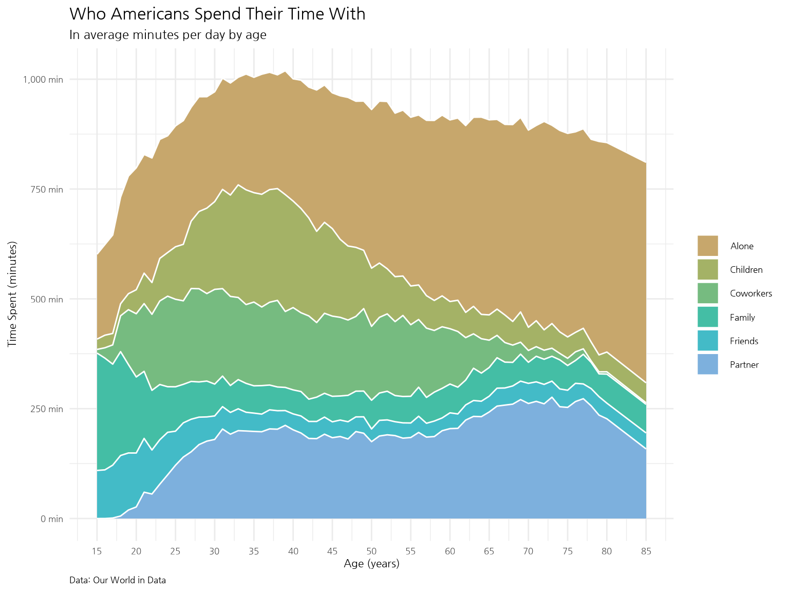
In this visualization, I used geom_area so that the user can see the distribution of time spent with each type of person over a lifetime. Now, the user can see that at age 35, while time spent with children and alone is increasing, time spent with other types of people is also generally increasing. Thus, we can see that this age is a very social time during a person’s life. I believe this chart is more effective because it is easier to distinguish the categories due to its colorblind-friendly palette and white background. When looking at data regarding how we spend our time, I think it is important to look at this relatively to understand how our interactions evolve because even if we are spending more time with one type of person, it does not necessarily mean that we are spending less time with others. We cannot see this relative relationship in the first chart. Additionally, I have included more informative title and subtitle, noting that the data represents an average, and axis labels with units so that the user is less at risk for misinterpretation.