── Attaching core tidyverse packages ──────────────────────── tidyverse 2.0.0 ──
✔ dplyr     1.1.4     ✔ readr     2.1.5
✔ forcats   1.0.0     ✔ stringr   1.5.1
✔ ggplot2   3.4.4     ✔ tibble    3.2.1
✔ lubridate 1.9.3     ✔ tidyr     1.3.0
✔ purrr     1.0.2
── Conflicts ────────────────────────────────────────── tidyverse_conflicts() ──
✖ dplyr::filter() masks stats::filter()
✖ dplyr::lag()    masks stats::lag()
ℹ Use the conflicted package (<http://conflicted.r-lib.org/>) to force all conflicts to become errors

Attaching package: 'scales'


The following object is masked from 'package:purrr':

    discard


The following object is masked from 'package:readr':

col_factorEnergy Use and Global Warming
Rows: 21890 Columns: 129
── Column specification ────────────────────────────────────────────────────────
Delimiter: ","
chr   (2): country, iso_code
dbl (127): year, population, gdp, biofuel_cons_change_pct, biofuel_cons_chan...

ℹ Use `spec()` to retrieve the full column specification for this data.
ℹ Specify the column types or set `show_col_types = FALSE` to quiet this message.
New names:
Rows: 135 Columns: 3
── Column specification ────────────────────────────────────────────────────────
Delimiter: ","
chr (1): year
dbl (1): temp
lgl (1): ...3

ℹ Use `spec()` to retrieve the full column specification for this data.
ℹ Specify the column types or set `show_col_types = FALSE` to quiet this message.
Introduction
For our project, we choose to focus on an a country energy use dataset from the organization Our World in Data which researches global problems. The dataset they provide is extensive, containing over 20,000 observations of 129 fields spanning approximately 120 years. It contains information on almost every country and region that has existed during this time frame (e.g. German Democratic Republic) and regional statistics. As more countries develop and increase their energy use, understanding how these dynamics work becomes ever more important especially considering the battle with climate change that directly relates to the use of fossil fuels as an energy source.
The fields we are looking at include fossil fuels (coal, natural gas, and oil) which have been shown to directly influence climate change; renewables including (solar, wind, geothermal, hydroelectric, etc.) which do not directly emit CO2 into the atmosphere leading to an increase in global surface temperatures; and Nuclear electric which is an expensive alternative to both fossil fuels and renewables, has an functionally limitless fuel source, but has the danger of melting down catastrophically in addition to the need to dispose of the spent radioative fuel at the end of the nuclear production process. Scientists debate on the best way to provide energy for the world and these debates, typically, include some mix of all these sources. Our analysis aims to look at the trends in energy production and its relation to climate change.
How does the energy mix vary by country for high, medium, and low wealth economies (measured by GDP)?
Introduction
With that as our impetus, we want to look at how energy use compares between the top and bottom global economies: what types of energy production do they use (i.e. coal, natural gas, oil, solar, nuclear). The richest countries consume the most energy because they have it available to them but what type of energy is that; the poorest countries are the most vulnerable to climate change and it is interesting to discover what types of energy they use.
To do this we use two groups of countries from the dataset: high-income economies and lower middle-income economies as defined by the World Bank, measured by gross national income (GNI) in 2022. We then look at how energy use statistics change over time from 1990 to 2021 for both groups, measuring consumption per capita in order to make better comparisons and to account for population changes over time. These energy dimensions include:
- Coal:
coal_cons_per_capita - Natural gas:
gas_energy_per_capita - Oil:
oil_energy_per_capita - Renewable:
renewables_energy_per_capita - Nuclear electric power:
nuclear_energy_per_capita
We were particularly interested in this question because we believe that understanding the differences in energy types and consumption between high-income and low-income countries is essential to see how we can transition towards greener energy sources.
Approach
To answer this question, we decided to produce two stacked bar plots with the year on as the x-axis, the per-capita energy consumption on the y-axis, and the fill defining the energy source. We feel this type of plot is best to illustrate the way different energy sources stack up by group of countries, as it makes trends over time clear, and lets us see absolute values while also letting us see the share a specific energy source provides.
Analysis
Warning: The `size` argument of `element_line()` is deprecated as of ggplot2 3.4.0.
ℹ Please use the `linewidth` argument instead.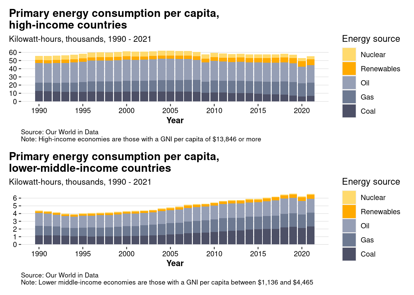
Discussion
In the first plot we see the progression of energy use for high income economies since 1990. Taking all sources into account. Energy use peaked in the mid-2000s and has been gradually decreasing ever since. Fossil fuels specifically have decreased over this same time period as well. The use of renewable have slightly increased while the use of nuclear has slightly decreased since 1990. If we look at the metrics of coal, oil, and gas specifically the story changes: coal use has been decreasing, oil use increasing and gas consistent over the time period. Over all, energy use in the developed world has stayed relatively consistent since the 90s. While energy use has decreased and the replacement of coal with renewables has occurred, percapita energy use has not really changed alot over the past 30 years.
If we look at Lower and Middle income economies, the story is completely different. Energy use has increased every year (except 2020) since the mid-90s; coal and renewable use has almost doubled over that period. Overall, the use from all soruces has increased by ~50% over the time period. But it is necessary to note the scales of the y-axis. Low income countries use 1/10 of the energy the high income countries. The total energy use of a lower income country is almost as much as the year-to-year fluctuation in energy use of the higher income countries. Technology and the modern age is accelerating quickly and the implementations in lower income countries make a bigger difference in energy use than high income countries. Now that we have the context of which countries use what energy we can look at how energy use and global temperatures related.
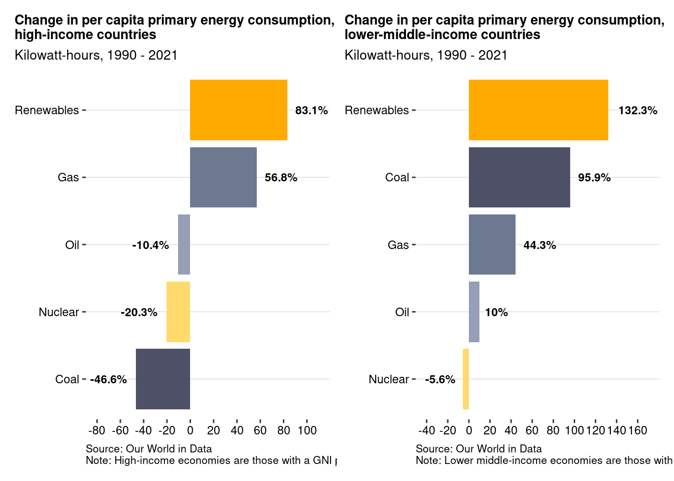
Looking at the second set of graphs we can see the percent change in energy use by type and economy. We can see that high income countries have been decreasing their reliance on coal, nuclear, and oil energy sources but have increased their reliance on natural gas. We can also see the increase in renewable energy of over 80%. The graph for loer-middle income countries show that energy demand for all types (except nuclear has gone up considerably since the 90s. These graphs show us something that makes sense: countries that are poorer now were very poor in the 90s and their energy demand reflects that. As these societies begin to industrialize their energy demand will increase significantly.
Are global fossil fuel use and average global temperature correlated?
Introduction
The question “Are global fossil fuel use and average global temperature correlated?” was inspired by the current heated political debate in the United States regarding climate change — whether humans are causing the climate to warm by burning fossil fuels. To be sure, the debate is more nuanced than that, with disagreements arising as to the proportion of warming that can be attributed to the natural warming of the planet versus human activity; whether the rises in temperature are actually dangerous; whether other sources of energy are actually healthier for the environment; concerns about the economy; etc. While a simple visualization will not be sufficient to prove causation, it will be helpful to establish/confirm a basic underlying premise of the debate: that both fossil fuel use and global temperatures are indeed increasing.
The dataset conveniently has a country named ‘World’ which stores aggregated energy statistics. We will use this instead of manually summing across every country in the dataset. Once we filter for country == 'World' we will look at the fossil_fuel_consumption column, which represents fossil fuel consumption, measured in terawatt-hours. Fossil fuel consumption is defined by the data owners as the sum of primary energy from coal, oil, and gas. The climate data will come from NASA’s GISS “GISTEMP Surface Temperature” dataset, which records historical estimates of global surface temperature change. However, NASA tracks a popular climate metric called “temperature anomalies” as opposed to the absolute temperature, so we will use data from the Earth Policy Institute that has been conveniently converted to degrees Fahrenheit for us. Note: the underlying data is still from NASA GISS.
Approach
For the first plot, we chose to have two separate line plots stacked on top of eachother (visually similar to when you use faceting and specify the number of columns to be 1). Both line plots have the same x-axis (year) and the same scale in order to facilitate comparison. However, the y-axes are different. The y-axis on the top plot is temp, measured in degrees Fahrenheit, while the y-axis on the bottom plot is fossil_fuel_consumption, measured in terrawatt hours. The choice of two separate line plots was intentional. If we chose to use one plot, we would have to use two different y-axes with different units (since we are analyzing three variables), which, as we discussed in class, is unadvisable. Furthermore, we chose to use a line graph, as opposed to other types of plots, since we are trying to look at changes in the level of each of our two focus variables (temp and fossil_fuel_consumption) over a shared variable time. Line plots lend themselves very well to time-series. There is yet another added benefit of using line plots here: we are dealing with a natural phenomena (global warming) that may have a “lag” factor (i.e., if you burn a lot of fossil fuels in a given year, there might not be an observable change in global temperatures until the following year). We will easily be able to observe on a line plot if there is any such lag. This valuable information would disappear if we used, say, a scatterplot.
For the second plot, however, we do want to use a scatterplot since scatterplots are good at visualizing correlation and correlation is at the core of our question. With a scatterplot, we will easily be able to see whether or not temp and fossil_fuel_consumption are correlated. Note, however, that unlike the first plot we will not be able to easily see if there is a “lag” correlation. In order to avoid losing out on temporal information, we colored the points by the year variable, which may help identify clusters of points that could potentially provide valuable insights.
Analysis
# A tibble: 48 × 2
    year fossil_fuel_consumption
   <dbl>                   <dbl>
 1  1965                  40434.
 2  1966                  42534.
 3  1967                  44167.
 4  1968                  46834.
 5  1969                  49985.
 6  1970                  53179.
 7  1971                  55254.
 8  1972                  58133.
 9  1973                  61580.
10  1974                  61420.
# ℹ 38 more rows
Warning: There was 1 warning in `mutate()`.
ℹ In argument: `year = as.numeric(year)`.
Caused by warning:
! NAs introduced by coercion# A tibble: 49 × 2
year temp
<dbl> <dbl>
1 1965 57
2 1966 57.1
3 1967 57.2
4 1968 57.1
5 1969 57.3
6 1970 57.3
7 1971 57.1
8 1972 57.2
9 1973 57.5
10 1974 57.1
# ℹ 39 more rowsWarning: Using `size` aesthetic for lines was deprecated in ggplot2 3.4.0.
ℹ Please use `linewidth` instead.Warning: Removed 1 row containing missing values (`geom_line()`).
Joining with `by = join_by(year)`# A tibble: 1 × 1
correlation_coefficient
<dbl>
1 0.910Joining with `by = join_by(year)`
`geom_smooth()` using formula = 'y ~ x'
Discussion
Looking at the line plots, you can see that both fossil fuel use and average global temperature increase over time. Fossil fuel use increases steadily from around 40,000 TWh in 1965 to above 125,000 TWh in 2012. During that same period, the average global temperature has an upward trend — albeit with more volatility — from 57 degrees Fahrenheit to just under 58.5 degrees Fahrenheit, an increase in about 1.5 degrees Fahrenheit over a period of 48 years. The fact that fossil fuel consumption increased seems to make sense since the global population has also increased. If I were to speculate based on the general consensus of the scientific community, I would say that global temperatures rose in part as a result of the increases in fossil fuel consumption (although what part of the increase is due to the natural warming of the planet is impossible to tell from the plot). It is difficult to tell from the plot whether or not there is any “lag” aspect to global warming since the temperature spikes appear seemingly random from a glance, while the fossil fuel line trends smoothly upwards. It is also impossible from the plot alone to determine whether a 1.5 degree increase over a 48 year period is an “alarming” increase, or if it is “normal”.
Looking at the scatterplot, it is clear there is a strong, positive, linear correlation between global fossil fuel consumption and average global temperature. In fact, the correlation coefficient is extremely high, at .91. This lends more credence to the notion that burning fossil fuels increases global temperatures, but at the end of the day, our plot can only establish correlation, not causation. So we can’t say for certain, but that is our speculation for why the data looks the way it does.
Presentation
Our presentation can be found here.
Data
Our World in Data (June 6, 2023). Energy Data, https://github.com/rfordatascience/tidytuesday/blob/master/data/2023/2023-06-06/ (accessed 29 Feb 2024)
Compiled by Earth Policy Institute from National Aeronautics and Space Administration, Goddard Institute for Space Studies, “Global Land-Ocean Temperature Index in 0.01 Degrees Celsius,” at data.giss.nasa.gov/gistemp/tabledata_v3/GLB.Ts+dSST.txt, updated 15 January 2013. URL: http://www.earth-policy.org/indicators/c51/temperature_2013 (accessed 29 Feb 2024)
References
Compiled by Earth Policy Institute from National Aeronautics and Space Administration, Goddard Institute for Space Studies, “Global Land-Ocean Temperature Index in 0.01 Degrees Celsius,” at data.giss.nasa.gov/gistemp/tabledata_v3/GLB.Ts+dSST.txt, updated 15 January 2013. URL: http://www.earth-policy.org/indicators/c51/temperature_2013 (accessed 29 Feb 2024)