── Attaching core tidyverse packages ──────────────────────── tidyverse 2.0.0 ──
✔ dplyr     1.1.4     ✔ readr     2.1.5
✔ forcats   1.0.0     ✔ stringr   1.5.1
✔ ggplot2   3.4.4     ✔ tibble    3.2.1
✔ lubridate 1.9.3     ✔ tidyr     1.3.0
✔ purrr     1.0.2
── Conflicts ────────────────────────────────────────── tidyverse_conflicts() ──
✖ dplyr::filter() masks stats::filter()
✖ dplyr::lag()    masks stats::lag()
ℹ Use the conflicted package (<http://conflicted.r-lib.org/>) to force all conflicts to become errors
corrplot 0.92 loadedTaylor Swift Critiques
Rows: 194 Columns: 29
── Column specification ────────────────────────────────────────────────────────
Delimiter: ","
chr   (7): album_name, track_name, artist, featuring, key_name, mode_name, k...
dbl  (14): track_number, danceability, energy, key, loudness, mode, speechin...
lgl   (4): ep, bonus_track, explicit, lyrics
date  (4): album_release, promotional_release, single_release, track_release

ℹ Use `spec()` to retrieve the full column specification for this data.
ℹ Specify the column types or set `show_col_types = FALSE` to quiet this message.
Rows: 274 Columns: 29
── Column specification ────────────────────────────────────────────────────────
Delimiter: ","
chr   (7): album_name, track_name, artist, featuring, key_name, mode_name, k...
dbl  (14): track_number, danceability, energy, key, loudness, mode, speechin...
lgl   (4): ep, bonus_track, explicit, lyrics
date  (4): album_release, promotional_release, single_release, track_release

ℹ Use `spec()` to retrieve the full column specification for this data.
ℹ Specify the column types or set `show_col_types = FALSE` to quiet this message.
Rows: 14 Columns: 5
── Column specification ────────────────────────────────────────────────────────
Delimiter: ","
chr  (1): album_name
dbl  (2): metacritic_score, user_score
lgl  (1): ep
date (1): album_release

ℹ Use `spec()` to retrieve the full column specification for this data.
ℹ Specify the column types or set `show_col_types = FALSE` to quiet this message.
Introduction
Taylor Swift, a pop-culture icon, has become a massive figure in society not only in the US, but worldwide. Her music and songwriting, as well as other endeavors, have heavily influenced popular culture, the music industry, and even politics. She has been had increased headlines in the last few months due to her relationship with NFL superstar Travis Kelce, making her become relevant to a whole new audience in the sports world. Given her relevance and fame, we decided to analyze Swift’s music using Taylor Swift data from the TidyTuesday project. The Taylor Swift data we will utilize consists of three different data sets. The first is taylor_albums, a data set with details about all of Swift’s albums including release date, meta-critic score, and user score. The second is taylor_album_songs, a data set which includes all songs that are part of a Taylor Swift album. This data set includes information such as the album it is part of, any featured artists, as well as more specific information such as the songs energy, dance-ability, liveliness, etc. The third data set is taylor_all_songs, which includes all songs Swift has ever been featured in. This data set includes the same information as taylor_album_songs, it simply has more entries.
Given the massive success most of her albums have had, this data set provides the necessary information to predict what components of her songs make her Swift’s music so popular. With this data, we have the necessary tools to carry out and in-depth, intriguing analysis of some aspects of her music.
Danceability vs Valence: What has a higher impact on an album’s Meta-critic Score?
Introduction
Taylor Swift is characterized by her versatility. As Hudgins mentions, “Swift expertly navigated switching genres throughout her career”, going from pop, to indie folk, to country (University of Oregon). Her music encompasses many different styles throughout her career. Despite these differences, she has always injected her style into her music, still managing to sound like herself. However, one thing that characterizes Swift’s music no matter the album being spoken about is her “capacity for writing songs and lyrics that are very immediate, that tap into universal emotions and experiences” (The Independent, 2022).
Given Swift’s ability to reflect other people’s emotions through her own lens, we wonder if there are other aspects of her music which good predictors for a song’s meta-critic score. Components of a song, such as danceability or valence (positivity conveyed by the song), might be correlated with how successful a track is among her listeners. This being said, we are interested in seeing if a song’s danceabiliity or its valence is a more accurate predictor to tell if one of Taylor’s tracks will be a hit. The data sets we plan to use for this is a combination of the taylor_album_songs as well as taylor_albums. We will combine the danceability and valence from the taylor_album_songs together with the meta-critic score in taylor_albums, joining these two data saets using the album_name variable.
Approach
To answer the question posed above, we will use three different plots. The first two will be scatterplots, each exploring the relationship between danceability and the meta-critic score of albums as well as the valence and meta-critic score of albums. In these scatter plots, we will be able to see the distribution of these two relationships for all of Taylor Swift’s albums. We will also be able to calculate if there is any correlation between these variables and an album’s meta-critic score using a correlation coefficient. Next, we will use a box plot to analyze whether albums that have a low, medium, or high danceability or valence tend to have a higher meta-critic score. We will facet this plot by quantile type (danceability or valence) to allow a clearer analysis. Lastly, we will perform a linear regression model. In these box plots, we will evaluate if an album with a lower or higher danceability or valence tends to have a higher meta-critic score, whereas in the scatterplots we are analyzing if there is any relationship between danceability or valence with meta-critic scores.
Lastly, we will conduct a regression analysis where the meta-critic score is the dependent variable, and danceability and valence are the independent variables. We will use this model to see which predictor has a larger effect on the meta-critic score. This analysis using both the visualization and the regression model will hopefully give us a basis with which we can predict what an album’s meta-critic score will likely be based on its average danceability score or average valence score of all its songs.
Analysis
(2-3 code blocks, 2 figures, text/code comments as needed) In this section, provide the code that generates your plots. Use scale functions to provide nice axis labels and guides. You are welcome to use theme functions to customize the appearance of your plot, but you are not required to do so. All plots must be made with ggplot2. Do not use base R or lattice plotting functions.
danceability <- taylor_album_songs |>
  left_join(taylor_albums,  by = join_by(album_name)) |>
  select(album_name, track_name, danceability, valence, metacritic_score) |>
  group_by(album_name, metacritic_score) |>
  drop_na() |>
  mutate(album_name = case_when(
    album_name == "evermore" ~ "Evermore",
    album_name == "folklore" ~ "Folklore",
    album_name == "reputation" ~ "Reputation",
    TRUE ~ album_name
    ),
    album_name = as.factor(album_name))

danceability1 <- danceability |>
   summarize(
    album_dance_mean = mean(danceability),
    album_valence_mean = mean(valence),
  ) |>
  arrange(desc(album_dance_mean))
`summarise()` has grouped output by 'album_name'. You can override using the
`.groups` argument.# Definining quantile cutóffs for both variables
quantiles_danceability <- quantile(danceability1$album_dance_mean, probs = c(1/3, 2/3))
quantiles_valence <- quantile(danceability1$album_valence_mean, probs = c(1/3, 2/3))
# Categorize danceability into low, medium, and high
danceability1$album_dance_quantile <- cut(danceability1$album_dance_mean,
breaks = c(-Inf, quantiles_danceability, Inf),
labels = c("Low", "Medium", "High"),
include.lowest = TRUE)
# Categorize valence into low, medium, and high
danceability1$album_valence_quantile <- cut(danceability1$album_valence_mean,
breaks = c(-Inf, quantiles_valence, Inf),
labels = c("Low", "Medium", "High"),
include.lowest = TRUE)
pivoted_data <- pivot_longer(
danceability1,
cols = c("album_dance_quantile", "album_valence_quantile"),
names_to = "quantile_type",
values_to = "quantile_category"
) |>
mutate(quantile_type = case_when(
quantile_type == "album_dance_quantile" ~ "Danceability",
quantile_type == "album_valence_quantile" ~ "Valence",
)) |>
select(album_name, metacritic_score, quantile_type, quantile_category)# Danceability vs Meta-critic Score plot
danceability1 |>
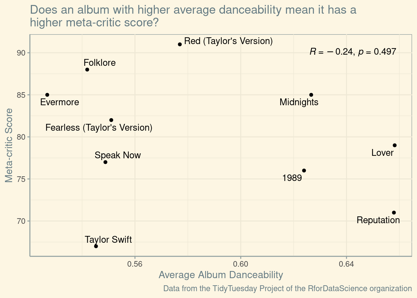
ggplot(aes(x = album_dance_mean, y = metacritic_score, label = album_name)) +
geom_point() +
theme_solarized() +
geom_text_repel() +
stat_cor(p.accuracy = 0.001, r.accuracy = 0.01, hjust = -3) +
labs(
title = "Does an album with higher average danceability mean it has a \nhigher meta-critic score?",
x = "Average Album Danceability",
y = "Meta-critic Score",
caption = "Data from the TidyTuesday Project of the RforDataScience organization"
)
# Valence vs Meta-critic Score plot
danceability1 |>
  ggplot(aes(x = album_valence_mean, y = metacritic_score, label = album_name)) +
  geom_point() +
  theme_solarized() +
  geom_text_repel() +
  stat_cor(p.accuracy = 0.001, r.accuracy = 0.01)+
  labs(
    title = "Does an album with a higher valence mean it has a \nhigher meta-critic score?",
    x = "Average Album Valence",
    y = "Meta-critic Score",
    caption = "Data from the TidyTuesday Project of the RforDataScience organization"
  )
# Faceted boxplot comparing quantiles
pivoted_data |>
  ggplot(aes(x = quantile_category, y = metacritic_score, fill = quantile_category)) +
  geom_boxplot() +
  facet_wrap(~quantile_type) +
  theme_solarized() +
  theme(legend.position = "none") +
  scale_fill_taylor(palette = "taylor1989") +
  labs(
    title = "How does higher or lower danceability compare to valence? ",
    x = "Album Quantile",
    y = "Meta-critic Score",
    caption = "Data from the TidyTuesday Project of the RforDataScience organization"
  )
# Multiple linear regression
model <- lm(metacritic_score ~ album_dance_mean + album_valence_mean, data = danceability1)

# Summary to look at coefficients and significance
tidy(model) |>
  rename(t.value = statistic) |>
  mutate_if(is.numeric, round, digits=4) |>
gt()| term | estimate | std.error | t.value | p.value |
|---|---|---|---|---|
| (Intercept) | 107.4690 | 40.5827 | 2.6481 | 0.0330 |
| album_dance_mean | -39.5667 | 55.9337 | -0.7074 | 0.5022 |
| album_valence_mean | -10.5102 | 43.1169 | -0.2438 | 0.8144 |
glance(model) |>
  rename(f.statistic = statistic) |>
  select(f.statistic, p.value) |>
  mutate_if(is.numeric, round, digits=4) |>
gt()| f.statistic | p.value |
|---|---|
| 0.2531 | 0.7832 |
Discussion
In the first plot comparing the average danceability to the meta-crticic score of her songs we can see that there is a r-value of -0.24 which can be classified as a weak negative correlation. A negative correlation would hint at the fact that her country or indie songs (given those genres have lower danceability scores) score better than her pop songs, but given the fact that there is a low correlation and the correlation is not statistically significant it is hard to really make the conclusion that her “less-danceable” songs score better.
In the next plot comparing the average valence to meta-critic score, the r-value is -0.03 and the p-value is extremely high so we can say that there is essentially no correlation between the valence and meta-critic score. As mentioned in the introduction, Swift is known for being very versatile and this helps support that because the positivity of her songs doesn’t seem to have an effect on how well-liked they are. She has had just as much success writing sad songs as happy songs, which has been a key factor to why she is one of the most consistent and famous artists for the past decade.
Similarly, in the boxplot we can tell that for the most part the danceability and valence did not have much of an effect on the meta-critic score. Along the same lines, 74% of the variability in the meta-critic score is explained by the model. This is a very low percentage, suggesting that the model does not explain much of the variability in the meta-critic scores. Additionally, the F-statistic is 0.2531 with a p-value of 0.7832, indicating that there is no statistically significant relationship between the predictors and the outcome variable. The model is not statistically significant, meaning that there is no evidence that the predictors have an effect on the meta-critic score. In summary, neither danceability nor valence in Swift’s music show a significant impact on the meta-critic score of an album in this model.
Interpreting the statistical significance of the linear regression model, with a high p-value, we fail to reject the null hypothesis for both variables. This means there is not strong evidence that change in danceability or valence is correlated with a change in meta-critic score. We ignore the intercept because a 0 value for valence or danceability doesn’t have much value in this analysis.
From Re-Releases to Loudness: How Has Taylor’s Music Changed Over Time?
Introduction
The questions we are asking are: how have the audio features of Taylor Swift’s music (danceability, energy, speechiness, acousticness, instrumentalness, liveness, and valence) changed over the course of her career? We’re interested in this question because Taylor’s music has changed a lot over time. “From country, to pop, to indie folk, Swift has expertly navigated switching genres throughout her career” (University of Oregon). Additionally, Taylor has been releasing re-recordings of her past albums called Taylor’s Versions. The master rights to her back catalog was sold once Taylor left her former record label. The re-releases allow Taylor to have regain ownership over her music while making tweaks to some past tracks. It could be interesting to explore the differences between these “eras” using the characteristics described by our dataset.
In order for us to answer this question, we need to use the track_release column and plot it against loudness. We also need to identify which albums and songs are Taylor’s Version by looking at the album_name and track_name. Then we need to calculate and plot the average danceability, energy, liveliness, speechiness, valence, and acousticness. There is no longer a need to combine the date columns as the track_release column has dates for all of Taylor’s songs. All of these variables are in taylor_all_songs.csv.
Approach
(1-2 paragraphs) Describe what types of plots you are going to make to address your question. For each plot, provide a clear explanation as to why this plot (e.g. boxplot, barplot, histogram, etc.) is best for providing the information you are asking about. The two plots should be of different types, and at least one of the two plots needs to use either color mapping or facets.
For this question we will create two plots: one scatter plot with a regression line, looking at the how the loudness audio feature changes over Taylor’s career, and one bar chart faceted by audio feature, comparing difference in audio feature scores between the original album releases and Taylor’s Versions, which are color mapped.
The linear regression reveals a relationship over time because it draws our eye from one end of the graph to the other end. It can point out the trends in Taylor’s songs to the viewer. By showing the scatterplot as another layer on the same plot, the viewer can see the distribution of the data points themselves, adding confidence to the line of regression. If there is no relationship, it is clearly represented by a flat line. In terms of the bar plot, it with a dodged positions makes it easy to compare the differences in scores between the two album version as they are right next to each other.
Analysis
(2-3 code blocks, 2 figures, text/code comments as needed) In this section, provide the code that generates your plots. Use scale functions to provide nice axis labels and guides. You are welcome to use theme functions to customize the appearance of your plot, but you are not required to do so. All plots must be made with ggplot2. Do not use base R or lattice plotting functions.
# Audio Features Reported by Spotify
features <- c("danceability", "energy", "speechiness", "acousticness",
              "instrumentalness", "liveness", "valence")

# Formats Data
all_songs_clean <- taylor_all_songs |>
  mutate(type = case_when(ep == FALSE ~ "Album",
                          ep == TRUE ~ "Extended Play",
                          is.na(ep) ~ "Single"))

album_version <- all_songs_clean |>
  pivot_longer(all_of(features), names_to = "feature",
               values_to = "score") |>
  mutate(feature = case_when(
    feature == "danceability" ~ "Danceability",
    feature == "energy" ~ "Energy",
    feature == "speechiness" ~ "Speechiness",
    feature == "acousticness" ~ "Acousticness",
    feature == "liveness" ~ "Liveness",
    feature == "instrumentalness" ~ "Instrumentalness",
    feature == "valence" ~ "Valence"
    ))|>
  filter(type == "Album") |>
  mutate(taylor_ver = grepl("Taylor's Version", album_name),
         album_name = sub(" \\(Taylor's Version\\)", "", album_name),
         track_name = sub(" \\(Taylor's Version\\)", "", track_name)) |>
  # Make sure only the same tracks are used
  filter(track_name %in% unique(track_name[taylor_ver])) |>
  group_by(album_name, taylor_ver, feature) |>
  summarize(score = mean(score))
`summarise()` has grouped output by 'album_name', 'taylor_ver'. You can
override using the `.groups` argument.# Correlation Matrix depending on track release
corr <- cor(as.numeric(taylor_all_songs$track_release),
select_if(taylor_all_songs, is.numeric),
use = "complete.obs")
corrplot(corr, method = "color", addCoef.col = 'black', cl.pos = 'n')
# Chose to plot loudness because of the highest correlation
all_songs_clean |>
  filter(type %in% c("Album", "Single")) |>
  ggplot(mapping = aes(x = track_release, y = loudness, color = type)) +
  geom_point(alpha = 0.5) +
  geom_smooth(method = "lm", se = FALSE) +
  labs(title = "Loudness for Album Releases Decreases Slower than Singles",
       subtitle = "Song Loudness (dB) Over Time by Release Type",
       x = "Year",
       y = "Loudness (dB)",
       color = "Release Type",
       caption = "Data from the TidyTuesday Project of the RforDataScience organization") +
  scale_color_taylor(palette = "taylor1989") +
  theme_solarized()
`geom_smooth()` using formula = 'y ~ x'Warning: Removed 5 rows containing non-finite values (`stat_smooth()`).Warning: Removed 5 rows containing missing values (`geom_point()`).
# Statistical Significance
model <- lm(loudness ~ track_release, data = all_songs_clean)
mod_df <- tidy(model, quick = TRUE) |>
  mutate_if(is.numeric, round, digits=4)
gt(mod_df)| term | estimate | std.error | statistic | p.value |
|---|---|---|---|---|
| (Intercept) | 2.8641 | 1.3685 | 2.0930 | 0.0373 |
| track_release | -0.0006 | 0.0001 | -7.5301 | 0.0000 |
album_version |>
  # Instrumentalness is 0 for all values
  filter(feature != "Instrumentalness") |>
  ggplot(mapping = aes(x = album_name, y = score, fill = taylor_ver)) +
  geom_col(position = "dodge") +
  facet_wrap(vars(feature)) +
  labs(title = paste("There is Little Change in Audio Features Across Versions"),
       subtitle = "Mean Score by Album Version",
       x = "Album Name",
       y = "Score",
       fill = "Album Version",
       caption = paste0("Data from the TidyTuesday Project of the ",
                        "RforDataScience organization\nInstrumental score",
                        " is 0 for all albums*")) +
  scale_fill_taylor(palette = "taylor1989",
                    labels = c("Original", "Taylor's Version")) +
  # All scores are from 0 to 1
  scale_y_continuous(limits = c(0,1)) +
  theme_solarized()
Discussion
(1-3 paragraphs) In the Discussion section, interpret the results of your analysis. Identify any trends revealed (or not revealed) by the plots. Speculate about why the data looks the way it does.
Over Taylor Swift’s career, the loudness of her music releases has decreased. Upon performing a linear regression model, due to the low p-value, there is strong evidence that a change in year is associated with a change in loudness. The decline in loudness appears steeper for album releases than single releases because she has fewer singles than the total number of songs across all her albums and started releasing singles later than albums according to our dataset. Also, our analysis shows that songs from Taylor’s album releases before 2015 were distributed more closely together in terms of loudness scores and notably louder than later ones. She was known for being a country star during this time. Her more recent albums have more loudness variety, hinting at Taylor Swift’s ventures into other genres.
There is little change in the liveliness scores between the original albums and Taylor’s Version of Fearless and Red. Both scores are rather low, which is to be expected as both versions of the two albums were recorded within a studio, not in front of a live audience. The energy and valence scores on Taylor’s Version of Fearless are higher than the original, but these scores are lower on Taylor’s Version of Red. Regardless, from the audio features we can see that as Taylor Swift has matured as an artist, she has different stories to convey through her music than she did when she was younger. This will vary depending on the album she is working on, influencing the scores of different audio features.
Three trends can be seen through the audio features in both Fearless and Red: danceability scores were lower on Taylor’s Versions, acousticness was higher on Taylor’s Versions, and speechiness was slightly higher on Taylor’s Versions. The slight increase in speechiness may suggest that there is more focus on the vocals on the track or that the way that Taylor Swift sings has changed over time. The inverse relationship of acousticness and danceability scores between the two album versions indicates changes in Taylor Swift’s music. Her preference for acoustic music has grown since the albums’ original releases, which can be notably seen between the acousticness scores of the two Red albums. While Taylor’s music continues to make music suitable for dancing, our analysis shows that her music may be slightly slower in tempo or have slightly weaker beats, showing the subtle ways Taylor has evolved her craft.
Presentation
Our presentation can be found here.
Data
Include a citation for your data here. See http://libraryguides.vu.edu.au/c.php?g=386501&p=4347840 for guidance on proper citation for datasets. If you got your data off the web, make sure to note the retrieval date.
Thompson, W. Jake. (2023, October 17). Taylor Swift. [Data set]. tidytuesday. https://github.com/rfordatascience/tidytuesday/blob/master/data/2023/2023-10-17/readme.md
References
List any references here. You should, at a minimum, list your data source. *
https://musicanddance.uoregon.edu/TaylorSwift#:~:text=From%20country%2C%20to%20pop%2C%20to,pop%20with%20the%20album%2C%20Red.
https://en.wikipedia.org/wiki/Cultural_impact_of_Taylor_Swift#:~:text=Swift%20has%20a%20capacity%20for,and%20analysis%20of%20her%20music.
https://help.spotontrack.com/article/what-do-the-audio-features-mean
https://cran.r-project.org/web/packages/tayloRswift/readme/README.html
https://github.com/rfordatascience/tidytuesday/blob/master/data/2023/2023-10-17/readme.md
https://gt.rstudio.com/articles/gt.html#a-walkthrough-of-the-gt-basics-with-a-simple-table
https://www.rdocumentation.org/packages/gt/versions/0.1.0