Who Is Responsible for Climate Change?
Same data. Different metrics. Different verdicts.
Key Findings · Lenses 1 & 2
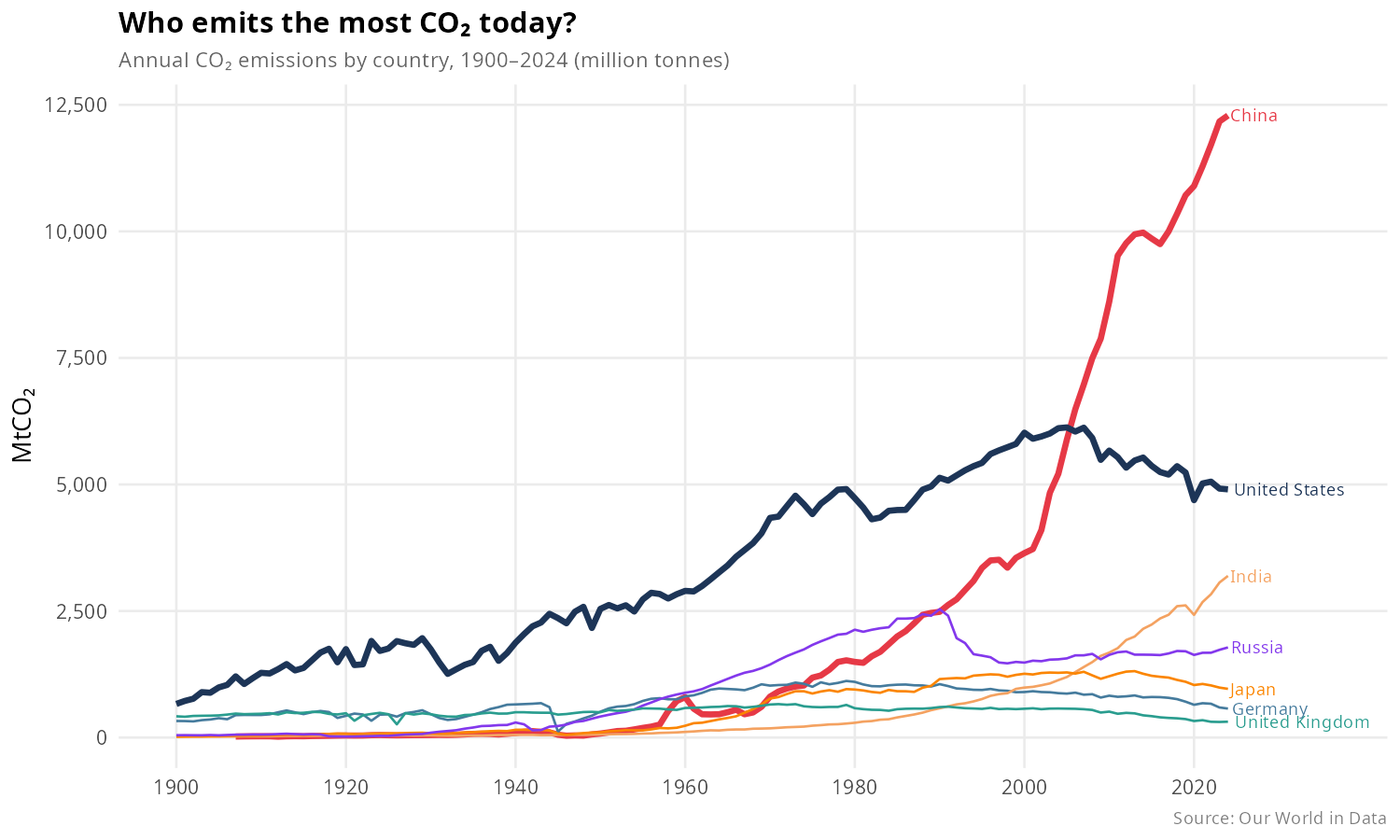
Lens 01 · Total
China surpassed the US around 2006 — but its output reflects manufacturing demand from wealthier nations, not domestic consumption.
Lens 02 · Per Capita
The US, Russia, and Germany are the real high emitters per person, reflecting car-dependent infrastructure and fossil-fuel grids.
Key Findings · Lenses 3 & 4
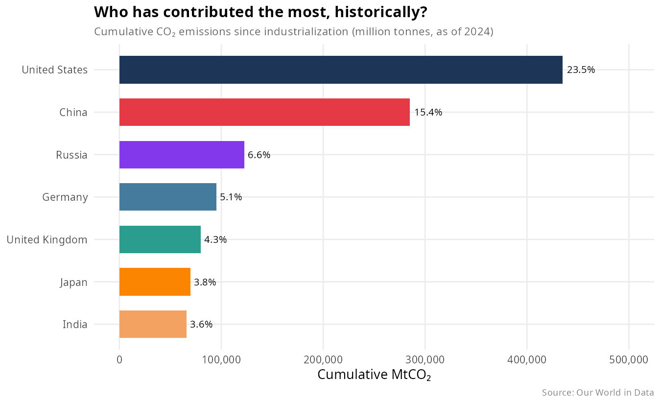
Lens 03 · Cumulative
The US accounts for ~23.5% of all historical emissions — the foundation of the historical responsibility argument made by developing nations.
Lens 04 · Consumption
The US and UK’s apparent domestic progress is partly an artifact of offshoring production, not genuine decarbonization.