Powered by Poverty
Energy access, income, and poverty in the United States
Cameron Kull, Maria Persaud Fernandez, and Chris Wang
Project Goal
We built a Closeread story that asks:
As the U.S. grid gets cleaner, where do poverty and fossil-heavy infrastructure still overlap?
- Audience: public readers interested in climate, infrastructure, and inequality.
- Product: a guided scrollytelling article with maps, plant overlays, and summary charts.
- New workflow: Quarto Closeread with interactive
{ggiraph}maps and charts.
Data We Joined
1 U.S. Energy Information Administration Electricity data on capacity, generation, and emissions
2 U.S. Census Bureau Small Area Income and Poverty Estimates
3 World Resources Institute U.S. power plant geography and capacity
Product Demonstration
The product is the website: scrollytelling first, with each map and chart introduced only after the prior step in the argument has been established.
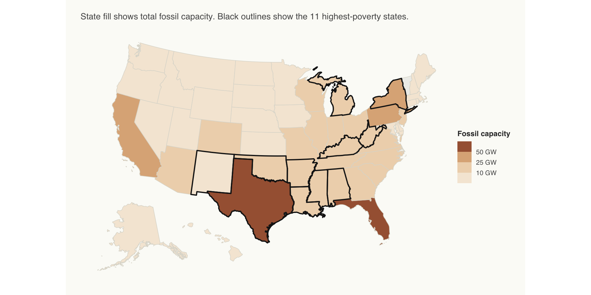
Fossil Capacity Is Concentrated
Fossil capacity is not just a plant-by-plant story. At the state scale, the same high-poverty states often sit inside fossil-heavy electricity systems.
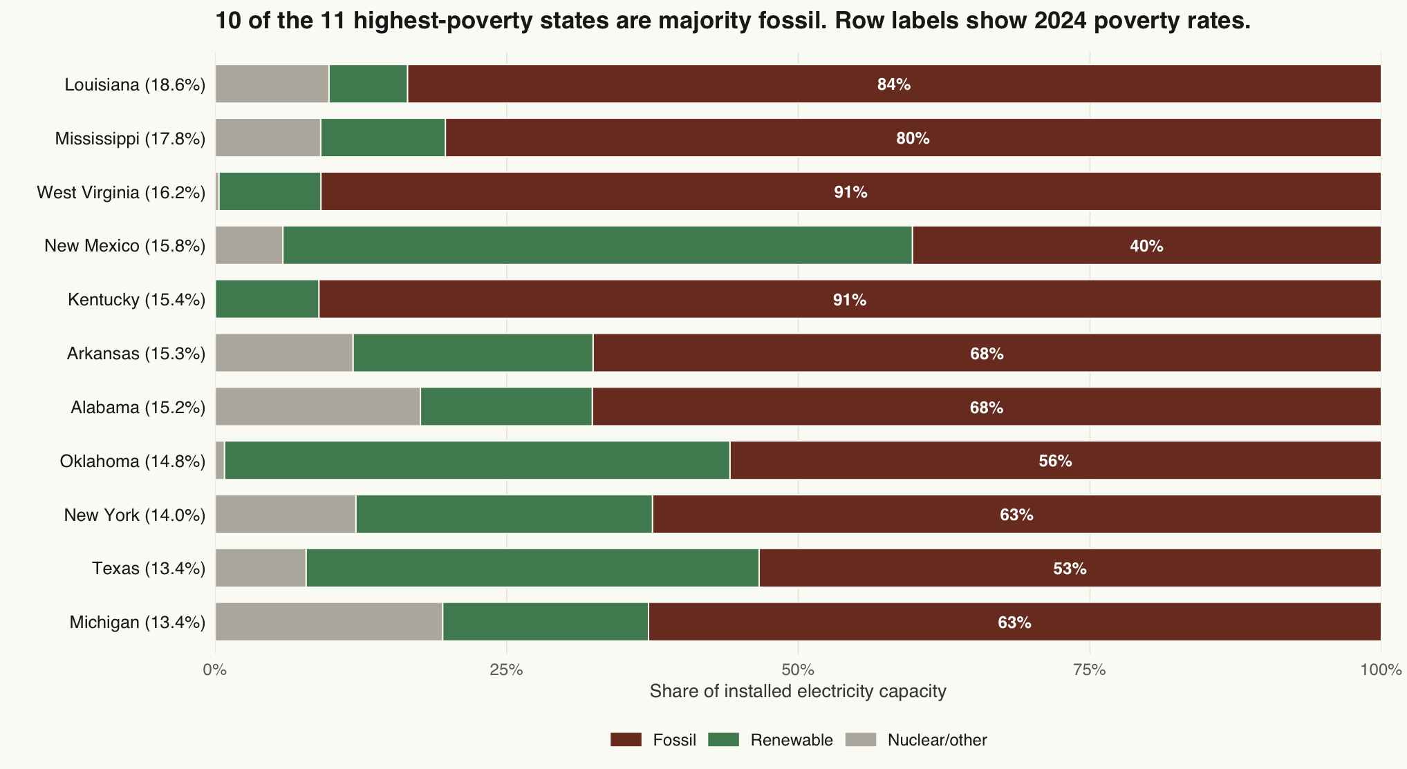
10 of 11 Highest-Poverty States Are Majority Fossil
Rows are the 11 states with the highest 2024 poverty rates. Brown is fossil capacity share; New Mexico is the only non-majority-fossil exception.
Product Design
- Closeread controls the reading order: national transition, state map, scale context, poverty layer, county detail, and synthesis.
ggiraphadds hover detail without turning every map into a dashboard.- The plant overlays add local context without claiming a causal relationship.
- Narrative copy explains what the data supports and what it does not prove.
Limitations
- State energy data cannot identify household-level energy burden.
- Total CO₂ is not per-capita or per-MWh intensity. It reflects state size and industrial scale.
- Texas and Louisiana require the industrial-electricity context before any equity claim.
- WRI plant data is contextual, not a complete 2024 inventory.
- The analysis shows association, not causation.
Takeaway
A cleaner grid is not automatically an equitable grid.
The question isn’t only how fast the U.S. cuts emissions.
It is who gets cleaner infrastructure first, and who is still waiting.