info1300-2024sp-documents
Project 2 Requirements
Read this document thoroughly to understand the requirements for project 2.
Resources
Project Document Summary:
- Project 2 > Overview Document
- Project 2 > Requirements Document
- Project 2 > Milestone 1
- Project 2 > Milestone 2
- Project 1 > Final Deliverable
Coding Resources:
- MDN HTML Reference
- MDN CSS Reference
- Markdown Reference Documentation
- Basic concepts of flexbox
- A Complete Guide to Flexbox
- Flexbox Basics > How To Guide
Table of Contents
Deadlines
| Submissions | Deadline | Slip Day Deadline | Credit |
|---|---|---|---|
| Milestone 1 (p2m1) | Wed 3/6, 11:59pm | Thu 3/7, 11:59pm | 36 points (correctness) |
| Milestone 2 (p2m2) | Wed 3/13, 11:59pm | Thu 3/14, 11:59pm | 52 points (correctness) |
| Final Submission (p2fin) | Wed 3/20, 11:59pm | Thu 3/21, 11:59pm | 100 points(correctness) |
Audience Requirements
As a web designer, not only do you need to be familiar with web programming, but you also need to understand your users. Identifying their goals is the first step in building any website.
You’ll need to identify a cohesive audience and redesign the Apple Harvest Festival website to meet that audience’s goals. Your audience might be travelers from around New York, local Ithaca residents, festival vendors, etc. You may select any audience, including the audiences listed here, so long as you possess user research that documents the uniformity of the audience’s goals.
Selecting an Audience
When selecting your audience, consider the following:
-
Your audience must represent a cohesive group with relatively uniform goals.
Audiences like “nearby (30min) area residents” and “out-of-towners visiting Ithaca for a weekend” likely represent groups that are largely cohesive in terms of their goals for using the Apple Harvest Festival website. Nearby residents probably know how to get to the Ithaca Commons. Out-of-towners probably don’t know how to get to the Commons and might need lodging information.
Tip: You may use these audiences; you may use the audience we identified in class.
Avoid overly broad audiences like “students” or “Cornell students” that don’t represent uniform goals. Especially avoid “everyone.”
Avoid arbitrarily specific audiences. For example “Cornell students” or “first-year Cornell students” in this context is probably arbitrarily specific. What do Cornell first-year students need that is so different from Ithaca College first year students or all Cornell students, that would justify a specific website for only Cornell first year students?
You cannot be the sole audience for Project 2; no “me” audiences. You aren’t designing a site for yourself.
-
You will need access to at least 3 members of your audience.
You will be conducting user interviews with 3 members of your audience.
Note: The identity of the interviewees is not your audience. It’s the goals that determine the audience. Yes, you may only interviewed Cornell students, but are their goals different from Ithaca College students or local area residents? Probably not as we discovered in class.
-
The language for your website must be English.
Pick an audience that can communicate in English. Your TAs will grade your work. Your work must be in English for us to grade it.
User Research – User Interviews
You will conduct user interviews as part of your user research.
When conducting user interviews, you should discover similar/uniform goals for each member of the audience you interview. If you discover that the goals aren’t consistent/uniform, then this is a sign that your audience likely isn’t a cohesive group.
-
You are required to conduct user interviews with 3 distinct members of your site’s audience.
Your participants may not be your friends or family.
-
Take thorough notes to document your user interviews in the design journey.
Interview notes are important for the analysis of a cohesive audience and their goals.
Please don’t record the interview. Recording for user research typically requires informed consent from participants. That’s not something we’re able to cover in an introductory-level course. It’s also note that it’s a lot of work to transcribe recorded interviews.
-
Do not fabricate user interview data.
We understand that conducting user interviews is time-consuming. However, we believe it’s an important skill to learn to create usable websites. While it may be tempting to avoid conducting user interviews and write up some fake data in the design journey, fake data will result in a 0 for your “user research” grade.
Tip: Here are some things you need to think when conducting user interviews:
-
Why would your audience visit the site?
Are they looking for something to do? Or have they already decided to go and are they looking for a particular piece of information about the festival?
Is the information they need 2 weeks in advance of the festival the same information they need the day of?
-
What are the goals of the audience?
If the audience is a food vendor, they might need to know where their electrical hook-up is or how to apply for a food permit.
If it’s an attendee, they might need to know where the bathrooms are or where to park.
-
What types of content would you need to include in your redesigned site?
Do they need a map? Or where accessible ramps exist?
Or the hours of the festival?
Do they need to know what the dog policy is?
Do they have an allergy to bees? (There are a lot of bees at the festival.)
-
How will they access the website? A desktop or mobile device?
If they’re planning a visit, they may browse using a laptop computer.
Once they’re at the festival, they’re likely to be using a mobile device.
-
In what context or situation will they be using the site?
Is it casual browsing ahead of time to see if they want to go?
Is it looking up information in a hurry to find where parking is permitted after they arrived downtown and all the roads were closed?
Content Requirements
You will develop a multiple-page site with at least 3 pages with substantial content.
-
Your site must include content that addresses the goals of your site’s audience.
-
Your website must include substantial content. Each page should be content rich.
This includes substantial text content. You are also required to include media content.
Tip: If you’re using a bunch (not all) of the instructor provided content, you’ve probably got enough content.
-
You may use any content you find or create.
- You are strongly encouraged to use the instructor provided content! However, you are not required to use it.
- You may create your own content. You are not required to do so.
- You may find content from other sources, including the existing site or social media. You are not required to do so.
- You may share content with your peers in this class. You are not required to do so.
-
Carefully select the content you include in the site. Only include content that addresses the goals of your audience.
Some students include all the instructor provided content “just to be safe.” Pro-tip: This is probably a bad idea. Why? Because if you’re including content that doesn’t address the audience’s goals, then you’re not designing a site for them.
-
The content you use need not be real nor accurate for this year’s festival. However, it must be realistic and believable for your site’s audience.
You may “invent” content. You are free to use your artistic license for your content.
-
You must cite all content.
The instructor has provided content you may use for your project. Cite all instructor provided content as a comment in the code (no visible citation required). The citation must state “instructor provided.”
All other content: You must follow the course citation policy.
-
All content must respect the user’s internet bandwidth/speed.
No content should be larger than 1MB. In fact, most of the time it should be at least half that size. You will need to scale some resources to reduce its file size.
You probably need to check the instructor provided content file sizes. Some of it’s probably too big.
Warning: All content files must be less than 100MB Files larger than 100MB are rejected by GitHub. Before you commit, check to make sure none of your files are larger than 100MB. (Please check before committing. It’s really hard to fix this if you forget.)
Design Requirements
This assignment is about re-designing an existing site. There’s lots to improve about the existing site. Your website is required to be different from the existing website for the Apple Harvest Festival. Your re-design should be unique, creative, and usable for your site’s audience.
-
You are required to plan before you code.
If you later decide to change your design, you are required to plan those design changes in your design journey before you code them. Don’t delete the old design/plan. Keep it there. The design journey is about documenting the iterations of your site’s design. Be sure to explain why you made any changes. This context is important for understanding your design’s evolution.
Minor changes do not require planning. How do you know if it’s minor? If you look at your design journey, you should be able to recognize the sketches and plan as the same site that shows up in the browser. Changing the name of a page is minor. Adding a sidebar is not.
At least 1 iteration of card sorting is required.
-
You are required to thoroughly document your design process.
We want to see the ideas that you considered, but didn’t make the final cut. We want to see the evolution of your design and your reasons for changing it.
-
Your sketches should help you plan the layout of your website.
Sketches are used to plan the design of your website. Your sketches should follow best-practices as taught in class. Final sketches should represent all the content to be included on the page and its layout.
You should plan where and how you will use flexboxes to create this layout. You should identify the parent and child elements for each flexboxes. If you do not already have an appropriate container, indicate where you will create a container
<div>.Do not annotate every HTML element in your sketch. You do not need to annotate colors/fonts/other theme aspects. The sketches are for ideating and planning the layout of your content.
-
Your final design in the design journey should be mostly identical to the final version.
The sketches do not need to be identical, but they should be very close. Small changes like renaming “News” to “Latest Events” does not necessitate a new design. (Although, you should provide a rationale in the design journey for this change.) However, adding in a sidebar does need a new design and should be documented.
If you need to make changes to your site: Stop. Design it, document it, then code it.
-
Your design must employ familiar web design patterns.
At minimum, this includes the following for every page:
- A navigation bar/menu
- A sidebar or side by side layout (for wide layout; stacked in narrow layout)
- A footer
For example, your wide layout should be similar to the following wide layout design pattern:
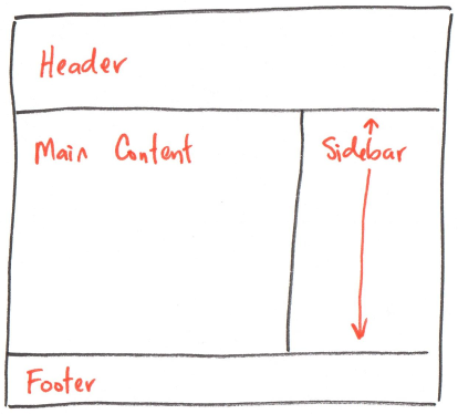
Note: The sidebar is frequently aligned to the right, but it’s also common to have a left aligned sidebar.
You are required to use at least two flexboxes to lay out content side-by-side in the wide version of your site. Implementing a navigation bar and a sidebar is sufficient to meet this requirement.
Tip: Avoid horizontal scrolling/scroll bars.
-
The design must be aesthetically pleasing and properly employ visual design principles.
If you are not sure whether your site is aesthetically pleasing or how effectively it employs visual design principles, ask several of your peers to critique your design. We strongly encourage you to collaborate with your peers.
-
The design must be responsive for both “mobile” and “desktop” devices.
Plan both the narrow and wide versions of your site.
-
The “mobile” design must be reasonably different compared to the “desktop” design.
-
Your responsive design must be implemented with CSS media queries.
Use media queries; you can’t just set every element’s width to 100% and call your site responsive.
What are the responsive break points for narrow and wide screens? There is no one correct answer. Your content should dictate the responsive breaks points. You should also consider the devices your audience will likely use.
Your responsive design must be fluid. It should seamlessly change from narrow to wide layouts. Do not have gaps in your responsive design. For example your narrow layout only support screens up to 600px, but your wide layout doesn’t start till 900px. There is a gap between 600 and 900!
-
You are required to use flexbox for your project.
-
You are required to frame your content in your “desktop” design.
The main body should have a maximum width to ensure readability. It should not fill 100% of the screen if the browser is unreasonably wide.
-
You may not use interactivity in your design.
We haven’t learned about interactivity and JavaScript yet. If the page dynamically changes after a user clicks something (rather than loading a new page), then it requires interactivity. Avoid interactivity for this project.
Please note that you will add interactivity to your Project 1 or 2 web site in Project 3. Consider planning now for adding interactivity in Project 3.
-
You may not include forms in your design.
Forms require a web server to respond and process the request. We won’t learn server-side web development in this course.
Website Requirements
For your website you should follow the standards and best practices set forth in class, labs, and Project 1.
As a professional web developer, your client will not give you a rubric telling you that your design needs to be aesthetically pleasing or that you need to name the main HTML file index.html. It is expected that you know the standards, conventions, and expectations of your field. We expect the same in this class.
As a reference, here are some of these expectations that you have learned so far in this class:
- Final site must be professional and polished:
- Your website is designed to address the goals of a cohesive audience(s).
- Your design is aesthetically pleasing, professional, and polished.
- Well-designed (content organization, theme, layout, visual design, etc.)
- Design effectively employs visual design principles (contrast, hierarchy, alignment, proximity, etc.)
- Functional and looks great in both Firefox and Chrome/Chromium.
- Site adheres to best practices:
- All images file sizes respect users’ bandwidth; all image file sizes are reasonable and not unnecessarily large.
- Images are not “resized” in CSS or HTML (relative
%dimensions permitted.) - Images are scaled (“resized” in an image editor) to be no larger than the maximum space available for it in the layout.
- Images are not “resized” in CSS or HTML (relative
- Content is cited correctly as specified in the course citation policy.
- Your code is documented with comments where appropriate.
- The HTML is well-structured for your site’s content (i.e. use of
<header>,<main>,<section>,<aside>,<footer>,<strong>,<em>).- Please do not use elements for style:
<b>,<i>,<hr>,<br>, etc.
- Please do not use elements for style:
- External styling via CSS. No inline or internal styling (i.e.
<style>elements orstyle=""attributes). - Your code (HTML, CSS) is well written, readable, formatted, and properly indented.
- No broken or dead links. Remember that some computers use case-sensitive file and folder names!
- No hotlinking of external resources. This almost always includes embedding.
- Using Google fonts is permitted when using the
@importtechnique.
- Using Google fonts is permitted when using the
- Validated HTML5 and CSS3. You must have 0 errors; warnings are permitted.
- All files are reasonably sized (~< 1MB) for the web (this includes: images, videos, PDFs, etc.)
- Well-organized site files.
- All HTML files are located in the root of website’s repository.
- Main page is named index.html.
- Images are located in an
imagesdirectory. - Your CSS files are located in the
stylesdirectory.
- You have tested your website in Firefox and Chrome.
- All images file sizes respect users’ bandwidth; all image file sizes are reasonable and not unnecessarily large.
- JavaScript is prohibited for this assignment.
- All code must be your own work.