── Attaching core tidyverse packages ──────────────────────── tidyverse 2.0.0 ──
✔ dplyr     1.1.4     ✔ readr     2.1.5
✔ forcats   1.0.0     ✔ stringr   1.5.1
✔ ggplot2   3.4.4     ✔ tibble    3.2.1
✔ lubridate 1.9.3     ✔ tidyr     1.3.0
✔ purrr     1.0.2
── Conflicts ────────────────────────────────────────── tidyverse_conflicts() ──
✖ dplyr::filter() masks stats::filter()
✖ dplyr::lag()    masks stats::lag()
ℹ Use the conflicted package (<http://conflicted.r-lib.org/>) to force all conflicts to become errors

Attaching package: 'hms'


The following object is masked from 'package:lubridate':

hmsUFO Sightings
Rows: 96429 Columns: 12
── Column specification ────────────────────────────────────────────────────────
Delimiter: ","
chr  (7): city, state, country_code, shape, reported_duration, summary, day_...
dbl  (1): duration_seconds
lgl  (1): has_images
dttm (2): reported_date_time, reported_date_time_utc
date (1): posted_date

ℹ Use `spec()` to retrieve the full column specification for this data.
ℹ Specify the column types or set `show_col_types = FALSE` to quiet this message.
Rows: 26409 Columns: 12
── Column specification ────────────────────────────────────────────────────────
Delimiter: ","
dbl  (2): rounded_lat, rounded_long
date (1): rounded_date
time (9): astronomical_twilight_begin, nautical_twilight_begin, civil_twilig...

ℹ Use `spec()` to retrieve the full column specification for this data.
ℹ Specify the column types or set `show_col_types = FALSE` to quiet this message.
Rows: 14417 Columns: 10
── Column specification ────────────────────────────────────────────────────────
Delimiter: ","
chr (6): city, alternate_city_names, state, country, country_code, timezone
dbl (4): latitude, longitude, population, elevation_m

ℹ Use `spec()` to retrieve the full column specification for this data.
ℹ Specify the column types or set `show_col_types = FALSE` to quiet this message.
Introduction
This dataset represents a comprehensive fusion of UFO sighting records sourced from the National UFO Research Center, further enhanced with meteorological and lighting condition data obtained from https://sunrise-sunset.org/. This integration provides a unique perspective on the environmental conditions prevalent at the time of each UFO sighting. The dataset comprises three distinct data frames: ‘day_parts_map’, which documents daytime conditions across 26,409 entries and 12 variables; ‘places’, detailing the locations of sightings with 14,417 entries and 10 variables; and ‘ufo_sightings’, which captures detailed accounts of 96,429 UFO sightings over 12 variables. Our selection of this dataset stems from a keen interest in exploring the phenomena of UFOs, offering us a rich foundation for our presentation.
Question 1: How does the time of day at which UFO sightings change over time and by location?
Introduction
My interest in this question stems from the potential to uncover underlying factors influencing reported sighting times. This means first confirming strong enough trends in the parts of the day sightings occur. It is only after confirming such trends that we can attempt to explain what factors may cause such trends. Given how large of a dataset we are given access to, it is also interesting to assess things at the largest scale possible. That means looking at things across the longest period of time available and across the largest geographical scale possible.
That being said, the most relevant variables for answering this question are going to be a) the timestamps of the sightings (these are surprisingly precise), b) its year, and c) its location. Since time of day is the dependent variable, we are mainly looking at first how (a) is influenced by (b), and second how (a) is influenced by (c). This also means that must merge the ufo_sightings and places (through variable “city”) in order to answer that first part.
Approach
The best type of plot for answering how time of day is influenced over the years would be one that can best show frequency trends across different values. We thought a density plot (geom_density) would be best for this because it allows us to have timestamps on the x-axis and we can also overlay different fill values. Having timestamps on the x-axis was fairly important, and a density plot allowed us to still address trends over time by sectioning fill values by decade. Thus, we have a density plot where each fill layer represents a decade from the 1990s (start of dataset) till today.
To answer the second part of the question (time of day by location), we needed a plot that could show. Since using timestamps would be too redundant, we opted for the day_part variable, which shows what part of the day the sighting took place at (data was cleaned to only show: dawn, morning, afternoon, dusk, night). It would also be impossible to show every country without bombarding the viewer with an overload of information, and using a world map would be too difficult to work with for this question. Therefore, we opted to choose 4 statistically relevant yet geographically dispersed countries and compare them to one another. The best way to do so was to use stacked bar charts so that we could compare proportions all in one chart without having to facet unnecessarily. This meant that color mapping would be a key element to understanding the graph. We are able to compare countries to one another as each stacked bar represents one country, all of which have the same order of proportions. A stacked bar chart also enabled us to prepare the data such that the parts of the day were chronologically ordered from dawn till night (this ended up paying off, as we were able to identify an additional interesting trend).
Analysis
merged_q1 = merge(x=ufo_sightings,y=places,by="city")

merged_q1 <- merged_q1 |>
  mutate(
    reported_date_time = format(reported_date_time, "%H:%M:%S"),
    reported_date_time = as_hms(reported_date_time),
    year = lubridate::year(posted_date),
    decade = paste0(as.character(floor(year / 10) * 10), "s")
  )

merged_q1a <- merged_q1|>
  filter(
    country_code.x == c("US")
  )

merged_q1b <- merged_q1|>
  mutate(
    day_part = ifelse(
      grepl("dusk", day_part, ignore.case = TRUE),
      "dusk",
      day_part
    ),
    day_part = ifelse(
      grepl("dawn", day_part, ignore.case = TRUE),
      "dawn",
      day_part
    ),
    day_part = str_to_title(day_part),
    day_part = fct_relevel(
      .f = day_part, "Dawn", "Morning", "Afternoon", "Dusk", "Night"
    ),
    country_name = ifelse(
      country_code.x == "US",
      "United States",
      ifelse(
        country_code.x == "GB",
        "United Kingdom",
        ifelse(
          country_code.x == "ZA",
          "South Africa",
          ifelse(
            country_code.x == "AU",
            "Australia",
            "Other"
          )
        )
      )
    )
  )|>
  filter(
    country_name == c("United States", "Australia", "United Kingdom", "South Africa")
    )|>
  drop_na(day_part)
Warning: There was 1 warning in `filter()`.
ℹ In argument: `==...`.
Caused by warning in `country_name == c("United States", "Australia", "United Kingdom",
"South Africa")`:
! longer object length is not a multiple of shorter object lengthmerged_q1b <- merged_q1b|>
mutate(
country_name = fct_relevel(
.f = country_name, "United States", "United Kingdom", "South Africa", "Australia"
)
)ggplot(merged_q1a, aes(x = reported_date_time, fill = decade)) +
geom_density(alpha = 0.5)+
labs(
title = "Time of Sightings Over the Years",
x = "Time of Day",
fill = "Decade"
)+
scale_fill_brewer(palette = "Spectral")+
theme_classic(base_size = 12)+
theme(axis.title.y=element_blank(),
axis.text.y=element_blank(),
axis.ticks.y=element_blank())+
scale_x_time(limits = as.hms(c('0:00:00', '24:00:00')), breaks = hms(hours = seq(0, 24, 6)))Warning: `as.hms()` was deprecated in hms 0.5.0.
ℹ Please use `as_hms()` instead.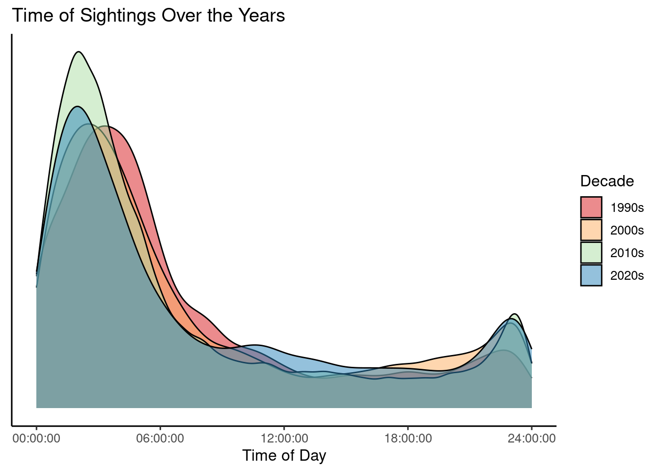
ggplot(merged_q1b, aes(x = country_name, fill = day_part)) +
  geom_bar(position="fill", stat="count", alpha = 0.5) +
  labs(
    x = "Country", y = "",fill = "Part of Day",
    title = "Sightings by part of day around the world"
  )+
  scale_fill_brewer(palette = "Spectral") +
  scale_y_continuous(labels = scales::percent_format())+
  theme_classic(base_size = 12)+
  theme(axis.text.x = element_text(angle = 45, hjust = 1),
        axis.title.x=element_blank())
Discussion
From the first visualization, our analysis reveals two key trends. First, quite obviously, there is a very strong consistency in the density layers, meaning that the frequency of the times of day sightings occur at stay the same over time. Secondly, there is a very high peak between the night hours of midnight and 5am. Daytime sightings much rarer by comparison.
The second visualization confirms this consistency. But first, it confirms that geographical location across the world does not affect the time of day sightings occurs at. There is a very strong cohesiveness across the four countries with regards to the stacked bar chart proportions. Even more clearly that in the first visualization, we observe an exponential growth in sightings as the day progresses from dawn. The evening activity is followed by a very high nighttime activity. Early morning hours, however, see the lowest frequency of reported sightings.
These patterns could be attributed to various factors, including: increased public activity and awareness in the evenings, potential misidentification of celestial objects or atmospheric phenomena due to twilight lighting conditions, and reduced visibility during the early morning hours. Notably, the overall patterns of UFO sightings by time of day remain remarkably consistent across the analyzed years, suggesting a potential underlying influence on the reported timing of these events. Of course, it could also just be that aliens prefer to visit us during the night as to observe us in more secrecy.
Question 2: How is the shape of a UFO dependent on location? How do shapes of UFOs change over time?
Introduction
While the topic of UFO sightings is an ominous study, one might wonder what exactly do the UFOs look like when they are sighted. When examining the dataset, the shape variable stood out to us for this very reason. I wanted to know what shapes of each UFO were most recorded in the study. Assumptions can be made on the specific properties of UFOs if a certain trend of a UFO shape is more prominent than others. Our team was also intrigued by the relationship of UFO shape with the location that it was spotted in. We wanted to know if certain shapes were prominent in certain locations, as well as the distribution of UFOs over the U.S. overall. Only the ufo_sightings dataset was necessary to answer this question. I filtered the country variable in this question to show only U.S. characteristics. Additionally, I filtered the city and shape variables to efficiently create plots that showed the top sighting numbers within both of these variables.
Approach
I created a aligned bar chart to answer the question that measures the top 5 most sighted UFO shapes in the top 5 cities that have the most sighting UFOs overall. The specific bar plot allows me to show both the shape hierarchy and location hierarchy of UFO sightings in an ordered fashion. I separated the different UFO shapes by color, and divided each distribution of shapes in their respective cities through the discrete divides on the x-axis.
Analysis
ufo_exclude_shapes <- ufo_sightings |>
  filter(!(shape %in% c("light", "unknown", "other"))) |>
  filter(!is.na(shape))

total_sightings_by_city <- ufo_sightings |>
  filter(country_code == "US") |>
  count(city, sort = TRUE)


top_cities <- head(total_sightings_by_city, 5) |>
  select(city)


top_shapes_in_top_cities <- ufo_exclude_shapes |>
  filter(city %in% top_cities$city) |>
  count(city, shape) |>
  group_by(city) |>
  top_n(5, n) |>
ungroup()ggplot(top_shapes_in_top_cities, aes(x = factor(city, levels = c("New York City", "Seattle", "Phoenix", "Las Vegas", "Portland")), y = n, fill = shape)) +
geom_bar(stat = "identity", position = "dodge") +
theme_minimal() +
labs(title = "Trendy UFO Shapes Common in the West",
subtitle = "A glimpse at the U.S. hotspots of Top UFO Shapes",
x = "Region",
y = "Number of Sightings",
fill = "Shape") +
scale_color_brewer(palette = "Spectral") +
scale_y_continuous(breaks = seq(from = 0, to = 60, by = 10)) +
theme(plot.title = element_text(face = "bold", size = rel(1.7)),
plot.subtitle = element_text(face = "plain", size = rel(1.3), color = "grey70"), legend.title = element_text(face = "bold"),
axis.text.x = element_text(angle = 45, hjust = 1))
specified_shapes <- c('disc', 'triangle', 'fireball', 'circle', 'orb', 'sphere')
ufo_filtered <- ufo_sightings |>
  filter(shape %in% specified_shapes) |>
  mutate(year = year(posted_date)) |>
  group_by(year, shape) |>
summarize(number_of_sightings = n(), .groups = 'drop')ggplot(ufo_filtered, aes(x = year, y = number_of_sightings, color = shape)) +
geom_smooth(se = FALSE) +
labs(title = "Rollercoaster Sighting Numbers Since 1998",
subtitle = "The top 5 most-sighted UFO Shapes in the U.S. Over Time",
x = "Year",
y = "Number of Sightings") +
scale_color_manual(values = c("red", "turquoise", "black", "blue", "purple"))+
scale_x_continuous(breaks = seq(from = 1998, to = 2022, by = 4)) +
theme_minimal() +
theme(plot.title = element_text(face = "bold", size = rel(1.7)),
plot.subtitle = element_text(face = "plain", size = rel(1.3), color = "grey70"), legend.title = element_text(face = "bold"),
panel.grid.minor = element_blank(),
legend.box.background = element_rect(colour = "black"))`geom_smooth()` using method = 'loess' and formula = 'y ~ x'
Discussion
From the bar chart visualization, we can see that although New York City has the largest number of UFO sightings, the other 4 cities in the top 5 are all on the West Coast of the United States. Many sightings in cities like Phoenix and Las Vegas may stem from the UFO lore that are attributed to the Southwest Region, such as Area 51 sightings. It is cool to see this factor of increased UFO sightings in this area that many people wonder about being confirmed by the data and our visualization.
In the line plot, we can see the most sighted UFO shapes in the U.S. all follow the same trend of sighting numbers over the years, dating back to the start of the study in 1998. There is an increase in UFO sightings from the start of the study, and these numbers peak rapidly for all the shapes in the early 2010s. We can contribute this rise in sightings to the advancements of technology, allowing for photographs and sharing of these UFOs to take place, and garner more interest with the mass population. In addition, an increase in miltary tests and activities with drones can be an influence in the sightings of UFOs that people on the ground might not be familiar with during the early 2010s. This peak is followed by a significant drop, which we can attribue to a loss of interest in UFOs after their sightings exploded for the couple years prior. The fireball-shaped UFOs had the biggest fluctuation in sightings over the years compared to other shapes. However, all the shapes in this graph follow the same trajectory of sightings over the years.
Presentation
Our presentation can be found here.
Data
National UFO Research Center & Sunrise-Sunset.org. (2023). UFO Sightings and Environmental Conditions Dataset. Retrieved February 24, 2024, from https://sunrise-sunset.org/
References
- National UFO Research Center & Sunrise-Sunset.org from https://sunrise-sunset.org/