top_species_names_df <- observation_data |>
  filter(valid == 1) |>
  left_join(select(
    species_dictionary,
    species_code, species_name = primary_com_name
  )) |>
  group_by(species_code, species_name) |>
  summarize(total_sightings = sum(how_many), .groups = 'drop') |>
  filter(total_sightings > 10000) |>
  select(species_code, species_name)

q1_observation <- observation_data |>
  drop_na(snow_dep_atleast) |>
  filter(
    species_code %in% top_species_names_df$species_code,
    valid == 1
  ) |>
  left_join(top_species_names_df, by = "species_code") |>
  mutate(
    snow_category = case_when(
      snow_dep_atleast == 0 ~ "None",
      snow_dep_atleast > 0 & snow_dep_atleast < 5 ~ "Light",
      snow_dep_atleast >= 5 & snow_dep_atleast < 10 ~ "Moderate",
      snow_dep_atleast > 10 ~ "Heavy"
    ),
    species_name = as.factor(species_name),
    snow_category = as.factor(snow_category),
    snow_category = fct_relevel(
      snow_category,
      "None", "Light", "Moderate", "Heavy"
    )
  )

birds_df <- q1_observation |>
  group_by(species_name, snow_category) |>
  summarize(
    n = n(),
    total_sightings = sum(how_many),
    avg_flock_size = total_sightings / n
  ) |>
  summarize(
    species_name, snow_category, n,
    total_sightings, avg_flock_size,
    n_prop = min(total_sightings)/sum(total_sightings),
    ttl = sum(total_sightings),
    end_size = max(avg_flock_size)
  ) |>
  ungroup() |>
  mutate(
    species_name = fct_reorder(
      species_name, n_prop, tail, n=1, .desc = T
    ),
    prop = total_sightings / ttl
  )

name <- as.character(levels(birds_df$species_name)) |>
unique()Project FeederWatch, Revealing a Bird’s Secret
Introduction
Our data-set comes from Project FeederWatch, which is operated by the Cornell Lab of Ornithology and Birds Canada.
FeederWatch, which has been sponsored by Wild Bird Unlimited since 2016, is a survey of birds that visit backyards, nature centers, community areas, and other locales in North America from November to April. This data-set is created from the contributions of the individual FeederWatchers. Thousands of voluntary FeederWatchers in communities across North America count birds and send their tallies to the FeederWatch database. The TidyTuesday only offers a subset of the 2021 data, which is from November 2020 to April 2021, but data available through 1988 is available on FeederWatch Raw Dataset Downloads page.
observation_data is a data-set where each entry represents each unique observation. Individual columns that we focused on while answering our questions include the following:
loc_id: Unique identifier for each survey siteproj_period_id: Calendar year of end of FeederWatch season.observation_dataonly has PFW_2021.species_code: Bird species observed, stored as 6-letter species codeshow_many: Maximum number of individuals seen at one time during observation periodvalid: Validity of each observation based on flagging systemsnow_dep_atleast: Participant estimate of minimum snow depth during a checklist
site_data is a data-set where each entry represents each unique observation location. It has various columns that classifies the type of the observation location, and describes its environmental factors.
loc_id: Unique identifier for each survey siteproj_period_id: calendar year of end of FeederWatch season.site_datahas many different project period id’s, over the years.numfeeders\_\: numbers of feeder types present at each location. Feeder types are suet, ground, hanging, platform, humming, water, thistle, fruit, hopper, tube, and other feeders.
observation_data and site_data, in combined, show which bird species visit feeders at thousands of locations across the continent every winter. The data-sets also indicate how many individuals of each species are seen, and can also be used to measure changes in the winter ranges and abundances of bird species over time.
The last data-set, species_dictionary maps the species_code column in observation_data to actual names of bird species.
species_code: Bird species observed, stored as 6-letter species codesprimary_com_name: Corresponding primary common name eachspecies_code
Question 1: Bird Species by Snowfall
Introduction
Are birds, by bird species, more likely to be observed when there’s a lot of snow, there’s less snow, or doesn’t matter? What influence will the snow amount will have on the average flock size of the birds?
We’re interested in answering this question because intuitively, we’d think that birds would be less likely to come out if it’s snowing heavily. But there may be certain bird species that actually come out more in the snow as it helps them capture more prey. At the same time, although snow might reduce the activeness of a bird, but it might result in a bigger size of the flock to preserve body temperature. We weren’t totally sure, and thought it’d be really interesting to find the answer to this question.
Here, we
observation_data$species_code: Bird species observed, stored as 6-letter species codes.observation_data$how_many: Maximum number of individuals seen at one time during observation period.observation_data$snow_dep_atleast: Participant estimate of minimum snow depth during a checklist.
Approach
- Data-Wrangling
- First, we will identify species with sufficient data. We will filter the data-set to include only those bird species that have been observed more than 10,000 times based on the
species_codeto ensure that the analysis focuses on species with enough data to draw meaningful conclusions. We will first aggregate the number of birds observed usinggroup_by()andsummarize()to sumhow_many. Then, we willfilter()the outcome to ensure that we only continue with the species meeting threshold. - Then, we will create a new categorical variable called
snow_categorybased onsnow_dep_atleast, usingmutate()function. - Then, we will use species_dictionary data-set to get
species_name, names of birds, byspecies_code. - Then, we will group by
species_nameandsnow_categoryand summarize total sighting case reported, total birds sighted, and average flock size.
- First, we will identify species with sufficient data. We will filter the data-set to include only those bird species that have been observed more than 10,000 times based on the
- Visualization
- We will create 2 visualizations. First one will display the number of sightings difference for each species and snow level. Second one will display how the snow level affects average flock sizes of each bird species.
- For the first one, we will use a stacked bar chart, with
xbeingspecies_nameandybeing sighting case reported,colorbeingsnow_category. We believe this stacked bar chart will best visualize whether or not each species of bird is more frequently sighted (thus being more active), as the height of each bar intuitively describes it. - For the second one, we will use a line chart, with
xbeingsnow_categoryandybeing average flock size, andcolorbeingsnow_category. We believe this line chart will best visualize whether or not each species of bird will have bigger or smaller flock size as more snow is present in the environment, as the line chart will describe the trend of it for each species.
Analysis
birds_df |>
  ggplot(aes(x = species_name, y = prop, fill = snow_category)) +
  geom_col(position = "stack") +
  scale_y_continuous(
    labels = label_percent()
  ) +
  theme_minimal() +
  theme(
    legend.position = "bottom"
  ) +
  labs(
    title = "Higher Snow Level Leads to Lower Bird Activity",
    subtitle = "Variation in Reported Sighting Cases Proportion for
Each Snow Level among Bird Species",
    x = "\nBird Species",
    y = "Proportion of Reported Sighting Cases",
    fill = "Amount of Snow"
  ) +
  scale_x_discrete(
    guide = guide_axis(n.dodge = 2),
    labels = label_wrap(10)
  ) +
  theme(
    axis.title = element_text(size = 14),
    axis.text = element_text(size = 12),
    legend.text = element_text(size = 12),
    legend.title = element_text(size = 14)
  ) +
  scale_fill_brewer(palette = "Set2")
birds_df |>
  ungroup() |>
  mutate(
    species_name = fct_reorder(
      species_name, avg_flock_size, tail, n=1, .desc = T
    )
  ) |>
  ggplot(aes(
    x = snow_category, y = avg_flock_size, color = species_name
  )) +
  geom_path(aes(group = species_name)) +
  labs(
    title = "Average Flock Size Increases with Higher Snow Level",
    subtitle = "Average Flock Size VS Snow Level",
    x = "\nAmount of Snow",
    y = "Average Flock Size",
    color = "Species"
  ) +
  theme_minimal() +
  theme(
    axis.title = element_text(size = 14),
    axis.text = element_text(size = 12),
    legend.text = element_text(size = 12),
    legend.title = element_text(size = 14)
  ) +
  scale_fill_brewer(palette = "Set2")
Discussion
First Plot
The first plot shows that the most of the sightings are reported from no-snow area, and generally, as the location has more show, it has less reported sightings for all of the birds. In general, it seems that the birds are less likely to appear when there is snow, and even more so when there is heavy snow. However, there are some variations in the degree. Some birds, such as Black-capped Chickadee and Blue Jay have higher proportion of sighting under heavy snow than other birds, such as Pine Siskin, do. Results suggest that all of the birds tend to become less active as they have more snow in their environment, but with variation in their degree. However, this might be simply caused by different reasons as well, such as less human observers in the snowy regions.
Second Plot
On the second plot, we can confirm that our initial hypothesis was correct: in general, the flock size of the birds were bigger when there’s high amount of snow. However, for some birds, although they also displayed higher average flock size in all of the light, moderate, and heavy snow environment than in no-snow environment, their average flock size in heavy snow environment was smaller than in the moderate snow environment.
Overall
Our results strongly suggest that snow conditions have significant effects on both the frequency of each species being sighted and reported and its average flock size. Specifically,
Snow tends to have a negative effect on bird observation counts. However, there is significant variaiton among species. Certain bird species are observed more or less frequently than other species, indicating species-specific differences in visibility or behavior that affect their observation counts.
Snow tends to have a positive effect on average bird flock size.
Limitations
It is important to note that in snowy conditions, the accessibility of bird feeders or natural food sources may be limited, potentially affecting both sightings and flock sizes. This study does not account for changes in bird feeder accessibility, which could influence bird behavior and observer reports.
Question 2: Bird Species and Feeder Type
Introduction
Our second question is what species of birds does each feeder type attract more? We are interested in answering this question because we think that different species of birds would have various foraging habits and nutritional needs so we are curious whether they would prefer different feeder types too. To answer this question, we need loc_id, proj_period_id, and all the numfeeders_* columns from the site_data, as well as loc_id, proj_period_id, species_code, and how_many columns from the observation_data. In addition, we need species_dictionary to translate species codes for our results.
Approach
We are using a bar plot faceted by feeder types and a waffle plot. We chose the bar plot to visualize the percentages of the top 5 bird species sighted found near each feeder type to show whether there are variations across feeder types. A greater or smaller percentage of a species in a feeder type compared to other types would indicate a stronger or weaker preference of the feeder types by the species. If the percentages are rather uniform, we can infer that species preference doesn’t play a part in the high percentages that visit the feeder.
Because we acknowledged that the total count of each feeder type can vary drastically across the locations, we will use a waffle plot to visualize what ratios a specific species of interest go to each feeder type, to account for and possibly reveal the imbalance in the feeder types numbers. If it is found that a large percentage of this species is observed near a feeder type, we would deduce with confidence that this species has a preference, and we could infer the possible reasons behind this strong preference.
Analysis
#Select relevant columns in both datasets.
feeder <- site_data |>
  select(loc_id, proj_period_id, starts_with("numfeeders"))

top_5_lists <- observation_data |>
  filter(valid == 1) |>
  left_join(select(
    species_dictionary,
    species_code, species_name = primary_com_name
  )) |>
  group_by(species_code, species_name) |>
  summarize(total_sightings = sum(how_many), .groups = 'drop') |>
  filter(total_sightings > 20000) |>
  select(species_code, species = species_name) |>
  pull(species)

species <- observation_data |>
  #Filter out invalid observations
  filter(valid == 1) |>
  select(loc_id, proj_period_id, species_code, how_many) |>

  #Melt observation_data to have species codes as columns
  #and the sum of sightings as values for each location
  #and project period. The goal is to keep each loc_id as one row.
  pivot_wider(
    names_from = species_code,
    values_from = how_many,
    values_fn = list(how_many = sum)
  )

#Join the feeder and species data by loc_id and project period.
#Merging by project period id is important because many
#locations in site_data have outdated feeder information from
#previous project period. For accuracy, we only take into
#consideration locations that are updated in 2021 and
# have sightings in 2021.
species_feeder <- left_join(
  species, feeder, by = c("loc_id", "proj_period_id")
) |>
  mutate_all(~replace(., is.na(.), 0))

#Create a list of feeder type column names
feeder_columns <-
  grep("^numfeeders_", names(species_feeder), value = TRUE)

totals_list <- list()

#Loop through each column name to filter loc_id's where
#the feeder type is present (num >= 1), select all species
#sum columns, and calculate the sum of the species counts
for (feeder_col in feeder_columns) {
  totals <- species_feeder |>
    filter( !! sym(feeder_col) >= 1) |>
    select(
      -c(1, 2, (ncol(species_feeder) - 10):ncol(species_feeder))
    ) |>
    colSums()
  totals_list[[feeder_col]] <- totals
}

totals_df <- as.data.frame(totals_list) |>
  #Moved species from row names to a column.
   rownames_to_column("species_code")

#Calculate the percentages for each feeder type by dividing
#each species count of the feeder type by the total bird
#count for that feeder type
for (feeder_col in feeder_columns) {
  totals_df <- totals_df |>
  mutate(
    !!paste0(feeder_col, "_perc") := round(
      .data[[feeder_col]] / sum(.data[[feeder_col]])
      * 100, 1
    )
  )
 }

#Modify feeder type column names
colnames(totals_df) <-
  sub("^numfeeders_", "", colnames(totals_df))

#Translated species codes to their common names
totals_df <- left_join(
  totals_df,
  species_dictionary[, c(
    "species_code", "primary_com_name"
    )],
  by = "species_code"
)

totals_df$species_code = totals_df$primary_com_name

totals_df <- subset(totals_df, select = -primary_com_name) |>
  rename(species = species_code)

top5_perc <- totals_df |>
  select(ends_with("perc"), species) |>
  select(-other_perc)|>
  pivot_longer(
    cols = ends_with("perc"),
    names_to = "feeder_type"
  ) |>
  filter(species %in% top_5_lists) |>
  group_by(feeder_type) |>
  na.omit()

top5_perc |>
  mutate(
    species = fct_reorder(species, value, mean, n=1, .desc = T),
    feeder_type = case_when(
      feeder_type == "fruit_perc" ~"Fruit",
      feeder_type == "ground_perc" ~"Ground",
      feeder_type == "humming_perc" ~"Sugar Water",
      feeder_type =="hopper_perc" ~"Hopper",
      feeder_type == "platfrm_perc" ~"Platform",
      feeder_type == "suet_perc" ~"Suet",
      feeder_type == "tube_perc" ~"Tube"
    )
  ) |>
  ggplot(aes(x = species, y = value, fill = species)) +
  geom_bar(stat = "identity", position = "dodge") +
  facet_wrap(~ feeder_type) +
  theme_minimal() +
  scale_y_continuous(labels = percent_format(scale = 1)) +
   theme(axis.text.x = element_blank(),
          legend.position = "bottom",
    legend.direction = "horizontal")+
  guides(fill = guide_legend(title = NULL)) +
  labs(
    subtitle =
      "Mourning Dove Ranked as the #1 Visitor for Most of the Feeder Types",
    x = "Species",
    y = "Proportion of Visit",
    title = "Feeder Types and the Top Five Species That Visit"
  ) +
  scale_fill_brewer(palette = "Set2")
mourning_dove <- totals_df |>
  filter(species == "Mourning Dove") |>
  select(cols = -species, -ends_with("perc")) |>
  pivot_longer(
    cols = everything(),
    names_to = "feeder_type",
    values_to = "count"
  )|>
  filter(count != 0)

t <- mourning_dove |>
  pull(count)


set.seed(123)
mourning_dove |>
  mutate(
    feeder_type = case_when(
      feeder_type == "fruit" ~"Fruit",
      feeder_type == "ground" ~"Ground",
      feeder_type == "humming" ~"Sugar Water",
      feeder_type == "hopper" ~"Hopper",
      feeder_type == "platfrm" ~"Platfrm",
      feeder_type == "suet" ~"Suet",
      feeder_type == "tube" ~"Tube"
    )
  ) |>
  slice(rep(1:n(), times = t)) |>
  slice_sample(n = 200) |>
  waffle_iron(mapping = aes_d(group = feeder_type), rows = 10) |>
  ggplot(mapping = aes(x = x, y = y, fill = group)) +
  geom_waffle() +
  coord_equal() +
  labs(
    x = "",
    title =
      "Mourning Dove Has High Preference Variance for Feeder Type",
    y = "",
    fill = "Feeder Type"
  ) +
  theme_minimal() +
  theme(
    axis.text = element_blank()
  ) +
  scale_fill_discrete() +
  scale_fill_brewer(palette = "Set2")
Discussion
First Plot
From our barplots, we see relative uniform percentages across the feeder types, which indicates that the bird five most common species prefer these feeder types about equally. However, within these five species for each feeder type, we noticed that mountain dove is consistently ranked the most visiting species for all feeder types, and we were curious about the reasons behind it and whether the mourning dove goes to all of these feeder types at equal proportions.
Second Plot
From the waffle chart, we see more specific differences in the number of mourning dove that are observed near fruit, humming, and other feeder types. However, from the previous exploration with the data, we recognized that the mentioned feeder types are much smaller in number, which contributed to the differences in percentages of mourning dove at the feeders. The waffle chart revealed to us that within the specific species, there may be preferences for each type of feeder with a potential disinterest in feeder types that are fruit and sugar water. However, the variability in feeder type observations within this bird species could be attributed to that the lesser visited feeders are less common overall.
Overall
From our barplots, we see relative uniform percentages across the feeder types, which indicates that the bird 5 most common species prefer these feeder types about equally. We noticed that mountain dove is consistently ranked the most visiting species for all feeder types. This might be simply because the species might have been sighted more than other species. As it ranked #1 for most feeder types, our initial hypothesis that different feeder type will attract different species more is invalidated.
Still, we had another question: If it ranked #1 for most feeder types with nearly equal percentages, will Mourning Doves have similar preferences for every feeder type? (whether the mourning dove go to all of these feeder types at equal proportions.) From the waffle chart, we see greater differences in the percentages of mourning dove that are observed near fruit, humming, and other feeder types. However, from previous exploration with the data, we recognized that the mentioned feeder types are much smaller in number, which contributed to the differences in percentages of mourning dove. As a result, the data revealed to us that bird species don’t seem to have strong preferences towards specific feeder types. They seem to feed on which ever feeder type is available to them.
In summary
- Our results show that there is a general Preference Across Feeder Types as it was found that there is a general uniformity in the preference of the top five bird species across various feeder types. This suggests that these species, including the mourning dove, do not exhibit a strong preference for specific feeder types when it comes to feeding. The uniform percentages imply that the availability of food sources, rather than the feeder type, may play a more significant role in attracting these bird species.
- The mourning dove, in particular, was found to be the most visiting species across all feeder types analyzed. This consistency underscores the mourning dove’s adaptability and lack of strong preference for feeder type.
- The observation that feeder types such as fruit, humming, and others, which are less common, still attract mourning doves at different percentages points to the influence of feeder availability on bird feeding behavior. This supports the idea that birds, including mourning doves, may be opportunistic feeders, visiting whatever feeders are available to them rather than showing a distinct preference for one type over another.
Notes & Limitations
For the wrangled dataset used in question 2, the species counts for certain types (hanging, water, thistle) of feeders are 0. This is because these feeder types are discontinued according to the website of project FeederWatch. Observations for locations with these feeder types are not present in project period 2021.
The analysis assumes equal accessibility to all feeder types for all bird species, which may not be the case in reality which we mentioned. Physical characteristics of feeders and their placements can influence which species are able to feed from them.
Due to the nature of the dataset, being created from individual voluntary contribution, the dataset does not fully represent the actual bird population, and foraging behavior. Also, the accuracy might be lower.
Presentation
Our presentation can be found here.
Data
Include a citation for your data here. See http://libraryguides.vu.edu.au/c.php?g=386501&p=4347840 for guidance on proper citation for datasets. If you got your data off the web, make sure to note the retrieval date.
Cornell Lab of Ornithology. (n.d.). Project FeederWatch: Explore raw dataset requests. February 28, 2024. Retrieved from https://feederwatch.org/explore/raw-dataset-requests/
References
List any references here. You should, at a minimum, list your data source.
https://github.com/rfordatascience/tidytuesday/tree/master/data/2023#readme
https://github.com/rfordatascience/tidytuesday/tree/master/data/2024#readme
https://github.com/rfordatascience/tidytuesday/blob/master/data/2023/2023-01-10/readme.md
https://drive.google.com/file/d/1kHmx2XhA2MJtEyTNMpwqTQEnoa9M7Il2/view
https://celebrateurbanbirds.org/learn/birds/focal-species/dark-eyed-junco/#:~:text=Habitat,to%20more%20than%2011%2C000%20feet.
Cornell Lab of Ornithology
Birds Canada
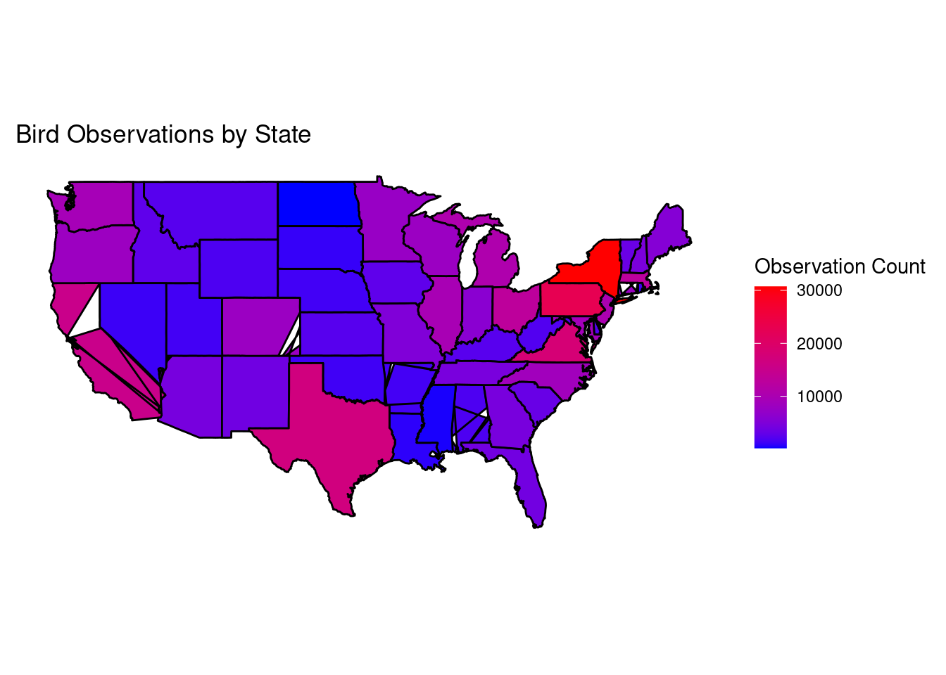
(Extra, fun) Plot
This plot attempts to show the density of bird observations based on geography.
library(ggplot2)
library(maps)
library(dplyr)
# TODO: fix map bugs
library(ggplot2)
library(maps)
library(dplyr)
map_observation_data_aggregated = observation_data |>
filter(
str_sub(subnational1_code, 1, 2) == "US"
) |>
mutate(
state_abbreviation = str_sub(subnational1_code, -2, -1)
) |>
group_by(state_abbreviation) |>
summarise(total_sightings = sum(how_many, na.rm = TRUE))
states_map = map_data("state")
map = data.frame(
region = tolower(state.name),
state_abbreviation = state.abb
) |>
merge(states_map, by = "region") |>
merge(
map_observation_data_aggregated,
by = "state_abbreviation", all.x = TRUE) |>
ggplot() +
geom_polygon(
aes(x = long, y = lat, group = group, fill = total_sightings),
color = "black"
) +
scale_fill_gradient(low = "blue", high = "red") +
labs(
fill = "Observation Count",
title = "Bird Observations by State"
) +
theme_minimal() +
coord_fixed(1.3) +
theme(
axis.text.y = element_blank(),
axis.title.y = element_blank(),
axis.text.x = element_blank(),
axis.title.x = element_blank(),
panel.grid.major.y = element_blank(),
panel.grid.minor.y = element_blank(),
panel.grid.major.x = element_blank(),
panel.grid.minor.x = element_blank(),
)
map