── Attaching core tidyverse packages ──────────────────────── tidyverse 2.0.0 ──
✔ dplyr     1.1.4     ✔ readr     2.1.5
✔ forcats   1.0.0     ✔ stringr   1.5.1
✔ ggplot2   3.5.1     ✔ tibble    3.2.1
✔ lubridate 1.9.4     ✔ tidyr     1.3.1
✔ purrr     1.0.4
── Conflicts ────────────────────────────────────────── tidyverse_conflicts() ──
✖ dplyr::filter() masks stats::filter()
✖ dplyr::lag()    masks stats::lag()
ℹ Use the conflicted package (<http://conflicted.r-lib.org/>) to force all conflicts to become errorsProject title
Rows: 271116 Columns: 15
── Column specification ────────────────────────────────────────────────────────
Delimiter: ","
chr (10): Name, Sex, Team, NOC, Games, Season, City, Sport, Event, Medal
dbl  (5): ID, Age, Height, Weight, Year

ℹ Use `spec()` to retrieve the full column specification for this data.
ℹ Specify the column types or set `show_col_types = FALSE` to quiet this message.
Introduction
(1-2 paragraphs) Brief introduction to the dataset. You may repeat some of the information about the dataset provided in the introduction to the dataset on the TidyTuesday repository, paraphrasing on your own terms. Imagine that your project is a standalone document and the grader has no prior knowledge of the dataset.
The dataset we chose is named “120 Years of Olympic history: athletes and results”, consisting of data records of all Olympic games dating back to Athens 1896 to Rio 2016. Each observation of the dataset corresponds to every athlete participating in the Olympic games (differentiated by an ID number unique to every athlete along with their name), with vectors consisting of details of the Olympic game the athlete participated in as well as the athletes description. Vectors include biological information, such as the athletes’ age, weight, height, and sex. Additionally, the dataset provides us with details of the corresponding Olympic game the athlete participated in, such as year, event, season, city, sport, event, team name, National Olympic Committee 3-letter code, and the medal they won if they won, if not, the vector is filled in with “NA”.
Regarding its origin, the dataset is from the source Kaggle, posted by rgriffin. The dataset’s provenance is Collection Methodology with data scraped from www.sports-reference.com in May 2018. The dataset was inspired by the idea behind how the Olympics have evolved over time, changes in participation, inclusion of different genders, nations, and sports. The file contains 271,116 rows and 15 columns. An important note to mention is that the Winter and Summer Games were held in the same year up until 1992 and then Winter Games were scattered to occur on a four year cycle starting with 1994, followed by Summer Games in 1996, and so on.
Question 1 <- Update title to relate to the question you’re answering
Introduction
(1-2 paragraphs) Introduction to the question and what parts of the dataset are necessary to answer the question. Also discuss why you’re interested in this question.
How has gender representation changed over time across different sports, and how does it compare between the Summer and Winter Olympics? This question is crucial as it sheds light on the progress made toward gender equality in sports. It also explores how the season of the event, whether Summer or Winter, may influence gender equality, as biases could exist between the two. Understanding these biases is essential for driving meaningful progress towards equality.
The dataset includes the Sex, Year, Sport, and Season (Summer or Winter) of Olympic athletes. This information will enable us to calculate the proportions of male and female athletes over time, comparing trends across both the Summer and Winter Olympic Games.
Approach
(1-2 paragraphs) Describe what types of plots you are going to make to address your question. For each plot, provide a clear explanation as to why this plot (e.g. boxplot, barplot, histogram, etc.) is best for providing the information you are asking about. The two plots should be of different types, and at least one of the two plots needs to use either color mapping or facets.
The first plot will pertain to the difference in proportion of gender over time for every olympic game available in the dataset. In this case, the best plot to demonstrate any change in the gender gap is a stacked area chart. A stacked area plot allows us to see any overall trends and shows gender distribution over time across all sports. Since there are too many sports involved with the Olympic games to display all proportionately and since some sports were not a part of the Olympic games until just recently, we will use the top 10 Olympic sports in which the most athletes have participated in to have the best gauge of how many males participated compared to females.
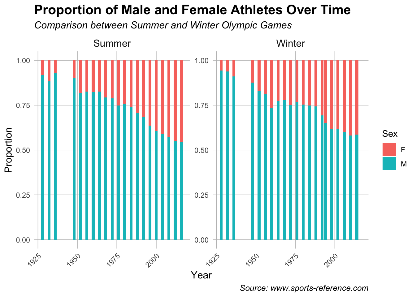
The second plot analyzes the gender proportion shown across sports by type of game (summer or winter). For this plot we chose to do a bar plot as you can more accurately see the gender proportion demonstrated for each year individually. This choice allows for a clear year-by-year comparison, making it easier to observe trends in gender participation. Unlike line charts, a bar plot distinctly highlights individual data points for each year, ensuring that changes in gender representation are easily visible. We also used the top 10 Olympic sports in which the most athletes have participated in.
Analysis
(2-3 code blocks, 2 figures, text/code comments as needed) In this section, provide the code that generates your plots. Use scale functions to provide nice axis labels and guides. You are welcome to use theme functions to customize the appearance of your plot, but you are not required to do so. All plots must be made with ggplot2. Do not use base R or lattice plotting functions.
# Top 10 sports with the most athlete participation
top_sports <- olympic_data |>
  count(Sport) |>
  top_n(10, wt = n) |>
  pull(Sport)

# Filtered dataset to only include top 10 sports
filtered_data <- olympic_data |>
  filter(Year > 1925,
         Sport %in% top_sports
    )

# Cleaned data to find proportion
gender_trend <- filtered_data |>
  group_by(Year, Sport, Sex) |>
  summarise(Count = n(), .groups = 'drop') |>
  group_by(Year, Sport) |>
  mutate(Proportion = Count / sum(Count))

# Area plot
ggplot(gender_trend, aes(x = Year, y = Proportion, fill = Sex)) +
  geom_area(position = "fill") +
  facet_wrap(~Sport, scales = "free_x") +
  labs(title = "Close in Gender Gap: Gender Representation in Top 10 Olympic\nSports Over Time",
       x = "Year", y = "Proportion", fill = "Gender") +
  theme_minimal() +
  scale_x_continuous(breaks = seq(min(gender_trend$Year), max(gender_trend$Year),
                                  by = 8)) +
  theme(plot.title = element_text(hjust = 0.5, face = "bold"),
        strip.placement = "outside",
        axis.text.x = element_text(angle = 45, hjust = 1, size = 6),
        panel.spacing.y = unit(1, "cm"),
        axis.title.x = element_text(face = "bold"),
        axis.title.y = element_text(face = "bold"),
        legend.title = element_text(face = "bold"))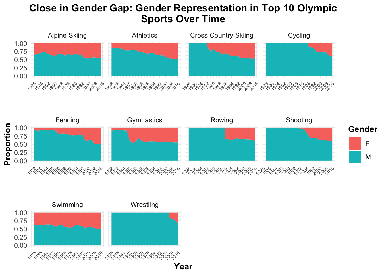
library(ggplot2)
library(dplyr)

# Step 1: Clean and process the data
gender_proportion <- olympic_data %>%
  filter(Year > 1925) %>%
  group_by(Year, Sex, Season) %>%
  summarise(count = n()) %>%
  group_by(Year, Season) %>%
  mutate(total = sum(count),
         proportion = count / total) %>%
  ungroup()

# Step 2: Create the enhanced histogram
ggplot(gender_proportion, aes(x = Year, y = proportion, fill = Sex)) +
  geom_bar(stat = "identity", position = "stack") +
  facet_wrap(~Season, scales = "free_y") +
  labs(
    title = "Proportion of Male and Female Athletes Over Time",
    subtitle = "Comparison between Summer and Winter Olympic Games",
    x = "Year",
    y = "Proportion",
    fill = "Sex",
    caption = "Source: www.sports-reference.com"
  ) +
  theme_minimal() +
  theme(
    plot.title = element_text(size = 16, face = "bold"),
    plot.subtitle = element_text(size = 12, face = "italic"),
    plot.caption = element_text(size = 10, face = "italic"),
    axis.text.x = element_text(angle = 45, hjust = 1),
    axis.title.x = element_text(size = 12),
    axis.title.y = element_text(size = 12),
   strip.text = element_text(size = 12),
    panel.grid.major = element_line(color = "gray", size = 0.3),
    panel.grid.minor = element_blank()
  )
Discussion
(1-3 paragraphs) In the Discussion section, interpret the results of your analysis. Identify any trends revealed (or not revealed) by the plots. Speculate about why the data looks the way it does.
Plot 1: The plot shows the evolution of the gender gap in the top 10 Olympic sports, with each subplot representing a sport and displaying the proportion of male (blue) and female (red) athletes over time. Several sports, such as Athletics, Gymnastics, and Swimming, have seen a significant increase in female participation, especially after 1960, reflecting broader societal shifts toward gender equality in sports. However, sports like Cycling, Fencing, and Rowing show more gradual progress in gender equality. Meanwhile, sports like Shooting and Wrestling show minimal change in the gender balance, with women remaining underrepresented. These trends suggest that while female participation has increased across many sports due to expanded opportunities and changing attitudes, certain sports have seen slower progress. Overall, the data highlights both the successes in reducing gender disparities and the continued challenges in achieving full equality in all Olympic sports.
Plot 2: The histogram reveals a clear trend of increasing female participation in both the Summer and Winter Olympic Games over time, with a more significant increase in the Summer Olympics. In the early 20th century, male athletes overwhelmingly outnumbered female athletes, particularly in the Summer Games, where the gender gap began to close after the 1950s. By the 2000s, the proportion of female athletes in the Summer Olympics increased substantially. In contrast, the Winter Olympics showed a slower increase in female participation, as the events traditionally favored male-dominated sports like ice hockey and ski jumping. While women’s representation in the Winter Games has improved, it remains lower compared to the Summer Games. These trends suggest that while progress toward gender equality in sports has been more pronounced in the Summer Olympics, the Winter Olympics still face historical biases that have hindered faster inclusion of female athletes.
Question 2 <- Athlete Size and Medal Success
Introduction
How does athlete size vary across different Olympic sports, and how does it compare between male and female athletes? These questions are particularly interesting because different sports have distinct physical demands. For example, height might be an advantage in basketball but less important in gymnastics, leading to differences in athletes’ body sizes. Understanding how size correlates with various disciplines can provide insights into the attributes that contribute to elite performance. The dataset includes Height and Weight variables, which can be analyzed separately or combined to calculate an athlete’s Body Mass Index (BMI). Additionally, the Sex variable allows for further analysis by distinguishing between male and female athletes.
Approach
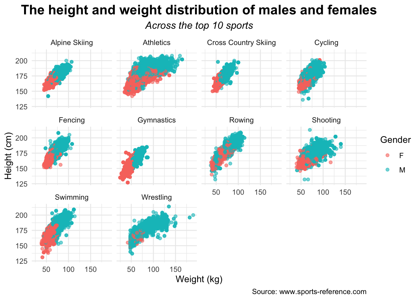
A scatter plot can be used to visualize the relationship between an athlete’s height and weight. This plot is ideal because it allows us to observe two variables and their potential correlations to sport type. We can categorize athletes’ sex by color, further enriching the analysis. This approach helps determine whether certain sports favor specific body types and whether the relationship between size and sport differs between male and female athletes, offering insights into how physical attributes influence athletics.
Additionally, a ridge plot can be used to compare the distribution of athlete sizes across different sports. Ridge plots are useful for visualizing the density of size distributions while allowing for smoother comparisons across multiple sports. By stacking the distributions, we can observe overlaps and differences in athlete sizes, making it easier to identify trends in body types favored by different disciplines. By distinguishing fill by sex, we can also see not only how size varies across sports but also how male and female anatomy differ, providing further insights into physical differences between elite athletes. This approach highlights whether certain sports have distinct physical requirements or if the relationship between size and success follows a broader trend across all athletes.
Analysis
(2-3 code blocks, 2 figures, text/code comments as needed) In this section, provide the code that generates your plots. Use scale functions to provide nice axis labels and guides. You are welcome to use theme functions to customize the appearance of your plot, but you are not required to do so. All plots must be made with ggplot2. Do not use base R or lattice plotting functions.
# remove data where weight/height is NA
cleaned_olympic <- olympic_data |>
  drop_na(Weight, Height)

# changing type of medal in order to rename NAs
cleaned_olympic$Medal <- as.character(cleaned_olympic$Medal)

# create medal_status
cleaned_olympic <- cleaned_olympic |> mutate(
  Medal_Status = ifelse(!is.na(Medal), "Medalist", NA)
)

# rename NA medals to non-medalist
cleaned_olympic$Medal_Status <- cleaned_olympic$Medal_Status |>
  replace_na("Non-medalist")

# filtered dataset to only include top 10 sports
filtered_colympic <- cleaned_olympic |>
  filter(Year > 1925, Sport %in% top_sports)

# created scatterplot faceting medals/non-medals and top 3 sports
ggplot(filtered_colympic, aes(x = Weight, y = Height, color = Sex)) +
  geom_point(alpha = 0.6) +
  labs(
    title = "The height and weight distribution of males and females",
    subtitle = "Across the top 10 sports",
    x = "Weight (kg)",
    y = "Height (cm)",
    color = "Gender",
    caption = "Source: www.sports-reference.com"
  ) +
  facet_wrap(
    facets = vars(Sport),
    ncol = 4
  ) +
  theme_minimal() +
  theme(
    plot.title = element_text(hjust = 0.5, size = 16, face = "bold"),
    plot.subtitle = element_text(hjust = 0.5, size = 12, face = "italic")
  )
Plot #2
olympic_data |>
  mutate(BMI = Weight / ((Height / 100)^2),
         Sport = fct_rev(factor(Sport))) |>
  filter(!is.na(BMI),
         Year > 1925,
         Sport %in% top_sports) |>
  ggplot(aes(x = BMI, y = Sport, fill = Sex)) +
  geom_density_ridges(alpha = 0.7) +
  scale_fill_viridis_d(end = 0.7) +
  labs(title = "BMI Distribution Across Sports",
       subtitle = "Distinguished by Sex",
       x = "BMI",
       y = "Sport") +
  theme_minimal() +
  theme(
    plot.title = element_text(size = 16, face = "bold"),
    plot.subtitle = element_text(size = 12, face = "italic"),
    axis.title.x = element_text(size = 12),
    axis.title.y = element_text(size = 12),
    strip.text = element_text(size = 12, face = "bold"),
    panel.grid.major = element_line(color = "gray", size = 0.1),
    panel.grid.minor = element_blank()
  )
Picking joint bandwidth of 0.339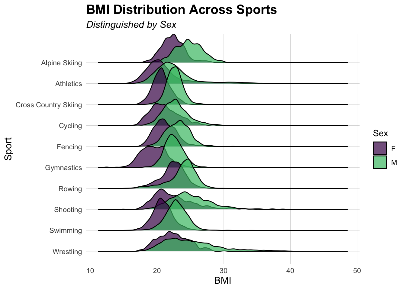
Discussion
(1-3 paragraphs) In the Discussion section, interpret the results of your analysis. Identify any trends revealed (or not revealed) by the plots. Speculate about why the data looks the way it does.
In the figure titled, “The height and weight distribution of males and females,” we have 10 different scatterplots faceted by the top 10 sports—based on athlete participation. In each of these plots, we take note of gender by color each point either red—for female—or blue—for male. For each of the ten Olympic sports, we have a different expected distribution. For example, the Athletics sport encompasses a wide variety of events and as a result the requirements for height and weight become far more diverse. Another example is the Fencing sport which has a more condensed and uniform minimum and maximum for weight and height in comparison. Additionally, it is important to take note that females tend to be on the smaller side for just about every sport except shooting, rowing, and cycling—where women are similar in height and weight for each.
The figure titled “BMI Distribution Across Sports” presents ridge plots for the top 10 sports, with gender distinguished by color—red for females and blue for males. The chart reveals that males and females display distinct BMI standards across these sports. While some overlap occurs, the peak BMI for each gender remains visibly separate. For example, in Cross Country Skiing, the distribution forms twin peaks, with the female peak positioned to the left of the male peak, reflecting different Olympic BMI norms. Overall, the trend indicates that females generally have a lower BMI than males in most sports.
Presentation
Our presentation can be found here.
Data
Include a citation for your data here. See http://libraryguides.vu.edu.au/c.php?g=386501&p=4347840 for guidance on proper citation for datasets. If you got your data off the web, make sure to note the retrieval date.
References
List any references here. You should, at a minimum, list your data source.