Stack Overflow Developer Income and Opinion Analysis
Author
Dank Extra Stella Zhang (jz766), Jack Chen (jc2742), Ryan Lee (rjl275), Josh Green (jtg227)
── Attaching core tidyverse packages ──────────────────────── tidyverse 2.0.0 ──
✔ dplyr     1.1.4     ✔ readr     2.1.5
✔ forcats   1.0.0     ✔ stringr   1.5.1
✔ ggplot2   3.5.1     ✔ tibble    3.2.1
✔ lubridate 1.9.4     ✔ tidyr     1.3.1
✔ purrr     1.0.4
── Conflicts ────────────────────────────────────────── tidyverse_conflicts() ──
✖ dplyr::filter() masks stats::filter()
✖ dplyr::lag()    masks stats::lag()
ℹ Use the conflicted package (<http://conflicted.r-lib.org/>) to force all conflicts to become errors

Attaching package: 'scales'


The following object is masked from 'package:purrr':

    discard


The following object is masked from 'package:readr':

    col_factor


Loading required package: lattice
Warning: package 'lattice' was built under R version 4.3.3
Attaching package: 'caret'

The following object is masked from 'package:purrr':

    lift
Rows: 122 Columns: 3
── Column specification ────────────────────────────────────────────────────────
Delimiter: ","
chr (2): qname, label
dbl (1): level

ℹ Use `spec()` to retrieve the full column specification for this data.
ℹ Specify the column types or set `show_col_types = FALSE` to quiet this message.
Rows: 24 Columns: 2
── Column specification ────────────────────────────────────────────────────────
Delimiter: ","
chr (2): qname, question

ℹ Use `spec()` to retrieve the full column specification for this data.
ℹ Specify the column types or set `show_col_types = FALSE` to quiet this message.
Rows: 65437 Columns: 28
── Column specification ────────────────────────────────────────────────────────
Delimiter: ","
chr  (2): country, currency
dbl (26): response_id, main_branch, age, remote_work, ed_level, years_code, ...

ℹ Use `spec()` to retrieve the full column specification for this data.
ℹ Specify the column types or set `show_col_types = FALSE` to quiet this message.
Introduction
The Stack Overflow Annual Developer Survey 2024 dataset encompasses responses from over 65,000 developers worldwide, covering demographics, education, work experience, technology usage, and perspectives on artificial intelligence. The dataset includes both numerical variables (e.g., years of experience, compensation) and categorical variables (e.g., country, education level, programming languages used), totaling 28 columns and 65,437 rows of developer responses. Each categorical response in the survey has been integer-coded, with corresponding labels available in a crosswalk file.
This dataset is highly relevant for comparing developer compensation across different countries and analyzing varying opinions on AI, focusing exclusively on single-response questions from the main survey sections. Our group includes several developers who frequently visit Stack Overflow for assistance, making us curious about what the broader developer community looks like. We also want to understand how AI is shaping the industry by exploring developers’ perspectives on AI tools, automation, and the evolving role of technology in day-to-day development practices.
Question 1: How do education level, age, country, and programming language usage influence the average annual compensation of developers?
Introduction
Developer compensation can be shaped by a wide range of factors, including formal education, age, geographic location, and programming language usage. High cost-of-living areas or regions with thriving tech industries often command higher salaries, while specific educational credentials or in-demand technical skills can further boost earning potential. Understanding how these elements intersect helps clarify why some developers earn significantly more than others, even within the same profession.
We are particularly interested in whether developer compensation remains uniform across different education levels, age brackets, countries, and dev types (indicating programming specialization or broader role descriptions). Uncovering these variations offers insights into how salary structures might evolve worldwide or in response to ever-shifting market demands.
To address this question, we focus on key variables from the Stack Overflow Annual Developer Survey 2024 dataset, including:
Demographic and Education Variables - ed_level (factor) – Highest education level completed or pursued - age_bracket (factor) – Age group of the respondent Geographic Variable - country (factor) – Primary location where the developer works/lives Technical/Role Variable - dev_type (factor) – Primary programming role or type of development performed Compensation Variable - normalized_comp_total (integer) – Total annual pay, normalized to USD
Approach
To answer this question, we will create plots that clearly communicate how annual compensation varies by country, education, and age.
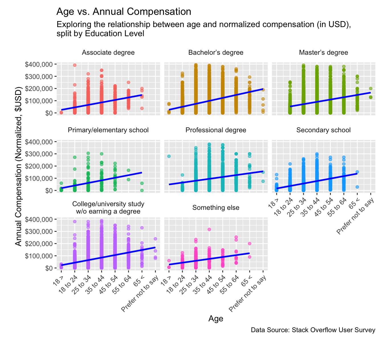
First, we generate a Scatter Plot of Age vs. Annual Compensation, faceted by education level. The scatter plot gives us a direct sense of whether older developers, or those with specific levels of formal education, show markedly higher or lower salaries. In addition, overlaying a linear regression line highlights any visible correlation between a developer’s age and their total normalized pay. Faceting by education level allows us to compare whether certain qualifications (e.g., a Master’s degree or secondary school) amplify or diminish this relationship. We considered using a simple bar chart for each age bracket within each education level but found that it masked the nuances of individual data points and the overall trend, which became much clearer through a scatter plot.
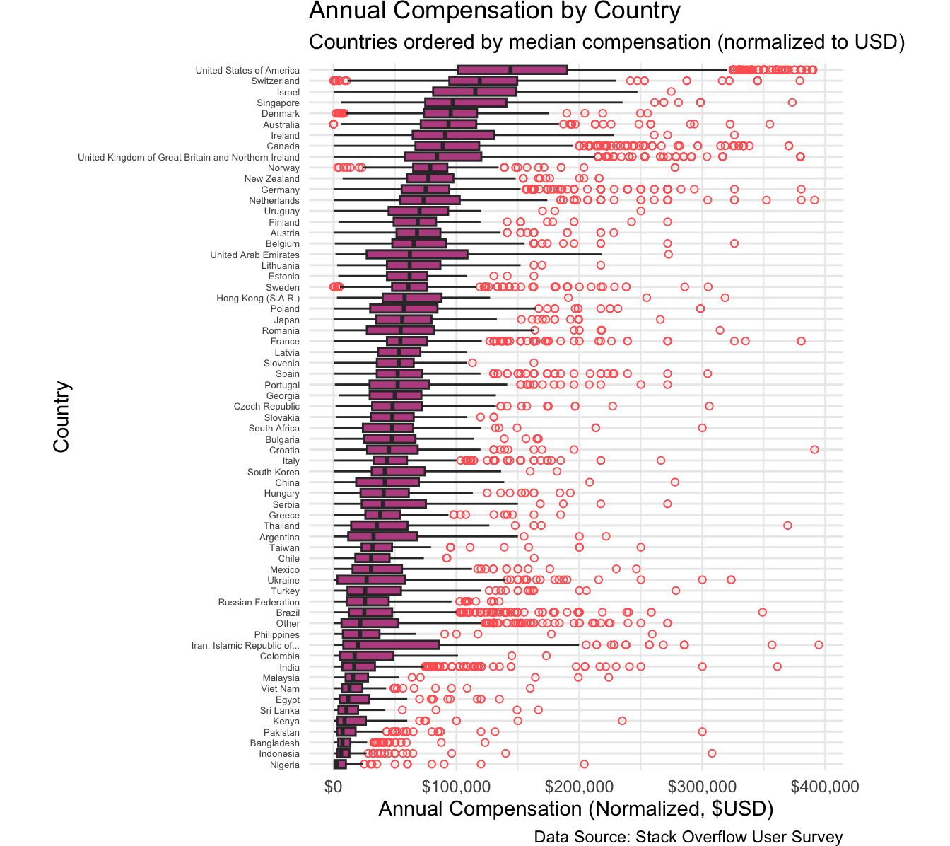
Secondly, we implement a Box Plot of Annual Compensation by Country, ordering the countries by their median salary. This method helps illustrate regional disparities in developer compensation, showing both the typical pay range in each country (through the interquartile range) and any outliers who earn significantly above or below the majority of respondents. We initially explored combining the countries into a single histogram or applying a density plot, but such approaches made it more difficult to compare compensation distributions side by side. By using a box plot, we retain a straightforward visual of how compensation varies among different countries while also highlighting cross-country differences in spread and median pay. Together, these two plots present a balanced view of how factors like location, age, and formal education collectively shape developer salaries.
Analysis
(2-3 code blocks, 2 figures, text/code comments as needed) In this section, provide the code that generates your plots. Use scale functions to provide nice axis labels and guides. You are welcome to use theme functions to customize the appearance of your plot, but you are not required to do so. All plots must be made with ggplot2. Do not use base R or lattice plotting functions.
# -----------------------# 1. Scatter Plot: Age vs. Annual Compensation with Regression Trendggplot(stackoverflow_survey_single_response, aes(x =as.numeric(as.character(age_bracket)), # Convert age_bracket to numeric for lmy = normalized_comp_total)) +geom_point(alpha =0.6, aes(color = ed_level)) +geom_smooth(method ="lm", se =FALSE, linewidth =1.0, color ="blue") +facet_wrap(~ed_level) +# Creates separate charts for each education levellabs(title ="Age vs. Annual Compensation",subtitle ="Exploring the relationship between age and normalized compensation (in USD),\nsplit by Education Level",x ="Age",y ="Annual Compensation (Normalized, $USD)",caption ="Data Source: Stack Overflow User Survey" ) +scale_y_continuous(labels = scales::dollar) +scale_x_continuous(breaks =0:7, # Ensure correct breaks for numeric x-axislabels =c("0"="18 >","1"="18 to 24","2"="25 to 34","3"="35 to 44","4"="45 to 54","5"="55 to 64","6"="65 <","7"="Prefer not to say" ) ) +theme(legend.position ="none", axis.text.x =element_text(angle =45, hjust =1), # Rotate x-axis labels by 45 degreesstrip.background =element_blank(), # Remove the background from facet labelsstrip.text =element_text(size =9), # Adjust the size of facet labelsplot.margin =margin(10, 10, 10, 20) # Adjust plot margins for spacing )
(1-3 paragraphs) In the Discussion section, interpret the results of your analysis. Identify any trends revealed (or not revealed) by the plots. Speculate about why the data looks the way it does.
The first plot (Age vs. Annual Compensation) is faceted by education level, revealing how compensation tends to scale with both age and academic qualifications. Notably, across all panels, a moderate upward slope is visible, suggesting that older developers typically earn higher salaries. However, the degree of increase varies by education category: Master’s Degree and Professional Degrees show relatively higher medians and a slightly steeper slope, indicating that advanced formal education may correlate with greater earning potential. Associate and Bachelor’s Degree holders also exhibit a positive relationship between age and compensation, but with more pronounced variability, possibly reflecting broader career pathways for these groups. Primary/Elementary and Secondary School categories reveal a similar upward trend; however, the range of compensation is generally narrower, suggesting that these respondents might face more limited earning potential or may still be building experience. Despite these trends, there are outliers at both ends of each distribution. Some younger developers with limited formal education report high salaries—possibly due to specialized skills, entrepreneurial ventures, or employment in top-paying companies—while certain older developers earn salaries that fall below each education group’s median. This underscores that while education and age can influence compensation, actual outcomes vary widely based on additional factors like job role, location, industry sector, and individual career trajectories.
The second plot (Annual Compensation by Country) orders countries by their median annual compensation (normalized to USD). A few key observations stand out: The United States, Switzerland, Israel, and several other High-Median countries with strong tech sectors and high costs of living cluster at the top. These countries also tend to have wide ranges of compensation—noticeable in the elongated boxplots and numerous outliers—reflecting diverse roles and levels of seniority in their tech ecosystems. Many European and developed Asian nations form a middle tier of Mid-Range countries. Though their medians may be lower than the top earners, the spread within each country can still be significant. Countries such as Nigeria, Bangladesh, and Pakistan often appear near the bottom of the median compensation scale, forming a Lower-Median country bracket. However, they too display outliers who earn significantly more than the local median, suggesting that remote work opportunities or specialized roles can greatly affect individual earnings. These disparities likely stem from a combination of economic conditions, cost-of-living differences, and the presence (or absence) of large tech hubs. It is possible that developers in top-paying countries have easier access to well-funded tech companies, higher-value contracts, and broader investor support. Meanwhile, developers in lower-paying regions might leverage remote or freelance opportunities to tap into higher-paying markets abroad.
Several intersecting factors could explain these patterns. Countries with significant local tech demand (e.g., the U.S.) drive wages up through competition, while smaller markets may see more modest salaries. In addition, the cost of living and purchasing power could have some bearing on these results. High-cost countries often pay higher nominal salaries, although the real spending power may not be as pronounced. Cultural and educational avenues could also serve as good reason behind the visual results, as certain regions place a premium on formal education for professional opportunities, whereas in other places, experience or skills-based hiring may dominate. Lastly, the paradigm of remote work could also have some influence: the post-pandemic shift toward remote roles can allow some developers from traditionally lower-wage regions to earn incomes closer to top global benchmarks. In conclusion, these results indicate that while age, education level, and country are clearly influential in determining a developer’s compensation, their effects are far from uniform. The presence of high-earning outliers across all segments underscores the complex interplay of personal skill sets, industry niches, and global hiring practices. Going forward, deeper analysis could incorporate factors such as programming language usage, role specialization, and company type to further clarify how these variables converge to shape developer earnings worldwide.
Question 2: How do developers’ opinions about AI vary based on their work background and experience?
Introduction
As AI tools become more integrated into software development, it is worth exploring how developers feel about this technology. While some view AI as a vital productivity enhancer, others remain skeptical about its accuracy or fear it could threaten their jobs. Factors such as previous experience with AI, job role, and organizational support could all influence these perspectives.
We are particularly interested in whether attitudes toward AI are uniform across different work backgrounds (e.g., dev type, remote vs. in-office), company sizes, and experience levels. Understanding these variations can provide insights into how AI might be adopted (or resisted) in different contexts.
To address this question, we focus on key variables from the Stack Overflow Annual Developer Survey 2024 dataset, including: Work Variables - remote_work (integer) – Current work situation - dev_type (integer) – Best current-job description - org_size (integer) – People in the company - purchase_influence (integer) – Level of influence in purchasing new technology - years_code_pro(integer) - Years the respondent has coded professionally AI Opinion Variables - ai_select (integer) – Use of AI in development process - ai_sent (integer) – Stance on using AI tools as part of development - ai_acc (integer) – Trust in AI accuracy - ai_complex (integer) – Belief about how well AI handles complex tasks - ai_threat (integer) – Belief that AI is not a threat to current job
Approach
We will create two different plots to visualize developers’ AI opinions:
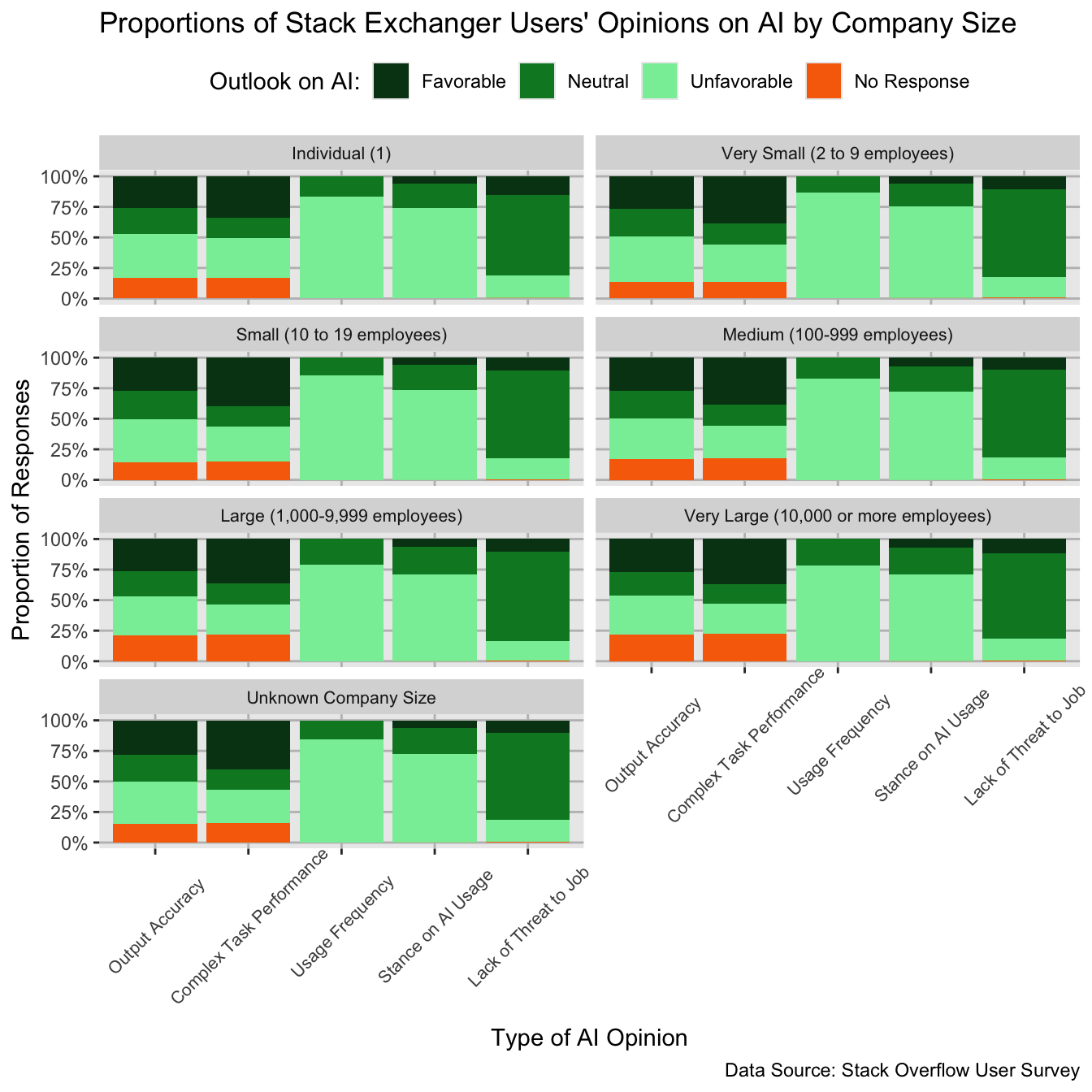
Firstly, we will implement a stacked Bar Chart of AI Perception faceted by company size. This chart contributes to answering the proposed question as companies of different sizes can reflect different work cultures and technology usage, for instance, the work of an independent developer would likely differ from that of a developer in a multi-billion company of thousands of people, and this difference may foster divergent opinions on AI among developers. A stacked bar chart is useful for understanding the proportional distributions of different opinions, and faceting further clarifies the opinions of different developers based on Company size.
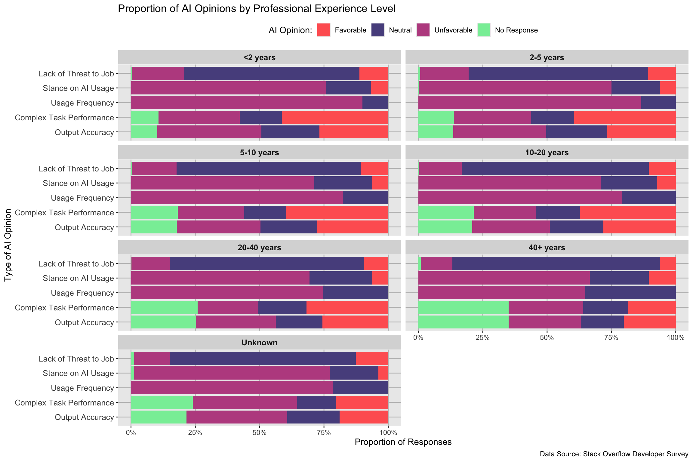
Secondly, we will implement another stacked bar chart of AI Perception faceted by professional experience level to examine how experience influences developers’ opinions on AI. Initially, we considered using a heatmap to illustrate patterns in AI opinions across experience levels. While this provided an overall visual representation, it did not effectively highlight the proportional relationships within each AI category, making it difficult to assess how opinions varied between groups. Similarly, we explored a box plot to examine the spread of AI opinions, but this approach failed to convey how favorable, neutral, and unfavorable sentiments compared within each experience level. Ultimately, we found that a stacked bar chart faceted by experience level was the most effective way to visualize these differences. This method clearly shows how favorable, neutral, and unfavorable AI opinions are distributed across categories such as AI usage, output accuracy, and job threat perception, allowing for direct comparisons across different experience levels.
Analysis
(2-3 code blocks, 2 figures, text/code comments as needed) In this section, provide the code that generates your plots. Use scale functions to provide nice axis labels and guides. You are welcome to use theme functions to customize the appearance of your plot, but you are not required to do so. All plots must be made with ggplot2. Do not use base R or lattice plotting functions.
Output Accuracy: How much do you trust the accuracy of the output from AI tools as part of your development workflow? Complex Task Performance: How well do the AI tools you use in your development workflow handle complex tasks? Stance on AI Usage: How favorable is your stance on using AI tools as part of your development workflow? Usage Frequency: Do you currently use AI tools in your development process? Lack of Threat to Job: Do you believe AI is a not a threat to your current job?
Discussion
(1-3 paragraphs) In the Discussion section, interpret the results of your analysis. Identify any trends revealed (or not revealed) by the plots. Speculate about why the data looks the way it does.
For the first graph, the results reflect that there exist a very minuscule difference in the distribution of different opinions on AI across different company sizes. There does not exist any category of AI opinions where any group showcased a significant divergence in opinions proportionally when compared to another group. This result suggests that at least within the context of Stack Overflow developers, company size, and indeed the associated work conditions and cultures surrounding different types of companies, does not have a significant impact on developer’s opinions on AI. The results show about small proportion of developers, about 25% on average for each company size category, positively respond to AI’s output accuracy and performance of complex tasks. Given that a small proportion of developers responded favorably to using AI tools for development, these opinions make sense within context with one another. It is possible this generally unfavorable sentiment towards AI performance and usage may stem from the fact that Stack Overflow is a technical discussion website for developers, and therefore users may view AI as an inferior tool for development or a crutch for unseasoned developers.
The second graph reveals notable patterns in how developers across different experience levels perceive AI. While there are some variations, the overall distribution of Favorable, Neutral, and Unfavorable responses remains relatively stable, suggesting that experience level alone does not significantly impact AI opinions. A key observation is that “Stance on AI Usage” and “Usage Frequency” had the highest proportion of unfavorable opinions across all experience levels. This indicates that many developers, regardless of expertise, are skeptical about AI’s role in their workflow. The low favorability of AI usage frequency suggests that developers either do not frequently integrate AI into their daily work or are hesitant to do so. This could stem from concerns about AI-generated code quality, debugging difficulties, or a general preference for traditional problem-solving methods. Similarly, the negative stance on AI usage suggests that developers may not yet trust AI to enhance their work efficiency or effectiveness. On the other hand, the “Threat to Job” category exhibited the highest proportion of neutral responses, indicating that most developers do not see AI as an immediate threat to their employment but also do not fully dismiss the possibility of AI-related job displacement. This neutrality suggests that while AI is recognized as an emerging tool, developers largely view it as a complement rather than a competitor to their roles. Instead of outright rejecting AI, they may acknowledge its potential to automate some tasks but do not yet see it replacing their core expertise. `Interestingly, despite the skepticism towards AI usage and frequency, other AI-related opinions, such as AI’s accuracy and ability to handle complex tasks, had a more balanced distribution of responses. A small proportion of developers, approximately 25-30% across experience levels, responded favorably to AI’s output accuracy and performance on complex tasks. This suggests that while AI is recognized for its strengths in specific areas, developers remain cautious about its broader application in software development. One possible explanation for this pattern is that Stack Overflow primarily caters to developers who value human-driven expertise and problem-solving. Developers, regardless of their experience level, may perceive AI as an incomplete or unreliable tool, particularly when compared to community-driven knowledge-sharing platforms. This skepticism might explain the generally cautious or neutral stance toward AI’s ability to generate accurate outputs or handle complex programming tasks.
Overall, these findings indicate that AI opinions among developers are relatively independent of experience level, reinforcing the idea that AI skepticism in development communities may stem from broader industry attitudes rather than individual expertise.
Include a citation for your data here. See http://libraryguides.vu.edu.au/c.php?g=386501&p=4347840 for guidance on proper citation for datasets. If you got your data off the web, make sure to note the retrieval date.
References
List any references here. You should, at a minimum, list your data source.