── Attaching core tidyverse packages ──────────────────────── tidyverse 2.0.0 ──
✔ dplyr     1.1.4     ✔ readr     2.1.6
✔ forcats   1.0.1     ✔ stringr   1.6.0
✔ ggplot2   4.0.1     ✔ tibble    3.3.0
✔ lubridate 1.9.4     ✔ tidyr     1.3.2
✔ purrr     1.1.0
── Conflicts ────────────────────────────────────────── tidyverse_conflicts() ──
✖ dplyr::filter() masks stats::filter()
✖ dplyr::lag()    masks stats::lag()
ℹ Use the conflicted package (<http://conflicted.r-lib.org/>) to force all conflicts to become errors

Attaching package: 'scales'


The following object is masked from 'package:purrr':

    discard


The following object is masked from 'package:readr':

    col_factor


Loading required package: sysfonts

Loading required package: showtextdbAustralian Frogs in 2023
Loading Packages
Loading Data
Rows: 294 Columns: 5
── Column specification ────────────────────────────────────────────────────────
Delimiter: ","
chr (5): subfamily, tribe, scientificName, commonName, secondary_commonNames

ℹ Use `spec()` to retrieve the full column specification for this data.
ℹ Specify the column types or set `show_col_types = FALSE` to quiet this message.
Rows: 136621 Columns: 11
── Column specification ────────────────────────────────────────────────────────
Delimiter: ","
chr  (3): scientificName, timezone, stateProvince
dbl  (6): occurrenceID, eventID, decimalLatitude, decimalLongitude, coordina...
date (1): eventDate
time (1): eventTime

ℹ Use `spec()` to retrieve the full column specification for this data.
ℹ Specify the column types or set `show_col_types = FALSE` to quiet this message.
Introduction
The dataset used in this project comes from the FrogID initiative, a citizen science program run by the Australian Museum that collects frog call recordings across Australia. Participants record frog calls using a mobile application, and these recordings are later identified and verified by experts. The data used here was released through the TidyTuesday project (September 2, 2025) and includes information about frog observations such as the frog’s scientific and common names, the location of the observation by Australian state or territory, and the date and time the call was recorded.
Australia is home to roughly 250 native frog species, many of which are endemic and found nowhere else in the world. However, a significant portion of these species face increasing threats from climate change, disease, habitat loss, and urbanization. Because frogs are highly sensitive to environmental conditions, tracking their presence and activity can provide important insight into ecosystem health and biodiversity patterns. The FrogID dataset provides a large collection of validated frog call recordings that can be used to examine patterns in frog activity across species, locations, and time.
Question 1
How Frog Calling Activity Varies by Season and State in Australia
Introduction
This analysis investigates how the number of frog call recordings varies by season and Australian state for the 10 most frequently recorded frog species in 2023 using the FrogID dataset. The dataset contains citizen-science recordings of frog calls across Australia, including variables such as species name, state, date, and call count. To answer this question, we focus specifically on species_common_name, state, season, year, and recording counts (number of observations).
Understanding seasonal and geographic variation is especially important in amphibian ecology because frog calling activity is closely tied to breeding seasons, rainfall, and temperature. Since you’ve previously worked on frog richness and conservation-related themes, this question builds naturally on that interest — but now shifts from biodiversity counts to behavioral patterns (calling activity) across environmental gradients. # Approach To answer this question, we will create two different types of plots: Faceted Bar Plot (Season x Species) A bar plot is ideal for comparing discrete count data (number of recordings) across categorical variables. By faceting by species and mapping season to fill color, we can clearly compare seasonal variation within each of the top 10 species. Faceting allows us to isolate patterns without overcrowding the visualization. Heatmap (State x Season) A heatmap (tile plot) is effective for visualizing intensity patterns across two categorical variables. Here, state will be on one axis and season on the other, with fill color representing the number of recordings. This makes it easy to identify geographic “hotspots” of frog calling activity.
Approach
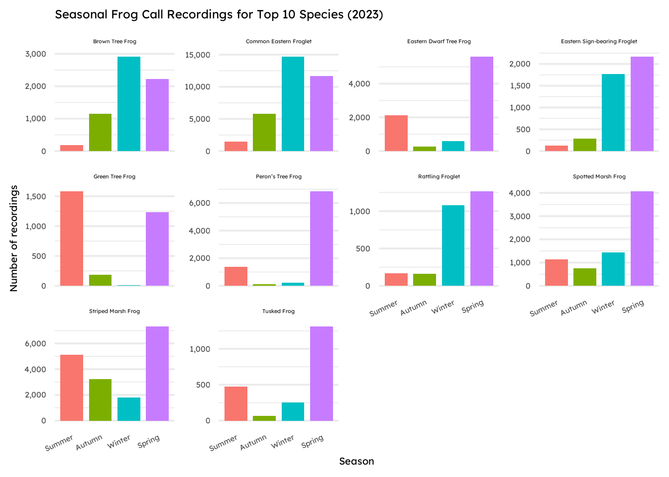
To examine how frog call recordings vary by season and species, we first create a faceted bar plot showing the number of recordings for the ten most frequently observed frog species across the four Australian seasons. Bar plots are well suited for comparing count data across categorical variables, such as season and species. By faceting the visualization by species and mapping season to color, the plot allows us to easily compare seasonal calling activity within each species while keeping the visualization readable.
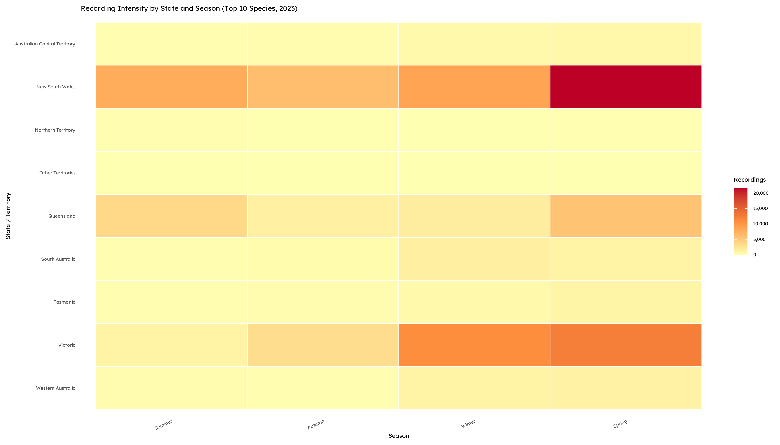
To explore geographic patterns in frog call activity, we also construct a heatmap showing the number of recordings by Australian state and season. A heatmap is effective for visualizing intensity patterns across two categorical variables because the color gradient highlights areas with higher or lower recording counts. This type of visualization allows us to quickly identify geographic hotspots of frog calling activity and observe how these patterns shift across seasons.
Analysis
# first, load and filter the data to only get the top 10 frequent frogs.
frog_top10_season <- frogs_df |>
  count(commonName, sort = TRUE) |>
  slice_head(n = 10) |>
  select(commonName) |>
  inner_join(frogs_df, by = "commonName") |>
  mutate(
    date = as.Date(eventDate),
    month = lubridate::month(date),
    season = dplyr::case_when(
      month %in% c(12, 1, 2) ~ "Summer",
      month %in% c(3, 4, 5)  ~ "Autumn",
      month %in% c(6, 7, 8)  ~ "Winter",
      month %in% c(9, 10, 11) ~ "Spring",
      TRUE ~ NA_character_
    ),
    season = factor(season, levels = c("Summer", "Autumn", "Winter", "Spring"))
  )
Visualization 1:
season_species_counts <- frog_top10_season |>
  count(commonName, season, name = "recordings")

ggplot(season_species_counts,
       aes(x = season, y = recordings, fill = season)) +
  geom_col(show.legend = FALSE, width = 0.8) +
  facet_wrap(~ commonName, scales = "free_y") +
  scale_y_continuous(labels = scales::comma) +
  labs(
    title = "Seasonal Frog Call Recordings for Top 10 Species (2023)",
    x = "Season",
    y = "Number of recordings"
  ) +
  theme_minimal(base_family = "lexend", base_size = 15) +
  theme(
    axis.text.x = element_text(size = 11, angle = 25, hjust = 1),
    panel.grid.major.x = element_blank(),
    strip.text = element_text(size = 8.5)
  )
Visualization 2:
state_season_counts <- frog_top10_season |>
  count(stateProvince, season, name = "recordings") |>
  tidyr::complete(stateProvince, season, fill = list(recordings = 0))

ggplot(state_season_counts,
       aes(x = season,
           y = forcats::fct_rev(factor(stateProvince)),
           fill = recordings)) +
  geom_tile(color = "white", linewidth = 0.3) +
  scale_fill_gradientn(
    colours = c("#ffffb2", "#fd8d3c", "#bd0026"),
    name = "Recordings",
    labels = scales::comma
  ) +
  labs(
    title = "Recording Intensity by State and Season (Top 10 Species, 2023)",
    x = "Season",
    y = "State / Territory"
  ) +
  theme_minimal(base_family = "lexend", base_size = 15) +
  theme(
    panel.grid = element_blank(),
    axis.text.x = element_text(angle = 25, hjust = 1)
  )
Discussion
The faceted bar plot reveals strong seasonal clustering of frog calls, with most species showing elevated recordings in spring and summer. This aligns with known amphibian breeding behavior: frogs are more vocally active during warmer and wetter seasons when reproductive conditions are favorable. Some species show sharper seasonal peaks than others, suggesting differences in breeding specialization or environmental sensitivity.
The heatmap demonstrates clear geographic variation in call intensity. States with warmer climates (such as Queensland and New South Wales) likely show higher recording counts, particularly during wetter seasons. This pattern may reflect both ecological conditions (rainfall and temperature) and human sampling density, since citizen science participation can vary by population distribution.
However, the heatmap also has limitations. Because values are encoded through color intensity, it can be difficult to determine exact numerical counts for each state-season combination without referencing the underlying data. Additionally, color gradients can sometimes exaggerate or obscure small differences between values, depending on the scale used. Another limitation is that heatmaps emphasize overall patterns rather than precise comparisons, meaning they are better suited for identifying broad trends rather than detailed quantitative analysis.
Overall, the data suggest that frog call activity in 2023 was strongly structured by seasonal reproductive cycles and regional climatic conditions. These findings highlight how behavioral datasets like FrogID recordings can serve as indirect indicators of ecological timing and environmental variability.
Question 2
Australia’s East Coast Anomaly: Mapping the Who, Where, and When of Australia’s Frog Life
Introduction
The FrogID Initiative is a national project designed to monitor frog populations across Australia by collecting geographical data through visual documentation and audio recordings contributed by citizen scientists. Australia is home to approximately 257 native frog species, many of which are endemic and found nowhere else on Earth. However, nearly one in five of these species is currently threatened with extinction due to pressures such as climate change, urbanization, disease, and invasive species (https://www.frogid.net.au/). Because frogs are highly sensitive to their surroundings, their distribution acts as a critical indicators of shifting environmental health. This dataset provides us with key information in order to understand how the abundance of species of frogs have shifted between seasons in Australia in 2023.
To analyze these trends, we focus on specific dimensions of the frogs_df dataset. The commonName and scientificName columns allow us to identify the most frequently observed species throughout the collection period. The stateProvince field is essential for mapping territories and identifying regional containment, revealing how community compositions remain unique or overlap across state lines. Finally, by utilizing the full range of the eventDate and eventTime columns, we ensure the analysis reflects a robust view of relative abundance rather than a snapshot skewed by a single unusual season or time. This comprehensive approach allows us to see which of Australia’s frog regions and frogs are truly thriving and active.
Approach
For our first plot, we are creating a stacked bar chart of the top 10 most recorded frog species across Australia in 2023. We’ve faceted the chart into seasons (Fall, Winter, Spring, Summer) so we can see how the mix of frogs calling in each state changes throughout the year. We chose this plot because it gives us a clear look at the seasonal “rhythm” of these frogs. Instead of assuming they are migrating, this visual shows us when different species are active and breeding, and when they go quiet during certain months. It’s a great way to see which frogs are the ‘stars’ of the soundscape in the spring compared to the winter.
For our second visualization, we create a 24-hour “rhythm map” of Australia’s East Coast. While our first plot established species composition, this heatmap explores the intensity of recording activity across the day in Queensland, New South Wales, and Victoria. By faceting this graph by season, we can observe how the peak window of frog calls evolves throughout the year. A temporal heatmap works better than a simple line graph because it allows us to visualize the acoustic density as a smooth, color-mapped gradient across a continuous 24-hour cycle, preventing individual data points from becoming a messy blur. By comparing these three states across all four seasons, we can visualize whether high-diversity regions maintain a year-round acoustic presence or if seasonal climate shifts force these populations into periods of silence.
Analysis
Visulaization One: Stacked Bar Chart
## Creating a stacked bar chart to understand
## the composition of Australian Frogs in Australian
## states by season (counted by recording their call)


## filtering top ten recorded specicies
top_10 <- frogs_df |>
    count(scientificName, sort=TRUE)|>
    top_n(10, n) |>
    pull(scientificName)

## Preparing the data: filtering data to be top 10 + defining seasons
plot1_data <- frogs_df |>
    filter(scientificName %in% top_10) |>
    mutate(
        date = as.Date(eventDate),
        month = month(date),
        species_label = paste0(commonName, " (", scientificName, ")"),
        ## Define seasons (Standard Australian categories)
        season = case_when(
          month %in% c(12, 1, 2) ~ "Summer",
          month %in% c(3, 4, 5) ~ "Autumn",
          month %in% c(6, 7, 8) ~ "Winter",
          month %in% c(9, 10, 11) ~ "Spring"
    ),
    season = factor(season, levels = c("Summer", "Autumn", "Winter", "Spring")),
    scientificName = factor(scientificName, levels = top_10)
)

################################################

## Plot 1 implementation: Stacked bar chart

q2_plot1 <- ggplot(plot1_data, aes(x = season, fill = species_label)) +
  geom_bar(position = "fill") +
  facet_wrap(~stateProvince, ncol = 3, nrow = 3) +
  scale_y_continuous(labels = percent_format()) +
  scale_fill_brewer(palette = "Paired") +
  labs(
    title = "The East Coast Anomaly: Consistently Higher Species Diversity Across All Seasons",
    subtitle = "Analyzing the proportional distribution of reported frog species across Australian states and seasons \n",
    caption = "Note: 'Diversity' refers to the relative abundance of the Top 10 species across 2023. Data: FrogID 2023.",
    x = "Season",
    y = "Proportion of Reported Frogs",
    fill = "Species (Scientific Name)"

  ) +

  ## Theme
  theme_minimal(base_family = "lexend", base_size = 15) +
  theme(
    ## Axis'
    axis.text.x = element_text(hjust = 0.5),
    axis.title.x = element_text(face = "bold", size = rel(1)),
    axis.title.y = element_text(face = "bold", size = rel(1)),

    ## Legend
    legend.position = "right",
    legend.text = element_text(size = rel(0.8)),
    legend.title = element_text(face = "bold", size = rel(0.9)),

    ## Graphic
    strip.background = element_rect(fill = "grey90", color = NA),
    strip.text = element_text(size = rel(0.9), face = "bold"),
    panel.spacing = unit(1, "lines"),
    plot.title.position = "plot",
    plot.caption.position = "plot",

    ## Titles
    plot.title = element_text(size = rel(1.5), face = "bold"),
    plot.caption = element_text(face = "bold")
 )

show(q2_plot1)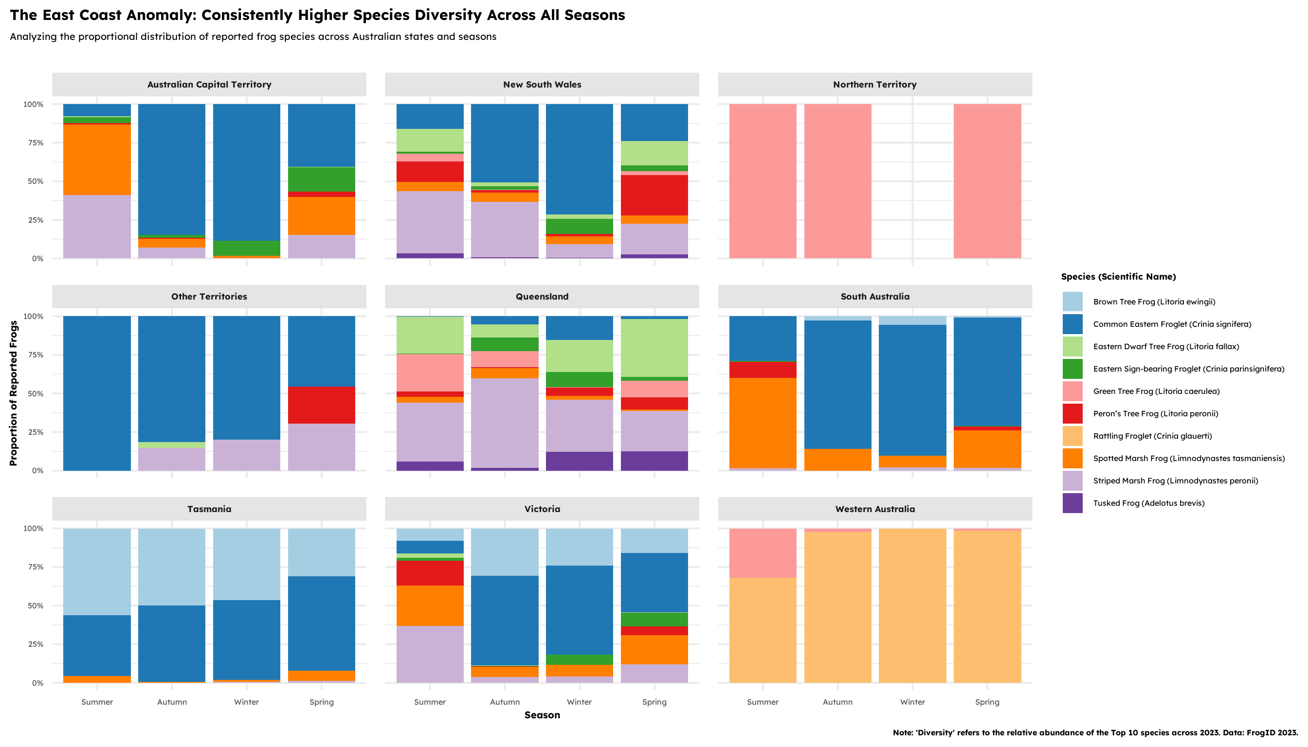
Visualization 2: Heatmap
## Creating a faceted temporal heatmap to analyze the 24-hour activity cycles of frog recordings across Australia's East Coast (Queensland, New South Wales, and Victoria).

## Process the East Coast Time Data
east_coast_time <- frogs_df |>
  ## East coast
  filter(stateProvince %in%
         c("Queensland", "New South Wales", "Victoria")) |>
  mutate(
    ## Extract the hour + month
    hour_of_day = hour(lubridate::parse_date_time(eventTime,
                                                  orders = c("HMS", "HM", "IMp"))),
    month_num = month(as.POSIXct(eventDate)),

    ## Define the season
    season = case_when(
      month_num %in% c(12, 1, 2)  ~ "Summer",
      month_num %in% c(3, 4, 5)   ~ "Autumn",
      month_num %in% c(6, 7, 8)   ~ "Winter",
      month_num %in% c(9, 10, 11) ~ "Spring"
    ),
    stateProvince = factor(
      stateProvince,
      levels = c("Queensland", "New South Wales", "Victoria")
    ),
    season = factor(
      season,
      levels = c("Spring", "Summer", "Autumn", "Winter")
    )
  )

## Counting data
east_coast_counts <- east_coast_time |>
  count(stateProvince, hour_of_day, season)

################################################

## Plot 2 implementation: Heatmap

q2_plot2 <- ggplot(east_coast_counts,
       aes(x = hour_of_day, y = stateProvince, fill = n)) +
  geom_tile(color = "white", linewidth = 0.1) +
  coord_fixed() +
  scale_fill_viridis_c(option = "cividis",
                       name = "Reports of frog calls") +
  guides(fill = guide_colorbar(title.position = "bottom",
                               title.hjust = 0.5)) +

  ## Time labels
  scale_x_continuous(
    breaks = seq(0, 24, by = 6),
    labels = c("12am", "6am", "12pm", "6pm", "12am")
  ) +

  facet_wrap(~season, ncol = 2) +

  ## Theme
  theme_minimal(base_family = "lexend", base_size = 15) +
  labs(
    title = "The East Coast Anomaly: A 24-Hour Seasonal Rhythm",
    subtitle = "Hourly recording intensity across Australia's East Coast faceted by season \n",
    x = "Hour of Day (Local Time)",
    y = NULL,
    caption = "Focusing on QLD, NSW, and VIC.
      Data: FrogID 2023."
  ) +
  theme(
    ## Axis'
    axis.title.x = element_text(face = "bold"),

    ## Graphic
    plot.title.position = "plot",
    plot.title = element_text(face = "bold", size = rel(1.5)),
    plot.subtitle = element_text(size = rel(1.1)),
    strip.text = element_text(face = "bold", size = rel(1.1)),
    panel.spacing = unit(1.25, "lines"),

    ## Legend
    legend.position = "bottom",
    legend.title = element_text(face = "bold", size = rel(0.9)),
    legend.key.width = unit(4, "lines")
  )

show(q2_plot2)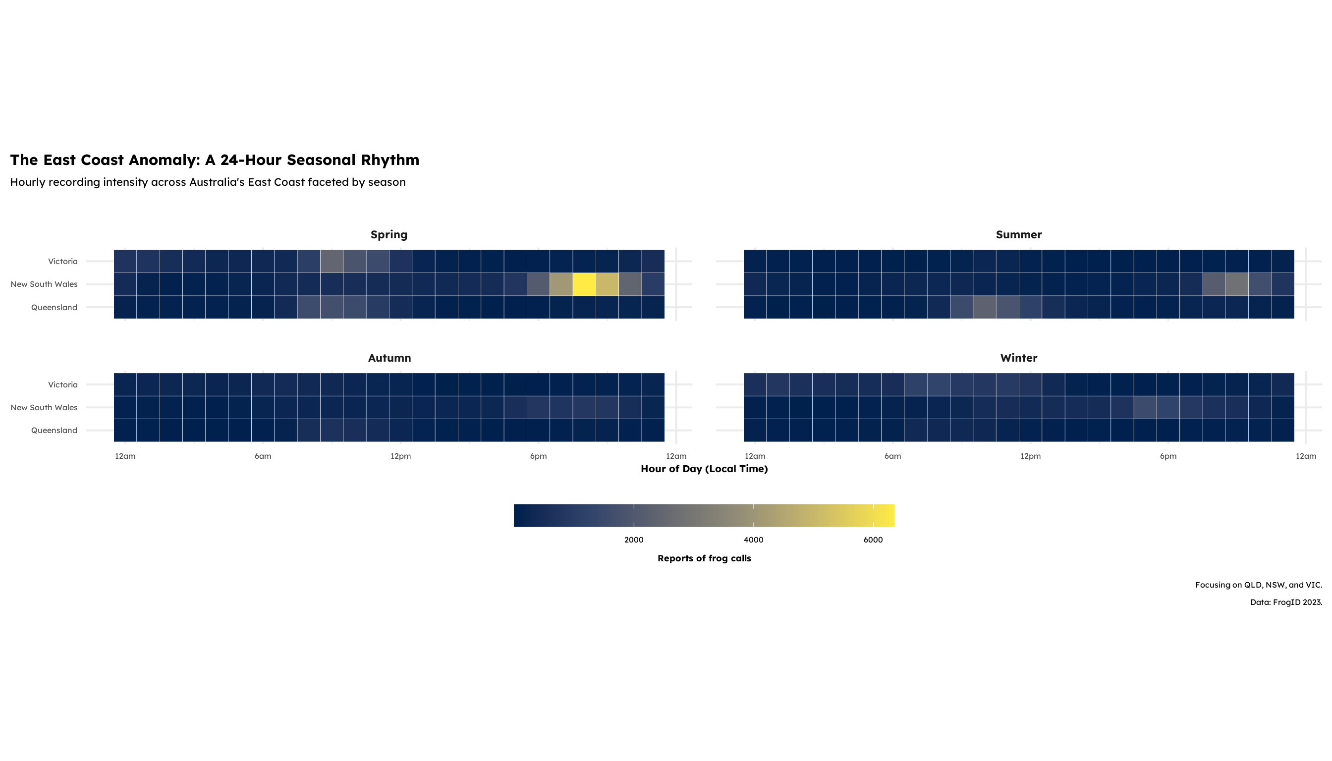
Discussion
After running the analysis to understand the proportions of the top ten recorded frog species, we noticed that there is surprisingly little frog diversity across most Australian states. Even as the seasons change, the primary activity remains heavily locked into the East Coast—specifically Queensland, New South Wales, and Victoria. While the Australian Capital Territory shows some variety, it doesn’t quite reach the levels seen on the coast. We suspect this trend of high East Coast diversity coincides with higher human populations. Since this is an app-based dataset, more users on the ground inevitably mean more types of frogs being reported. However, that user bias doesn’t change the reality that other states, besides the East Coast and the Capital Territory, simply do not show a diverse proportion of frogs in this study.
Because of this concentration, we focused our second visualization on the actual calls. Since users can report frogs by either taking a photo or recording a sound, we wanted to see if the time of day for these reports shifted by season. What we found in the East Coast was that the timing is actually quite stable across the year for the top 10 species. However, New South Wales shows a massive surge in the Spring months around 9:00 PM, which is where the data really peaks. Victoria also has a unique “morning surge” in the Spring around 9:00 AM that we don’t see elsewhere. Moving into Summer, New South Wales sees another spike between 8:00 PM and 10:00 PM, while Queensland experiences its own surge much earlier in the day, between 10:00 AM and 12:00 PM. New South Wales clearly sees the greatest variation in volume, with reports hitting the 6000 mark, whereas Victoria and Queensland tend to top out in the higher 4000 range.
Ultimately, these visualizations allowed us to examine the distribution and proportion of Australia’s top ten frog species faceted by state and grouped by season. The most diverse compositions are undeniably founded in the East Coast and the Capital Territory. The rural areas of Australia either have much smaller proportions of these frogs or simply lack the user density required to capture the true proportions of the landscape. By narrowing our scope to the East Coast, we were able to see that while peak calling hours fluctuate between states, the most intense activity occurs during the Spring and Fall, triggered by different environmental cues in each specific state.
Presentation
Our presentation can be found here.
Data
- FrogID (2020). FrogID. Australian Museum, Sydney. Available: http://www.frogid.net.au (Accessed: Date [e.g., 1 January, 2020]).
References
- Rowley, J.J.L., Callaghan, C.T., Cutajar, T., Portway, C., Potter K., Mahony, S, Trembath, D.F., Flemons, P. & Woods, A. (2019). FrogID: Citizen scientists provide validated biodiversity data on frogs of Australia. Herpetological Conservation and Biology 14(1): 155-170