How has the landscape of the Billboard Hot 100 changed over time?
Author
proud-seal (Max Savona, Morgan Stuart, Kamran Murray)
The following package(s) will be installed:
- tidytuesdayR [1.2.1]
These packages will be installed into "~/proj-01-proud-seal/renv/library/macos/R-4.5/aarch64-apple-darwin20".

# Installing packages --------------------------------------------------------
- Installing tidytuesdayR ...                   OK [linked from cache]
Successfully installed 1 package in 2.8 milliseconds.
The following package(s) will be installed:
- readr [2.2.0]
These packages will be installed into "~/proj-01-proud-seal/renv/library/macos/R-4.5/aarch64-apple-darwin20".

# Installing packages --------------------------------------------------------
- Installing readr ...                          OK [linked from cache]
Successfully installed 1 package in 2.7 milliseconds.
The following package(s) will be installed:
- fs [1.6.6]
These packages will be installed into "~/proj-01-proud-seal/renv/library/macos/R-4.5/aarch64-apple-darwin20".

# Installing packages --------------------------------------------------------
- Installing fs ...                             OK [linked from cache]
Successfully installed 1 package in 2.2 milliseconds.
── Attaching core tidyverse packages ──────────────────────── tidyverse 2.0.0 ──
✔ dplyr     1.1.4     ✔ readr     2.2.0
✔ forcats   1.0.1     ✔ stringr   1.6.0
✔ ggplot2   4.0.1     ✔ tibble    3.3.0
✔ lubridate 1.9.4     ✔ tidyr     1.3.2
✔ purrr     1.1.0
── Conflicts ────────────────────────────────────────── tidyverse_conflicts() ──
✖ dplyr::filter() masks stats::filter()
✖ dplyr::lag()    masks stats::lag()
ℹ Use the conflicted package (<http://conflicted.r-lib.org/>) to force all conflicts to become errors
Introduction
The Billboard Hot 100 has been the music industry’s most recognized singles chart since its inception in 1958. Each week, Billboard ranks songs based on a combination of sales data, radio airplay, and more recently also online streaming numbers. Over the decades, the way this data is collected and weighted has shifted considerably, reflecting changes in how people actually consume music through technology advancements. What started as a chart driven by physical record purchases and radio play now incorporates billions of streams from platforms like Spotify and Apple Music (mainly).
This dataset, which was curated by Jen Richmond for TidyTuesday, contains 1,177 songs that reached the number one position on the Hot 100 between 1958 and 2025. Each entry includes the song title, artist, date it reached number one, and how many weeks it held that spot. Beyond these basics, the data also provides genre classifications, artist demographics, musical attributes like tempo and energy, lyrical topics, and production credits. This gives us a fairly rich foundation to explore how the landscape of chart music has evolved over nearly seven decades.
Question 1 - Has It Become Easier or Harder to Dominate the Hot 100 Over Time?
Introduction
The first question we are choosing to tackle is “has it become easier or harder to dominate the Hot 100 over time?” We believe this is an interesting question because the music streaming industry has undergone dramatic changes over the course of this dataset from vinyl, to radio, to cassette, to cd, to electronic streaming. A reasonable proxy for how difficult it is to dominate the charts is the average number of time top songs stay at the top of the leaderboard. The approach we have decided to use to answer this question is the yearly average number of weeks #1 songs spend at the #1 spot. The data we need to answer this question consists of the number of weeks a song has sat at the #1 spot, the year that song was released in, the number of songs that achieved #1 for that year. With each new form of listening medium people get more choice in what they want to listen to.
Approach
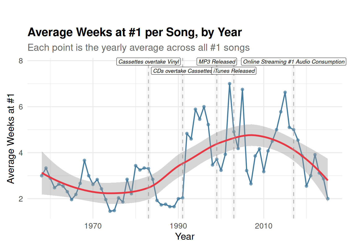
Our first plot is a line chart with a LOESS smoothing curve overlaid on the yearly averages. A line chart is the natural choice here because we are looking at a continuous trend over time as we want to see the year-to-year fluctuation as well as the broader trajectory. The LOESS curve helps us cut through the noise of individual years and identify the overall pattern. We also annotate this plot with dashed vertical lines and labels marking key moments in music consumption history (cassettes overtaking vinyl, CDs overtaking cassettes, the MP3 format, iTunes, and streaming becoming the dominant format). These annotations give us context for interpreting any shifts in the trend.
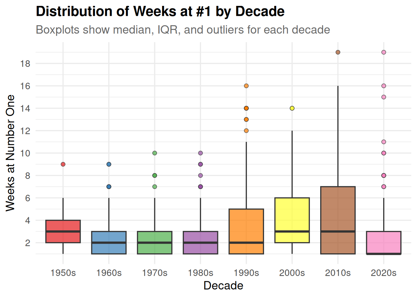
Our second plot is a boxplot of weeks at number one grouped by decade. While the line chart shows the yearly average, a boxplot lets us see the full distribution within each decade which includes the median, spread, and outliers. This is important because averages can be pulled around by a single dominant song in a given year, and we want to understand whether the overall distribution is shifting or just a few extreme cases. The boxplot uses color mapping by decade to make the comparison across eras visually clear.
Analysis
year_summary <- billboard_df %>%group_by(year) %>%summarise(avg_weeks =mean(weeks_at_number_one, na.rm =TRUE),.groups ="drop" )graph1 <-ggplot(year_summary, aes(x = year, y = avg_weeks)) +geom_line(color ="#457B9D", linewidth =0.8) +geom_point(color ="#457B9D", size =1.5, alpha =0.6) +geom_smooth(method ="loess", se =TRUE, color ="#E63946", linewidth =1.2) +# shaded regions instead of just linesgeom_rect(data = music_listener_timeline,aes(xmin = year -0.5, xmax = year +0.5, ymin =-Inf, ymax =Inf),fill ="grey80",alpha =0.15,inherit.aes =FALSE ) +geom_vline(data = music_listener_timeline,aes(xintercept = year),linetype ="dashed",color ="grey50",alpha =0.5 ) +# horizontal labels at the top with staggered y positionsgeom_label(data = music_listener_timeline %>%mutate(y_pos =max(year_summary$avg_weeks) +c(0.8, 0.4, 0.8, 0.4, 0.8)),aes(x = year, y = y_pos, label = text),size =2.8,hjust =0.5,vjust =0,fill ="white",alpha =0.9,label.size =0.2,fontface ="italic",inherit.aes =FALSE ) +labs(title ="Average Weeks at #1 per Song, by Year",subtitle ="Each point is the yearly average across all #1 songs",x ="Year",y ="Average Weeks at #1" ) +coord_cartesian(clip ="off") +theme_minimal(base_size =14) +theme(plot.title =element_text(face ="bold"),plot.subtitle =element_text(color ="grey40"),plot.margin =margin(t =40, r =10, b =10, l =10) )
Warning: The `label.size` argument of `geom_label()` is deprecated as of ggplot2 3.5.0.
ℹ Please use the `linewidth` argument instead.
print(graph1)
`geom_smooth()` using formula = 'y ~ x'
For the second plot, we group songs into decades and look at the distribution of weeks at number one using a boxplot. This helps us see whether the changes in the line chart above are driven by the typical song or by a handful of outliers.
billboard_decades <- billboard_df %>%filter(!is.na(weeks_at_number_one)) %>%mutate(decade =paste0(floor(year /10) *10, "s"))ggplot( billboard_decades,aes(x = decade, y = weeks_at_number_one, fill = decade)) +geom_boxplot(alpha =0.7, outlier.shape =21, outlier.size =2) +scale_fill_brewer(palette ="Set1") +scale_y_continuous(breaks =seq(0, 20, by =2)) +labs(title ="Distribution of Weeks at #1 by Decade",subtitle ="Boxplots show median, IQR, and outliers for each decade",x ="Decade",y ="Weeks at Number One" ) +theme_minimal(base_size =14) +theme(plot.title =element_text(face ="bold"),plot.subtitle =element_text(color ="grey40"),legend.position ="none" )
Discussion
The LOESS curve in the line chart lines up almost directly with changes in how people pay for and access music. From 1958 through the mid-1970s, songs averaged around 2 to 3 weeks at number one, and the chart cycled through a high volume of hits. 1975 alone saw 35 different songs reach the top spot. Listeners were buying individual singles on vinyl, and radio stations rotated through tracks pretty quickly. The mid-1970s is actually a low point, with the yearly average dipping below 1.5 weeks. Starting around the mid-1980s and picking up through the 1990s, the average begins climbing. By 1995, the average was up to 5.45 weeks and only 11 songs reached number one the entire year. In 2005, that went even further to 6.75 weeks across just 8 songs. This lines up with two things happening at once: radio consolidation after the Telecommunications Act of 1996 (which let companies own more stations and led to tighter, likely more repetitive playlists), and the launch of iTunes in 2003 with its pay-per-download model. When listeners have to spend $0.99 on each track, they tend to buy what they already know from the radio. That creates a loop: radio plays a song, people buy it, it stays at number one, radio keeps playing it. What happens after 2008 is the most telling part of the chart. That is the year Spotify launched its premium subscription at $9.99 per month for unlimited listening. Under a subscription, there is no cost to trying something new. Listeners are not committing a dollar every time they pick a song, so they explore more. The data shows this clearly: the number of songs reaching number one per year jumps back up (20 in 2020, 15 in 2024), and the average weeks at the top drops. The LOESS curve bends downward after 2010, falling from the 4 to 5 week range back toward 3. The boxplot by decade shows the same thing from a different angle. The 1990s and 2000s have higher medians and produce the most extreme outliers, with songs holding number one for 14 or 16 weeks. The 2020s are tighter and more compressed. More artists are reaching number one than during the CD era, but very few hold it for long. A TikTok trend (or gimmick) or a surprise album drop can push a song to the top, but the next one is always right behind it.
Question 2 - Do Certain Genres Last Longer at Number One Than Others?
Introduction
Our second question asks whether certain genres tend to hold the number one spot longer than others. The Billboard Hot 100 has always been a genre-diverse chart, and we wanted to see if some styles of music are better at maintaining chart dominance. For instance, we might expect that pop songs that are often designed for broad mainstream appeal might behave differently at the top of the charts compared to hip hop or rock songs.
The key variables for this question are cdr_genre and weeks_at_number_one. Since many songs in the dataset have multiple genres listed (separated by semicolons, like “Pop;Rock”), we extract the first listed genre as the primary genre for each song. We also filter to genres with at least 10 songs to avoid drawing conclusions from tiny sample sizes. This leaves us with six main genre categories: Pop, Rock, Funk/Soul, Electronic/Dance, Hip Hop, and Folk/Country.
Approach
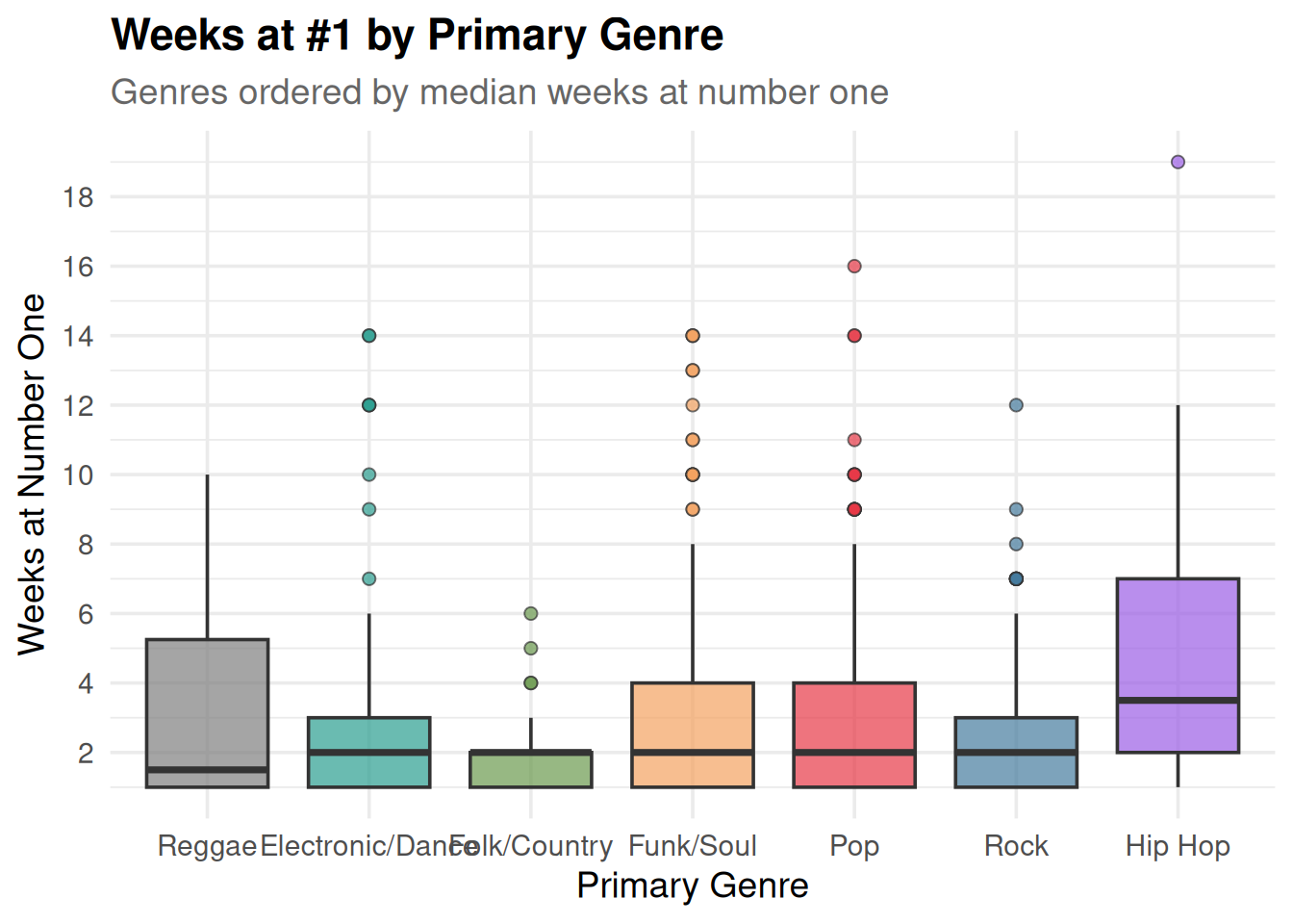
Our first plot for this question is a grouped boxplot comparing the distribution of weeks at number one across genres. A boxplot is ideal here because the distributions are skewed — most songs spend just one or two weeks at number one, while a few stay much longer. The boxplot shows us the median, the typical range, and the outliers for each genre side by side. We use color mapping to distinguish the genres visually.
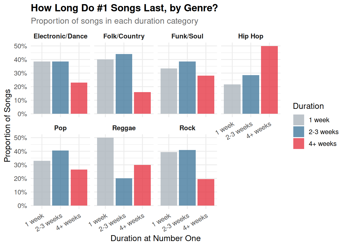
Our second plot is a faceted bar chart showing the proportion of songs in each genre that stayed at number one for different durations (1 week, 2-3 weeks, 4+ weeks). This complements the boxplot by showing us not just the center and spread of the distribution, but the actual breakdown of short vs. medium vs. long runs at number one. Faceting by genre lets us compare the shapes of these distributions directly. This is a different plot type from the boxplot and uses faceting as required.
Analysis
# extract primary genre (first listed before semicolon)billboard_genre <- billboard_df %>%filter(cdr_genre !="NA", !is.na(cdr_genre), cdr_genre !="") %>%mutate(primary_genre =str_extract(cdr_genre, "^[^;]+")) %>%group_by(primary_genre) %>%filter(n() >=10) %>%ungroup()ggplot(billboard_genre, aes(x =reorder(primary_genre, weeks_at_number_one, FUN = median),y = weeks_at_number_one,fill = primary_genre)) +geom_boxplot(alpha =0.7, outlier.shape =21, outlier.size =2) +scale_fill_manual(values =c("Pop"="#E63946", "Rock"="#457B9D","Funk/Soul"="#F4A261", "Electronic/Dance"="#2A9D8F","Hip Hop"="#9B5DE5", "Folk/Country"="#6A994E")) +scale_y_continuous(breaks =seq(0, 20, by =2)) +labs(title ="Weeks at #1 by Primary Genre",subtitle ="Genres ordered by median weeks at number one",x ="Primary Genre",y ="Weeks at Number One",fill ="Genre" ) +theme_minimal(base_size =14) +theme(plot.title =element_text(face ="bold"),plot.subtitle =element_text(color ="grey40"),legend.position ="none" )
For the second plot, we categorize each song’s run at number one into short (1 week), medium (2-3 weeks), or long (4 or more weeks) and compare the proportions across genres.
billboard_duration <- billboard_genre %>%mutate(duration_cat =case_when( weeks_at_number_one ==1~"1 week", weeks_at_number_one <=3~"2-3 weeks",TRUE~"4+ weeks" )) %>%mutate(duration_cat =factor(duration_cat, levels =c("1 week", "2-3 weeks", "4+ weeks")))genre_counts <- billboard_duration %>%count(primary_genre, duration_cat) %>%group_by(primary_genre) %>%mutate(prop = n /sum(n)) %>%ungroup()ggplot(genre_counts, aes(x = duration_cat, y = prop, fill = duration_cat)) +geom_col(alpha =0.8) +facet_wrap(~ primary_genre, nrow =2) +scale_fill_manual(values =c("1 week"="#ADB5BD", "2-3 weeks"="#457B9D", "4+ weeks"="#E63946")) +scale_y_continuous(labels = scales::percent_format()) +labs(title ="How Long Do #1 Songs Last, by Genre?",subtitle ="Proportion of songs in each duration category",x ="Duration at Number One",y ="Proportion of Songs",fill ="Duration") +theme_minimal(base_size =12) +theme(plot.title =element_text(face ="bold"),plot.subtitle =element_text(color ="grey40"),strip.text =element_text(face ="bold"),axis.text.x =element_text(angle =30, hjust =1))
Discussion
The genre boxplot shows a pretty striking result: Hip Hop stands out from every other genre with both a higher median and a wider spread of weeks at number one. The typical Hip Hop number one holds the top spot for around 4 weeks, compared to about 2 weeks for Pop, Rock, and the other genres. Hip Hop also produces more extreme outliers — songs that camp at number one for 10+ weeks. This could reflect the way streaming has boosted Hip Hop in particular, since the genre’s fanbase tends to be highly engaged with repeat plays on platforms like Spotify and Apple Music, and Billboard now counts streams in its chart formula.
Pop and Rock, despite being the two largest categories in the dataset, both cluster heavily around 1-2 weeks at number one. The faceted bar chart makes this even clearer — over half of Pop and Rock number ones only last a single week. Folk/Country has the tightest distribution of all, with very few songs managing to hold number one beyond 2 weeks, which makes sense given that country music often has a dedicated but smaller crossover audience on a mainstream pop chart.
It is worth noting that genre classifications are not perfectly consistent across seven decades of music — what counted as “Rock” in 1962 is very different from “Rock” in 2005. The cdr_genre field reflects a retrospective classification, which may smooth over some of these distinctions. Additionally, our choice to use only the first listed genre means that crossover songs get assigned to just one bucket, which is a simplification. Still, the overall pattern is clear: genre does appear to influence how long a song can hold the number one position, with Hip Hop emerging as the most dominant genre by this measure in the modern era.
Dalla Riva, C. (2025). Billboard Hot 100 Number Ones Data (1958-2025). Curated by Jen Richmond (R-Ladies Sydney). https://docs.google.com/spreadsheets/d/1j1AUgtMnjpFTz54UdXgCKZ1i4bNxFjf01ImJ-BqBEt0/edit?gid=1974823090#gid=1974823090
References
Billboard. (n.d.). Billboard Hot 100. https://www.billboard.com/charts/hot-100/
Richmond, J. (2025). TidyTuesday Billboard Hot 100 Number Ones dataset. https://github.com/rfordatascience/tidytuesday
“Cassette tape comeback and history of sales.” Billboard. https://www.billboard.com/business/tech/cassette-tape-comeback-birth-sales-1235260347/
“History of iTunes.” Wikipedia. https://en.wikipedia.org/wiki/History_of_iTunes
“On-demand streaming now accounts for the majority of audio consumption.” TechCrunch, January 4, 2018. https://techcrunch.com/2018/01/04/on-demand-streaming-now-accounts-for-the-majority-of-audio-consumption-says-nielsen/