── Attaching core tidyverse packages ──────────────────────── tidyverse 2.0.0 ──
✔ dplyr     1.1.4     ✔ readr     2.1.6
✔ forcats   1.0.1     ✔ stringr   1.6.0
✔ ggplot2   4.0.1     ✔ tibble    3.3.0
✔ lubridate 1.9.4     ✔ tidyr     1.3.2
✔ purrr     1.1.0
── Conflicts ────────────────────────────────────────── tidyverse_conflicts() ──
✖ dplyr::filter() masks stats::filter()
✖ dplyr::lag()    masks stats::lag()
ℹ Use the conflicted package (<http://conflicted.r-lib.org/>) to force all conflicts to become errorsLong Beach Animal Shelter
The Before, During, and After of an Animal’s Stay
Rows: 29787 Columns: 22
── Column specification ────────────────────────────────────────────────────────
Delimiter: ","
chr  (15): animal_id, animal_name, animal_type, primary_color, secondary_col...
dbl   (2): latitude, longitude
lgl   (2): outcome_is_dead, was_outcome_alive
date  (3): dob, intake_date, outcome_date

ℹ Use `spec()` to retrieve the full column specification for this data.
ℹ Specify the column types or set `show_col_types = FALSE` to quiet this message.
Introduction
For our project, we are exploring data from the Long Beach Animal Shelter. This dataset comes from the City of Long Beach Animal Care services, and has records for nearly 30,000 animals who have stayed at the Long Beach Animal Shelter. We will be focusing on the data for cats, dogs, and birds within the dataset, as these are common houselhold pets, and are the animals with the most number of instances within the data, with a combined total of over 25,000 records.
The data variables of note to our project are those relating to an animal’s time spent at the shelter, and their condition upon arrival and departure. The data also features location data of where the animal was rescued and animal characteristics, such as name, species, sex, primary and secondary colors, and date of birth.
We chose this dataset because we believe we can tell a more compelling story through data visualization when the data is from a topic we are interested in. We all enjoy animals, and are curious to learn more about the time animals spend in the shelter, what their outcomes were, and how their condition when they arrive impacts their duration of stay.
Question 1: How long are animals staying in shelter care, and does the condition they arrive in have an impact on that duration of time? Does their previous living context, being a stray, wild or living with an owner, have an impact on this as well?
Introduction
When reviewing this dataset, we were interested to know how long animals stay in shelter care. We are all familiar with stories of animals who stay in shelter care for months, even years, and we wanted to uncover if this was the norm. We also question whether the condition the animal arrives in impacts this duration of stay, especially compared to animals who arrive in good health and without behavioral issues. Is there any particular condition that has the most impact on shelter duration, and are animals who arrive in poor health or with poor behavior at a severe disadvantage from the start when it comes to leaving the shelter?
To answer our question, we are going to use intake condition and intake type to look at the animal’s background and status upon arrival, and we are using intake date and outcome take to determine how long the animal stayed at the shelter. Intake condition is the state in which the animal arrives at the shelter in, whether that be that they are injured, ill, have behavioral issues, etc. Intake type is the context that the animal is coming from before arriving at the shelter. For our project, we focused on animals who were strays, owner surrenders, or wild before their shelter arrival. The analyses we conduct to answer this question will help us better understand what drives turnover within shelters, and what animal arrival conditions require more time and care for the animal to leave the shelter.
Approach
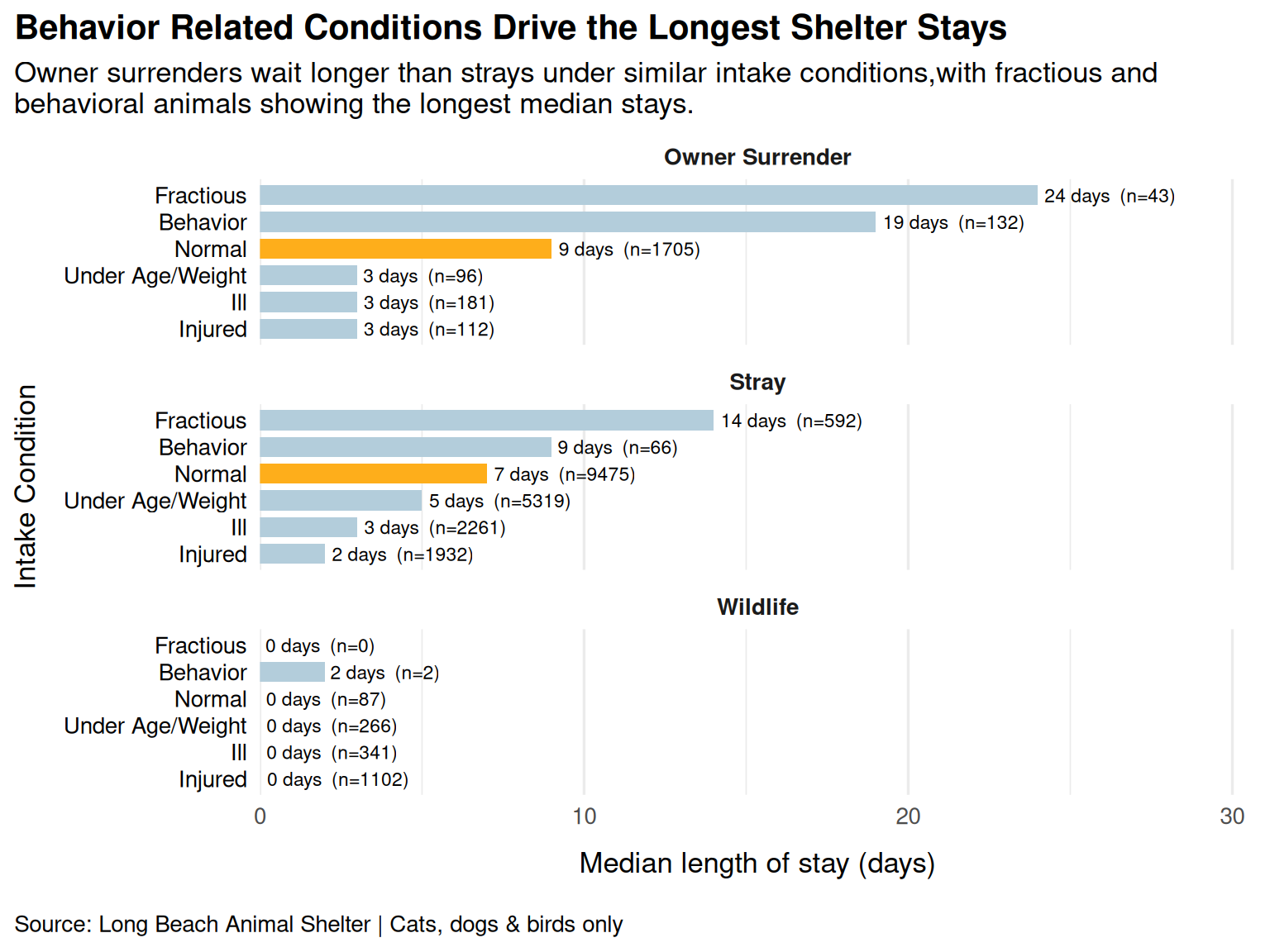
To investigate how long animals stay in shelter care and what factors influence that duration, two complementary visualizations were used. The first is a horizontal bar chart using geom_col showing the median length of stay grouped by intake condition and faceted by intake type. A bar chart is well-suited here because it allows direct comparison of a single summary statistic, which is median days in this scenario, across discrete categories. Moreover, faceting by intake types adds a second dimension without cluttering the plot, making it easy to see whether the same intake condition behaves differently depending on how the animal entered the shelter. The normal condition is highlighted in orange to anchor the reader’s eye to a baseline for comparison.
The second plot is a ridgeline density plot (using geom_density_ridges) showing the full distribution of length of stay by intake condition, again faceted by intake type. We narrowed down to only owner surrender and stray, as wildlife has most value around zero. While the bar chart summarizes central tendency, the ridgeline plot reveals the shape and spread of each condition’s stay duration, which are informations a single median value cannot convey. For example, two conditions may share the same median but have very different distributions. A log scale on the x-axis is used to handle the right skew common in shelter stay data, where most animals leave quickly but a long tail of cases stays for weeks or months.
Analysis
# Plot 1: Bar chart visualizing median length of stay by intake condition, separated by intake type

# create the bar chart
ggplot(
  data = los_by_condition_type,
  mapping = aes(
    x = median_los,
    y = fct_reorder(intake_condition_combined, median_los),
    fill = highlight
  )
) +
  # use bars to make cross-condition median comparisons fast and visually direct
  geom_col(width = 0.75) +
  # text labels shoiwng median length of stay and sample size
  geom_text(
    aes(label = paste0(round(median_los, 2), " days  (n=", n, ")")),
    hjust = -0.05,
    size = 3,
    color = "black"
  ) +
  # create separate panels for each intake type
  facet_wrap(~intake_type, ncol = 1, scales = "fixed") +
  # color the "normal" condition in orange for emphasis
  scale_fill_manual(
    values = c("normal" = "#feae1bff", "other" = "#b3cddbff")
  ) +
  # extend x-axis space so labels are not cut off
  scale_x_continuous(expand = expansion(mult = c(0, 0.28))) +
  # descriptive titles and labels for the plot
  labs(
    title = "Behavior Related Conditions Drive the Longest Shelter Stays",
    subtitle = "Owner surrenders wait longer than strays under similar intake conditions,with fractious and \nbehavioral animals showing the longest median stays.",
    x = "Median length of stay (days)",
    y = "Intake Condition",
    caption = "Source: Long Beach Animal Shelter | Cats, dogs & birds only"
  ) +
  # apply themes to make the plot visually appealing to the viewer
  theme_minimal(base_size = 13) +
  theme(
    legend.position = "none",
    plot.title.position = "plot",
    plot.title = element_text(hjust = 0, face = "bold"),
    plot.subtitle = element_text(hjust = 0),
    panel.grid.major.y = element_blank(),
    strip.text = element_text(face = "bold"),
    axis.text.y = element_text(color = "black"),
    axis.title.y = element_text(margin = margin(r = 10)),
    axis.title.x = element_text(margin = margin(t = 10, b = 10)),
    plot.caption.position = "plot",
    plot.caption = element_text(hjust = 0)
  )
# Plot 2: Ridgeline plot showing full length of stay distribution by intake condition, faceted by intake type

# prepare dataset for ridgeline distribution plot
ridge_df <- q1_animal_df |>
  # remove missing or invalid length of stay values and limit to owner surrender and stray
  filter(
    !is.na(length_of_stay),
    length_of_stay > 0,
    !is.na(intake_condition_combined),
    intake_type %in% c("owner surrender", "stray")
  ) |>
  # create highlight variable to emphasize "normal" condition
  mutate(
    # eeuse the same emphasis convention so Plot 2 visually matches Plot 1
    highlight = if_else(
      intake_condition_combined == "normal",
      "normal",
      "other"
    ),
    # keep facet order stable so the left/right comparison is consistent
    intake_type = factor(
      intake_type,
      levels = c("owner surrender", "stray"),
      labels = c("Owner Surrender", "Stray")
    ),
    # keep condition ordering consistent across plots so viewers don’t have to re-learn the axis
    intake_condition_combined = factor(
      intake_condition_combined,
      levels = c(
        "injured",
        "ill",
        "under age/weight",
        "normal",
        "behavior",
        "fractious"
      ),
      labels = c(
        "Injured",
        "Ill",
        "Under Age/Weight",
        "Normal",
        "Behavior",
        "Fractious"
      )
    )
  )

# create the ridgeline plot
ggplot(
  ridge_df,
  aes(x = length_of_stay, y = intake_condition_combined, fill = highlight)
) +
  # draw ridgeline density distributions for each intake condition
  geom_density_ridges(alpha = 0.8) +
  # log scale helps visualize heavily right-skewed length of stay distributions
  scale_x_log10() +
  # highlight normal condition with a different color (orange)
  scale_fill_manual(
    values = c("normal" = "#feae1bff", "other" = "#b3cddbff")
  ) +
  # create separate panels for owner surrender and stray
  facet_wrap(~intake_type, ncol = 2, scales = "fixed") +
  # descriptive titles and labels for the plot
  labs(
    title = "Shelter Leaves Spike within the First Week, but Ultimately Behavioral Cases \nHave Much Longer Stays",
    subtitle = "Length of stay distributions are right-skewed across conditions,\nwith behavioral and fractious animals showing heavier tails.",
    x = "Length of Stay",
    y = "Intake Condition",
    caption = "Source: Long Beach Animal Shelter | Wildlife excluded"
  ) +
  # apply theme to make the plot visually appealing to the viewer
  theme_minimal(base_size = 13) +
  theme(
    legend.position = "none",
    plot.title.position = "plot",
    plot.title = element_text(hjust = 0, face = "bold"),
    plot.subtitle = element_text(hjust = 0),
    panel.grid.major.y = element_blank(),
    strip.text = element_text(face = "bold"),
    axis.text.y = element_text(color = "black"),
    axis.title.y = element_text(margin = margin(r = 10)),
    axis.title.x = element_text(margin = margin(t = 10, b = 10)),
    plot.caption.position = "plot",
    plot.caption = element_text(hjust = 0)
  )
Picking joint bandwidth of 0.221Picking joint bandwidth of 0.132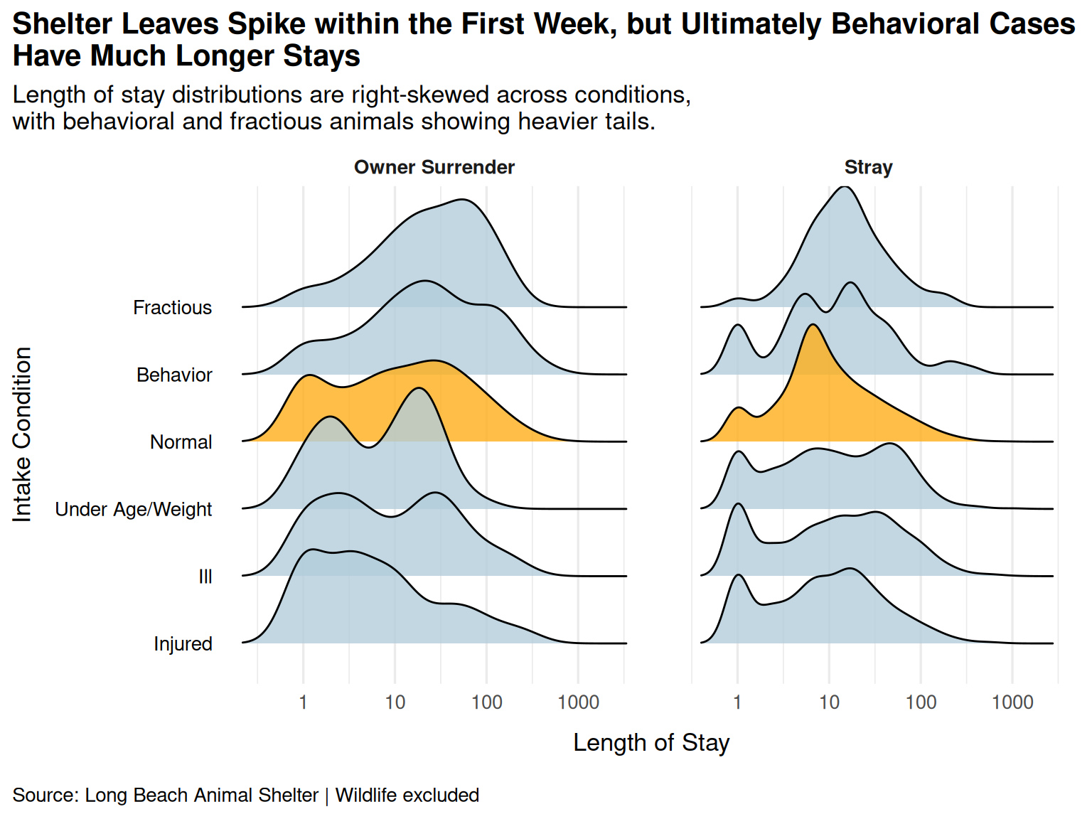
Discussion
From our analysis, we can see that animals generally leave shelter care within a relatively short period, but length of stay varies by intake condition. Behavioral and fractious animals have the longest stays and show heavier distribution tails, indicating that some animals remain in the shelter for extended periods. In addition, animals surrendered by owners tend to stay longer than strays under similar intake conditions, suggesting that prior living context also influences placement time.
The bar chart reveals a clear pattern as animals arriving with behavioral or fractious designations experience significantly longer shelter stays than those arriving in normal condition, regardless of intake type. Among owner surrenders, fractious animals wait a median of 24 days and behavior animals 19 days compared to just 9 days for normal animals. The same ordering holds for strays though at lower absolute values. This is suggesting that behavioral challenges are a consistent barrier to placement, likely because these animals require more careful matching with adopters or additional behavioral assessment before being made available. Injured and ill animals, by contrast, leave quickly, which likely reflects rapid decisions such as treatment, transfer to a rescue partner, or euthanasia rather than a smooth adoption process.
A secondary finding is that owner surrenders consistently stay longer than strays across nearly every intake condition. This is somewhat counterintuitive as owned animals typically have known histories and may be house-trained. But this may reflect the shelter’s intake process. Stray animals are subject to a mandatory stray hold period after which, if unclaimed, they move quickly into the adoption pipeline. Owner surrenders skip that hold and enter directly, but may face longer waits if the shelter is at capacity or if the animal requires behavioral evaluation. It is also possible that owner surrender animals skew toward older or more difficult-to-place individuals, since owners who can no longer care for a pet may be more likely to surrender animals with known behavioral issues.
Lastly, the ridgeline plot explores the finding in details by showing that median values alone understate the complexity of the distributions. All conditions exhibit right skew as most animals leave relatively quickly, but a meaningful tail extends to stays of several months or longer. This tail is especially noticeable for behavioral and fractious animals, indicating that while many are placed relatively quickly, a subset faces very long stays. This distinction matters practically as the median suggests a manageable stay for most animals, but the long tail highlights a group of harder-to-place animals that may warrant targeted intervention from shelter staff. Also, nearly all conditions exhibit a spike in leaves within the first week. This emphazies the fact the the turnover in shelters is high, even for intake conditions that often result in longer stays.
Question 2: How does the distribution of shelter outcomes vary by animal species? Have shelter outcomes changed over time? In particular, how have adoption rates evolved over time across species?
Introduction
Our group proposed this question because we were curious to know where animals end up after they leave the shelter. Do they find their forever homes, or do they end up elsewhere? Society roots for animals to be adopted into loving families, but we know that’s not always the case. Has time had a role in the outcomes of these animals? We are interested to know if as the relationship between the community and the animal shelter grew in length, were there more positive outcomes for the animals, particularily adoptions, and does this vary based on the animal species?
To answer our question, we are using animal type to separate our observations by animal species, outcome type so see the end result of the animal’s shelter stay, and outcome date to look at this data over time, particularly by year. Outcome type defines the final result of an animal’s stay at the shelter. In our analyses, we focus on animals who were adopted, rescued, transferred, returned to their owner, or were put down through euthanasia. Our analyses to this question will help us uncover not only where animals end up after their shelter stay, but if these outcomes for the shelter have changed overtime. We are hoping to see that as the relationship with the Long Beach community grew, more animals resulted in the positive outcome of being adopted into a family.
Approach
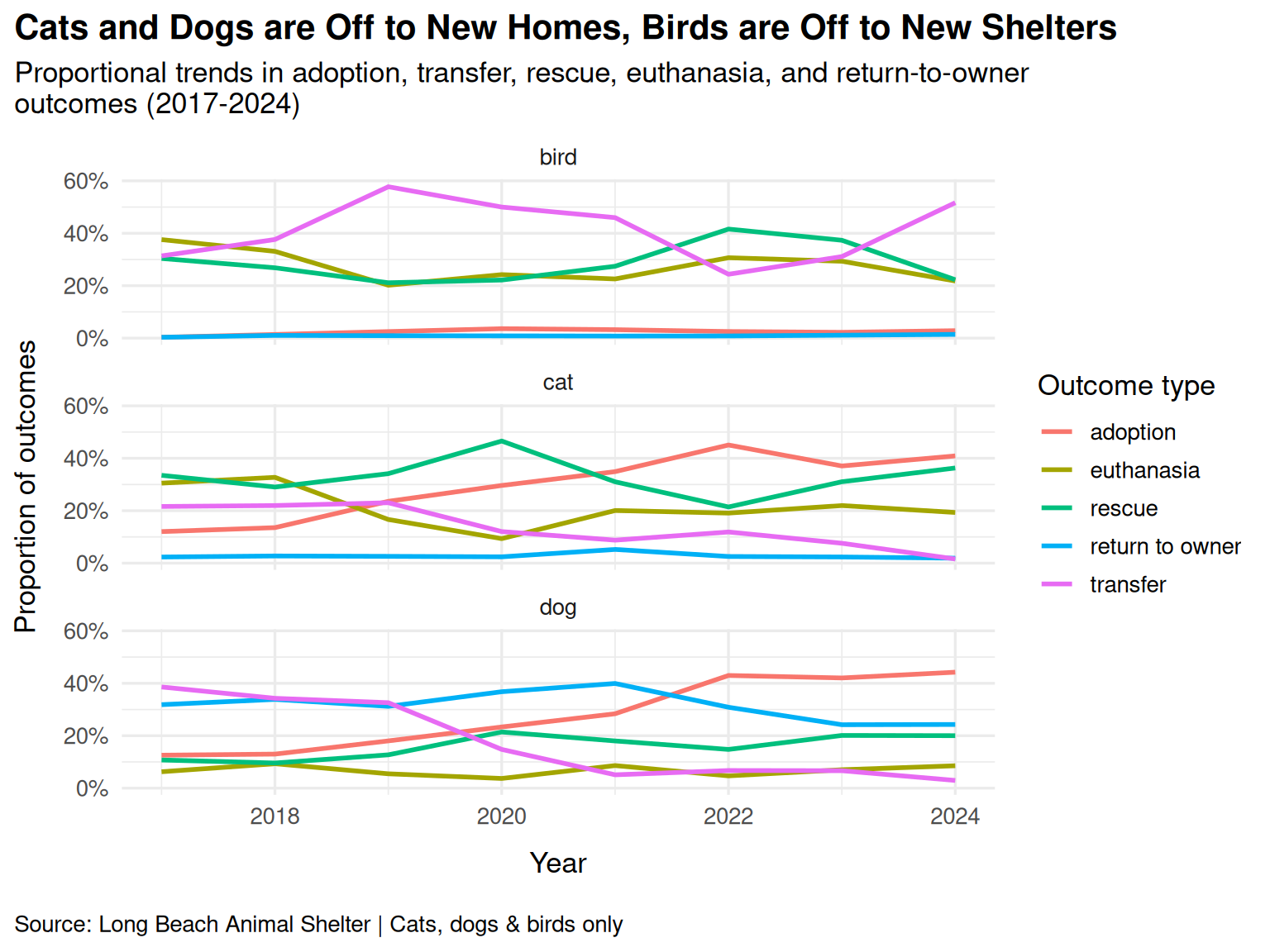
To address this question, we created two different visualizations that highlight complementary aspects of shelter outcomes. First, we constructed a faceted line plot showing the proportion of each outcome type over time for cats, dogs, and birds. This visualization allows us to compare the full distribution of outcomes within each species and observe how those proportions shift across years. By faceting by animal type and mapping outcome type to color, we can clearly see differences in outcome patterns between species while also tracking changes over time. The line plot is particularly useful for identifying trends and shifts in dominance among outcome types.
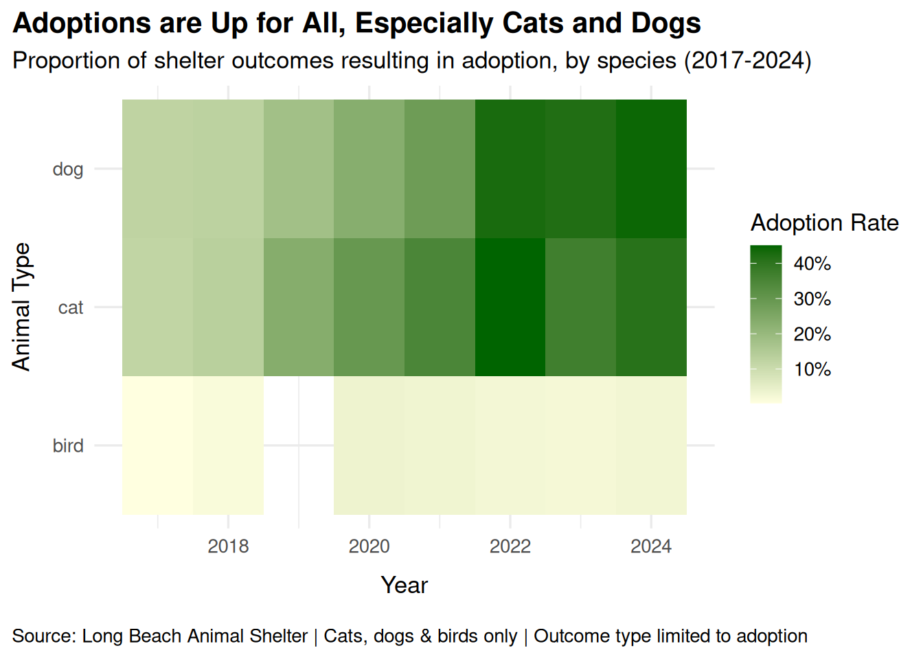
Second, because adoption represents a particularly meaningful and positive outcome, we chose to focus more closely on it by creating a heat map that displays adoption rates across species over time. The heat map places year on the x-axis and animal type on the y-axis, using color intensity to represent the proportion of adoption outcomes. Darker shades of green indicate higher adoption rates. This visualization simplifies the narrative by isolating one key outcome and allows us to quickly detect increases or decreases in adoption rates. Compared to the line plot, the heat map provides a more focused and visually intuitive way to emphasize long-term trends in adoption.
Together, these two visualizations enable us to examine both the overall distribution of shelter outcomes by species and the specific evolution of adoption rates over time. They also reveal meaningful differences in how outcome trends vary across species.
Analysis
# Plot 1: Line graph showing outcome trends over time.
ggplot(
  q2_animal_df,
  # map year to x-axis, proportion to y-axis, and use color to distinguish outcome types
  aes(x = year, y = proportion, color = outcome_type)
) +
  # add lines to show how proportions change over time
  geom_line(linewidth = 1) +
  # create separate panels for each animal type
  facet_wrap(~animal_type, ncol = 1) +
  # format y-axis as percentages
  scale_y_continuous(labels = scales::percent_format()) +
  # add descriptive axis labels and legend
  labs(
    x = "Year",
    y = "Proportion of outcomes",
    color = "Outcome type",
    title = "Cats and Dogs are Off to New Homes, Birds are Off to New Shelters",
    subtitle = "Proportional trends in adoption, transfer, rescue, euthanasia, and return-to-owner \noutcomes (2017-2024)",
    caption = "Source: Long Beach Animal Shelter | Cats, dogs & birds only"
  ) +
  theme_minimal(base_size = 13) +
  theme(
    plot.title.position = "plot",
    plot.title = element_text(hjust = 0, face = "bold"),
    axis.title.y = element_text(margin = margin(r = 10)),
    axis.title.x = element_text(margin = margin(t = 10, b = 10)),
    plot.caption.position = "plot",
    plot.caption = element_text(hjust = 0)
  )
# Plot 2: Heatmap showing adoption rates changed over time by species.
# filter to adoption only
adoption_trend <- q2_animal_df |>
  filter(outcome_type == "adoption")

# heatmap showing adoption rates over time by species
ggplot(
  adoption_trend,
  # year to the x-axis, animal_type to the y-axis, proportion to the fill color (adoption rate)
  aes(
    x = year,
    y = animal_type,
    fill = proportion
  )
) +
  # each tile represents one species-year combination
  geom_tile() +
  # use a color gradient to represent adoption rate, darker green indicates higher adoption rates
  scale_fill_gradient(
    low = "lightyellow",
    high = "darkgreen",
    labels = scales::percent_format()
  ) +
  labs(
    x = "Year",
    y = "Animal Type",
    fill = "Adoption Rate",
    title = "Adoptions are Up for All, Especially Cats and Dogs",
    subtitle = "Proportion of shelter outcomes resulting in adoption, by species (2017-2024)",
    caption = "Source: Long Beach Animal Shelter | Cats, dogs & birds only | Outcome type limited to adoption"
  ) +
  theme_minimal(base_size = 13) +
  theme(
    plot.title.position = "plot",
    plot.title = element_text(hjust = 0, face = "bold"),
    axis.title.y = element_text(margin = margin(r = 10)),
    axis.title.x = element_text(margin = margin(t = 10, b = 10)),
    plot.caption.position = "plot",
    plot.caption = element_text(hjust = 0)
  )
Discussion
From the line graph, it is clear that shelter outcome distributions differ across species and have changed over time. For both cats and dogs, adoption increases noticeably after 2019, while transfers decline, indicating a shift in outcome composition. In the earlier years, rescue is a prominent outcome for cats, whereas adoption accounts for a smaller share. Rescue refers to animals being transferred to external organizations rather than directly adopted, meaning they leave the shelter but have not yet entered a permanent home. Over time, adoption surpasses rescue for cats, suggesting a shift toward more direct placements. Dogs show an even steadier upward trend in adoption. In contrast, birds exhibit relatively stable outcome patterns, with adoption remaining low and transfer representing a substantial share in many years. Overall, cats and dogs move toward adoption as a dominant outcome, while birds do not demonstrate a comparable shift.
The heatmap further reinforces these findings by isolating adoption trends. Over time, the tiles for cats and dogs become progressively darker, indicating rising adoption rates in later years. Birds remain lighter overall, suggesting comparatively lower adoption proportions. However, a slight increase in bird adoption rates can still be observed when comparing earlier and later years, even though the overall level remains modest. It is also important to note that adoption data for birds in 2019 are missing in the summarized dataset, which explains the absence of a tile for that year in the heatmap. Compared to the line graph, the heatmap more clearly emphasizes long-term differences in adoption trajectories across species.
Taken together, these visualizations suggest that shelter outcome distributions vary by species and have evolved over time. Adoption has become increasingly common for cats and dogs, while birds have not experienced a similar magnitude of change. Although we cannot infer causation from this observational data, the patterns indicate that placement pathways may differ systematically across species. Future research could explore what institutional, community, or structural factors are associated with the observed increase in adoption rates.
Presentation
Our presentation can be found here.
Data
City of Long Beach. Animal Shelter Intakes and Outcomes. Long Beach Data Portal, https://data.longbeach.gov/explore/dataset/animal-shelter-intakes-and-outcomes/information/. Accessed 9 Feb. 2026.