library(tidyverse)
library(skimr)
library(janitor)
library(tidymodels)Fabulous Hitmontop
Exploratory data analysis
Research question(s)
Research question(s). State your research question (s) clearly.
For artworks that are considered popular and important in the Metropolitan Museum of Art Collection, what characteristics do they have?
For artworks that are included on the Timeline of Art History website, what characteristics do they tend to have?
What is the relationship between individual characteristics and the likelihood that they are considered popular/important or are highlighted art pieces?
Variables of interest: dynasty/period, accessionYear, department, objectName (physical type of the object), culture, artistDisplayName, artistNationality, artistGender, country, classification, objectBeginDate, objectEndDate
Identifier variable:
objectID: Identifying number for each artwork (unique, can be used as key field)Categorical variables:
isHighlight: When “true” indicates a popular and important artwork in the collectionisTimelineWork: Whether the object is on the Timeline of Art History websiteclassification: General term describing the artwork type.department: Indicates The Met’s curatorial department responsible for the artworkculture: Information about the culture, or people from which an object was createdobjectName: Describes the physical type of the objectartistDisplayName: Artist name in the correct order for displayartistNationality: National, geopolitical, cultural, or ethnic origins or affiliation of the creator or institution that made the artworkartistGender: Gender of the artist (currently contains female designations only)country: Country where the artwork was created or founddynasty: Dynasty (a succession of rulers of the same line or family) under which an object was createdperiod: Time or time period when an object was createdQuantitative variable:
accessionYear: Year the artwork was acquiredobjectBeginDate: Machine readable date indicating the year the artwork was started to be createdobjectEndDate: Machine readable date indicating the year the artwork was completed
Data collection and cleaning
Have an initial draft of your data cleaning appendix. Document every step that takes your raw data file(s) and turns it into the analysis-ready data set that you would submit with your final project. Include text narrative describing your data collection (downloading, scraping, surveys, etc) and any additional data curation/cleaning (merging data frames, filtering, transformations of variables, etc). Include code for data curation/cleaning, but not collection.
The Metropolitan Museum of Art Collection was downloaded as a csv file, which contains information for the various pieces of artwork housed by the museum. Minimal transformation and cleaning was needed, as each observation already represented a single work of art. Variable names were reformatted to match standard naming conventions for this course, and variables that we did not plan to use in our analysis were excluded to increase the efficiency of later analysis.
We transformed some variables to their appropriate data type: is_highlight and is_timeline_work into logical variables, and accession_year into a numeric variable. We also created numeric variable duration, which represents the amount of time an artwork was in progress before completion.
met_clean <- read.csv("data/MetObjects.csv") |>
  clean_names() |>
  select(
    object_id, is_highlight, is_timeline_work, classification, department,
    portfolio,  artist_display_name, artist_nationality, artist_gender, accession_year,
    object_begin_date, object_end_date, country, dynasty, period
  ) |>
  mutate(
    is_highlight = as.logical(is_highlight),
    is_timeline_work = as.logical(is_timeline_work),
    accession_year = as.numeric(accession_year),
    duration = object_end_date - object_begin_date
  )
Warning: There was 1 warning in `mutate()`.
ℹ In argument: `accession_year = as.numeric(accession_year)`.
Caused by warning:
! NAs introduced by coercionData description
Have an initial draft of your data description section. Your data description should be about your analysis-ready data.
What are the observations (rows) and the attributes (columns)?
Each observation represents a piece of artwork
Each attribute describes the feature of an artwork, which includes variables such as department, culture, country, etc.
Why was this dataset created?
- This dataset was create to provide the public with access to the MET’s art catalogue. According to their official website, the MET data can be of commercial and noncommercial use without permission from the museum.
Who funded the creation of the dataset?
- The MET museum complied the dataset on its own and funded the creation of the dataset.
What processes might have influenced what data was observed and recorded and what was not?
From the Data Collector side: Even though the MET museum is based in the United States, the information regarding artworks may be recorded as soon as the artwork is received from its original country. The majority of artworks may also focus on the Western area over others. Finally, the processes when categorizing the department and culture of each artwork can have different standards over the past century.
From the Data Analysis side: When an observation has NA values for all columns other than
objectID, it will be removed. Other than that, all observations are kept and filtered based on each visualization.
What preprocessing was done, and how did the data come to be in the form that you are using?
- We utilized the function
clean_names()andselect()to make the column names easy to access and choose the variables of interest. The data came in in csv format, so no pre-processing is needed to read the original dataset.
- We utilized the function
If people are involved, were they aware of the data collection and if so, what purpose did they expect the data to be used for?
- The people who collected the data for the MET museum knows that the purpose of the collection is to create an online catalog for the artworks. However, they only expect the data to be used for reference instead of a comprehensive analysis that attempts to observe trends over the years. Regardless, the collection of data is a neutral process that will not interfere with our analysis.
Data limitations
Identify any potential problems with your dataset.
- The output variable,
is_highlight, describes if a piece is a popular and important artwork in the collection. However, it shows the result in either True or False, so it does not quantify the popularity itself. Thus, the resulting analysis cannot explain the degree of influence from each factor or input variable, but only the tendency of them. - There are lots of missing data in the dataset. Ancient or older pieces have less data available, so the resulting analysis and interpretation might be biased to reflect the characteristics of newer pieces.
- Due to the nature of MET museum some of the cultures are not very well represented, such as Asian or African culture.
Exploratory data analysis
Perform an (initial) exploratory data analysis.
accession_vs_highlight <- met_clean |>
  select(accession_year, is_highlight) |>
  mutate(
    is_highlight_binary = if_else(is_highlight, 1, 0),
    is_highlight_binary = as.factor(is_highlight_binary),
  ) |>
  #na_if("") |>
  na.omit()

accession_highlight_log_fit <- logistic_reg() |>
  fit(is_highlight_binary ~ accession_year, data = accession_vs_highlight)
tidy(accession_highlight_log_fit)
# A tibble: 2 × 5
term estimate std.error statistic p.value
<chr> <dbl> <dbl> <dbl> <dbl>
1 (Intercept) -5.40 0.0219 -246. 0
2 accession_year -0.0000000706 0.00000152 -0.0464 0.963- There seems to be very little relationship between the accession year and whether the art piece is highlighted. The relationship is slightly negative, which may be attributed to older artworks having a longer time to accumulate popularity.
duration_vs_highlight <- met_clean |>
  select(duration, is_highlight) |>
  mutate(
    is_highlight_binary = if_else(is_highlight, 1, 0),
    is_highlight_binary = as.factor(is_highlight_binary),
  ) |>
  #na_if("") |>
  na.omit()

duration_highlight_log_fit <- logistic_reg() |>
  fit(is_highlight_binary ~ duration, data = duration_vs_highlight)
Warning: glm.fit: fitted probabilities numerically 0 or 1 occurredtidy(duration_highlight_log_fit)# A tibble: 2 × 5
term estimate std.error statistic p.value
<chr> <dbl> <dbl> <dbl> <dbl>
1 (Intercept) -5.12 0.0213 -240. 0
2 duration -0.00248 0.000184 -13.5 1.51e-41accession_vs_timeline <- met_clean |>
select(accession_year, is_timeline_work) |>
mutate(
is_timeline_work_binary = if_else(is_timeline_work, 1, 0),
is_timeline_work_binary = as.factor(is_timeline_work_binary),
) |>
#na_if("") |>
na.omit()
accession_timeline_log_fit <- logistic_reg() |>
fit(is_timeline_work_binary ~ accession_year, data = accession_vs_timeline)
tidy(accession_timeline_log_fit)# A tibble: 2 × 5
term estimate std.error statistic p.value
<chr> <dbl> <dbl> <dbl> <dbl>
1 (Intercept) -4.07 0.0116 -351. 0
2 accession_year -0.000000132 0.00000134 -0.0985 0.922- Similar to the relationship between accession year and the artwork’s highlight status, the relationship between accession year and the timeline status is very small. The relationship is also slightly negative, which again may be attributed to older artworks having a longer time to become established.
duration_vs_timeline <- met_clean |>
  select(duration, is_timeline_work) |>
  mutate(
    is_timeline_work_binary = if_else(is_timeline_work, 1, 0),
    is_timeline_work_binary = as.factor(is_timeline_work_binary),
  ) |>
  #na_if("") |>
  na.omit()

duration_timeline_log_fit <- logistic_reg() |>
  fit(is_timeline_work_binary ~ duration, data = duration_vs_timeline)
Warning: glm.fit: fitted probabilities numerically 0 or 1 occurredtidy(duration_timeline_log_fit)# A tibble: 2 × 5
term estimate std.error statistic p.value
<chr> <dbl> <dbl> <dbl> <dbl>
1 (Intercept) -4.05 0.0118 -343. 0
2 duration -0.000272 0.0000522 -5.22 0.000000176met_clean |>
count(is_highlight, is_timeline_work) is_highlight is_timeline_work n
1 FALSE FALSE 468634
2 FALSE TRUE 6686
3 TRUE FALSE 1182
4 TRUE TRUE 1302met_clean |>
ggplot(aes(x = is_highlight, fill = is_timeline_work)) +
geom_bar() +
scale_y_log10()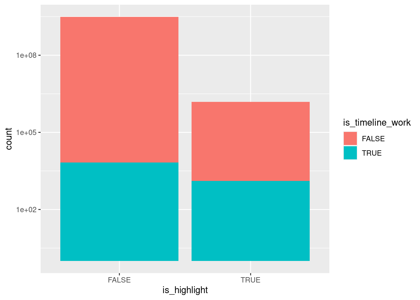
met_clean |>
  mutate(is_highlight = if_else(is_highlight == "True", TRUE, FALSE)) |>
  filter(is_highlight == TRUE) |>
  #na_if("") |>
  count(classification, sort = TRUE) |>
  head(n = 10)
[1] classification n
<0 rows> (or 0-length row.names)met_clean |>
mutate(is_timeline_work = if_else(is_timeline_work == "True", TRUE, FALSE)) |>
filter(is_timeline_work == TRUE) |>
#na_if("") |>
count(classification, sort = TRUE) |>
head(n = 10)[1] classification n
<0 rows> (or 0-length row.names)met_clean |>
mutate(is_highlight = if_else(is_highlight == "True", TRUE, FALSE)) |>
filter(is_highlight == TRUE) |>
#na_if("") |>
count(artist_display_name, sort = TRUE) |>
head(n = 20)[1] artist_display_name n
<0 rows> (or 0-length row.names)met_clean |>
mutate(is_timeline_work = if_else(is_timeline_work == "True", TRUE, FALSE)) |>
filter(is_timeline_work == TRUE) |>
#na_if("") |>
count(artist_display_name, sort = TRUE) |>
head(n = 20)[1] artist_display_name n
<0 rows> (or 0-length row.names)met_clean |>
select(accession_year) |>
group_by(accession_year) |>
summarize(n())# A tibble: 155 × 2
accession_year `n()`
<dbl> <int>
1 1870 1
2 1871 60
3 1872 4
4 1873 66
5 1874 5396
6 1875 49
7 1876 27
8 1877 10
9 1878 1
10 1879 1126
# ℹ 145 more rowsmet_clean |>
ggplot(mapping = aes(x = as.numeric(accession_year))) +
geom_bar() +
scale_y_continuous(limits = c(0, 20000)) +
scale_x_continuous(limits = c(1870, 2022), breaks = c(1880, 1900, 1920, 1940, 1960, 1980, 2000, 2020)) +
labs(
title = 'Number of Artwork Per Year',
subtitle = 'From 1870 to 2022',
caption = 'Source: The Metropolitan Museum of Art',
x = 'Year',
y = 'Count'
) +
theme_minimal()Warning: Removed 3562 rows containing non-finite values (`stat_count()`).Warning: Removed 3 rows containing missing values (`geom_bar()`).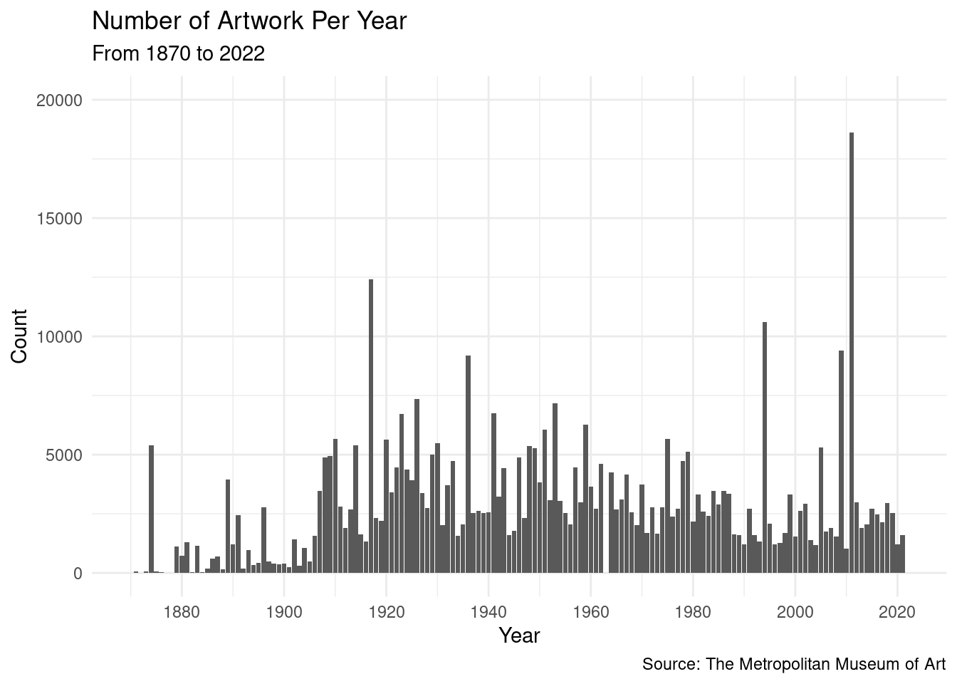
- According to the graph, even there are peaks of artwork in the 2000s, the majority of artwork are condensed around 1920 to 1980. This can be explained by the fact that newest artworks are not fully catalogued yet.
met_clean |>
  select(department, is_highlight) |>
  mutate(
    is_highlight = as.logical(is_highlight),
    is_highlight_binary = if_else(is_highlight, "Highlighted", "No"),
    is_highlight_binary = as.factor(is_highlight_binary)
  ) |>
  ggplot(aes(x = department, fill = is_highlight_binary)) +
  geom_bar(position = "fill") +
  theme(axis.text.x = element_text(angle = 45, vjust = 1, hjust=1)) +
  labs(
    x = "Department",
    y = "Percentage",
    fill = "Highlited Pieces",
    title = "% of Highlighted Pieces by Departments"
  ) +
  scale_y_continuous(labels = label_percent())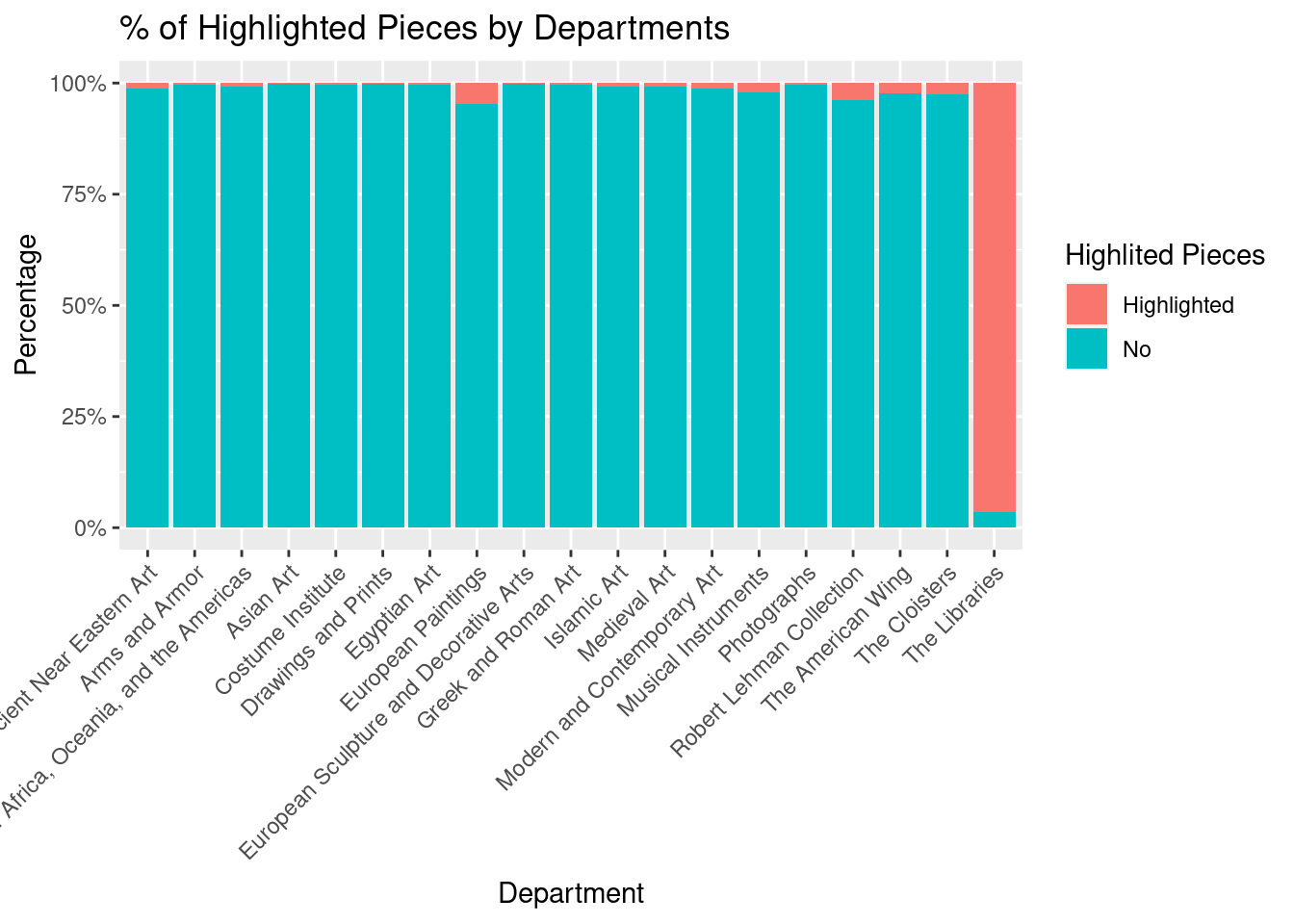
According to the graph, most of the highlighted pieces are from “The Libraries” department. This department has over 90% of its pieces as highlighted. Other departments also have some highlighted pieces, but their percentage is extremely low.
Questions for reviewers
List specific questions for your peer reviewers and project mentor to answer in giving you feedback on this phase.