Project Fabulous Hitmontop
The Metropolitan Museum of Art: What characteristics do important artworks share?
Introduction
In the past summer, Kevin and Fiona both visited the MET museum in New York City. As one of the biggest art collection in the world, they couldn't help but wonder what are the "standards" and "criteria" that museums use when they evaluate the importance and value of artworks.
Given their curiosity, our team decided to look into the MET museum artwork catalog. Within the data set, there is a variable called `is_highlight`, which is a boolean variable that identifies whether the museum considers the artwork valuable. However, there is no additional detail explaining how they highlighted the variable. Therefore, our team decided to pursue the overarching research question: "for artworks that are considered popular and important in the Metropolitan Museum of Art Collection, what characteristics do they have?"
Within this overarching research question, we formulated two analyses with more specific variables to explore: `object_end_date` and `is_timeline_work`
Is proportion of artworks completed before 1650 (pre-Renaissance) that are highlighted different from the proportion of artworks completed after 1650 (post-Renaissance) that are highlighted?
Is proportion of artworks on the art history timeline website that are highlighted higher than the proportion of artworks not on the art history timeline website that are highlighted?
After performing the analysis, we discovered that for each of the variables, a significant result was produced to reject the null hypothesis. There is sufficient evidence to justify that the proportion of highlighted artworks completed before 1650 (pre-Renaissance) is different from the proportion of highlighted artworks completed after 1650 (post-Renaissance). There is also sufficient evidence to prove that the proportion of highlighted artworks on the art history timeline website is higher than the proportion of highlighted artworks not on the art history timeline website.
Data description
Description of data set observations (rows) and attributes (columns)
Each observation represents a piece of artwork
Each attribute describes the feature of an artwork, which includes variables such as department, culture, country, etc.
The creation of the data set
- This data set was create to provide the public with access to the MET’s art catalogue. According to their official website, the MET data can be of commercial and noncommercial use without permission from the museum.
Funding for the data set
- The MET museum complied the data set on its own and funded the creation of the data set.
Processes that might have influenced what data was observed and recorded and what was not
From the Data Collector side: Even though the MET museum is based in the United States, the information regarding artworks may be recorded as soon as the artwork is received from its original country. The majority of artworks may also focus on the Western area over others. Finally, the processes when categorizing the department and culture of each artwork can have different standards over the past century.
From the Data Analysis side: When an observation has NA values for all columns other than objectID, it will be removed. Other than that, all observations are kept and filtered based on each visualization.
Pre-processing of data
- We utilized the function clean_names() and select() to make the column names easy to access and choose the variables of interest. The data came in in csv format, so no pre-processing is needed to read the original data set.
Expected purpose and transparency of data collection
- The people who collected the data for the MET museum knows that the purpose of the collection is to create an online catalog for the artworks. However, they only expect the data to be used for reference instead of a comprehensive analysis that attempts to observe trends over the years. Regardless, the collection of data is a neutral process that will not interfere with our analysis.
Data analysis
Analysis 1
- Is the proportion of artworks completed before 1650 (pre-Renaissance) that are highlighted different from the proportion of artworks completed after 1650 (post-Renaissance) that are highlighted?
Response: is_highlight (factor)
Explanatory: finished_recently (factor)
# A tibble: 1 × 1
      stat
     <dbl>
1 0.000867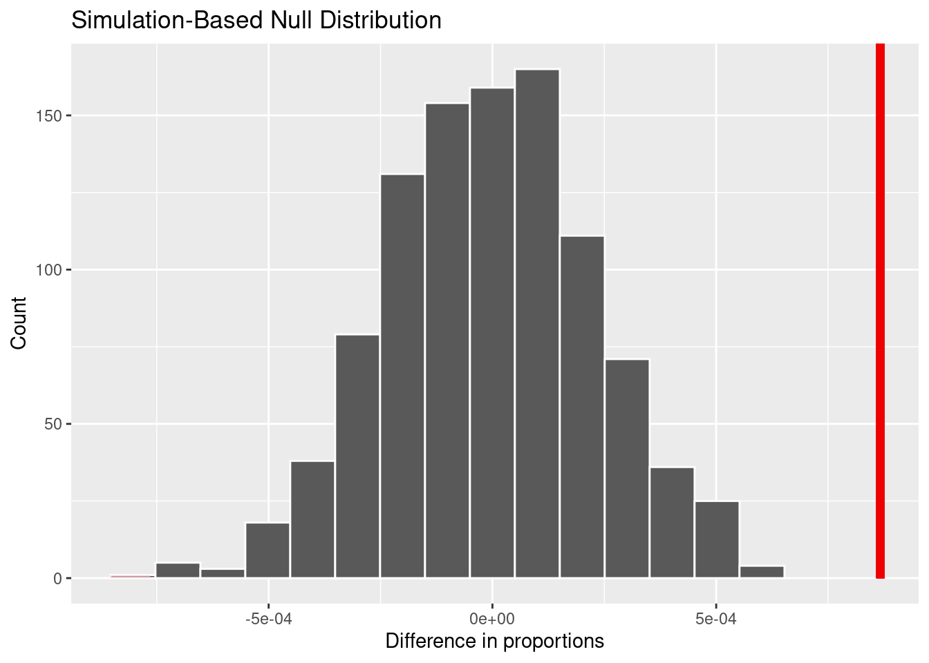
The data is organized by choosing the variables of interest and mutate object_end_date so that it becomes either ‘yes’ or ‘no’. Then the point estimate is generated using the difference in proportion, with success being is_highlight == True. Finally, a null distribution and generated and visualized through a bootstrap generation.
# A tibble: 1 × 1
  p_value
    <dbl>
1       0
Calculate a p-value with the null distribution that we produced. The p-value is conducted assuming a two-sided direction.
Analysis 2
Is proportion of artworks on the art history timeline website that are highlighted higher than the proportion of artworks not on the art history timeline website that are highlighted?
\[ H_0: p_{timeline~highlight} - p_{non-timeline~highlight} = 0 \]
\[ H_A: p_{timeline~highlight} - p_{non-timeline~highlight} > 0 \]
- Conduct hypothesis test under the assumption that the null hypothesis is true and calculate a p-value (probability of observed or more extreme outcome given that the null hypothesis is true)
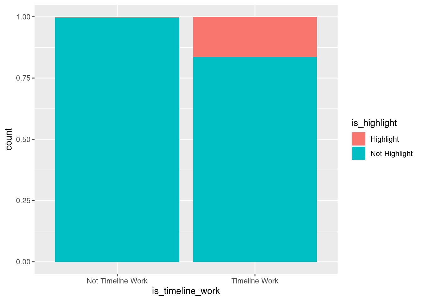
Segmented bar plots:
Hypothesis testing:
Response: is_highlight (factor)
Explanatory: is_timeline_work (factor)
# A tibble: 1 × 1
   stat
  <dbl>
1 0.160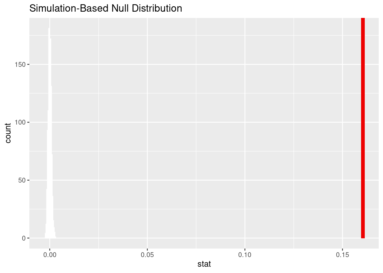
# A tibble: 1 × 1
  p_value
    <dbl>
1       0
Evaluation of significance
Analysis 1
Observed statistic/Point estimate value: 0.0008668092 (0.000867 once rendered)
We implemented a bootstrap sampling method with 1000 reps for the analysis. By conducting a hypothesis test for difference in proportions, we obtained a point estimate of 0.00867 and a null distribution like the graph shown above. Based on the distribution and the point estimate line labeled in red, it is clear that the point estimate (0.00867) is far from the highest point of the null distribution (~0.005). This indicates that there is little to no probability of a sample producing a higher proportion difference than the point estimate.
The calculated approximate p-value is 0. In the context of the research question, this means that assuming the null hypothesis is true (there is no difference between the proportion of of artworks completed before 1650 that are highlighted and the proportion of artworks completed after 1650 that are highlighted), the probability of a sample producing a mean proportion more extreme than the point estimate (higher than 0.00867) is 0%.
Although the point estimate value appears to be small, it is significant because of the size of the data set. The data set includes 477,804 observations. [pls reword the following] Based on the law of large numbers, the more observations, the more the observed statistic (the difference in proportions) should converge to zero.
Since the p-value is less than 0.05, we reject the null hypothesis in favor of the alternative hypothesis. Based upon simulating 1000 instances of the null distribution, the observed statistic of 0.000867 is statistically different enough from the null hypothesis scenario to reject the null hypothesis.
Analysis 2
Observed statistic/Point estimate value: 0.1604786.
We implemented a bootstrap sampling method with 1000 reps for the analysis. By conducting a hypothesis test for difference in proportions, we obtained a point estimate of 0.1604786 and a null distribution like the graph shown above. Based on the distribution and the point estimate line labeled in red, it is clear that the point estimate (0.1604786) is far from the highest point of the null distribution (~0.005). This indicates that there is little to no probability of a sample producing a higher proportion difference than the point estimate.
The calculated approximate p-value is 0. In the context of the research question, this means that assuming the null hypothesis is true, the probability of a sample producing a mean proportion more extreme than the point estimate is 0%.
Although the point estimate value appears to be small, it is significant because of the size of the data set. The data set includes 477,804 observations. [pls reword the following] Based on the law of large numbers, the more observations, the more the observed statistic (the difference in proportions) should converge to zero.
Since the p-value is 0, we reject the null hypothesis in favor of the alternative hypothesis. The data provide convincing evidence that the proportion of highlighted artworks included on the Timeline of Art History website is higher than the proportion of highlighted artworks not included on the Timeline of Art History website.
Interpretation and conclusions
Analysis 1
Analysis of the data shows that an artwork’s date of completion is a characteristic that influences its popularity and importance, as judged by the Metropolitan Museum of Art.
There is sufficient evidence that the proportion of artworks completed before 1650 (pre-Renaissance) that are highlighted is different from the proportion of artworks completed after 1650 (post-Renaissance) that are highlighted. This shows us that either one of the artwork classification (pre vs post-Renaissance) is preferred by the MET when it comes to highlighting them in their catalog. This makes sense because pre-Renaissance is often known as the best time period of art, while post-Renaissance – especially modern – artworks are not as valued in by art collectors. The result of this analysis should be an indication that the general bias towards older artworks is a problem in the modern space. The appreciation of modern art and newer ideas should be taken into account and hopefully facilitate a modern Renaissance.
Analysis 2
There is sufficient evidence to conclude that the proportion of highlighted artworks included on the Timeline of Art History website is higher than the proportion of highlighted artworks not included on the Timeline of Art History website. It makes sense that the museum would select pieces that are important and popular for their Timeline of Art History website. The Timeline of Art History website is meant to be a curated collection of prominent pieces, so it would not make sense to include pieces that are either not important and/or not popular.
Future Work
Other variables to explore (gender, departments, etc.)
Implement machine learning methods to perform analyses with more predictors and find the model that is best used for this research
Compare the result from the MET to other museums (ex. The Louvre), so we can interpret the differences in how museum around the world evaluate artwork importance
Limitations
The output variable,
isHighlight, describes if a piece is a popular and important artwork in the collection. However, it shows the result in either True or False, so it does not quantify the popularity itself. Thus, the resulting analysis cannot explain the degree of influence from each factor or input variable, but only the tendency of them.There are lots of missing data in the data set. Ancient or older pieces have less data available, so the resulting analysis and interpretation might be biased to reflect the characteristics of newer pieces.
Due to the nature of MET museum some of the cultures are not very well represented, such as Asian or African culture.
Because our data set deals with art, which is subjective, many of the variables are consequently evaluated in a subjective manner.
Because our data set deals with art, and art is subjective, many of the variables are decided in a subjective manner. For example, both the variables in the second analysis, isHighlight and isTimelineWork, have subjective components. isHighlight is defined as art that "indicates a popular and important artwork in the collection." isTimelineWork is defined as "Whether the object is on the Timeline of Art History website." Who decides whether the piece of artwork is "important" or whether it deserves to be on the Timeline of Art History website. Of course, the number of people who pay to see an exhibit can be used as a proxy for art's popularity, but at the end of the day a human or a committee has to make the decision, which can lead to biased data based on their personal perceptions. Art is extremely subjective, and it will be important to keep that in mind regardless of any conclusions we may draw from our analysis of the data.
Because our data set deals with art, which is subjective, many of the variables are consequently evaluated in a subjective manner.
Acknowledgments
tidyverse, janitors, and tidymodels are used as part of this analysis for data cleaning, hypothesis testing, and p-value calculation. We would also like to thank the MET museum for the open access csv file. Their official website also provided us with sufficient information as we are exploring data analysis possibilities.