Pride On Campus - How different aspects of colleges influence LGBTQ-inclusivity
Author
Dank Cap Serena Yang, Winnie Zhou, Wassan Nasreddin, Omowunmi Akingbola
Introduction
The Campus Pride Index measures LGBTQ+ inclusivity across U.S. college campuses, providing insights for students, policymakers, and institutions. A welcoming environment can have a significant impact on student well-being and academic success. The index helps identify the factors that influence these ratings like school size, location, and institution type, which can help prospective students make informed college choices and encourage universities to strengthen their inclusivity efforts.
This dataset, sourced from the 2024 Campus Pride Index, is based on eight factors: LGBTQ+ policy inclusion, institutional commitment, academic life, student life, housing, campus safety, counseling and health services, and recruitment and retention efforts. Each university receives an overall Pride Rating on a 1 to 5 scale, with 5 being the most LGBTQ-friendly. Beyond the Pride Ratings, the dataset also includes general details about each college, such as location, student population size, and external community type (urban, rural, etc.). It also provides data on institutional affiliations (public, private, minority-serving, or religious-affiliated), making it possible to analyze whether these factors influence LGBTQ+ inclusivity across campuses.
How are pride ratings affected by environmental factors on college campuses?
Introduction
We want to explore how different environmental variables might influence how LGBTQ-friendly a college campus is. To answer this question, we decided to focus on two defining aspects of college campus culture in addition to the pride score: student population size and the type of community in which the college is located. Larger student population size often (but not always) lends itself to more diversity while different community types such as rural or large cities often have different ranges of socio-political leanings and diversity.
This question allows us to find insight on whether different types of diversity have an influence on LGBTQ inclusion. It can also help inform students, especially students who identify as members of the LGBTQ community, in their college search and decisions as to what environments may be a better fit.
Approach
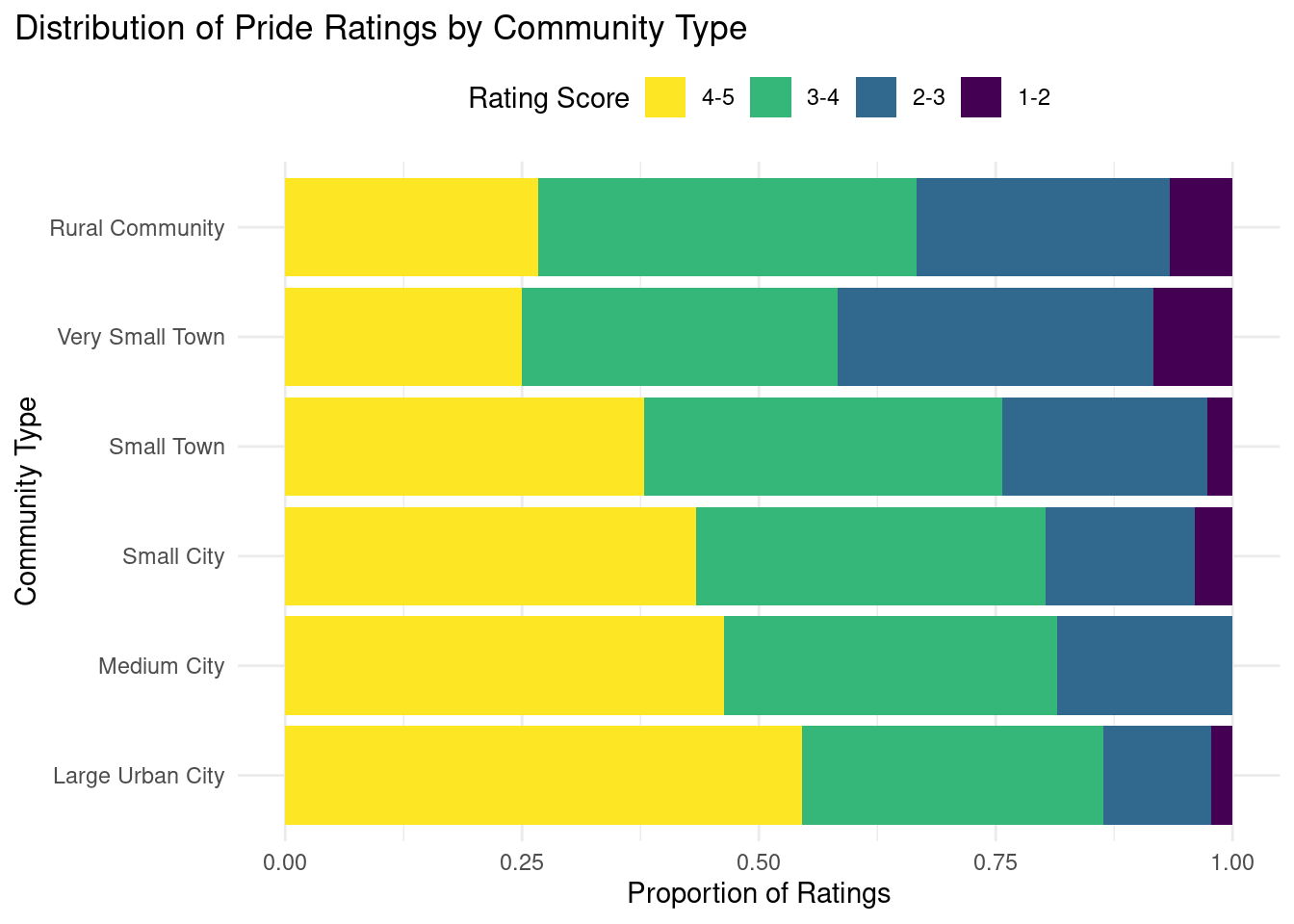
One of the plots we created was a stacked bar plot that shows the distribution of pride scores by community type (e.g., large urban city, small town, rural community). Each community type displays a proportion of five different-colored segments–each representing a pride score range (in intervals of one from zero to five). We believe the bar plot is the most helpful in understanding the relationship between community type and pride scores since it allows the viewer to easily compare the proportions of scores within each community type while addressing possible concerns of certain community types being more represented in the dataset. This method also ensures we can compare relative distributions rather than absolute numbers. This way, the viewer can more accurately assess whether some community types tend to have higher or lower pride scores while seeing how it compares to other communities relative to themselves.
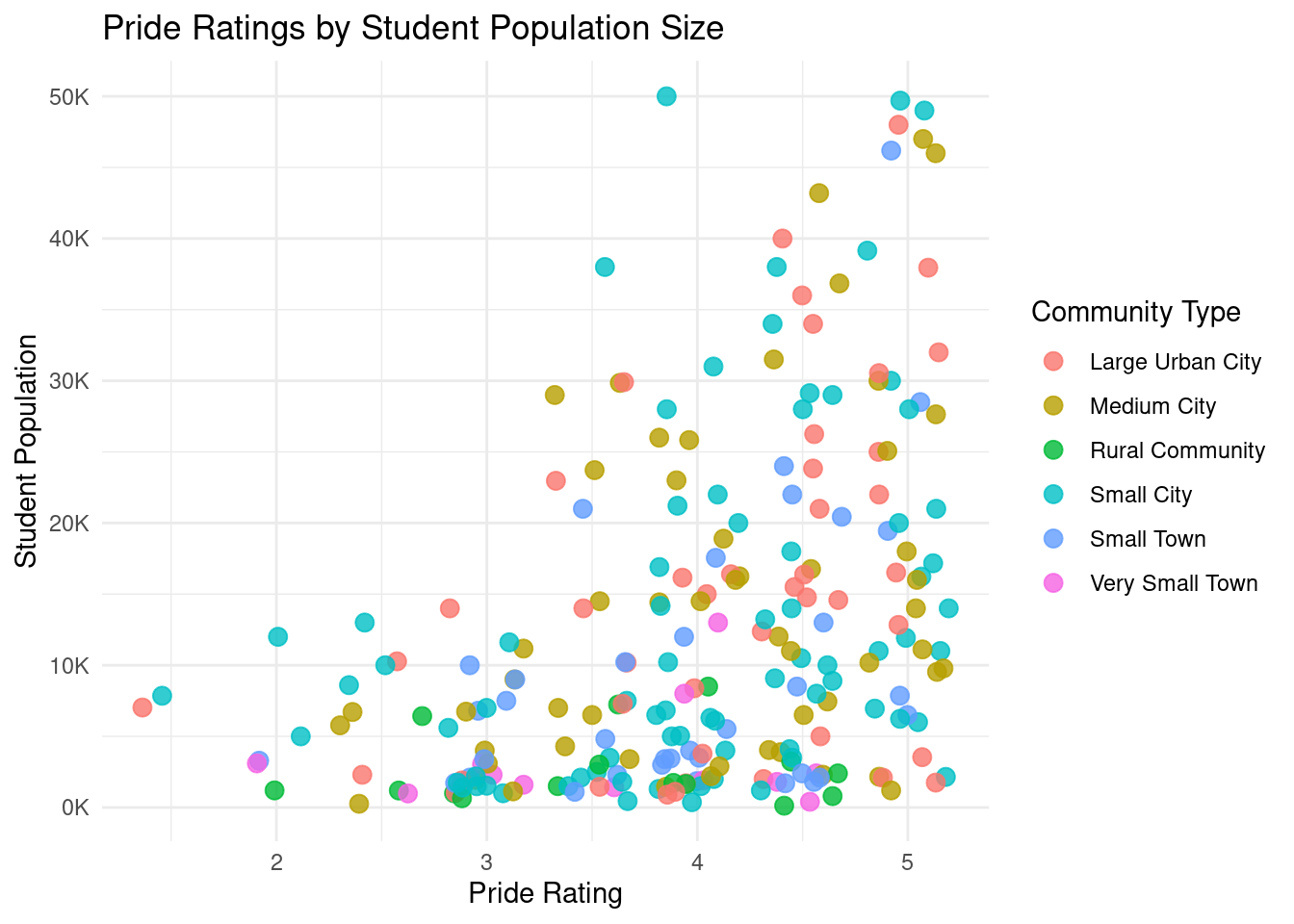
To examine the relationship between pride ratings and student population size, we created a scatter plot with jittered points. Each point represents a college, with the x-axis showing Pride Ratings and the y-axis showing Student Population Size. Community type is mapped to color, allowing us to see how different community types are distributed within the dataset.
We chose this plot because it effectively shows both individual data points and overall trends. The jittering effect prevents overlapping points, making patterns more visible. The plot shows how pride ratings vary based on both student population size and community type.
Analysis
# plot 1# mutate data for state populationdf_index <- df_index |>mutate(student_category =case_when( students <5000~"Small", students >=5000& students <=20000~"Medium", students >20000~"Large" ))# mutate data for community typedf_index <- df_index |>mutate(rating_category =cut(rating, breaks =c(0, 1, 2, 3, 4, 5), labels =c("0-1", "1-2", "2-3", "3-4", "4-5" ), include.lowest =TRUE))rename_cmap =c("large urban city"="Large Urban City", "medium city"="Medium City", "rural community"="Rural Community","small city"="Small City", "small town"="Small Town", "very small town"="Very Small Town")# stack bar chart that counts ratings by community Typeggplot(df_index, aes(y =fct_relevel( community_type,"large urban city","medium city","small city","small town","very small town","rural community", ),fill =fct_relevel( rating_category, "0-1", "1-2", "2-3", "3-4", "4-5" ) ) ) +geom_bar(position ="fill") +scale_fill_viridis_d(guide =guide_legend(reverse =TRUE))+labs(title ="Distribution of Pride Ratings by Community Type",x ="Proportion of Ratings",y ="Community Type",fill ="Rating Score") +theme_minimal() +scale_y_discrete(labels = rename_cmap) +theme(plot.title.position ="plot",legend.position ="top" )
# plot 2# Pride rating vs. student populationrename_ctype =c("Large Urban City", "Medium City", "Rural Community","Small City", "Small Town", "Very Small Town")ggplot(df_index, aes(x = rating, y = students, color = community_type)) +geom_jitter(alpha =0.8, size =3, width =0.2) +scale_color_viridis_d() +scale_y_continuous(labels =label_number(scale =1e-3, suffix ="K")) +labs(title ="Pride Ratings by Student Population Size",x ="Pride Rating",y ="Student Population",color ="Community Type") +scale_color_discrete(name ="Community Type", labels = rename_ctype) +theme_minimal()
Scale for colour is already present.
Adding another scale for colour, which will replace the existing scale.
Discussion
Overall, it looks like colleges located in densely populated communities (eg: large city, medium city) tend to have a significantly higher proportion of very LGBTQ-friendly colleges. The colleges that are considered to be very LGBTQ-friendly are those that have a very high pride score: between 4 and 5. The most densely populated community type–large urban city–has just over 50% of its college campuses with pride ratings between 4 and 5. This proportion consistently decreases as the community type decreases in size (other than the rural community experiencing a very small increase in proportion) with rural and small towns having around 25% of its college campuses located in such environments score in the highest pride rating range. This could be due to the fact that urban, more populated areas tend to have more diversity, which could translate to more diversity and likelihood of acceptance and inclusion in terms of the LGBTQ+ community as well. It is also important to note that despite a significant decrease in proportion of high pride scores as community size gets smaller, the proportion of colleges that are extremely not very pride-friendly (scores between zero and one) still remains very low and stays about the same regardless of the community type. While this could be partially due to the dataset’s coverage, this leads us to believe that the majority of college campuses are still somewhat LGBTQ-friendly regardless of community type.
A trend that was observed in the scatterplot is that larger student populations tend to have higher pride ratings, suggesting a positive correlation between school size and school pride. Additionally, community type plays a role in how pride ratings are distributed. For example, small city schools cluster around a pride rating of 4. Meanwhile, large urban cities and medium cities show a wider range of pride ratings, reflecting more variation in student experiences. This makes sense because a larger population can have a more diverse and inclusive environment through student organizations, and providing resources.
How do pride ratings vary by location and differ according to university type (public, private, and community college)?
Introduction
To examine how Pride Ratings vary by location, we utilized the Campus_location column, which contains both city and state names, and the rating column. We aggregated all universities within the same state and calculated the median Pride Rating for each state, helping us explore regional differences in LGBTQ+ inclusivity.
We also explored whether a campus being a public university, private university, or community college influences how LGBTQ-friendly it is in the top five states with the most universities. To answer this, we used the university_type, Campus_location, and rating columns to visualize the distribution of Pride Ratings for each university type within each selected state.
We found this question particularly interesting because it reveals how the intersection of geography and the nature of educational institutions can influence LGBTQ+ inclusivity. These insights may help guide targeted initiatives to create more supportive and inclusive campus environments.
Approach
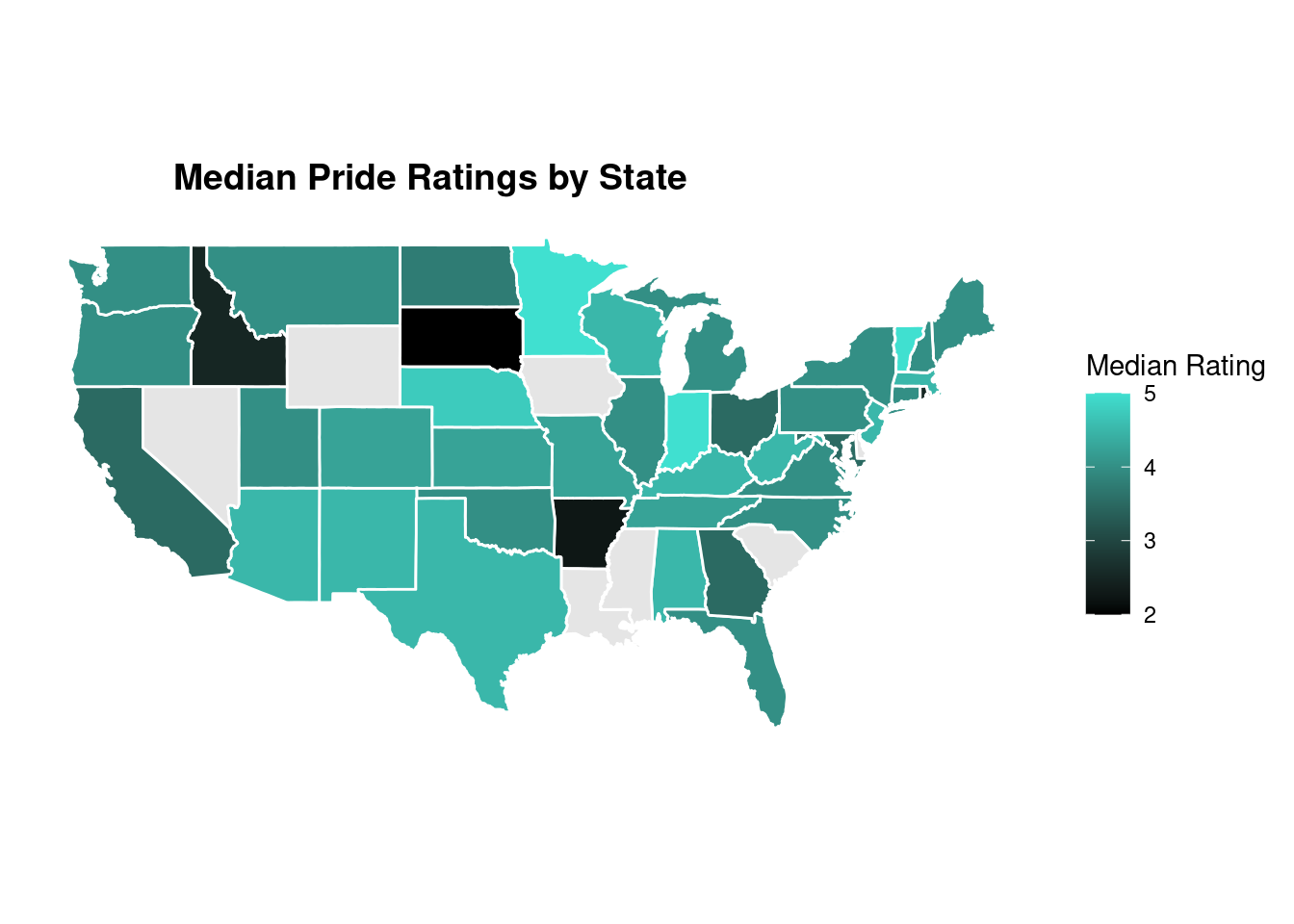
To explore this question, we used two types of visualizations: a map and boxplots for each state as a facet. The map provides a broad geographic overview of Pride Ratings, to show spatial patterns and regional differences across the United States. This helps us see how inclusivity varies by location. The choropleth map of the US has each state colored according to its median Pride Rating, using a gradient from black (indicating lower ratings) to turquoise (indicating higher ratings), to clearly display geographic differences in LGBTQ+ inclusivity at the state level. This helps identify regional patterns and highlight states where LGBTQ+ inclusivity may be stronger or weaker.
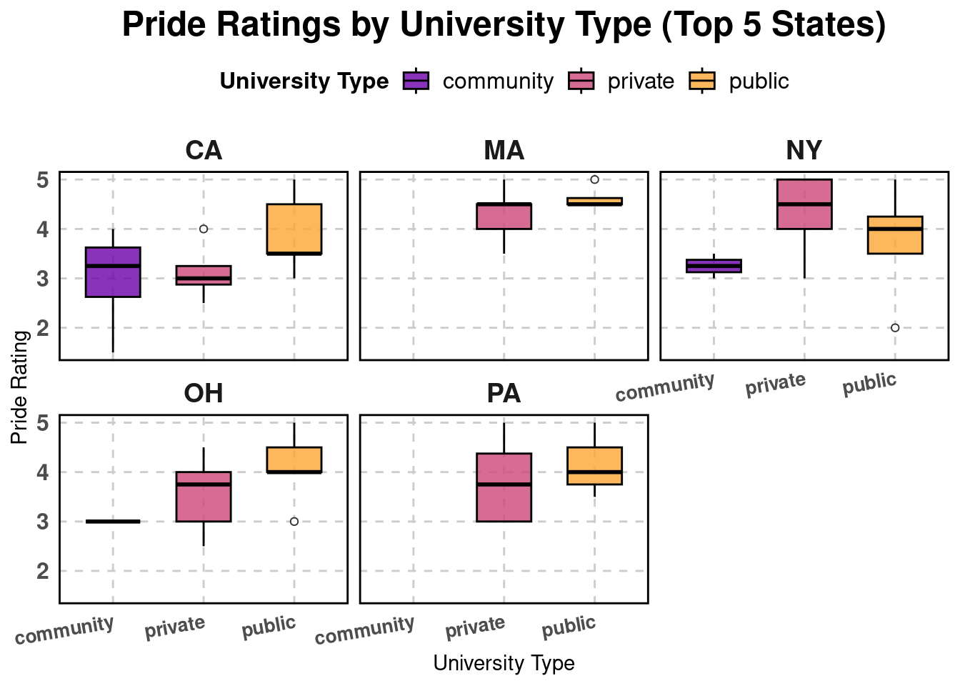
For a more detailed analysis, we used boxplots to compare the distribution of Pride Ratings across public, private, and community colleges in the five states with the highest number of universities: California, Massachusetts, New York, Ohio, and Pennsylvania. These states were selected based on data availability. Faceting by state allows us to see whether certain types of universities consistently receive higher or lower Pride Ratings across multiple states or if the trends vary by region. For example, if private universities tend to have higher ratings across all five states, it may suggest institutional policies or funding play a role in LGBTQ+ inclusivity. If the trends differ by state, local policies and cultural attitudes may have a greater influence.
Analysis
# plot 3# load US state map dataus_map <-map_data("state")# Extract state, join state names, and compute median ratingsdf <- df |>mutate(state =str_sub(campus_location, -2, -1)) |>left_join(data.frame(state = state.abb, state_lower =tolower(state.name)), by ="state" ) |>group_by(state_lower) |>summarise(avg_rating =median(rating, na.rm =TRUE), .groups ="drop")# Merge ratings with US map dataus_map <- us_map |>left_join(df, by =c("region"="state_lower"))ggplot(us_map, aes(x = long, y = lat, group = group, fill = avg_rating)) +geom_polygon(color ="white") +scale_fill_gradient(low ="black", high ="turquoise", na.value ="gray90") +coord_quickmap() +theme_minimal() +labs(title ="Median Pride Ratings by State", fill ="Median Rating") +theme(legend.position ="right",plot.title =element_text(hjust =0.3, size =14, face ="bold"),panel.grid =element_blank(), axis.title =element_blank(), axis.text =element_blank(), axis.ticks =element_blank(), panel.background =element_blank() )
# plot 4# Join data sets on campus_namedf_merged <- df_index |>inner_join(df_tags_mod, by ="campus_name")# State abbreviationdf_merged <- df_merged|>mutate(state =str_extract(campus_location,",\\s*([A-Z]{2})$") |>str_remove(",\\s*"))# Number of universities per statestate_counts <- df_merged |>count(state, sort =TRUE) # Top 5 states with most universitiestop_states <- state_counts|>top_n(5, n) |>pull(state)df_filtered <- df_merged |>filter(state %in% top_states)# Box Plotggplot(df_filtered, aes(x = university_type, y = rating, fill = university_type)) +geom_boxplot(outlier.shape =21, outlier.fill ="white", outlier.color ="black", color ="black",alpha =0.8, width =0.6) +facet_wrap(~ state, scales ="fixed") +scale_fill_viridis_d(option ="C", begin =0.2, end =0.8) +labs(title ="Pride Ratings by University Type (Top 5 States)",x ="University Type",y ="Pride Rating",fill ="University Type") +theme_minimal() +theme(axis.text.x =element_text(angle =10, hjust =1, size =10, face ="bold"), axis.text.y =element_text(size =12, face ="bold"), strip.text =element_text(size =14, face ="bold"), legend.position ="top", legend.title =element_text(size =12, face ="bold"), legend.text =element_text(size =12), plot.title =element_text(size =18, face ="bold", hjust =0.5), panel.grid.major =element_line(color ="grey80", linetype ="dashed"), panel.grid.minor =element_blank(),panel.border =element_rect(color ="black", fill =NA, linewidth =1))
Discussion
The map revealed that Indiana, Minnesota, and Vermont had the highest median Pride Ratings among all states, which was somewhat unexpected. We chose to use the median instead of the mean to minimize the impact of outliers. However, in cases where a state has only one university in the dataset, such as Vermont, its single high rating (5.0 for the University of Vermont) inflated the overall score. This may not reflect the broader reality of the entire state but highlights the limitations of having a small sample size and the nature of survey-based data. Indiana’s strong performance comes from institutions like Indiana University Bloomington and Purdue University, both scoring 5.0, while Earlham College scored 4.5, resulting in a high median rating. Minnesota also had two universities with 5.0 ratings and one with 4.0, placing it third overall. Meanwhile, states commonly regarded as very LGBTQ+ friendly, such as California, have more universities with slightly lower ratings, which reduces their median scores and causes them not to perform as well overall.
The box plots show clear differences in Pride Ratings across public universities, private universities, and community colleges in the top five states with the most universities. The data reveals that while public universities show high variability, their median ratings remain comparable to those of private universities. In some states, public universities even have slightly higher medians than private ones, challenging the assumption that private institutions always lead in LGBTQ+ inclusivity. Public universities’ greater variability in Pride Ratings could be a result of differences in inclusivity efforts across institutions, state policies, funding differences, or regional attitudes toward LGBTQ+ rights, as public institutions often operate under state governance. While private universities may have more uniform policies or resources dedicated to LGBTQ+ inclusivity, possibly due to institutional autonomy, targeted recruitment efforts, or a strong emphasis on diversity initiatives, their overall advantage in median ratings is not universal across all states.
Community colleges generally tend to have lower Pride Ratings, likely due to shorter student tenure, fewer campus resources, or different institutional priorities. The presence of high-scoring outliers, however, suggests that some community colleges do prioritize LGBTQ+ inclusivity, indicating that strong policies and support structures can exist regardless of institutional type.
Campus Pride (2024). Campus Pride Index: LGBTQ+ Inclusivity Ratings for U.S. Colleges & Universities. Campus Pride Organization. Retrieved February 10, 2025, from https://campusprideindex.org/