── Attaching core tidyverse packages ──────────────────────── tidyverse 2.0.0 ──
✔ dplyr     1.1.4     ✔ readr     2.1.5
✔ forcats   1.0.0     ✔ stringr   1.5.1
✔ ggplot2   3.5.1     ✔ tibble    3.2.1
✔ lubridate 1.9.4     ✔ tidyr     1.3.1
✔ purrr     1.0.4
── Conflicts ────────────────────────────────────────── tidyverse_conflicts() ──
✖ dplyr::filter() masks stats::filter()
✖ dplyr::lag()    masks stats::lag()
ℹ Use the conflicted package (<http://conflicted.r-lib.org/>) to force all conflicts to become errorsOlympic Trends
Introduction
The dataset that we are using for our project contains information about every Olympics starting from 1896 in Athens, to the 2016 Olympics in Rio. It contains basic bio data for each athlete, containing information such as Name, Sex, Age, Height, Weight, Nation, and much more. However, some athletes may be missing information on height, weight, medal status, and other columns due to some of these statistics not being recorded in the early Olympic games. The dataset contains both Summer and Winter Olympic data, and every row represents an “athlete-event”. This is considered an individual athlete that is competing in a specific Olympic event.
We chose this dataset because we all have interest in the Olympic games. As passionate fans of both Olympic games, we wanted to explore potential trends that exist since the start of the Olympic games in 1896 to recent Olympic games. It was helpful that the dataset contains 120 years of information, allowing us to analyze long-term trends and possible changes over the length of the Olympic games. Additionally, it contains lots of information on every athlete and the specific event that they were competing in, helping us think of various questions about athletes, their performance, and other factors that can influence the results of the games. Ultimately, we all felt that the dataset lined up with our interests, and we could think of interesting questions that would be answered by the dataset.
Question 1 Olympic Gender Representation Over Time
Introduction
The question that we wanted to evaluate highlights the change in gender representation in various Olympic sports over time, and what specific factors or milestones could have influenced this gender diversity shift. For this question, we decided to narrow down 10 specific events because they represented a diverse mix of individual and team events. In addition to this selection of events, we need to extract the Sex, Year, Sport, and Event variables from the dataset. Through extracting the total number of female and male athletes every Olympics, it can help us tell a story about how gender representation has changed over time. We are interested in this question because as fans of the Olympics, we wanted to see when there was a gender diversity shift in Olympic history.
Approach
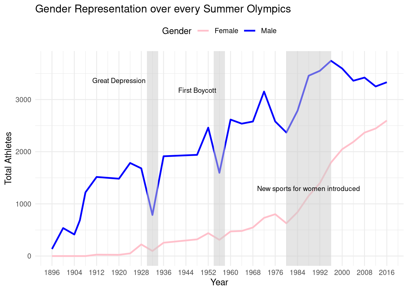
The first plot that we are going to make to answer this question is a line chart that shows the change in total male and female athletes over the course of the Olympic games. By plotting these trendlines on the same graph, the viewer will be able to easily see trends in gender diversity, and if the gap has increased or decreased over time. Also on this chart, we plan on highlighting certain time periods where a specific event or milestone could have impacted the shift in gender diversity. Through the combination of both lines and highlighting certain time periods, it easily visualizes a potential answer to our question.
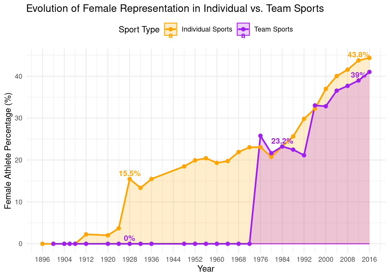
The second plot that we are going to make is a line graph that visualizes the evolution of female representation in individual sports compared to team sports. Our visualization compares the percentage of female athletes in team sports and individual sports, and gives the specific percentage next to important points. By graphing both lines together and displaying the percentages, viewers can easily see the evolution of female representation, and analyze how it was different in individual and team sports.
Analysis
Discussion
Based on our line plot graphing the total number of male and female athletes over time, we can conclude that female representation has greatly increased since 1896, while male representation has increased overall, but has fluctuated. We can also explain certain increases or decreases in representation, due to historical events. There was a general decrease during the Great Depression, the 1956 Olympic boycott, but a drastic increase when new sports for women were introduced. Overall, we can conclude that since the first Olympic games in 1896, the games have drastically become more inclusive over time, specifically with more opportunities for female athletes.
Based on our second visualization, our main takeaway is that female representation increased much sooner in individual sports compared to team sports. This is mainly due to the late addition of women’s team sports in the Olympic games, causing the late spike compared to individual sports. Overall, female representation in both individual and team sports has increased significantly over time, but at different rates. The earlier inclusion of women in individual sports paved the way for the inclusion of women’s team sports, explaining the general increase in women participation over time.
Question 2 Olympic Medal Success Rates by Country
Introduction
The question we decided to evaluate is “does a country’s economic wealth (GDP per capita) influence its Olympic medal efficiency (percentage of athletes who win medals)?” The question we wanted to evaluate focuses on the Olympic medal efficiencies of various countries and subsequently how their economic conditions can affect that success rate. We want to first examine what the absolute number of medals each country has won is and then look at their medal efficiency and GDP per capita to understand whether there is a connection. We chose to focus on countries with significant Olympic history: the USA, the former Soviet Union, Germany, France, China, Italy, Australia, Hungary, Sweden, and Japan. The data set included data on how many medals each athlete has won as well as their country of origin. We also created a tibble to integrate each of the country’s GDP/capita to better understand whether there is a correlation between how economic factors can influence performance as these countries would likely have a higher budget for research and technological improvements. We were interested in this question as we wanted to know whether, similar to other sports that have now implemented a spending cap, higher spending would generally yield higher results.
Approach
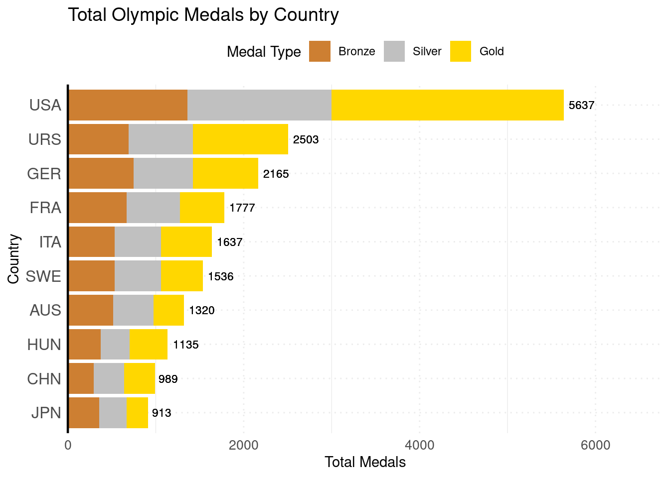
To tackle our question, we decided to use two different plots. First, we are thinking of including a bar plot that highlights how many medals each country has won, divided into what types of medals (bronze, silver, or gold) each one has won. By using a stacked format, we can easily observe which country has won the most medals over time and how the proportion of gold, silver, and bronze medals vary across countries. We also decided to display the total number of medals each country has to better communicate the exact medal counts.
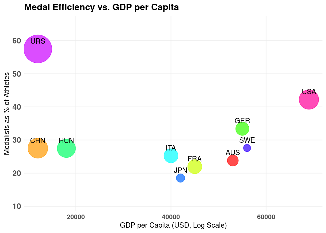
Our second plot would be a scatter plot which would investigate the relationship between a country’s GDP per capita and their medal efficiency. The plot would illustrate the percentage of medalists out of their athletes and the GDP per capita and the size of the bubbles will be indicative of the number of medals per capita. This will help us determine whether a country’s economic prowess may be correlated with their Olympics performance. We felt that a scatter plot would be most appropriate as we will be displaying two continuous variables, we’re able to manipulate the bubble size, and we can quickly identify outliers and trends.
Analysis
(2-3 code blocks, 2 figures, text/code comments as needed) In this section, provide the code that generates your plots. Use scale functions to provide nice axis labels and guides. You are welcome to use theme functions to customize the appearance of your plot, but you are not required to do so. All plots must be made with ggplot2. Do not use base R or lattice plotting functions.
Discussion
Looking at the stacked bar plot, we were able to gain more insight into the distribution of various medal types. The stacked bar chart provides a clear comparison of how various countries have historically performed in the Olympics in terms of their total medal counts and for each bronze, silver, and gold medal the countries have won over time. In particular, we noted that the USA had by far the highest number of medals and the highest number of gold medals. In fact, they have more gold medals than the next closest country has in total models. It also indicated that most countries had a fairly even split between the three types of models whereas the USA clearly showed out of all their medals, they have the most gold medals. Similarly, the URS also seems to have a higher amount of gold medals relative to the other medals they have won. These higher proportions of winning gold medals can be due to factors such as how the USR has a more systemic approach to Olympic success due to their highly selective government sports programs. The USA’s sustained dominance in Olympic history is likely influenced by factors such as strong investment in athletics, a large talent pool, and their competitive sports culture.
Looking at the scatter plot, we can see that countries with a higher GDP per capita do not necessarily have increased medal efficiency as the line forms a parabola. For instance, the USA, despite having a higher GDP per capita, does not have a higher medal efficiency than the Soviet Union. Similarly, Australia, Japan and France have lower medal efficiencies than countries like China or Hungary that have lower GDP per capita. However, when looking exclusively at first world countries, there is an upward trend between GDP per capita and medalists as a percentage of athletes. The medals per capita also help to contextualize some of the findings from the first graph as USA’s wins are no longer as skewed. Ultimately, we can conclude that overall economic factors and conditions measured by GDP per capita may be one of the contributing factors to Olympic success. After additional research, we have come to determine that early government training programs for athletes and financial incentives to win could also play a highly important role in a country’s success at the Olympics.
Presentation
Our presentation can be found here.
Data
Heesoo37. (2025). 120 Years of Olympic History: Athletes and Results. Kaggle. Retrieved March 5, 2025, from https://www.kaggle.com/datasets/heesoo37/120-years-of-olympic-history-athletes-and-results
References
- https://www.kaggle.com/datasets/heesoo37/120-years-of-olympic-history-athletes-and-results
- https://quarto.org/docs/presentations/revealjs/#code-block-height
- https://blogs.bu.edu/guidedhistory/russia-and-its-empires/tyler-benson/#:~:text=Even%20though%20the%20Soviet%20Union,programs%20initiated%20by%20the%20government.
- https://data.worldbank.org/indicator/NY.GDP.PCAP.CD