── Attaching core tidyverse packages ──────────────────────── tidyverse 2.0.0 ──
✔ dplyr     1.1.4     ✔ readr     2.1.6
✔ forcats   1.0.1     ✔ stringr   1.6.0
✔ ggplot2   4.0.1     ✔ tibble    3.3.0
✔ lubridate 1.9.4     ✔ tidyr     1.3.2
✔ purrr     1.1.0
── Conflicts ────────────────────────────────────────── tidyverse_conflicts() ──
✖ dplyr::filter() masks stats::filter()
✖ dplyr::lag()    masks stats::lag()
ℹ Use the conflicted package (<http://conflicted.r-lib.org/>) to force all conflicts to become errors

Attaching package: 'scales'


The following object is masked from 'package:purrr':

    discard


The following object is masked from 'package:readr':

col_factorProject title
Rows: 36121 Columns: 8
── Column specification ────────────────────────────────────────────────────────
Delimiter: ","
chr  (5): source, report, title, available_globally, runtime
dbl  (2): hours_viewed, views
date (1): release_date

ℹ Use `spec()` to retrieve the full column specification for this data.
ℹ Specify the column types or set `show_col_types = FALSE` to quiet this message.
Rows: 27803 Columns: 8
── Column specification ────────────────────────────────────────────────────────
Delimiter: ","
chr  (5): source, report, title, available_globally, runtime
dbl  (2): hours_viewed, views
date (1): release_date

ℹ Use `spec()` to retrieve the full column specification for this data.
ℹ Specify the column types or set `show_col_types = FALSE` to quiet this message.
Introduction
Netflix regularly publishes engagement reports that reveal how much time subscribers spend watching each title on the platform. This project draws on a cleaned version of that dataset, available through the TidyTuesday repository, which organizes the original Excel files from the Netflix newsroom into two structured tables. One table is for movies and one is for television shows. Each row captures a title’s performance during a half-year reporting window, with key variables including total hours viewed, runtime, number of views calculated as hours viewed divided by runtime, release date, whether or not the title was available globally, and a report period identifier. Because the data spans multiple reporting periods, the same title can appear more than once, making it possible to track how viewership evolves over time.
We chose this dataset because it measures actual audience behavior, rather than subjective ratings or editorial rankings, meaning it offers a more direct look at what content captures and sustains attention on a major global streaming platform. The dataset’s structure also has a distinction between moves and shows, multiple reporting windows, release dates, and global availability flags, which is well suited to the two questions we decided to investigate. First, do movies or shows released in winter/summer get more views than those released in spring/fall, and second, whether globally available content consistently outperforms regionally restricted titles and how that gap has changed across reporting periods.
Question 1: Do movies or shows released in winter/summer get more views than those released in spring/fall?
Introduction
This analysis explores how the timing of a title’s release relates to viewership engagement on Netflix, specifically asking whether movies and shows released during certain months or seasons accumulate more views than those released at other times of year. To answer this, we draw on the release_date and views columns from both the movies and shows datasets, combining them into a single table and deriving two new variables: release_month and season. The views variable, calculated as total hours viewed divided by runtime, serves as our measure of engagement since it accounts for the fact that shows are naturally longer than movies and gives a fairer comparison across both content types. This question is interesting because the entertainment industry has long operated on the assumption that release timing is everything, with studios fighting over summer slots and holiday windows for their biggest titles, yet it is not obvious whether that same logic applies to a streaming platform like Netflix where content is available on demand year round and the recommendation algorithm can surface any title at any time regardless of when it came out. By looking at real engagement data across four reporting periods from 2023 to 2025, we can test whether those seasonal patterns actually show up in the numbers or whether Netflix has effectively flattened the playing field for all release windows.
Approach
To explore how the timing of a title’s release relates to viewership engagement, the first visualization will be a bar chart showing average views for each of the 12 release months on the x-axis, with bars color-mapped by season (Spring, Summer, Fall, Winter). A bar chart is the most appropriate choice here because the goal is to compare a single summary statistic, average views, across discrete, ordered categories (months). The color mapping by season adds a second layer of information without cluttering the plot, allowing the viewer to immediately see not just which individual months perform best but whether entire seasons tend to cluster toward higher or lower engagement.
The second visualization will be a box plot with release season on the x-axis and log-transformed views on the y-axis, faceted by content type (Movies vs. Shows). While the bar chart answers which months and seasons have the highest average views, the box plot reveals the full spread and consistency of viewership within each season, showing whether high-performing seasons produce reliably high engagement across all titles or whether the average is driven by a handful of outliers. Faceting by content type directly addresses the second half of the research question: whether the seasonal pattern holds equally for movies and shows, or whether one content type is more sensitive to release timing than the other.
Analysis
(2-3 code blocks, 2 figures, text/code comments as needed) In this section, provide the code that generates your plots. Use scale functions to provide nice axis labels and guides. You are welcome to use theme functions to customize the appearance of your plot, but you are not required to do so. All plots must be made with {ggplot2}. Do not use base R or {lattice} plotting functions.
netflix <- bind_rows(
  movies |> mutate(content_type = "Movie"),
  shows  |> mutate(content_type = "Show")
) |>
  mutate(
    report_date = case_when(
      report == "2023Jul-Dec" ~ as.Date("2023-12-31"),
      report == "2024Jan-Jun" ~ as.Date("2024-06-30"),
      report == "2024Jul-Dec" ~ as.Date("2024-12-31"),
      report == "2025Jan-Jun" ~ as.Date("2025-06-30")
    ),
    release_month = month(release_date, label = TRUE, abbr = TRUE),
    release_month_num = month(release_date),
    season = factor(case_when(
      release_month_num %in% c(12, 1, 2)  ~ "Winter",
      release_month_num %in% c(3, 4, 5)   ~ "Spring",
      release_month_num %in% c(6, 7, 8)   ~ "Summer",
      release_month_num %in% c(9, 10, 11) ~ "Fall"
    ), levels = c("Spring", "Summer", "Fall", "Winter"))
  ) |>
  filter(!is.na(views), !is.na(season), !is.na(release_month))

# added report label column for quesrtion 2 analysis
netflix <- netflix |>
  mutate(
    report_label = case_when(
      report == "2023Jul-Dec" ~ "Jul–Dec 2023",
      report == "2024Jan-Jun" ~ "Jan–Jun 2024",
      report == "2024Jul-Dec" ~ "Jul–Dec 2024",
      report == "2025Jan-Jun" ~ "Jan–Jun 2025"
    )
  )

netflix <- netflix |>
  filter(!is.na(hours_viewed), !is.na(available_globally)) |>
  mutate(
    available_globally = factor(
      available_globally,
      levels = c("Yes", "No"),
      labels = c("Global", "Regional")
    ),
    report_label = case_when(
      report == "2023Jul-Dec" ~ "Jul–Dec 2023",
      report == "2024Jan-Jun" ~ "Jan–Jun 2024",
      report == "2024Jul-Dec" ~ "Jul–Dec 2024",
      report == "2025Jan-Jun" ~ "Jan–Jun 2025"
    )
  )

# Loading data in to csv for future use on presentation.qmd
write.csv(netflix, file = "data/netflix_q1.csv", row.names = FALSE)
netflix_monthly <- netflix |>
group_by(release_month, release_month_num, season) |>
summarise(avg_views = mean(views, na.rm = TRUE), .groups = "drop") |>
# Make sure months are ordered Jan–Dec on x-axis
arrange(release_month_num) |>
mutate(release_month = fct_reorder(release_month, release_month_num))
ggplot(netflix_monthly, aes(x = release_month, y = avg_views, fill = season)) +
geom_col(alpha = 0.85, width = 0.7) +
scale_x_discrete(
name = "Release Month"
) +
scale_y_continuous(
name = "Average Views",
labels = scales::label_number(scale = 1e-6, suffix = "M")
) +
scale_fill_manual(
name = "Season",
values = c(
"Spring" = "#009E73",
"Summer" = "#E69F00",
"Fall" = "#D55E00",
"Winter" = "#0072B2"
)
) +
labs(
title = "Which Release Month Drives the Most Netflix Views?",
subtitle = "Average views per release month, colored by season (2023–2025)"
) +
theme_minimal() +
theme(
legend.position = "bottom",
axis.text.x = element_text(size = 10)
)
# Loading data in to csv for future use on presentation.qmd
write.csv(netflix_monthly, file = "data/netflix_monthly.csv", row.names = FALSE)ggplot(netflix, aes(x = season, y = log10(views), fill = season)) +
geom_boxplot(alpha = 0.7, outlier.size = 0.8, outlier.alpha = 0.3) +
facet_wrap(~ content_type) +
scale_x_discrete(
name = "Release Season"
) +
scale_y_continuous(
name = "Views (log10 scale)",
labels = scales::label_log()
) +
scale_fill_manual(
name = "Season",
values = c(
"Summer" = "#E69F00",
"Winter" = "#0072B2"
)
) +
labs(
title = "Does Release Season Affect Netflix Viewership?",
subtitle = "Views distribution by season for Movies and Shows (2023–2025)"
) +
theme_minimal() +
theme(
strip.text = element_text(face = "bold", size = 11),
legend.position = "none" # redundant with x-axis labels
)
Discussion
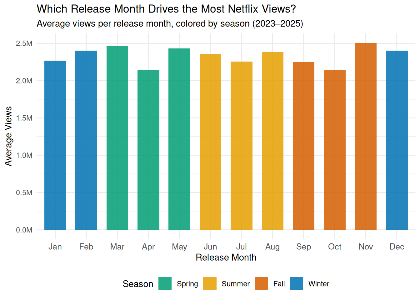
Looking at the bar chart, the first thing that stands out is how similar the bars are across all 12 months. Average views sit pretty consistently between 2.1M and 2.5M no matter when a title was released, which is honestly a bit surprising. If anything, you might expect a big spike in December or summer, but the data does not really show that. November is the one exception where views creep a little higher, which makes sense given that people tend to be home more during the holidays and are actively looking for something to watch. March and May also trend slightly above the rest, though the differences are small enough that it is hard to draw strong conclusions from them alone. Overall the bar chart suggests that when a title is released may not matter as much as we would expect.
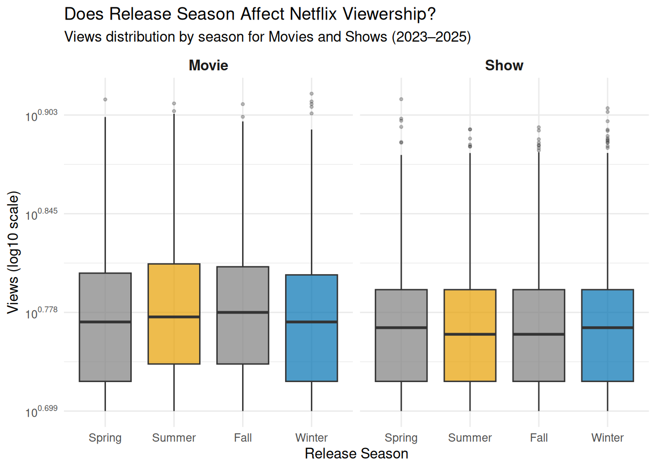
The box plot helps explain why that might be the case. While the averages are all fairly similar, Summer and Winter both show wider boxes compared to Spring and Fall, meaning those seasons have more variability in viewership. In other words, the big seasons do produce some massive hits, but they also produce plenty of titles that nobody watches. This kind of winner takes all pattern is pretty typical of the entertainment industry, where a few blockbusters carry the whole season while everything else gets buried. Spring and Fall on the other hand seem to produce more consistently mid-range performers, with fewer extreme highs and lows.
What is also interesting is that Movies and Shows follow nearly the same seasonal pattern in the box plot. There is very little difference between the two panels, which suggests Netflix is not really staggering its release strategy between the two formats. Both content types seem to rise and fall together with the seasons, which could mean that external factors like subscriber viewing habits and time of year matter more than the type of content being released.
Question 2: Does globally available content consistently outperform regionally restricted titles, and has that gap changed across reporting periods?
Introduction
Although Netflix operates in over 190 countries, not every title on the platform is available to all of its subscribers. Licensing agreements, regional regulations, and distribution strategies mean that some content becomes restricted to specific markets while other titles are released globally. This distinction brings up the question of whether or not making content viable worldwide translates into substantially higher engagement and whether or not that advantage is consistent over time. We became interested in this question because of how it speaks to the real-world impact of distribution strategy on viewership performance. For example, if globally available titles consistently dominated in hours viewed, it could suggest that broad reach is a powerful driver of engagement. On the other hand, if regionally restricted content sometimes competed with or narrowed the gap against global releases, it could point to the strength of locally targeted programming or shifting audience behavior across reporting periods.
To answer this question, we relied on the available_globally variable, which indicated whether or not a title was accessible to all Netflix subscribers or limited to certain regions, along with hours_viewed as our primary measure of engagement and report_period to track how the relationship evolves across the four half-year reporting windows. As with Question 1, we will add a content_type column to distinguish movies from shows before combining the two tables, and we will compute log_hours_viewed to handle the heavy right skew in the viewership data. We also plan to recode report_period as an ordered factor so that visualizations display the reporting windows chronologically. No external data is needed for this question since the variables already present in the dataset, once combined and transformed, provide all the information necessary to compare the distributions of viewership between global and regional titles and to examine whether or not that gap has widened, narrowed, or remained stable over time.
Approach
(1-2 paragraphs) Describe what types of plots you are going to make to address your question. For each plot, provide a clear explanation as to why this plot (e.g. boxplot, barplot, histogram, etc.) is best for providing the information you are asking about. The two plots should be of different types, and at least one of the two plots needs to use either color mapping or facets.
The first plot is a faceted violin + box plot. Violin plots are helpful here because viewership data is heavily right-skewed; a simple bar chart of means would be misleading, while the violin reveals the full shape of each distribution, which helps identify whether one group has a longer upper tail of breakout hits. The embedded boxplot adds precise summary statistics (median, IQR) on top of the distributional shape. Faceting by both reporting period and content type (Movies vs. Shows) also allows us to see whether the global advantage is consistent across time and content category simultaneously. Log10 transformation on the y-axis is applied to make the heavily skewed distributions interpretable, and color is used throughout the graph and mapped to the content’s overall availability.
The second plot is a faceted line + ribbon plot. While the violin plot shows overall distributions, this plot focuses specifically on the trend in the gap over time. By using median viewership data, it makes it easy to follow and understand temporal trends, and the shaded ribbon explicitly encodes the size of the gap between global and regional medians at each period. Faceting by content type (free y-scales) separates Movies and Shows, which operate at very different viewership magnitudes. Also, annotating the delta in the final reporting period helps emphasize the exact, numerical difference.
Analysis
(2-3 code blocks, 2 figures, text/code comments as needed) In this section, provide the code that generates your plots. Use scale functions to provide nice axis labels and guides. You are welcome to use theme functions to customize the appearance of your plot, but you are not required to do so. All plots must be made with {ggplot2}. Do not use base R or {lattice} plotting functions.
#Set up data and make color themes

# add available_globally as a factor to already created netflix
netflix |>
  filter(!is.na(hours_viewed), !is.na(available_globally)) |>
  mutate(
    available_globally = factor(
      available_globally,
      levels = c("Yes", "No"),
      labels = c("Global", "Regional")
    )
  )
# A tibble: 20,495 × 14
source report title available_globally release_date hours_viewed runtime
<chr> <chr> <chr> <fct> <date> <dbl> <chr>
1 1_What_We_… 2025J… Back… <NA> 2025-01-17 313000000 1H 54M…
2 1_What_We_… 2025J… STRAW <NA> 2025-06-06 185200000 1H 48M…
3 1_What_We_… 2025J… The … <NA> 2025-03-28 198900000 2H 5M …
4 1_What_We_… 2025J… Exte… <NA> 2025-04-30 159000000 1H 49M…
5 1_What_We_… 2025J… Havoc <NA> 2025-04-25 154900000 1H 47M…
6 1_What_We_… 2025J… The … <NA> 2025-03-14 158200000 2H 8M …
7 1_What_We_… 2025J… Coun… <NA> 2025-02-28 101000000 1H 25M…
8 1_What_We_… 2025J… Ad V… <NA> 2025-01-10 114000000 1H 38M…
9 1_What_We_… 2025J… Kind… <NA> 2025-02-05 98100000 1H 40M…
10 1_What_We_… 2025J… Nonn… <NA> 2025-05-09 109500000 1H 54M…
# ℹ 20,485 more rows
# ℹ 7 more variables: views <dbl>, content_type <chr>, report_date <date>,
# release_month <ord>, release_month_num <dbl>, season <fct>,
# report_label <chr># use theme_beautiful as a base
theme_beautiful <- function() {
theme_minimal(base_size = 13) +
theme(
panel.grid.minor = element_blank(),
plot.title = element_text(
family = "serif",
size = 16,
color = "#1A1A2E",
face = "bold",
hjust = 0,
margin = margin(b = 4)
),
plot.subtitle = element_text(
family = "serif",
size = 11,
color = "#4A4A6A",
hjust = 0,
margin = margin(b = 12)
),
plot.caption = element_text(
family = "serif",
size = 9,
color = "#9A9AB0",
hjust = 1,
margin = margin(t = 10)
),
axis.title = element_text(
family = "serif",
size = 11,
color = "#3A3A5A",
face = "italic"
),
axis.text = element_text(
family = "serif",
size = 10,
color = "#5A5A7A"
),
axis.line = element_line(color = "#C0C0D0", linewidth = 0.4),
axis.ticks = element_line(color = "#C0C0D0", linewidth = 0.4),
legend.position = "bottom",
legend.direction = "horizontal",
legend.box = "horizontal",
legend.margin = margin(t = 10, b = 10),
legend.background = element_rect(color = "#E0E0E0", linewidth = 0.4),
legend.key = element_rect(fill = NA),
legend.title = element_text(
family = "serif",
size = 10,
color = "#1A1A2E",
face = "bold"
),
legend.text = element_text(
family = "serif",
size = 10,
color = "#3A3A5A"
),
plot.margin = margin(20, 20, 12, 12)
)
}
# Color palette — global blue, regional orange (matching HW palette)
availability_colors <- c("Global" = "#4A7FB5", "Regional" = "#E07B39")
availability_fills <- c("Global" = "#4A7FB5", "Regional" = "#E07B39")# Plot 1: Faceted Violin + Box Plot
# Shows distribution of log(hours_viewed) by availability, faceted by report period and content type
plot1 <- ggplot(
data = netflix,
mapping = aes(
x = available_globally,
y = log10(hours_viewed),
fill = available_globally,
color = available_globally
)
) +
geom_violin(alpha = 0.35, linewidth = 0.4, trim = TRUE) +
geom_boxplot(
width = 0.18,
outlier.alpha = 0.08,
outlier.size = 0.6,
linewidth = 0.4,
# Override fill to white so box is readable inside violin
fill = "white",
color = NA
) +
geom_boxplot(
width = 0.18,
outlier.shape = NA,
linewidth = 0.4,
fill = NA
) +
# Median dot on top
stat_summary(
fun = median,
geom = "point",
size = 2.5,
shape = 21,
fill = "white",
stroke = 1.2
) +
facet_grid(content_type ~ report_label) +
scale_y_continuous(
name = "Hours Viewed (log\u2081\u2080 scale)",
labels = label_number(suffix = "", accuracy = 1),
breaks = seq(4, 9, by = 1)
) +
scale_fill_manual(values = availability_fills) +
scale_color_manual(values = availability_colors) +
labs(
title = "Global vs. Regional Content Viewership Distributions",
subtitle = "Log\u2081\u2080-transformed hours viewed by availability status, reporting period, and content type",
x = "Availability",
fill = "Availability",
color = "Availability",
caption = "Source: Netflix Engagement Reports 2023–2025 via TidyTuesday"
) +
theme_beautiful() +
theme(
strip.text = element_text(
family = "serif",
size = 11,
face = "bold",
color = "#1A1A2E"
),
panel.spacing = unit(1, "lines"),
# Remove redundant x-axis text since fill/color legend handles it
axis.text.x = element_text(size = 9)
)
plot1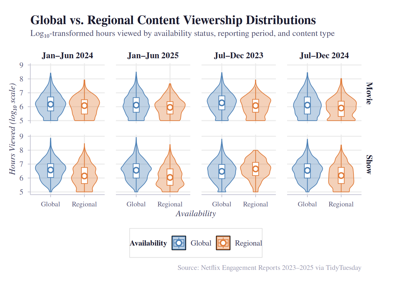
# Plot 2: Median Gap Over Time (line + ribbon)
# Summarizes median hours_viewed per group, then plots trend lines with a shaded ribbon showing the gap between global and regional

# Summarize medians
median_summary <- netflix |>
  group_by(report_label, available_globally, content_type) |>
  summarise(
    median_hours = median(hours_viewed, na.rm = TRUE),
    .groups = "drop"
  )

# Pivot wider to compute gap for ribbon
gap_df <- median_summary |>
  pivot_wider(
    names_from = available_globally,
    values_from = median_hours
  ) |>
  # In case some periods have no Regional titles, keep NAs explicit
  mutate(gap = Global - Regional)

plot2 <- ggplot() +
  # Shaded ribbon showing the gap between global and regional medians
  geom_ribbon(
    data = gap_df,
    mapping = aes(
      x = report_label,
      ymin = Regional,
      ymax = Global,
      group = content_type
    ),
    fill = "#4A7FB5",
    alpha = 0.12
  ) +
  # Lines connecting medians over time
  geom_line(
    data = median_summary,
    mapping = aes(
      x = report_label,
      y = median_hours,
      color = available_globally,
      group = available_globally
    ),
    linewidth = 1
  ) +
  # Points at each period
  geom_point(
    data = median_summary,
    mapping = aes(
      x = report_label,
      y = median_hours,
      color = available_globally,
      fill = available_globally
    ),
    size = 3,
    shape = 21,
    color = "white",
    stroke = 1.5
  ) +
  # Gap annotation label on the last period
  geom_text(
    data = gap_df |> filter(report_label == "Jan–Jun 2025"),
    mapping = aes(
      x = report_label,
      y = (Global + Regional) / 2,
      label = paste0("+", label_number(scale_cut = cut_short_scale())(gap))
    ),
    family = "serif",
    size = 3.2,
    color = "#3A3A5A",
    hjust = -0.15
  ) +
  facet_wrap(~content_type, ncol = 1, scales = "free_y") +
  scale_y_continuous(
    labels = label_number(scale_cut = cut_short_scale()),
    expand = expansion(mult = c(0.05, 0.15)) # extra room for gap labels
  ) +
  scale_color_manual(values = availability_colors) +
  scale_fill_manual(values = availability_fills) +
  labs(
    title = "Has the Global–Regional Viewership Gap Changed Over Time?",
    subtitle = "Median hours viewed for globally vs. regionally available titles across reporting periods",
    x = "Reporting Period",
    y = "Median Hours Viewed",
    color = "Availability",
    fill = "Availability",
    caption = "Source: Netflix Engagement Reports 2023–2025 via TidyTuesday"
  ) +
  theme_beautiful() +
  theme(
    strip.text = element_text(
      family = "serif",
      size = 11,
      face = "bold",
      color = "#1A1A2E"
    ),
    panel.spacing = unit(1.5, "lines")
  )

plot2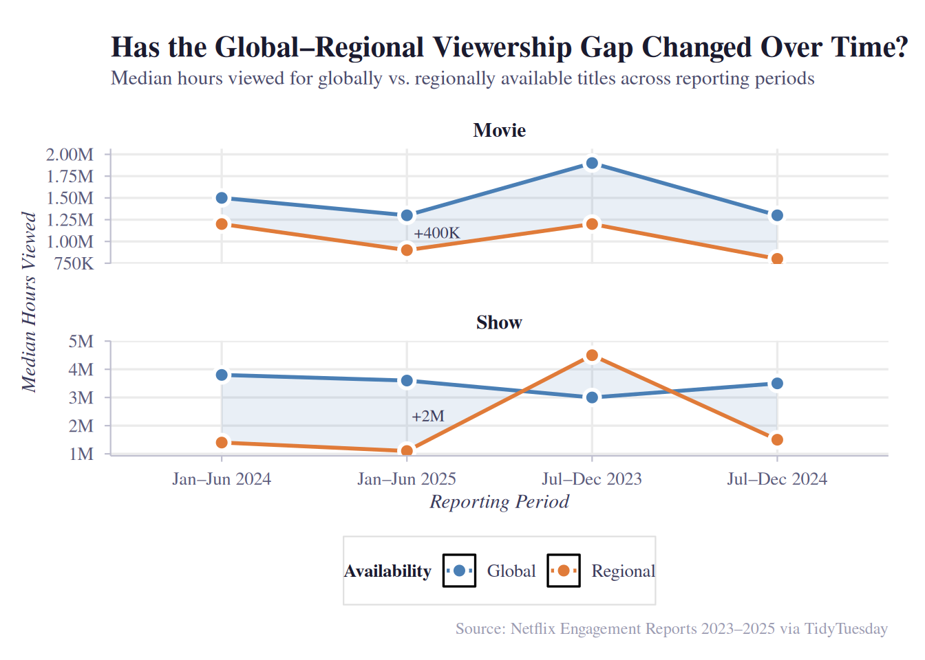
Discussion
(1-3 paragraphs) In the Discussion section, interpret the results of your analysis. Identify any trends revealed (or not revealed) by the plots. Speculate about why the data looks the way it does.
Both plots show that globally available content has substantially higher viewership than regionally restricted titles across all four reporting periods and both content types. In the violin plots, the global distribution is shifted noticeably upward in evert period, with a higher median and a longer upper tail. For Shows, the distributions are closer together on the log scale, suggesting the global advantage is relatively smaller in proportional terms for shows than for movies.
The line plot reveals how the gap has evolved over time. For Movies, the gap narrows somewhat from H2 2023 to H1 2025 — global median viewership declines while regional viewership stays relatively flat — yet a +600K hour gap persists in the most recent period. For Shows, the gap remains large and stable around +2M hours throughout, with both lines moving roughly in parallel. This suggests that globally available shows have a strong advantage during this specific observed period.
A key caveat is that global vs. regional availability is not randomly assigned. Netflix likely designates its highest-investment, most broadly appealing content for global release, meaning the viewership gap may partly reflect production budget and marketing spend rather than distribution reach alone. The regional titles that do appear in the data may be niche or culturally specific content designed for smaller audiences. This selection effect limits causal interpretation; we can say global titles are associated with higher viewership, but not that making a regional title global would cause its viewership to increase. # Presentation
Our presentation can be found here.
Data
Include a citation for your data here. See https://data.research.cornell.edu/data-management/storing-and-managing/data-citation/ for guidance on proper citation for datasets. If you got your data off the web, make sure to note the retrieval date.
References
Our data source for our data set was: https://github.com/rfordatascience/tidytuesday/blob/main/data/2025/2025-07-29/readme.md