# The five most represented genres in the dataset
top_genres <- c("Pop", "Rock", "Funk/Soul", "Electronic/Dance", "Hip Hop")

# Derive decade; unnest songs that span multiple genre tags so each
# genre–decade cell gets its own row; drop cells with < 3 songs to
# avoid unreliable decade-level means.
q1_data <- billboard |>
  mutate(
    decade = floor(year(as.Date(date)) / 10) * 10,
    genre = str_split(cdr_genre, ";")
  ) |>
  unnest(genre) |>
  filter(genre %in% top_genres) |>
  group_by(decade, genre) |>
  filter(n() >= 3) |>
  summarize(
    Energy = mean(energy, na.rm = TRUE),
    Danceability = mean(danceability, na.rm = TRUE),
    Acousticness = mean(acousticness, na.rm = TRUE),
    .groups = "drop"
  ) |>
  pivot_longer(
    cols = c(Energy, Danceability, Acousticness),
    names_to = "feature",
    values_to = "mean_value"
  ) |>
  # Set display order for facets
  mutate(
    feature = factor(
      feature,
      levels = c("Energy", "Danceability", "Acousticness")
    )
)The Changing Sound of Chart-Topping Music
Introduction
This project uses a TidyTuesday dataset that catalogs every song that reached #1 on the Billboard Hot 100, covering chart-topping hits from August 4, 1958 to January 11, 2025. Each row represents a unique #1 song instance with its chart peak date, and the dataset includes 1,177 songs across 105 variables. These variables describe chart performance (such as weeks_at_number_one), musical and audio characteristics (including bpm, energy, danceability, acousticness, loudness_d_b, and length_sec), and metadata about artists and production. Importantly, audio features like energy, danceability, and acousticness are derived from Spotify’s audio analysis algorithm and scored on a 0-100 scale, where higher values indicate greater presence of that quality. For acousticness specifically, a score near 100 reflects live instrumentation while a score near 0 reflects electronic production.
In addition to audio features, the dataset includes categorical descriptors such as genre (cdr_genre), artist structure (solo as opposed to group), and demographic indicators including variables about gender and race. A companion table (topics.csv, from the same TidyTuesday release) provides a reference list of lyrical topic categories used to tag songs thematically. Overall, this dataset is useful for studying how popular music changes over time and how those changes differ across genres and artist characteristics.
How have musical characteristics of #1 hits changed over time across genres?
Introduction
A common claim about pop music is that it has “changed” over time, becoming more danceable, more produced, louder, or less acoustic, but those shifts may not happen uniformly across genres. This question asks: do audio feature trends like energy, danceability, and acousticness move differently over time depending on genre? We find this question compelling because it helps separate broad industry-wide changes driven by production technology and streaming-era listening habits from genre-specific evolution, revealing whether the homogenization of pop music is a real phenomenon or a genre-specific illusion.
To answer this, we primarily need: - Time: date (and a derived decade or year variable) - Audio features: energy, danceability, acousticness (optionally bpm, loudness_d_b, etc.) - Genre grouping: cdr_genre Because some genre entries appear as combined labels (e.g., “Rock;Funk/Soul”), we’ll also inspect genre frequencies and potentially filter to the most common genres (or standardize multi-genre entries) so comparisons are interpretable and not driven by tiny groups.
Approach
We use two different plot types to capture both continuous change over time and distributional differences by era.
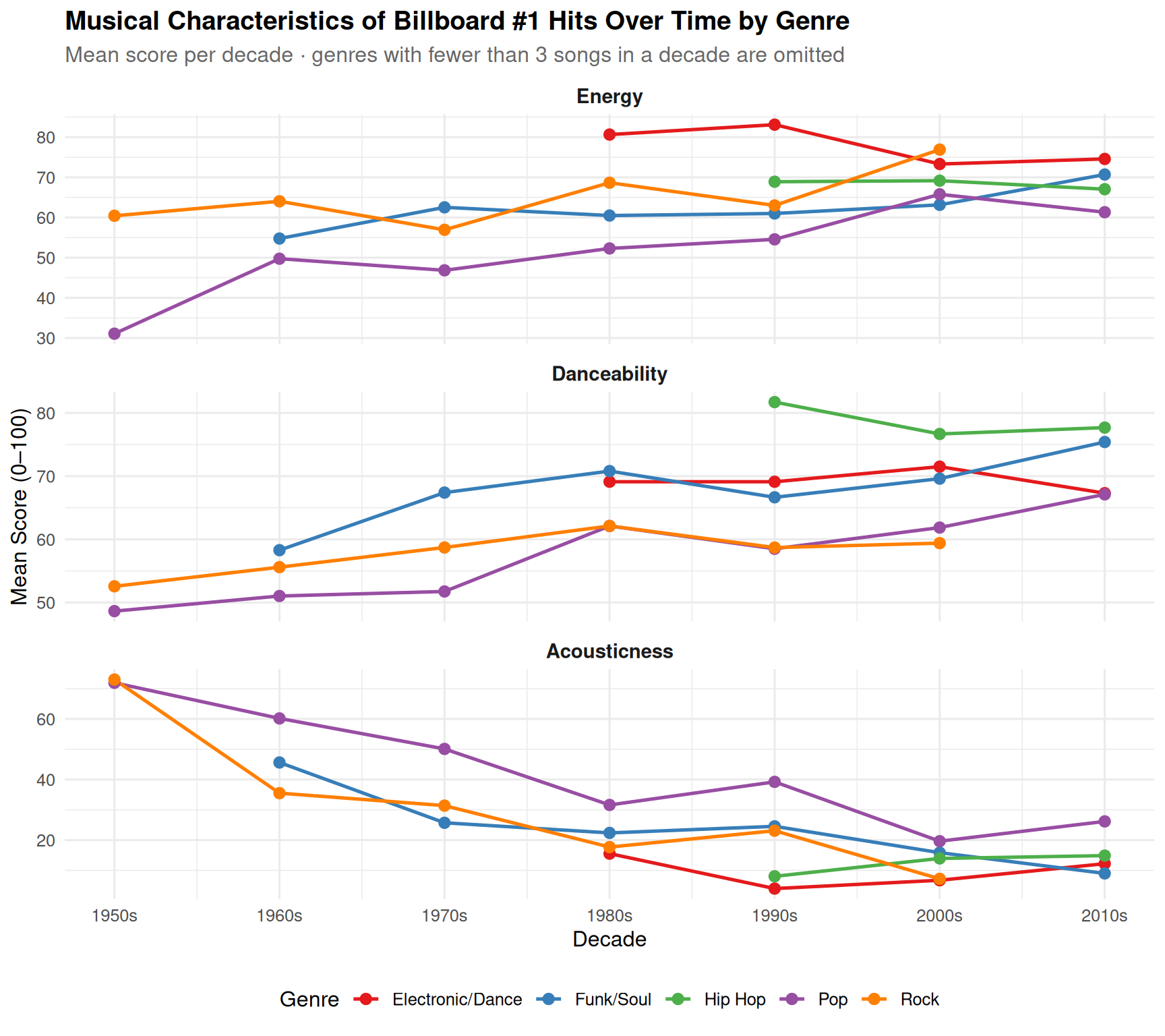
- Plot 1 - Line chart (color mapped by genre, faceted by feature); a line chart plotting mean audio feature scores per decade, with color mapped to genre and faceted by feature (Energy, Danceability, Acousticness).
- Why this plot: This is the best choice because time-series lines are purpose-built for showing trajectories and trends over ordered time intervals. Coloring by genre directly answers whether trends diverge across genres, for example whether Pop increased in energy faster than Rock, or whether all genres declined in acousticness at the same rate. Faceting by feature keeps each audio dimension readable without overcrowding a single panel.
- Plot 2 - Ridge Density Plot (filled by era, faceted by feature); a ridge density plot grouping all songs into three broad eras (Pre-1980s, 1980s-1990s, 2000s+), with fill color mapped to era and faceted by feature.
- Why this plot: This is the best choice as a complement to the line chart because it reveals something the line chart cannot: not just where the average moved, but how the entire distribution of songs shifted across eras. This matters because a mean can shift due to a few extreme outliers without reflecting a true industry-wide change. The ridge plot confirms whether the trend is genuine and broad by showing the full shape and spread of scores. It also uses color mapping to distinguish eras, making the directional shift immediately visible without requiring the reader to trace individual lines.
Analysis
ggplot(q1_data, aes(x = decade, y = mean_value, color = genre, group = genre)) +
  geom_line(linewidth = 0.9) +
  geom_point(size = 2.5) +
  facet_wrap(~feature, ncol = 1, scales = "free_y") +
  scale_x_continuous(
    breaks = seq(1950, 2010, by = 10),
    labels = paste0(seq(1950, 2010, by = 10), "s")
  ) +
  scale_color_brewer(palette = "Set1", name = "Genre") +
  labs(
    title = "Musical Characteristics of Billboard #1 Hits Over Time by Genre",
    subtitle = "Mean score per decade · genres with fewer than 3 songs in a decade are omitted",
    x = "Decade",
    y = "Mean Score (0–100)",
    color = "Genre"
  ) +
  theme_minimal(base_size = 12) +
  theme(
    legend.position = "bottom",
    strip.text = element_text(face = "bold", size = 11),
    plot.title = element_text(face = "bold"),
    plot.subtitle = element_text(color = "grey40")
  )
top_genres <- c("Pop", "Rock", "Funk/Soul", "Electronic/Dance", "Hip Hop")

era_colors <- c(
  "Pre-1980s" = "#4E79A7",
  "1980s-1990s" = "#F28E2B",
  "2000s+" = "#E15759"
)

q1_ridge <- billboard |>
  mutate(
    year = year(as.Date(date)),
    era = case_when(
      year < 1980 ~ "Pre-1980s",
      year < 2000 ~ "1980s-1990s",
      TRUE ~ "2000s+"
    ),
    era = factor(era, levels = c("Pre-1980s", "1980s-1990s", "2000s+")),
    genre = str_split(cdr_genre, ";")
  ) |>
  unnest(genre) |>
  filter(genre %in% top_genres) |>
  pivot_longer(
    cols = c(energy, danceability, acousticness),
    names_to = "feature",
    values_to = "value"
  ) |>
  mutate(
    feature = recode(
      feature,
      energy = "Energy",
      danceability = "Danceability",
      acousticness = "Acousticness"
    ),
    feature = factor(
      feature,
      levels = c("Energy", "Danceability", "Acousticness")
    )
  )

ggplot(q1_ridge, aes(x = value, y = era, fill = era)) +
  geom_density_ridges(
    alpha = 0.75,
    scale = 1.8,
    color = "white",
    linewidth = 0.4,
    quantile_lines = TRUE,
    quantiles = 2,
    quantile_fun = median
  ) +
  facet_wrap(~feature, ncol = 3) +
  scale_fill_manual(values = era_colors, name = NULL) +
  scale_x_continuous(
    limits = c(0, 100),
    breaks = c(0, 25, 50, 75, 100),
    labels = c("0\n(Low)", "25", "50", "75", "100\n(High)")
  ) +
  labs(
    title = "The Sound of #1 Hits Has Changed Dramatically Since the 1950s",
    subtitle = "Each curve shows the spread of all Billboard #1 songs in that era · Vertical line = median",
    x = "Feature Score (0–100)",
    y = NULL,
    caption = "Source: Billboard Hot 100 · TidyTuesday 2025"
  ) +
  theme_minimal(base_size = 12) +
  theme(
    legend.position = "bottom",
    strip.text = element_text(face = "bold", size = 12),
    strip.background = element_rect(fill = "grey95", color = NA),
    panel.grid.minor = element_blank(),
    panel.grid.major.y = element_blank(),
    panel.spacing = unit(1.2, "lines"),
    axis.text.y = element_text(size = 10),
    plot.title = element_text(face = "bold", size = 13),
    plot.subtitle = element_text(color = "grey40", size = 9.5),
    plot.caption = element_text(color = "grey55", size = 8.5, hjust = 0),
    plot.margin = margin(12, 12, 10, 12)
  )
Picking joint bandwidth of 5.09Picking joint bandwidth of 3.91Picking joint bandwidth of 6.05Warning: Removed 6 rows containing non-finite outside the scale range
(`stat_density_ridges()`).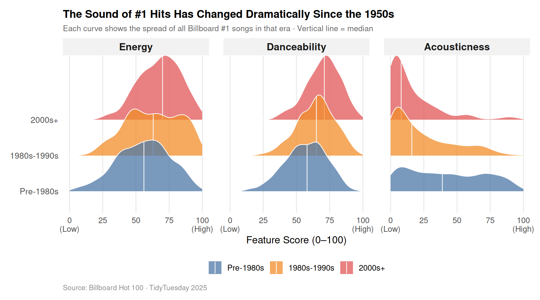
Discussion
The line chart reveals how audio feature trends diverged across genres over time. Pop showed the most dramatic energy increase, rising from a mean of 31 in the 1950s to the 60s range by the 2000s, the steepest climb of any genre. Electronic/Dance and Hip Hop entered the charts in the 1980s and 1990s already scoring high in energy and danceability, suggesting these genres were born out of the production-heavy era rather than having transitioned into it. This likely reflects the rise of synthesizers, drum machines, and digital audio workstations in the 1980s, which lowered the barrier to producing high-energy electronic music and gave rise to entirely new genres built around that sound. Across all genres, acousticness declined steadily decade by decade, though the rate varied. Rock dropped from 73 to near 7, the sharpest fall of any genre, likely reflecting the shift from guitar-driven arrangements toward electronically processed and amplified production even within rock music.
The ridge plot zooms out from genre-specific trends to show the overall industry-wide picture across three broad eras. Rather than just showing where averages moved, it shows that the entire distribution of songs shifted, meaning the change was not driven by a few outlier songs pulling the mean but reflects a genuine industry-wide transformation. The acousticness panel is the most striking: the Pre-1980s curve spreads broadly across 0 to 100, reflecting genuine stylistic diversity in early chart-topping music, while the 2000s+ curve is almost entirely compressed against zero. This suggests that electronic production did not merely become more common, it became the near-universal standard for chart-topping music. This compression of the distribution is likely driven by the economics of the streaming era, where algorithmic playlists and radio formatting favored high-energy, low-acoustic music, incentivizing artists across genres to adopt similar sonic profiles.
How is chart longevity (weeks at #1) associated with artist demographics?
Introduction
While many songs only briefly reach the top of the Billboard Hot 100 chart, others remain at #1 for multiple weeks. What factors might be associated with longer chart dominance? We focus specifically on how chart longevity relates to artist demographics, examining artist_structure (solo artist vs. duo vs. group), artist_male (gender composition), and artist_black (racial identity). We also explore how critical reception (overall_rating) and collaboration status interact with sustained chart success.
We analyze the variable weeks_at_number_one, which measures how many weeks each song remained at the top of the chart. Because the distribution is heavily right-skewed — the majority of songs spend only one or two weeks at #1, while a handful of blockbusters spend ten or more — we use a log scale where appropriate to make distributional differences interpretable. These choices allow us to ask not only who most often reaches #1, but whose songs tend to stay there longest.
Approach
We use two different plot types to examine how artist identity and critical reception correlate with sustained chart dominance.
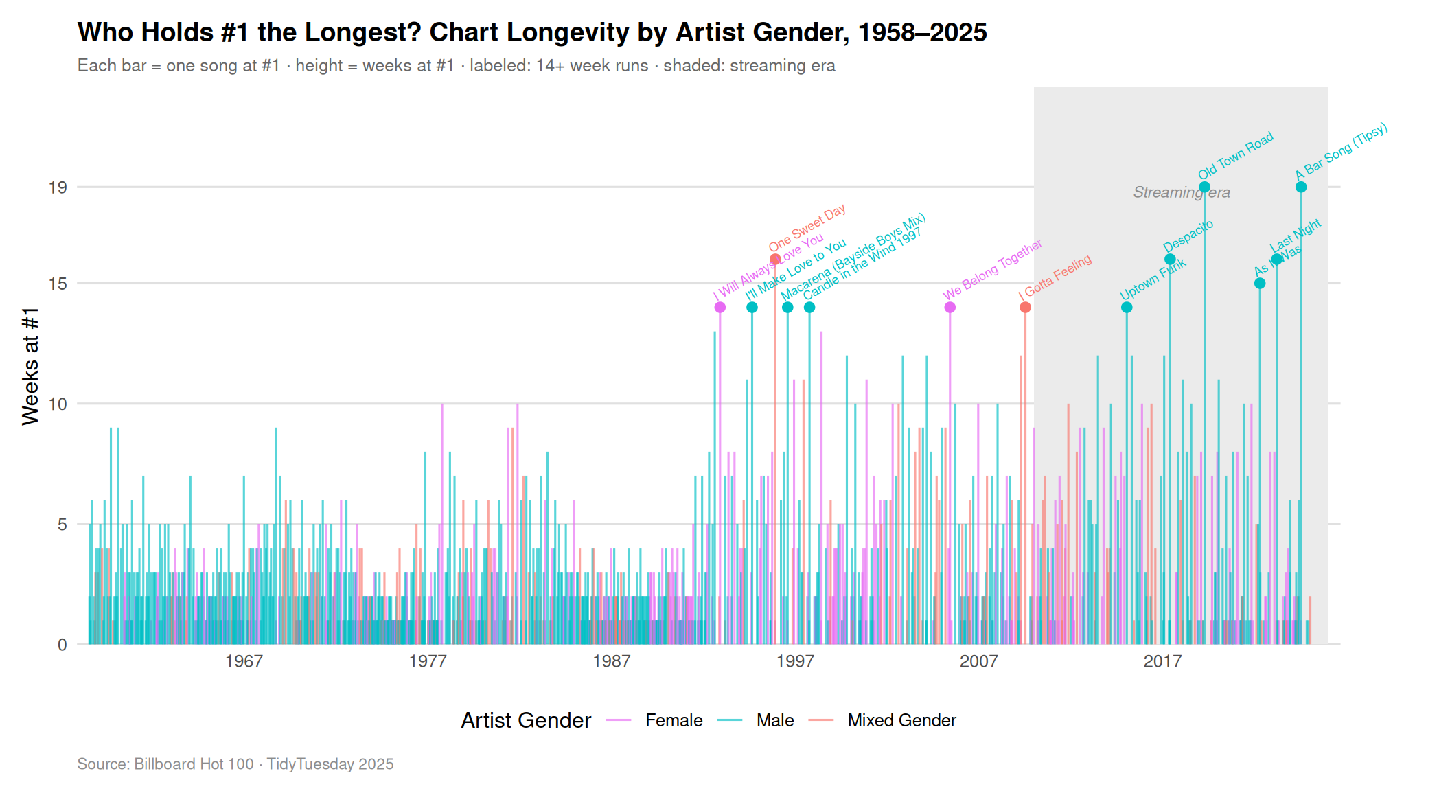
- Plot 1 - Timeline Segment Chart (“Chart Barcode”); A vertical segment chart plotting every #1 song as a colored bar arranged chronologically from 1958 to 2025, where height encodes weeks at #1 and color encodes artist gender (Female, Male, Mixed Gender). Songs with 14 or more weeks at #1 are individually labeled by title. A shaded background marks the streaming era (2010+).
- Why this plot: Because longevity is so right-skewed, static distribution summaries like boxplots collapse nearly all variation into an indistinguishable cluster at one or two weeks. The segment chart solves this by preserving every individual song and arranging them over time, making the streaming era’s dramatic extension of chart runs immediately legible as a skyline shift. Color encoding directly reveals which gender groups produce the longest runs, and labeled songs ground the analysis in specific, recognizable cultural moments rather than abstract statistics.
- Plot 2 - Faceted Scatterplot with Regression (Color Mapped by Featured Status); A faceted scatterplot mapping overall_rating against weeks_at_number_one, with separate panels for artist structures (Solo, Duo, and Group) and color mapping to distinguish between standard releases and those with featured artists.
- Why this plot: This choice is ideal for identifying correlations between continuous variables while controlling for categorical differences in artist identity. By using faceting, we can observe how the relationship between critical acclaim and chart longevity differs across distinct industry roles, such as solo acts versus large groups. Smoothed regression lines let us determine if the longevity multiplier of a high rating is more pronounced when a featured artist is present, providing a clearer story of synergy than a single-panel plot would allow. This design meets project requirements by utilizing both color mapping and faceting to communicate multi-variable relationships.
Analysis
# artist_male: 0=Female, 1=Male, 2=Mixed Gender, 3=Other (5 songs → dropped)
q2_stripe <- billboard |>
  mutate(
    date_parsed = as.Date(date),
    gender = case_when(
      artist_male == 0 ~ "Female",
      artist_male == 1 ~ "Male",
      artist_male == 2 ~ "Mixed Gender",
      TRUE             ~ NA_character_
    )
  ) |>
  filter(!is.na(gender)) |>
  mutate(gender = factor(gender, levels = c("Female", "Male", "Mixed Gender")))

# Songs with 14+ weeks get individual labels
top_songs <- filter(q2_stripe, weeks_at_number_one >= 14)
gender_palette <- c(
"Female" = "#E76BF3",
"Male" = "#00BFC4",
"Mixed Gender" = "#F8766D"
)
ggplot(q2_stripe) +
# Streaming era background
annotate(
"rect",
xmin = as.Date("2010-01-01"), xmax = as.Date("2026-01-01"),
ymin = 0, ymax = Inf,
fill = "grey92", alpha = 1
) +
annotate(
"text",
x = as.Date("2018-01-01"), y = 18.8,
label = "Streaming era", color = "grey55",
size = 3, fontface = "italic"
) +
# Every song as a segment
geom_segment(
aes(
x = date_parsed, xend = date_parsed,
y = 0, yend = weeks_at_number_one,
color = gender
),
alpha = 0.65,
linewidth = 0.55
) +
# Highlight dots for blockbusters
geom_point(
data = top_songs,
aes(x = date_parsed, y = weeks_at_number_one, color = gender),
size = 2.2,
show.legend = FALSE
) +
# Song title labels (angled to reduce overlap)
geom_text(
data = top_songs,
aes(x = date_parsed, y = weeks_at_number_one, label = song, color = gender),
size = 2.4,
angle = 30,
vjust = -0.7,
hjust = 0,
show.legend = FALSE,
check_overlap = TRUE
) +
coord_cartesian(clip = "off") +
scale_color_manual(values = gender_palette, name = "Artist Gender") +
scale_x_date(
date_breaks = "10 years",
date_labels = "%Y",
expand = c(0.01, 0)
) +
scale_y_continuous(
breaks = c(0, 5, 10, 15, 19),
expand = expansion(mult = c(0, 0.22))
) +
labs(
title = "Who Holds #1 the Longest? Chart Longevity by Artist Gender, 1958\u20132025",
subtitle = "Each bar = one song at #1 \u00b7 height = weeks at #1 \u00b7 labeled: 14+ week runs \u00b7 shaded: streaming era",
x = NULL,
y = "Weeks at #1",
caption = "Source: Billboard Hot 100 \u00b7 TidyTuesday 2025"
) +
theme_minimal(base_size = 12) +
theme(
legend.position = "bottom",
panel.grid.major.x = element_blank(),
panel.grid.minor = element_blank(),
panel.grid.major.y = element_line(color = "grey88"),
plot.title = element_text(face = "bold"),
plot.subtitle = element_text(color = "grey40", size = 9.5),
plot.caption = element_text(color = "grey55", size = 8.5, hjust = 0),
plot.margin = margin(12, 60, 10, 12)
)
# prepare data
q2_data <- billboard |>
  filter(!is.na(overall_rating), !is.na(weeks_at_number_one)) |>
  mutate(
    featured_status = if_else(
      (artist_structure * 10) %% 10 == 5,
      "Feature",
      "Standard"
    ),
    artist_base_type = case_when(
      floor(artist_structure) == 1 ~ "Solo Act",
      floor(artist_structure) == 2 ~ "Duo",
      floor(artist_structure) == 0 ~ "Group (3+ People)",
      TRUE ~ "Other"
    )
  )

ggplot(
  q2_data,
  aes(x = overall_rating, y = weeks_at_number_one, color = featured_status)
) +
  geom_jitter(alpha = 0.3, size = 1.5) +
  geom_smooth(method = "lm", se = FALSE, linewidth = 1.2) +
  facet_wrap(~artist_base_type) +
  scale_color_viridis_d(
    option = "mako",
    begin = 0.2,
    end = 0.7,
    name = "Collaboration Status",
    labels = c("Includes Featured Artist", "Standard Release")
  ) +
  labs(
    title = "Does Collaboration Increase Chart Longevity?",
    subtitle = "Comparing ratings vs. weeks at #1 across artist structures",
    x = "Overall Critic Rating (0-100)",
    y = "Weeks at #1"
  ) +
  theme_minimal(base_size = 12) +
  theme(
    legend.position = "bottom",
    strip.text = element_text(face = "bold", size = 11),
    plot.title = element_text(face = "bold"),
    plot.subtitle = element_text(color = "grey40")
  )
`geom_smooth()` using formula = 'y ~ x'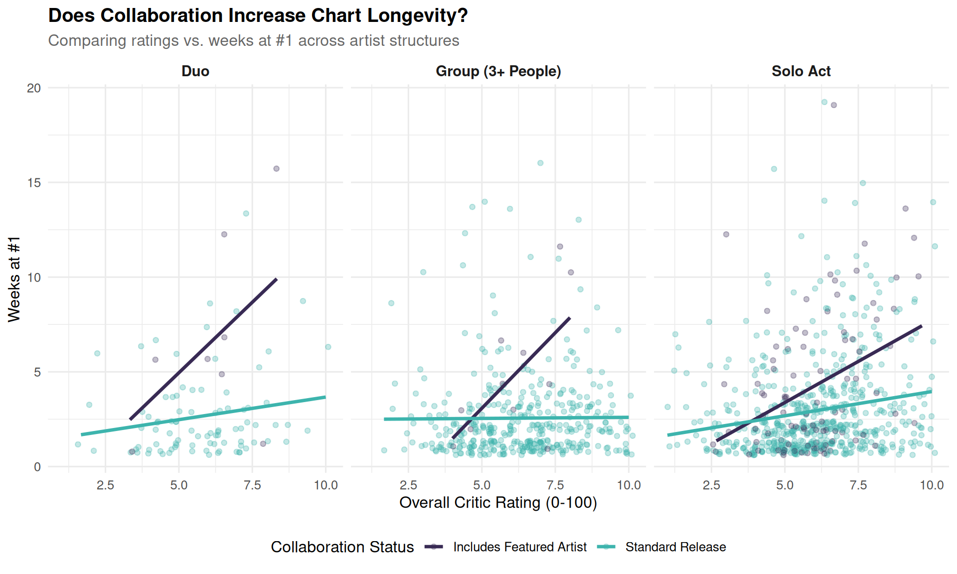
Discussion
The segment chart makes the most striking pattern immediately legible: the ceiling of chart longevity has risen sharply in the streaming era. Before 2010, runs of more than 10 weeks were exceptional enough to be remarkable; after 2010 (the shaded region), runs of 14–19 weeks appear with enough regularity to reshape the right side of the timeline into a distinct skyline. This shift reflects how streaming platforms measure listening differently from radio — each individual play counts as a chart-eligible event, allowing a song that is already dominant to compound its lead week after week in a self-reinforcing loop. The color encoding shows that male artists (teal) account for the large majority of both the overall volume of #1 entries and the record-breaking runs at the very top: all 13 labeled songs (14+ weeks) are predominantly male-coded, with the exception of Whitney Houston’s 14-week run for “I Will Always Love You” (1992) and Mariah Carey’s “We Belong Together” (2005). Female artists appear consistently across the full timeline as the purple segments confirm, but their runs tend to be bounded at the lower end of the blockbuster range. The mixed-gender (salmon) segments — capturing duets and cross-artist collaborations — cluster noticeably in the 1990s and again in the streaming era, including “One Sweet Day” (16 weeks, 1995) and “I Gotta Feeling” (14 weeks, 2009), suggesting that combining fan bases has been a recurring longevity strategy across different eras of the industry.
The faceted scatter plot reveals a disparity in how critical reception translates to chart longevity based on artist collaboration. For standard releases, whether by solo acts, duos, or larger groups, the relationship between critic ratings and weeks at #1 is relatively weak, as evidenced by the flatter regression lines. This suggests that for typical releases, remaining at #1 may be driven more by pre-existing fan-base size or industry marketing than by the perceived quality of the track itself. In contrast, songs featuring guest artists across all three artist structures show a much steeper positive correlation, indicating that the combination of high critical acclaim and a featured artist creates a powerful longevity multiplier. This synergy of overlapping fan bases allows high-quality tracks to sustain their #1 position for significantly longer than solo efforts, proving that in the modern streaming landscape, collaborations are strategically helpful for remaining at the top of the charts.
Presentation
Our presentation can be found here.
Data
The primary dataset for this analysis consists of two files: billboard.csv and topics.csv. These data were originally compiled by Chris Dalla Riva and distributed via the TidyTuesday project on August 26, 2025.
- Scope: The data covers every song to reach the #1 spot on the Billboard Hot 100 between August 4, 1958, and January 11, 2025.
- Content: It contains 1,177 unique songs. Variables include musical metadata (BPM, loudness), Spotify-derived audio features (danceability, energy, acousticness), and artist demographic information (gender, race, and group structure).
- Retrieval: Data was accessed on February 11, 2026, from the official R4DS TidyTuesday GitHub repository.
References
- Dalla Riva, C. (2025, August 26). Billboard #1s [Data set]. TidyTuesday.