Attaching package: 'scales'

The following object is masked from 'package:purrr':

    discard

The following object is masked from 'package:readr':

    col_factor
Introduction
This project explores user engagement data for movies and TV shows on Netflix. The dataset comes from Netflix’s regularly released Engagement Reports, which have been summarized and provided in the TidyTuesday Week 30 2025 dataset, by Jen Richmond. It includes information about viewing activity for titles that were released throughout the world, spanning from late 2023 through June 2025. Netflix separates its reporting periods into 6-month blocks (e.g. Jan-June 2024, July-Dec 2024), which prevents the proprietary engagement data from being disaggregated into more granular units of time. The dataset contains two tables: one for movies (36,121 rows x 8 columns) and one for TV shows (27,803 rows x 8 columns). Data is presented at the title x reporting-period level, so each row contains data on the viewing activity for a title (a unique movie or TV show, identified by its name) during that specific reporting period. Variables include hours_viewed(total hours users spent viewing a title), runtime(total time that the movie/show lasts if played in full), views(a ratio depicting the total hours spent viewing a movie/show, proportional to the actual runtime), release_date(the date that a title was first made available on Netflix), and whether the title is available_globally(a binary categorical variable that takes the value of “yes” or “no”).
In the age of streaming, platforms like Netflix do more than simply deliver entertainment: they generate detailed records of audience behavior. Every click, pause, and completed title leaves behind a digital trace that reflects subtle decisions about attention, preference, and time allocation. We are particularly interested in how these seemingly small choices made by individual Netflix users can accumulate into large-scale patterns. This dataset thus offers a rare opportunity to analyze entertainment consumption not at the individual user or title level, but rather focusing on the aggregate level across hundreds of millions of viewers over the incremental 6-month reporting periods.
Question 1: Does runtime influence completion behavior for movies and shows?
Introduction
Streaming platforms are designed around the assumption that viewers will consume movies and TV show content in full. However, in practice, audience behavior is far less predictable. For example, movies may be paused and never resumed, while TV shows are often abandoned after a few episodes. This raises a key question: does the length of a title influence how fully it is watched? We are particularly interested in whether longer titles experience lower engagement proportions and whether this pattern differs between movies and television shows. Runtime represents a direct time commitment, and in an environment where viewers can choose from seemingly endless content options, longer titles could potentially impose a larger “attention cost”. If completion rates decline as runtime increases, this could suggest that audience engagement may be shaped not just by content quality, but also by users’ time/attention constraints or cognitive demands. Exploring this correlation can allow us to better understand how modern streaming audiences allocate their attention, and whether the length of a piece of content influences how fully that content is consumed. Further, as frequent Netflix users ourselves, we are curious whether our intuition that longer movies and multi-season shows could be harder to finish is reflected more broadly in the real-world data.
To investigate this, we construct an engagement proportion defined as Engagement Proportion = Hours Viewed / (Views x Runtime). This allows us to compare expected viewing time to the actual hours viewed as reported by Netflix. An engagement proportion of 1 would suggest that, on average, viewers watch a title in full. Engagement proportion values below 1 would suggest partial viewing of a title. Meanwhlie, values above 1 could indicate rewatching or repeating (parts of) a movie or TV show. Therefore, the variables runtime, views, and hours_viewed, will allow us to investigate whether longer titles tend to have lower completion rate and whether this relationship differs between movies and TV shows.
Approach
First, we begin by exploring the relationship between runtime and engagement proportion by creating a smoothed trend plot, faceted by content format (i.e. movie vs show). Because runtime is a continuous variable and engagement proportion may contain noise, a smoothed line helps reveal broader patterns without being overly influenced by individual outliers. Faceting allows for a direct comparison between the two content formats (movies vs shows) while still accounting for their fundamentally different runtime distributions.
Second, to better understand the underlying structure of the data, we also create a jittered scatterplot of the raw engagement proportions. Netflix’s reported engagement metrics are aggregated and appear rounded, so it is important to visualize the individual data points in order to identify clustering patterns or irregularities that could be influencing the smoothed trends. Runtime is converted into hours to ensure consistent measurement, and extreme values are filtered out. For movies, any runtime that falls outside the range of 60 minutes (1 hour) to 180 minutes (3 hours) is considered an outlier while for shows, any runtime that falls outside the range of 60 minutes (1 hour) to 3600 minutes (60 hours) is considered an outlier. This is done in order to prevent extreme outliers from distort our interpretation of the data. Together, these visualizations allow us to examine both overall trends as well as the raw distribution of engagement behavior in relation to runtime.
Analysis
# combine the movies and shows datasets into one dataframemovies_shows <-bind_rows("movie"= movies,"show"= shows,.id ="movie_or_show") # make "movie" and "show" values uppercase in movie_or_show columnmovies_shows$movie_or_show <-str_to_title(movies_shows$movie_or_show)# loading font font_add_google("Cabin","Cabin")showtext_auto()# define a theme function to apply to each visualizationtheme2 <-function() {theme_minimal(base_size =20,base_family ="Cabin" ) +theme(plot.title.position ="plot",plot.title =element_text(hjust =0.5,color ="black",size =17.5,lineheight =1,margin =margin(b =5) ),plot.subtitle =element_text(hjust =0.5,color ="#454141",size =14,margin =margin(b =10) ),strip.text =element_text(size =13,margin =margin(b =5) ),axis.title =element_text(color ="black",size =15 ),axis.text =element_text(color ="black",size =10 ),axis.text.x =element_text(margin =margin(t =10) ),axis.title.y =element_text(# angle = 90,margin =margin(r =10) ),axis.text.y =element_text(margin =margin(b =15) ),legend.title =element_text(size =11.5 ),legend.text =element_text(size =10.5 ),legend.position ="right",panel.grid.major.x =element_blank(),panel.grid.minor.x =element_blank(),panel.grid.major.y =element_blank(),panel.grid.minor.y =element_blank(),panel.background =element_rect(fill ="white" ) )}#creating a variable for release windowmovies_shows <- movies_shows |>mutate(release_window =paste0(year(release_date),if_else(semester(release_date) ==1, " Jan-Jun", " Jul-Dec") ),release_window =factor( release_window,levels =unique(release_window[order(release_date)]) ) )#aggregate engagement: find average hours viewed per window, per formatavg_engagement <- movies_shows |>group_by(release_window, movie_or_show) |>summarize(avg_hours_viewed =mean(hours_viewed, na.rm =TRUE),median_hours_viewed =median(hours_viewed, na.rm =TRUE),.groups ="drop"#remove the grouping after summarizing )# convert release_window into a real date variable so the x-axis is like a timeline instead of a categorical axisavg_engagement2 <- avg_engagement |>filter(!is.na(release_window)) |>mutate(movie_or_show =factor(movie_or_show, levels =c("Movie", "Show")),year =as.integer(str_extract(release_window, "^\\d{4}")),half =if_else(str_detect(release_window, "Jan-Jun"), "Jan–Jun", "Jul–Dec"),month =if_else(str_detect(release_window, "Jan-Jun"), 1L, 7L),release_date =as.Date(sprintf("%d-%02d-01", year, month)) ) |>arrange(release_date) |>select(-year, -month)#JP# create a grouped bar chart comparing average hours viewed across release windows for movies and showsggplot(data = avg_engagement2,mapping =aes(x = release_date,y = avg_hours_viewed,fill = movie_or_show )) +geom_col(position ="dodge" ) +labs(title ="Average Hours Viewed by Release Date",x ="Release Window",y ="Average Hours Viewed",fill =NULL ) +scale_y_continuous(labels =label_number(scale_cut =cut_short_scale() ) ) +scale_fill_manual(values =c(Movie ="#E50914", Show ="#4C4C69")) +theme2() +theme(axis.text.x =element_text(angle =0, hjust =1, size =12) ) +facet_wrap(~movie_or_show, ncol =1)
Warning: Removed 2 rows containing missing values or values outside the scale range
(`geom_col()`).
# line plot showing how average viewing hours change over time ggplot(data = avg_engagement2,mapping =aes(x = release_date,y = avg_hours_viewed,color = movie_or_show,group = movie_or_show,shape = half )) +geom_line(linewidth =1.3) +geom_point(size =3) +scale_color_manual(values =c(Movie ="#E50914", Show ="#4C4C69")) +scale_shape_manual(values =c("Jan–Jun"=16, "Jul–Dec"=15),name ="Release Window" ) +scale_y_continuous(labels =label_number(scale_cut =cut_short_scale()) ) +scale_x_date(date_breaks ="1 year",date_labels ="%Y" ) +labs(title ="Trends in Hours Viewed Across Release Windows",x ="Release Window",y ="Average Hours Viewed",color =NULL,shape =NULL ) +theme2() +theme(axis.text.x =element_text(angle =45, hjust =1) )
Warning: Removed 2 rows containing missing values or values outside the scale range
(`geom_line()`).
Warning: Removed 2 rows containing missing values or values outside the scale range
(`geom_point()`).
Discussion
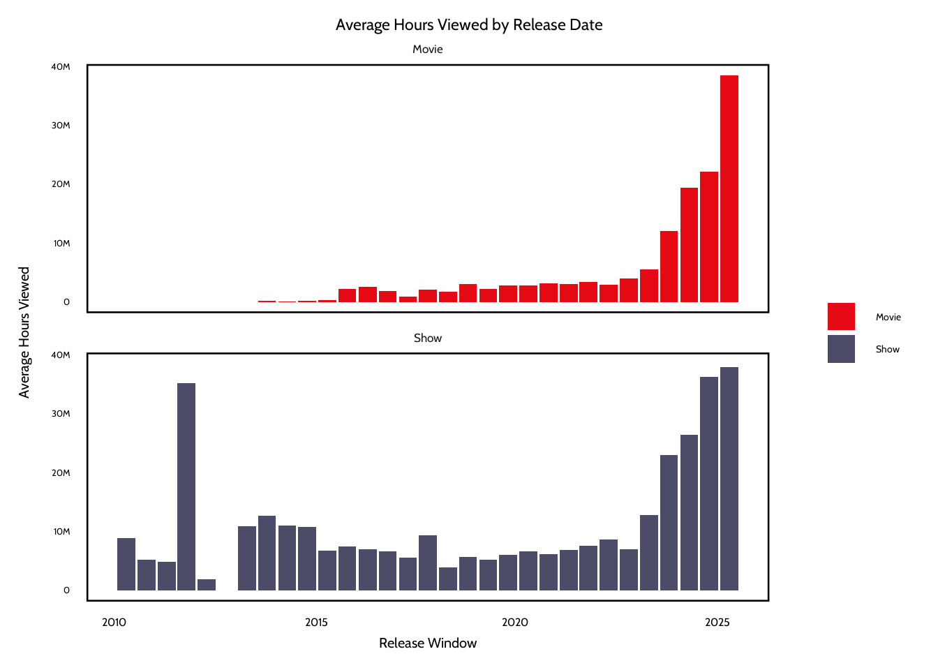
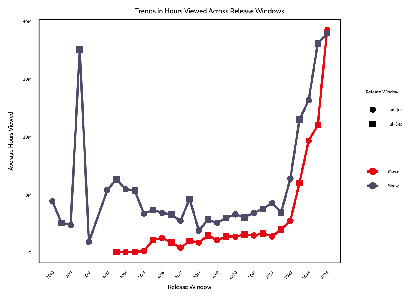
The plots show several patterns in viewer engagement across release windows. One pattern is that shows receive higher average hours viewed than movies across almost every release window. This difference is probably because of the structure of tv content with multiple episodes or seasons. This increases the total number of viewing hours that a single show can get. On the other hand, movies are usually just limited to one runtime, which means that even highly successful films would have fewer total hours viewed.
Another pattern is that both plots show that engagement has increased in more recent release windows after 2023. Average hours viewed for both movies and shows rise sharply during the 2023–2025 windows. This shows that newer releases generate more total viewing hours. One possible explanation could be that Netflix’s subscriber base and global reach have expanded over time. Newer titles are exposed to a larger audience now than titles released in earlier years. Also, Netflix has invested in high-profile releases and large-scale original productions in more recent years, which could be a reason for their higher engagement metrics.
Lastly, the early release windows have more variability, especially for shows. Some early periods have large spikes or dips in hours viewed. This might be the impact of a few extremely popular titles dominating engagement in a given window. Because the analysis uses averages, these blockbuster releases could strongly influence the results. The visualizations show that release timing could be associated with engagement levels, but the trend most likely reflects broader platform growth and the influence of some titles rather than a seasonal effect.
Question 2: Are certain release windows associated with higher viewer engagement?
Introduction
Beyond content length (i.e. runtime), timing may also influence audience engagement activity. Titles are released to streaming platforms continuously, but viewer attention is finite and Netflix users can be fickle. Content released during certain periods may benefit from seasonal viewing patterns, lower competition from other new releases, or even shifts in the audience behavior. This leads us to our second question: are movies and shows released in certain 6-month windows associated with higher levels of engagement? Using the release_date variable, we group titles into Netflix’s established reporting windows (January-June, and July-December of each year within the available data). We measure engagement using total hours_viewed, which captures the aggregate audience attention. By comparing average engagement across release windows and content formats, we are aiming to identify whether the timing of a title’s release window is linked to stronger performance in terms of hours viewed.
We are particularly interested in this question because release timing shapes how audiences encounter content, and as regular users of Netflix, we have noticed that certain releases seem to dominate the cultural conversation and viewing habits for a period of time while other releases seem to fade pretty quickly into the background. We are curious about whether engagement is influenced not just by wht is being released, but also by when it is released. In a modern day environment where new titles are constantly competing with each other for viewers’ attention, understanding how release timing relates to viewer engagement can offer insight into how audiences are allocating their limited time and attention spans when so many new titles are being released.
Approach
First, to compare engagement across release windows, we first aggregate average and median hours_viewed by 6-month period, as well as by format (movie vs show). Because release_window is categorical, we use a grouped bar chart for visual comparison of engagement levels across periods. This lets us directly compare viewership data for movies versus shows within each reporting window. We apply similar outlier rules from our approach for Question 1 (movies with a runtime outside the 1 hour to 3 hour range are considered outliers, while shows with a runtime outside the range of 1 hour to 60 hours are considered outliers).
Second, we also create a line plot across sequential release windows in order to observe trends in hours viewed over time. Line plots are very useful for displaying patterns across ordered time intervals and can help s reveal whether engagement measured by viewing hours increases, decreases, or remains stable across successive reporting periods. We also use color to distinguih between movies versus shows, thus allowing us to compare how engagement trajectories may differ by content format. Together, these plots can allow us to compare engagement across release periods in addition to seeing how it changes over time.
Warning: There was 1 warning in `mutate()`.
ℹ In argument: `period = hms(runtime)`.
Caused by warning in `.parse_hms()`:
! Some strings failed to parse
#Q2 Plot #1: Showing Engagement Proportion vs Runtime for Movies and Showggplot(data = movies_shows,mapping =aes(x = length_hours,y = engagement_proportion,color = report )) +geom_smooth(se =FALSE) +facet_wrap(~movie_or_show, ncol =1, scales ="free_x") +labs(title ="Expected Vs Actual Engagement for Movies and Shows",subtitle ="We are exploring if people watch shows for the expected amount of time (full episodes / movies) ",x ="Runtime (Hours)",y ="Engagement Proportion",color ="Report Period" ) +scale_color_manual(values =c("2023Jul-Dec"="#7A0019","2024Jan-Jun"="#BB0000","2024Jul-Dec"="#E50914","2025Jan-Jun"="#FF6B6B" ),labels =c("2023 Jul-Dec","2024 Jan-Jun","2024 Jul-Dec","2025 Jan-Jun" )) +theme2()
`geom_smooth()` using method = 'gam' and formula = 'y ~ s(x, bs = "cs")'
# convert variables to factors, order for consistent plotting movies_shows <- movies_shows |>mutate(#have reporting periods appear chronologicallyreport =factor(report, levels =sort(unique(report))),movie_or_show =factor(movie_or_show, levels =c("Movie", "Show")) )# create binned runtime summaries for moviesmovies_binned <- movies_shows |>filter(movie_or_show =="Movie") |>mutate(# divide movie runtimes into bins btwn 1 and 3 hoursbin =cut( length_hours,breaks =seq(1, 3, by =0.15),include.lowest =TRUE ) ) |>#aggregate engagement stas within each runtime bingroup_by(bin) |>summarize(x =mean(length_hours, na.rm =TRUE),med =median(engagement_proportion, na.rm =TRUE),q25 =quantile(engagement_proportion, 0.25, na.rm =TRUE),q75 =quantile(engagement_proportion, 0.75, na.rm =TRUE),n =n(),.groups ="drop" ) |># remove bins with very small sample size to reduce noise filter(n >=20)#Q1 Plot #2: Raw Engagement vs Runtime# random seed for reproducible samplingset.seed(1)# randomly sample 15% of the dataset to improve plot readability since full dataset is so large, plotting all points would create heavy overplotting ms_sample <- movies_shows |>sample_frac(0.15)# jittered sctaterplot showing raw engagement proportions vs runtime ggplot(data = ms_sample,mapping =aes(x = length_hours,y = engagement_proportion )) +# horizontal jitter to reduce overlapgeom_jitter(aes(color = report),alpha =0.35,size =0.7,width =0.08,height =0 ) +geom_hline(yintercept =1,linetype ="dashed",linewidth =1 ) +facet_wrap(~movie_or_show,ncol =1,scales ="free_x" ) +coord_cartesian(ylim =c(0.5, 1.5) ) +scale_y_continuous(labels =percent_format(accuracy =1 ) ) +scale_x_continuous(trans ="log1p" ) +labs(title ="Raw Engagement Proportion vs Runtime",x ="Runtime (Hours, Log Scale)",y ="Engagement Proportion",color ="Report Period" ) +theme2() +theme(legend.position ="bottom",strip.background =element_rect(fill ="#E6E6E6",color =NA ),strip.text =element_text(size =13,margin =margin(b =5) ) ) +guides(colour =guide_legend(override.aes =list(size =4.5,alpha =0.35 ) ) )
Discussion
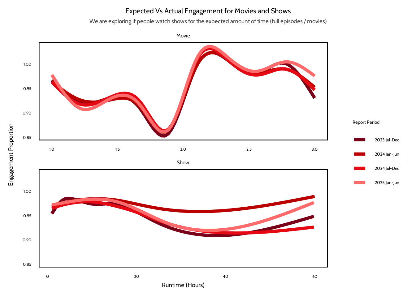
Across both movies and shows, the results suggest that runtime has little effect on overall completion behavior. In the binned summary plots, the median engagement proportion is very close to 100% across most of the runtime values. For movies, engagement appears to be very stable between hours one and three, with only a small dip around shorter runtimes. For shows, the median engagement also is near 100%. The interquartile range is wider for longer runtimes, which means there’s greater variability in viewing behavior for longer shows.
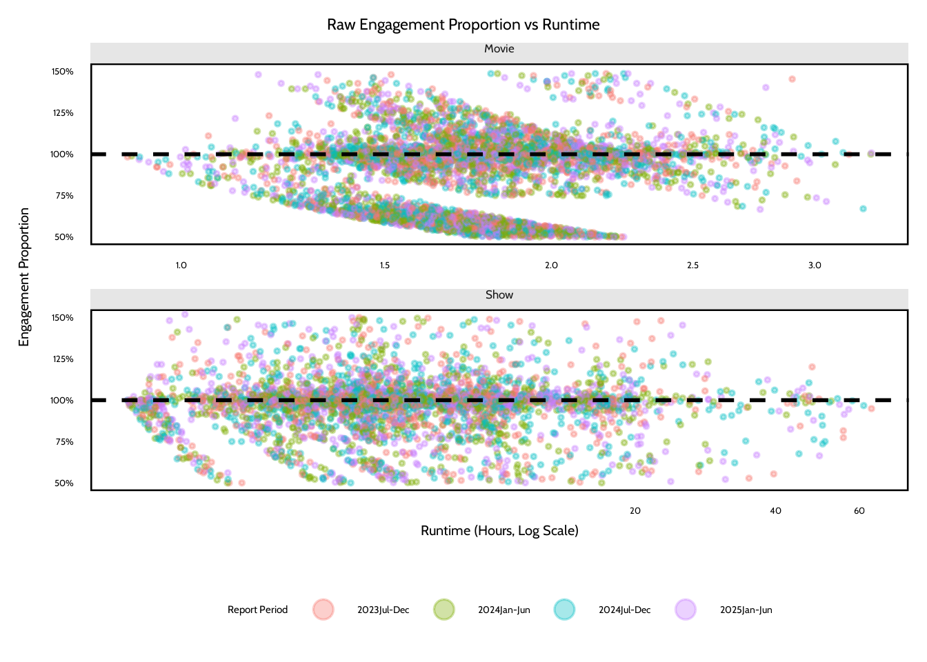
The raw jitter plot provides additional context for understanding these patterns. The points cluster mostly around the 100% reference line. This suggests that, on average, viewers watch the full runtime of both movies and shows. However, the diagonal banding patterns in the raw data indicate rounding artifacts in the aggregated Netflix metrics. Because the engagement proportion is found from hours viewed, views, and runtime, rounding in the reported view counts can create repeated patterns that appear as slanted stripes in the plot. This suggests that some of the variation in the raw distribution could be from the structure of the aggregated data rather than just viewer behavior.
In conclusion, the analysis doesn’t provide evidence that longer titles lead to lower completion rates. Engagement is mostly consistent across all runtime lengths, especially for movies. For shows, the variability for longer runtimes might be because of the differences in how viewers interact with content that has multiple seasons. Some viewers might watch an entire series and others might stop after just a few episodes. As a result, although runtime could influence viewing variability, it doesn’t seem to strongly affect the completion behavior observed in the Netflix engagement data.
Include a citation for your data here. See https://data.research.cornell.edu/data-management/storing-and-managing/data-citation/ for guidance on proper citation for datasets. If you got your data off the web, make sure to note the retrieval date.
Richmond, J., & Harmon, J. (2025). What have we been watching on Netflix? [Data file and codebook]. Los Gatos, CA: Netlix [producer]. Tidy Tuesday [distributor]. https://github.com/rfordatascience/tidytuesday/blob/main/data/2025/2025-07-29/readme.md
References
List any references here. You should, at a minimum, list your data source.
Richmond, J., & Harmon, J. (2025). What have we been watching on Netflix? [Data file and codebook]. Los Gatos, CA: Netlix [producer]. Tidy Tuesday [distributor]. https://github.com/rfordatascience/tidytuesday/blob/main/data/2025/2025-07-29/readme.md