── Attaching core tidyverse packages ──────────────────────── tidyverse 2.0.0 ──
✔ dplyr     1.1.4     ✔ readr     2.1.6
✔ forcats   1.0.1     ✔ stringr   1.6.0
✔ ggplot2   4.0.1     ✔ tibble    3.3.0
✔ lubridate 1.9.4     ✔ tidyr     1.3.2
✔ purrr     1.1.0
── Conflicts ────────────────────────────────────────── tidyverse_conflicts() ──
✖ dplyr::filter() masks stats::filter()
✖ dplyr::lag()    masks stats::lag()
ℹ Use the conflicted package (<http://conflicted.r-lib.org/>) to force all conflicts to become errors

Attaching package: 'scales'


The following object is masked from 'package:purrr':

    discard


The following object is masked from 'package:readr':

col_factorNetflix Engagement Patterns
Rows: 36121 Columns: 8
── Column specification ────────────────────────────────────────────────────────
Delimiter: ","
chr  (5): source, report, title, available_globally, runtime
dbl  (2): hours_viewed, views
date (1): release_date

ℹ Use `spec()` to retrieve the full column specification for this data.
ℹ Specify the column types or set `show_col_types = FALSE` to quiet this message.
Rows: 27803 Columns: 8
── Column specification ────────────────────────────────────────────────────────
Delimiter: ","
chr  (5): source, report, title, available_globally, runtime
dbl  (2): hours_viewed, views
date (1): release_date

ℹ Use `spec()` to retrieve the full column specification for this data.
ℹ Specify the column types or set `show_col_types = FALSE` to quiet this message.
theme_netflix <- function(base_size = 12, ...) {
theme_minimal(base_size = base_size) %+replace%
theme(
#background
plot.background = element_rect(fill = "#FFFFFF", color = NA),
panel.background = element_rect(fill = "#FFFFFF", color = NA),
strip.background = element_rect(fill = "#ffffffff", color = NA),
plot.title = element_text(
face = "bold",
color = "#141414",
size = base_size + 2
),
plot.subtitle = element_text(
color = "#333232ff",
size = base_size - 1,
margin = margin(t = 6, b = 8)
),
plot.caption = element_text(color = "#282727ff", size = base_size - 3),
axis.title = element_text(color = "#4A4A4A", size = base_size - 1),
axis.text = element_text(color = "#434343ff", size = base_size - 2),
strip.text = element_text(
face = "bold",
color = "#141414",
size = base_size - 1
),
#legend styling
legend.title = element_text(color = "#4A4A4A", size = base_size - 1),
legend.text = element_text(color = "#4b4b4bff", size = base_size - 2),
legend.position = "right",
legend.direction = "vertical",
legend.box = "vertical",
#grid styling
panel.grid.major.y = element_line(color = "#EFEFEF", linewidth = 0.4),
panel.grid.major.x = element_blank(),
panel.grid.minor = element_blank(),
legend.background = element_rect(fill = "#FFFFFF", color = NA),
legend.key = element_rect(fill = "#FFFFFF", color = NA),
plot.margin = margin(14, 14, 10, 14)
)
}
#cleaner report window labels for cleaner axis later on
report_labs <- c(
"2023Jul-Dec" = "2023\nJul–Dec",
"2024Jan-Jun" = "2024\nJan–Jun",
"2024Jul-Dec" = "2024\nJul–Dec",
"2025Jan-Jun" = "2025\nJan–Jun"
)Introduction
(1-2 paragraphs) Brief introduction to the dataset. You may repeat some of the information about the dataset provided in the introduction to the dataset on the TidyTuesday repository, paraphrasing on your own terms. Imagine that your project is a standalone document and the grader has no prior knowledge of the dataset.
Netflix’s content library is divided between titles made available worldwide and those restricted to specific regions. Of the roughly 64,000 title-period observations in this dataset, approximately 72% are regionally restricted and only 28% are globally available — meaning global titles are a deliberate, curated minority of Netflix’s catalog. Understanding whether that global designation is associated with meaningfully higher viewer engagement is important for content strategy: if globally distributed titles consistently outperform regional ones, that has real implications for how Netflix allocates production resources and which titles receive worldwide releases.
Question 1: Is Netflix engagement driven more by new releases or by older catalog titles across reporting periods?
Introduction
(1-2 paragraphs) Introduction to the question and what parts of the dataset are necessary to answer the question. Also discuss why you’re interested in this question.
As streaming platforms mature, understanding whether viewer engagement is primarily driven by newly released titles or by older catalog content is critical for long-term content strategy. If engagement is heavily concentrated among recently released titles, Netflix may need to continually invest in fresh releases to sustain subscriber attention. Conversely, if older titles continue to generate substantial viewing hours, this suggests that the back catalog provides durable value and reduces reliance on constant new production. Examining how engagement is distributed across different stages of a title’s lifecycle can therefore offer insight into whether Netflix operates as a “new-release-driven” platform or as a library with sustained long-term engagement.
To answer this question, we use hours_viewed as the measure of total engagement, release_date to calculate how old each title is at the time of a reporting period, and report to compare patterns across time. We create months_since_release by measuring the time between release_date and the end of each reporting period, and then group titles into lifecycle categories (age_bucket) such as 0–3 months, 3–12 months, and 12+ months. Because older titles have had more time to accumulate viewing, we also compute views_per_month (views divided by months since release) to compare engagement intensity across titles of different ages in a more standardized way.
Approach
(1-2 paragraphs) Describe what types of plots you are going to make to address your question. For each plot, provide a clear explanation as to why this plot (e.g. boxplot, barplot, histogram, etc.) is best for providing the information you are asking about. The two plots should be of different types, and at least one of the two plots needs to use either color mapping or facets.
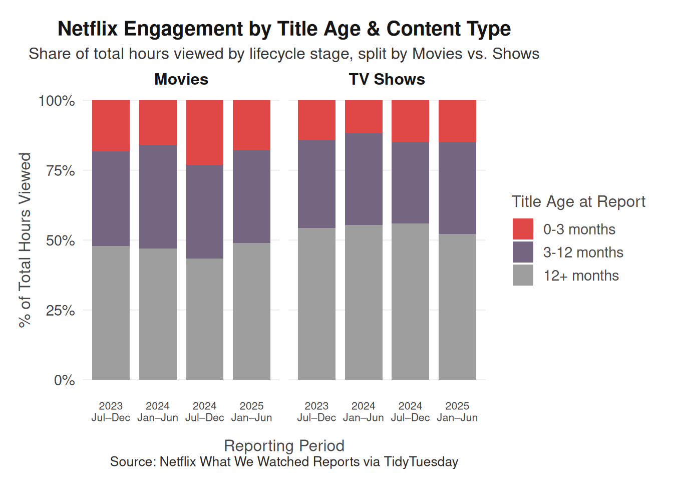
To evaluate whether engagement is driven more by new releases or older titles, we will use two complementary visualizations that capture both overall engagement structure and normalized engagement intensity. First, we will create a stacked bar chart showing the percentage of total hours_viewed contributed by each age_bucket within each reporting period. A stacked bar chart is appropriate because the age buckets are mutually exclusive categories that collectively account for total engagement in each report. Converting values into proportions allows us to compare how the composition of engagement changes over time, independent of differences in overall viewing volume between reporting periods. This visualization directly reveals whether newer titles account for a growing or shrinking share of total platform engagement.
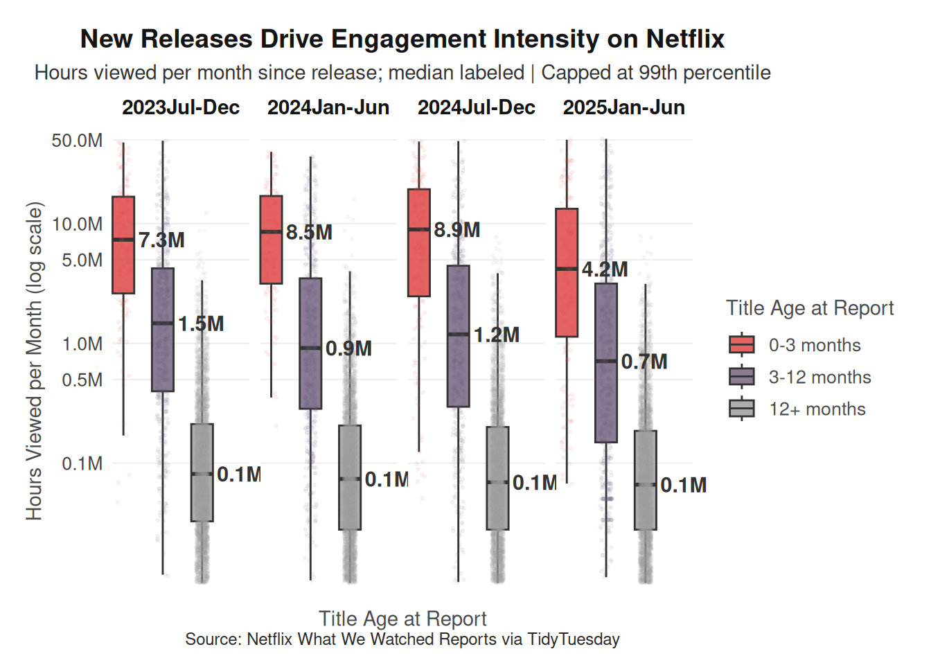
Second, we will construct faceted boxplots of views_per_month by age_bucket, with separate panels for each reporting period. Because engagement data is highly right-skewed, boxplots are well suited for visualizing medians, variability, and outliers without distortion from extreme blockbuster titles. Using views_per_month helps control for unequal exposure time, ensuring that older titles are not mechanically advantaged simply because they have been available longer. Faceting by reporting period allows us to assess whether engagement intensity patterns across lifecycle stages remain stable or shift over time. Together, these plots provide both a structural and per-title perspective on how Netflix engagement is distributed across its content lifecycle.
Analysis
(2-3 code blocks, 2 figures, text/code comments as needed) In this section, provide the code that generates your plots. Use scale functions to provide nice axis labels and guides. You are welcome to use theme functions to customize the appearance of your plot, but you are not required to do so. All plots must be made with {ggplot2}. Do not use base R or {lattice} plotting functions.
report_end_dates <- c(
  "2023Jul-Dec" = as.Date("2023-12-31"),
  "2024Jan-Jun" = as.Date("2024-06-30"),
  "2024Jul-Dec" = as.Date("2024-12-31"),
  "2025Jan-Jun" = as.Date("2025-06-30")
)

q1_data <- netflix_combined %>%
  drop_na(release_date, hours_viewed) %>% # drop missing release dates AND hours
  filter(hours_viewed > 0) %>% # remove zero-hour rows
  mutate(
    report_end = report_end_dates[report],
    months_since_release = as.numeric(
      interval(release_date, report_end) / months(1)
    ),
    age_bucket = case_when(
      months_since_release <= 3 ~ "0-3 months",
      months_since_release <= 12 ~ "3-12 months",
      TRUE ~ "12+ months"
    ),
    age_bucket = factor(
      age_bucket,
      levels = c("0-3 months", "3-12 months", "12+ months")
    )
  ) %>%
  filter(months_since_release >= 0.5) # floor at 0.5 months to avoid division issues
q1_summary_type <- q1_data %>%
group_by(report, age_bucket, content_type) %>%
summarise(total_hours = sum(hours_viewed, na.rm = TRUE), .groups = "drop") %>%
group_by(report, content_type) %>%
mutate(pct = total_hours / sum(total_hours) * 100)
ggplot(q1_summary_type, aes(x = report, y = pct, fill = age_bucket)) +
geom_col(position = "stack", width = 0.8) +
facet_wrap(
~content_type,
labeller = labeller(content_type = c(Movie = "Movies", Show = "TV Shows"))
) +
scale_fill_manual(
values = c(
"0-3 months" = "#e04747ff",
"3-12 months" = "#746581ff",
"12+ months" = "#9e9e9eff"
),
name = "Title Age at Report"
) +
scale_x_discrete(labels = report_labs) +
scale_y_continuous(labels = label_percent(scale = 1)) +
labs(
title = "Netflix Engagement by Title Age & Content Type",
subtitle = "Share of total hours viewed by lifecycle stage, split by Movies vs. Shows",
x = "Reporting Period",
y = "% of Total Hours Viewed",
caption = "Source: Netflix What We Watched Reports via TidyTuesday"
) +
theme_netflix(base_size = 13) +
theme(
plot.title = element_text(face = "bold"),
legend.position = "right",
axis.text.x = element_text(angle = 0, hjust = 0.5, size = 8),
axis.title.x = element_text(margin = margin(t = 12))
)
q1_box_data <- q1_data %>%
  mutate(views_per_month = hours_viewed / months_since_release) %>%
  filter(!is.na(views_per_month), views_per_month > 1e4) %>%
  group_by(report) %>%
  mutate(cap = quantile(views_per_month, 0.99, na.rm = TRUE)) %>%
  ungroup() %>%
  filter(views_per_month <= cap)

median_labels <- q1_box_data %>%
  group_by(report, age_bucket) %>%
  summarise(med = median(views_per_month, na.rm = TRUE), .groups = "drop") %>%
  mutate(med_label = paste0(round(med / 1e6, 1), "M"))

ggplot(
  q1_box_data,
  aes(x = age_bucket, y = views_per_month, fill = age_bucket)
) +
  geom_boxplot(
    outlier.shape = NA,
    width = 0.55,
    linewidth = 0.5,
    alpha = 0.85
  ) +
  geom_jitter(
    aes(color = age_bucket),
    width = 0.15,
    alpha = 0.06,
    size = 0.5,
    show.legend = FALSE
  ) +
  geom_text(
    data = median_labels,
    aes(x = age_bucket, y = med, label = med_label, nudge_x = 0.38, hjust = 0),
    nudge_x = 0.38,
    size = 4,
    fontface = "bold",
    color = "gray20",
    inherit.aes = FALSE
  ) +
  facet_wrap(~report, nrow = 1) +
  scale_y_log10(
    labels = label_number(scale = 1e-6, suffix = "M"),
    breaks = c(1e5, 5e5, 1e6, 5e6, 1e7, 5e7),
    limits = c(1e4, NA),
    minor_breaks = NULL
  ) +
  scale_fill_manual(
    values = c(
      "0-3 months" = "#e04747ff",
      "3-12 months" = "#746581ff",
      "12+ months" = "#9e9e9eff"
    ),
    name = "Title Age at Report"
  ) +
  scale_color_manual(
    values = c(
      "0-3 months" = "#e04747ff",
      "3-12 months" = "#746581ff",
      "12+ months" = "#9e9e9eff"
    )
  ) +
  labs(
    title = "New Releases Drive Engagement Intensity on Netflix",
    subtitle = "Hours viewed per month since release; median labeled | Capped at 99th percentile",
    x = "Title Age at Report",
    y = "Hours Viewed per Month (log scale)",
    caption = "Source: Netflix What We Watched Reports via TidyTuesday"
  ) +
  theme_netflix() +
  coord_cartesian(clip = "off") +
  scale_x_discrete(expand = expansion(add = c(0.2, 1.2))) +
  theme(
    axis.text.x = element_blank(),
    axis.ticks.x = element_blank()
  )
Discussion
(1-3 paragraphs) In the Discussion section, interpret the results of your analysis. Identify any trends revealed (or not revealed) by the plots. Speculate about why the data looks the way it does.
The visualizations reveal that Netflix engagement is distributed across both new releases and older catalog titles, but the patterns differ depending on how engagement is measured. The stacked bar chart shows that older titles (12+ months since release) consistently account for the largest share of total hours viewed across reporting periods, particularly for television shows. This suggests that a substantial portion of overall viewing comes from Netflix’s existing catalog rather than only from newly released content. While newly released titles (0–3 months) still contribute a meaningful share of total engagement, they rarely dominate the total viewing volume within a reporting period.
However, the boxplots of views per month since release tell a somewhat different story. When engagement is adjusted for how long a title has been available, new releases show much higher engagement intensity on average compared to older titles. Titles in the 0–3 month age bucket typically have the highest median views per month, while engagement intensity declines substantially for titles that have been available longer. This pattern indicates that while older catalog titles collectively generate a large portion of total viewing hours, individual new releases tend to attract stronger short-term attention from viewers.
Together, these results suggest that Netflix operates through a combination of short-term excitement around new releases and long-term engagement from its catalog library. Newly released titles likely benefit from marketing campaigns, algorithmic promotion, and viewer curiosity immediately after release, driving high engagement intensity early in their lifecycle. Over time, engagement naturally declines as viewers move on to newer content, but the large volume of older titles means that the catalog still contributes significantly to overall platform viewing. This balance between fresh releases and sustained catalog engagement highlights how streaming platforms can rely both on new content to generate excitement and on a deep content library to maintain consistent viewer activity.
Question 2: How does engagement differ between globally distributed and regionally released titles across reporting periods and release seasons?
Introduction
(1-2 paragraphs) Introduction to the question and what parts of the dataset are necessary to answer the question. Also discuss why you’re interested in this question.
Have you ever traveled to another country and noticed that the content available on Netflix suddenly looks different? Titles that were available at home may disappear, while entirely new shows and movies appear in the catalog. This occurs because Netflix’s content library varies across regions due to licensing agreements and distribution strategies. Some titles are released globally, making them available in most or all markets, while others are regionally restricted, meaning they are only accessible in specific countries. Understanding whether these globally distributed titles actually generate higher engagement than regionally released ones can provide insight into how Netflix prioritizes its content investments and distribution decisions.
To investigate this question, we focus on several key variables from the dataset. The variable hours_viewed captures total viewer engagement for each title during a reporting period, while release_date allows us to determine how long the title has been available within that period. Because titles released earlier in a reporting window have more time to accumulate views, we adjust engagement by calculating hours viewed per month exposed (adjusted_hours_viewed). We then normalize this measure within each reporting period and content type to produce a performance_index, where a value of 1 represents the typical title in that group. Using the available_globally variable, we compare globally distributed and regionally restricted titles to examine whether global releases systematically achieve higher engagement across reporting periods.
Approach
(1-2 paragraphs) Describe what types of plots you are going to make to address your question. For each plot, provide a clear explanation as to why this plot (e.g. boxplot, barplot, histogram, etc.) is best for providing the information you are asking about. The two plots should be of different types, and at least one of the two plots needs to use either color mapping or facets.
For the first visualization, we constructed boxplots comparing the performance index for globally available and regional titles, with separate facets for movies and television shows. We chose boxplots for this comparison because we found that the engagement data is highly skewed, with a small number of blockbuster titles generating extremely large viewing totals. Choosing boxplots allows us to summarize the median, interquartile range, and extreme values without allowing outliers to dominate the visualization. Using a log-scaled y-axis further improves readability by compressing extreme values while preserving proportional differences. Faceting by content type allows us to examine whether the relationship between global availability and engagement differs between movies and shows. Faceting is used so that with the large number of comparisons, the visual bandwidth does not become too overwhelming for the viewer.
Second, we created a ridgeline density plot of the performance index across reporting periods, colored by availability (Global vs Regional) and faceted by content type. Density ridge plots provide a useful way to visualize the full distribution of engagement performance across time rather than focusing only on summary statistics. By stacking distributions for each reporting period, we can observe whether the relative performance of globally distributed titles shifts over time. Coloring the distributions by availability highlights whether global titles tend to cluster at higher performance levels compared to regional titles. Together, these two visualizations provide both a summary comparison of typical engagement levels and a distributional view of how engagement patterns evolve across reporting periods.
Analysis
(2-3 code blocks, 2 figures, text/code comments as needed) In this section, provide the code that generates your plots. Use scale functions to provide nice axis labels and guides. You are welcome to use theme functions to customize the appearance of your plot, but you are not required to do so. All plots must be made with {ggplot2}. Do not use base R or {lattice} plotting functions.
# report windows (start/end) for the periods in your dataset and use lubridate to generate workable dates
report_bounds <- tribble(
  ~report       , ~report_start         , ~report_end           ,
  "2023Jul-Dec" , as.Date("2023-07-01") , as.Date("2023-12-31") ,
  "2024Jan-Jun" , as.Date("2024-01-01") , as.Date("2024-06-30") ,
  "2024Jul-Dec" , as.Date("2024-07-01") , as.Date("2024-12-31") ,
  "2025Jan-Jun" , as.Date("2025-01-01") , as.Date("2025-06-30")
)

# taking the combined dataset from before
df <- netflix_combined %>%
  filter(available_globally %in% c("Yes", "No")) %>%
  mutate(
    release_date = as.Date(release_date),
    available_globally = if_else(
      available_globally == "Yes",
      "Global",
      "Regional"
    )
  ) %>%
  left_join(report_bounds, by = "report") %>%
  filter(!is.na(report_start), !is.na(report_end)) %>%
  #for each report window, compute how long the title was actually available (to consider for the ex. titles that were only available for 2 months of the 5 month window)
  mutate(
    # If a title released before the window, it was available the full window. If it released during the window, availability starts at release_date.
    exposure_start = pmax(release_date, report_start),

    #if the release is after report_end, it had 0 exposure in that window; drop those rows.
    exposed_days = as.numeric(difftime(
      report_end,
      exposure_start,
      units = "days"
    )),

    #converting to months; we need to enforce minimum of 1 month to avoid huge inflation from titles with tiny exposure.
    months_exposed = pmax(exposed_days / 30.44, 1),

    #Engagement index, now correctly adjusted for exposure within the report window
    adjusted_hours_viewed = hours_viewed / months_exposed
  ) %>%
  #drop titles that weren't released until after the report ended
  filter(release_date <= report_end)
#separating using groupby to differentiate between movies and shows, then applying the performance index normalization
df_norm <- df %>%
group_by(report, content_type) %>%
mutate(
performance_index = adjusted_hours_viewed /
median(adjusted_hours_viewed, na.rm = TRUE)
) %>%
ungroup()
ggplot(
df_norm,
aes(available_globally, performance_index, fill = available_globally)
) +
geom_boxplot(outlier.alpha = 0.15) +
geom_hline(yintercept = 1, linetype = "dashed") +
scale_y_log10(
breaks = c(0.25, 0.5, 1, 2, 4, 8, 16),
labels = scales::label_number(accuracy = 0.01)
) +
scale_fill_manual(
values = c(
"Global" = "#e04747ff",
"Regional" = "#9e9e9eff"
)
) +
facet_wrap(~content_type) +
labs(
title = "Global vs Regional Performance Within Reporting Periods",
subtitle = "Hours viewed per month (within the 5 month report window)\nnormalized to report type median (1 = typical)",
x = "Availability",
y = "Performance Index (log scale)",
fill = "Availability"
) +
theme_netflix()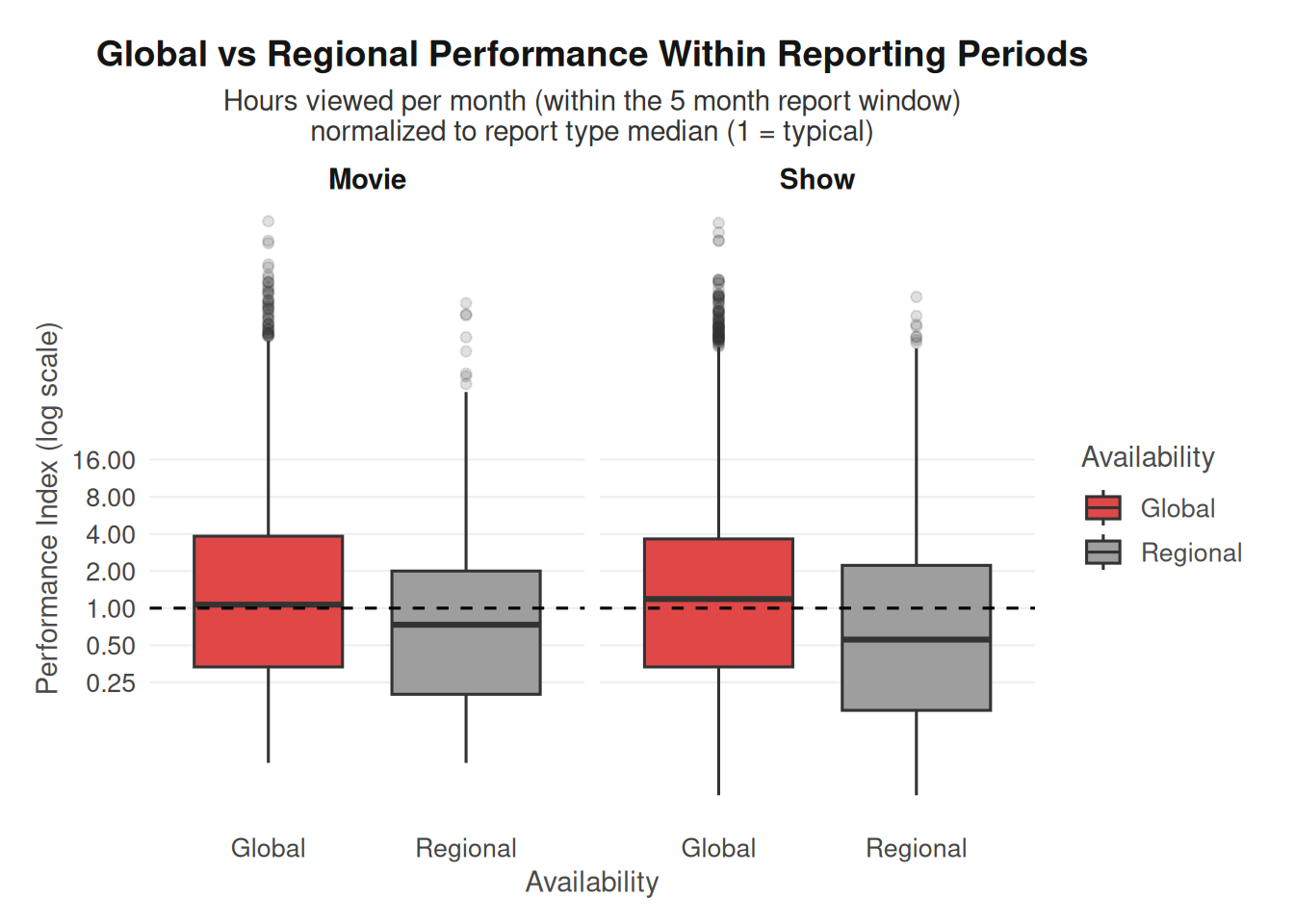
ggplot(
  df_norm,
  aes(
    x = performance_index,
    y = report,
    fill = available_globally
  )
) +
  geom_density_ridges(
    alpha = 0.5,
    scale = 0.9,
    rel_min_height = 0.01
  ) +
  geom_vline(xintercept = 1, linetype = "dashed") +
  scale_x_log10(
    breaks = c(0.1, 0.25, 0.5, 1, 2, 4, 8, 16),
    labels = c(".1", ".25", ".5", "1", "2", "4", "8", "16"),
    limits = c(0.02, 20)
  ) +
  scale_fill_manual(
    values = c(
      "Global" = "#d90000ff",
      "Regional" = "#959595ff"
    )
  ) +
  facet_wrap(~content_type) +
  labs(
    title = "Performance Distribution Across Report Periods",
    subtitle = "Hours viewed per month exposed, normalized to report × type median (1 = typical)",
    x = "Performance Index (log scale)",
    y = "Report Period",
    fill = "Availability"
  ) +
  theme_netflix() +
  theme(
    strip.text = element_text(margin = margin(b = 8))
  )
Picking joint bandwidth of 0.16Picking joint bandwidth of 0.145Warning: Removed 1019 rows containing non-finite outside the scale range
(`stat_density_ridges()`).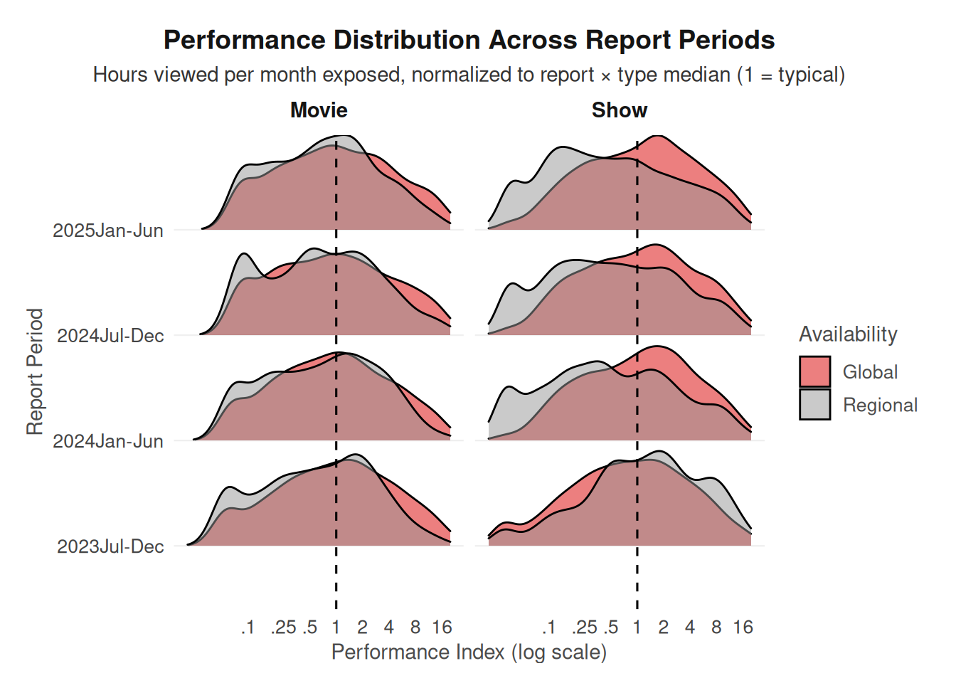
Discussion
(1-3 paragraphs) In the Discussion section, interpret the results of your analysis. Identify any trends revealed (or not revealed) by the plots. Speculate about why the data looks the way it does.
The boxplots indicate that globally distributed titles generally achieve slightly higher performance indices than regionally restricted titles for both movies and television shows. Because the performance index is normalized so that a value of 1 represents the typical title within each reporting period and content type, values above 1 indicate above-average engagement. In both panels, the median performance of globally distributed titles tends to be somewhat higher than that of regional titles. However, the distributions still overlap considerably, suggesting that while global titles may have a modest advantage, many regional titles still perform at comparable levels.
The ridgeline density plots provide additional insight into how these differences evolve across reporting periods. For television shows, the distributions suggest a growing gap between globally distributed and regional titles over time, with the global distributions shifting further to the right of the regional ones in later reporting periods. This pattern indicates that globally released shows are increasingly more likely to achieve above-median engagement relative to regional shows. In contrast, the difference between global and regional movies appears more stable across reporting periods, with the two distributions remaining closer together and showing less separation over time.
One possible explanation for this pattern is that globally distributed television series often receive greater marketing investment and sustained audience attention across multiple regions. Because shows typically release episodically and encourage ongoing viewer engagement, globally promoted series may accumulate momentum more effectively than regionally restricted content. Movies, on the other hand, tend to generate engagement in shorter bursts following release, which may limit the extent to which global distribution produces widening performance differences over time. Overall, the results suggest that global availability is associated with somewhat stronger engagement, particularly for television shows, where the performance gap between global and regional titles appears to grow across reporting periods.
Presentation
Our presentation can be found here.
Data
Include a citation for your data here. See https://data.research.cornell.edu/data-management/storing-and-managing/data-citation/ for guidance on proper citation for datasets. If you got your data off the web, make sure to note the retrieval date.
The data used in this project come from the Netflix What We Watched engagement dataset, distributed through the TidyTuesday project. The dataset contains engagement statistics for Netflix movies and television shows across multiple reporting periods, including variables such as hours_viewed, views, release_date, and whether the title was distributed globally or restricted to specific regions. The data originate from Netflix’s publicly released engagement reports and were compiled and published by the TidyTuesday project for open analysis and reproducible research.
Netflix. (2023–2025). What We Watched: A Netflix Engagement Report. Netflix, Inc. https://about.netflix.com/en/news/what-we-watchedAccessed March 3, 2026.
References
List any references here. You should, at a minimum, list your data source.
R for Data Science Community. (2025). TidyTuesday: Netflix “What We Watched” dataset (July 29, 2025 release). GitHub repository. https://github.com/rfordatascience/tidytuesday/tree/main/data/2025/2025-07-29 Accessed March 3, 2026.