── Attaching core tidyverse packages ──────────────────────── tidyverse 2.0.0 ──
✔ dplyr     1.1.4     ✔ readr     2.1.6
✔ forcats   1.0.1     ✔ stringr   1.6.0
✔ ggplot2   4.0.1     ✔ tibble    3.3.0
✔ lubridate 1.9.4     ✔ tidyr     1.3.2
✔ purrr     1.1.0
── Conflicts ────────────────────────────────────────── tidyverse_conflicts() ──
✖ dplyr::filter() masks stats::filter()
✖ dplyr::lag()    masks stats::lag()
ℹ Use the conflicted package (<http://conflicted.r-lib.org/>) to force all conflicts to become errors

Attaching package: 'scales'


The following object is masked from 'package:purrr':

    discard


The following object is masked from 'package:readr':

    col_factor


Linking to GEOS 3.12.1, GDAL 3.8.4, PROJ 9.4.0; sf_use_s2() is TRUEUS Fuel Price Trends
Rows: 22360 Columns: 5
── Column specification ────────────────────────────────────────────────────────
Delimiter: ","
chr  (3): fuel, grade, formulation
dbl  (1): price
date (1): date

ℹ Use `spec()` to retrieve the full column specification for this data.
ℹ Specify the column types or set `show_col_types = FALSE` to quiet this message.
Rows: 366 Columns: 2
── Column specification ────────────────────────────────────────────────────────
Delimiter: ","
dbl  (1): CPIAUCNS
date (1): observation_date

ℹ Use `spec()` to retrieve the full column specification for this data.
ℹ Specify the column types or set `show_col_types = FALSE` to quiet this message.
Introduction
(1-2 paragraphs) Brief introduction to the dataset. You may repeat some of the information about the dataset provided in the introduction to the dataset on the TidyTuesday repository, paraphrasing on your own terms. Imagine that your project is a standalone document and the grader has no prior knowledge of the dataset.
Our data set originates from the US Energy Information Administration and contains weekly observations across multiple gasoline grades and fuel formulations starting in August 1980 and until June 2025. The dataset contains 22,360 rows and 5 variables (date, fuel, grade, formulation, and price), with each row representing a weekly gasoline price observation by fuel type, grade, and formulation. We chose this dataset because fuel prices impact both large business operations and individual activities, so we’re curious how US prices have trended historically, as well as what international trends and geographical factors may help explain those price movements. For our analysis, we focus on data beginning in August 1995, as this is when the dataset includes the most complete information on both diesel and gasoline.
Note that the original dataset reports nominal prices, so to make more meaningful comparisons over time, we adjusted the prices for inflation using a CPI dataset.
1. How has pricing of gasoline and diesel changed over time?
Introduction
(1-2 paragraphs) Introduction to the question and what parts of the dataset are necessary to answer the question. Also discuss why you’re interested in this question.
Since fuel prices impact both every day individual lives as well as greater economic activity, we wanted to analyze how the prices of gasoline and diesel in the United States have changed over time. We were also curious how prices fluctuate within each year, as demand for fuel varies month to month. For our analysis, we used the date variable to track prices across time, the fuel variable to distinguish between and diesel, and the price variable to measure the cost of each fuel type.
Approach
(1-2 paragraphs) Describe what types of plots you are going to make to address your question. For each plot, provide a clear explanation as to why this plot (e.g. boxplot, barplot, histogram, etc.) is best for providing the information you are asking about. The two plots should be of different types, and at least one of the two plots needs to use either color mapping or facets.
Our first plot visualizes the seasonality of fuel prices using a polar bar chart. This type of plot makes sense for displaying seasonal patterns because it arranges the months around a circular axis, allowing recurring monthly patterns to become easier to identify. In this visualization, the distance from the center represents the price, while different colors represent different years, enabling us to compare how monthly fuel prices vary both within a year and across years.
Our second plot is a time series chart that shows how fuel prices have changed over the time period within the dataset. Because we observed clear seasonality in our first visualization, we apply a time series decomposition to separate the data into the original price series, a seasonally adjusted series, and the long-term trend, allowing us to better understand the underlying price movements. Below the main chart, we also include a residual bar chart to show deviations from the trend, which highlights periods when prices fluctuated significantly.
Both plots are faceted by fuel type.
Analysis
(2-3 code blocks, 2 figures, text/code comments as needed) In this section, provide the code that generates your plots. Use scale functions to provide nice axis labels and guides. You are welcome to use theme functions to customize the appearance of your plot, but you are not required to do so. All plots must be made with {ggplot2}. Do not use base R or {lattice} plotting functions.
monthly_wide <- monthly_adjusted_price |>
  filter(grade == "all") |>
  select(date, fuel, price) |>
  pivot_wider(names_from = fuel, values_from = price)
# Use R.decompose to find yt = S(t) * Tt * Rt
# where:
# yt is the observed price for some t
# S(t) is the seasonal index for some t
# Tt is the trend from 2x12MA of y
# Rt is the residual or the left over
decomp_vector <- function(timeseries) {
d <- decompose(timeseries, type = "multiplicative")
data.frame(
date = seq(
as.Date("1995-01-01"),
by = "month",
length.out = length(timeseries)
),
price = as.numeric(d$x),
trend = as.numeric(d$trend),
seasonal = as.numeric(d$seasonal),
residual = as.numeric(d$random)
) |>
mutate(seasonal_adjusted = price / residual)
}
gasoline_decomp <- decomp_vector(ts(
monthly_wide$gasoline,
start = c(1995, 1),
frequency = 12
))
diesel_decomp <- decomp_vector(ts(
monthly_wide$diesel,
start = c(1995, 1),
frequency = 12
))
diesel_resid_sd <- sd(diesel_decomp$residual, na.rm = TRUE)
gasoline_resid_sd <- sd(gasoline_decomp$residual, na.rm = TRUE)
diesel_decomp <- diesel_decomp |>
mutate(
abnormal = if_else(abs(residual - 1) > 2 * diesel_resid_sd, TRUE, FALSE)
)
gasoline_decomp <- gasoline_decomp |>
mutate(
abnormal = if_else(abs(residual - 1) > 2 * gasoline_resid_sd, TRUE, FALSE)
)combined_decomp <- bind_rows(
gasoline_decomp |> mutate(fuel = "Gasoline"),
diesel_decomp |> mutate(fuel = "Diesel")
)
make_polar <- function(decomp_df) {
decomp_df |>
mutate(
year = as.integer(format(date, "%Y")),
month = as.integer(format(date, "%m"))
) |>
arrange(desc(year)) |>
ggplot(aes(x = month, y = price, fill = year)) +
geom_col(position = "identity", width = 1, alpha = 0.8) +
geom_text(
data = data.frame(
month = 12,
price = c(0, 2, 4, 6),
label = c("$0", "$2", "$4", "$6")
),
aes(x = month, y = price, label = label),
inherit.aes = FALSE,
fontface = "bold",
size = 4,
hjust = -0.3,
color = "grey"
) +
scale_x_continuous(
breaks = 1:12,
labels = month.abb
) +
scale_y_continuous(
limits = c(0, 7),
labels = label_dollar(accuracy = 0.01)
) +
coord_polar() +
scale_fill_viridis_b(n.breaks = 6) +
labs(
title = "Seasonality of US Diesel and Gasoline Prices",
x = NULL,
y = NULL,
fill = "Year"
) +
facet_wrap(~fuel, nrow = 1) +
theme_minimal(base_size = 14, base_family = "sans serif") +
theme(
plot.title = element_text(size = 18, hjust = 0.5),
legend.title = element_text(size = 12),
legend.text = element_text(size = 10),
axis.text.y = element_blank(),
axis.ticks.y = element_blank()
)
}
make_polar(combined_decomp)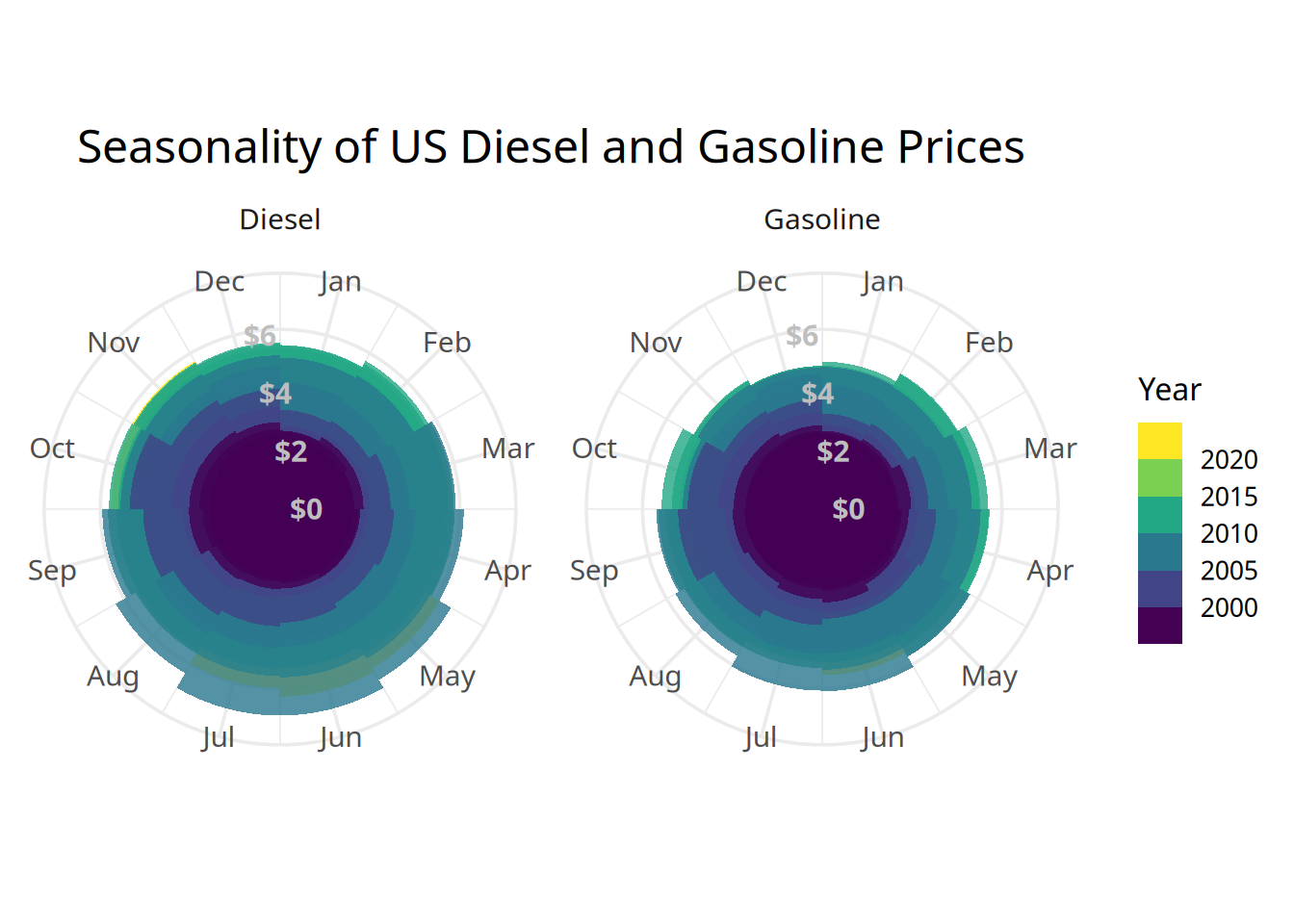
make_decomp_plots <- function(decomp_df, resid_sd, line_color, title) {
  p1 <- decomp_df |>
    ggplot(aes(x = date)) +
    geom_rect(
      aes(
        xmin = date,
        xmax = lead(date),
        ymin = -Inf,
        ymax = Inf,
        fill = abnormal
      ),
      alpha = 0.2
    ) +
    geom_ribbon(
      aes(
        ymin = trend,
        ymax = seasonal_adjusted,
        fill = "Diff"
      ),
      alpha = 0.5
    ) +
    geom_line(
      aes(y = price, color = "Price", linetype = "Price"),
      linewidth = 0.5
    ) +
    geom_line(
      aes(y = trend, color = "Trend", linetype = "Trend"),
      linewidth = 1
    ) +
    geom_line(
      aes(
        y = seasonal_adjusted,
        color = "Seasonally Adjusted",
        linetype = "Seasonally Adjusted"
      ),
      linewidth = 0.8
    ) +
    labs(title = title, y = "Price") +
    scale_y_continuous(labels = label_dollar(accuracy = 0.01)) +
    scale_fill_manual(
      values = c("TRUE" = "red", "FALSE" = "transparent", "Diff" = line_color),
      na.value = "transparent",
      guide = "none"
    ) +
    scale_color_manual(
      name = "Metric",
      values = c(
        "Price" = "grey70",
        "Trend" = line_color,
        "Seasonally Adjusted" = line_color
      )
    ) +
    scale_linetype_manual(
      name = "Metric",
      values = c(
        "Price" = "solid",
        "Trend" = "solid",
        "Seasonally Adjusted" = "dashed"
      )
    ) +
    scale_x_date(
      limits = c(min(decomp_df$date), max(decomp_df$date)),
      date_breaks = "5 years",
      date_labels = "%Y",
      expand = c(0, 0)
    ) +
    theme_minimal(base_size = 14, base_family = "sans serif") +
    theme(
      axis.text.x = element_blank(),
      axis.title.x = element_blank(),
      legend.position = "top",
      legend.justification = "center",
      legend.title = element_blank(),
      plot.title = element_text(hjust = 0.5),
      axis.title.y = element_text(size = 14)
    )

  p2 <- decomp_df |>
    ggplot(aes(x = date, y = residual - 1)) +
    geom_col(fill = "grey40") +
    annotate(
      "rect",
      xmin = min(decomp_df$date, na.rm = TRUE),
      xmax = max(decomp_df$date, na.rm = TRUE),
      ymin = -resid_sd,
      ymax = resid_sd,
      fill = "green",
      alpha = 0.2
    ) +
    scale_y_continuous(labels = \(x) x + 1) +
    scale_x_date(
      limits = c(min(decomp_df$date), max(decomp_df$date)),
      date_breaks = "5 years",
      date_labels = "%Y",
      expand = c(0, 0)
    ) +
    labs(x = "Year", y = "Residual") +
    theme_gray(base_size = 14, base_family = "sans serif") +
    theme(
      axis.title.y = element_text(size = 14),
      axis.ticks.x = element_blank(),
      axis.ticks.y = element_blank()
    )

  p1 / p2 + plot_layout(heights = c(3, 1))
}

patch1 <- make_decomp_plots(
  diesel_decomp,
  diesel_resid_sd,
  "#0C7BDC",
  "Diesel"
)
patch2 <- make_decomp_plots(
  gasoline_decomp,
  gasoline_resid_sd,
  "#FFC20A",
  "Gasoline"
)

wrap_plots(patch1, patch2, ncol = 1) +
  plot_annotation(
    title = "Time Series Decomposition of US Diesel and Gasoline Prices",
    caption = "Red shaded regions highlight months where the residual deviated more than two standard deviations from its expected value.",
    theme = theme(
      plot.title = element_text(family = "sans serif", size = 18, hjust = 0.5),
      plot.caption = element_text(family = "sans serif", size = 12)
    )
  )
Warning: Removed 12 rows containing missing values or values outside the scale range
(`geom_ribbon()`).Warning: Removed 12 rows containing missing values or values outside the scale range
(`geom_line()`).
Removed 12 rows containing missing values or values outside the scale range
(`geom_line()`).Warning: Removed 12 rows containing missing values or values outside the scale range
(`geom_col()`).Warning: Removed 12 rows containing missing values or values outside the scale range
(`geom_ribbon()`).Warning: Removed 12 rows containing missing values or values outside the scale range
(`geom_line()`).
Removed 12 rows containing missing values or values outside the scale range
(`geom_line()`).Warning: Removed 12 rows containing missing values or values outside the scale range
(`geom_col()`).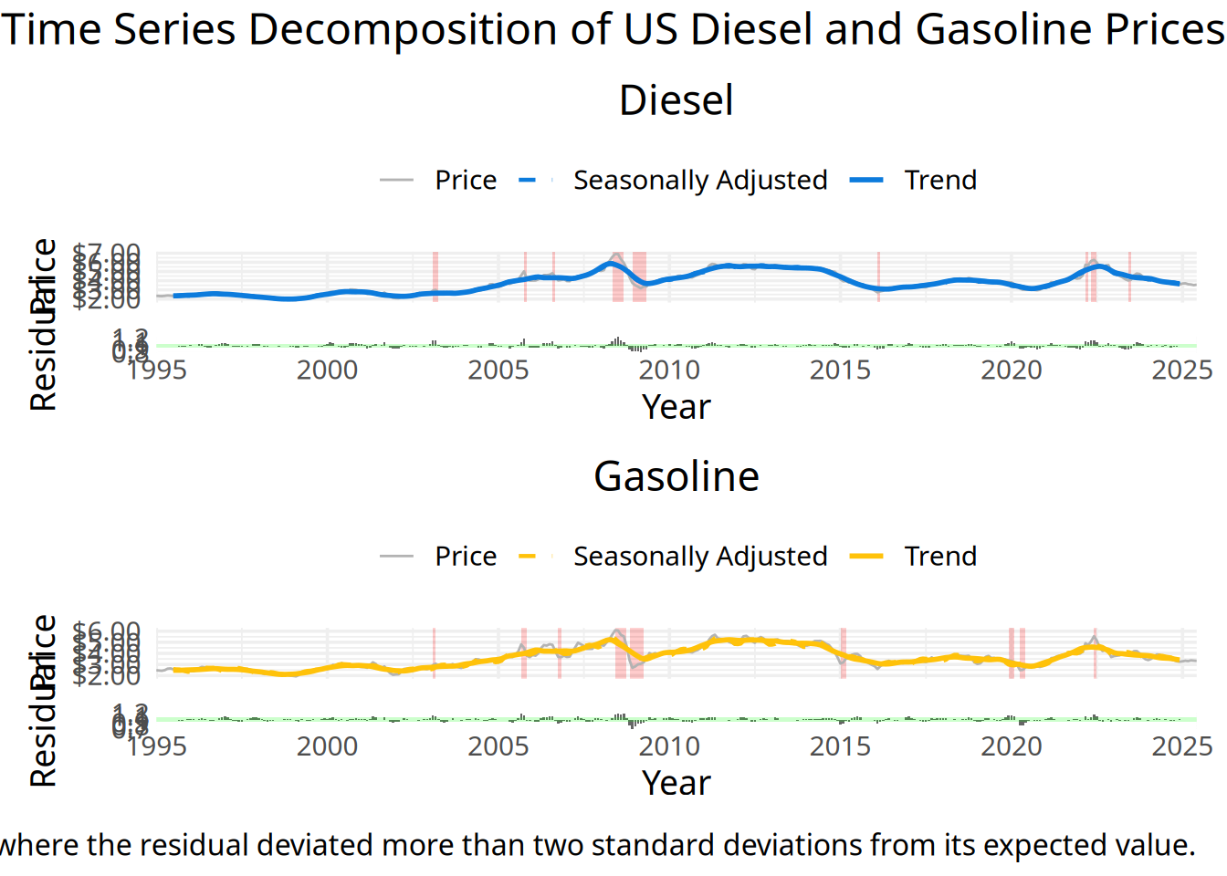
Discussion
(1-3 paragraphs) In the Discussion section, interpret the results of your analysis. Identify any trends revealed (or not revealed) by the plots. Speculate about why the data looks the way it does.
Our analysis shows that trends in diesel and gasoline prices are closely correlated. This indicates that there may be more shared underlying factors that affect both their prices rather than differentiate them, which makes sense given that both products are derived from crude oil and share similar supply chains. Additionally, prices for both fuel types tend to peak during the summer months, suggesting that seasonal increases in travel and cooling demand place greater upward pressure on fuel markets than winter heating needs.
Our time series decomposition also highlighted significant volatility around certain periods. These high-deviation periods align with major global economic or geopolitical events such as the 2008 financial crisis and the Russia-Ukraine War, which understanably effect global energy supply and demand. In our second question, we plan to explore how US fuel prices compare to global price trends to further understand the impact of worldwide factors on US pricing.
Overall, our results suggest that while fuel prices exhibit predictable seasonal patterns and long-term trends, they remain highly sensitive to external shocks. Major geopolitical events can cause prices to deviate substantially from their expected trajectories.
How do Global Oil Markets and Domestic Production Geography Influence U.S. Fuel Prices?
Introduction
(1-2 paragraphs) Introduction to the question and what parts of the dataset are necessary to answer the question. Also discuss why you’re interested in this question.
After observing trends in the fluctuation in fuel prices, we began to wonder what external factors may play a major role in driving these price fluctuations. While seasonal demand and long-term economic cycles may explain some variation in the data, fuel prices are shaped by both domestic and global factors. We focused on the benchmarks Brent and West Texas Intermediate (WTI) as they are international crude benchmarks and gas and diesel are refined from crude oil. Particularly, we wanted to focus on the spread of these two benchmarks and how they may impact domestic fuel prices.
Additionally, we wanted to explore domestic production geography, particularly looking at where the major reserves are and how fuel pricing is affected throughout regions of the U.S. In order answer this question, we combined CPI-adjusted crude oil spot prices, the Brent-WTI spread, U.S. retail fuel prices, and state-level oil production data.
Approach
(1-2 paragraphs) Describe what types of plots you are going to make to address your question. For each plot, provide a clear explanation as to why this plot (e.g. boxplot, barplot, histogram, etc.) is best for providing the information you are asking about. The two plots should be of different types, and at least one of the two plots needs to use either color mapping or facets.
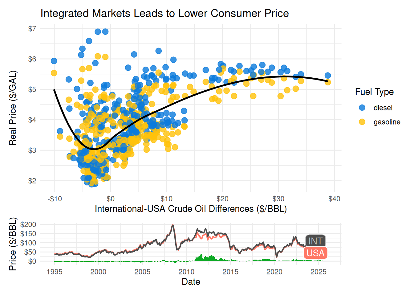
We are producing 2 visualizations to address this question. The first visualization consists of a time series plot line plot and a scatterplot layered with a smoothing line. The time series plot uses a line chart which is the most appropriate choice because price is measured continuously over time and allows us to connect price movements with global events. The scatterplot allows us to look closely at the relationship between global and domestic oil prices and retail gas prices without consideration for time. The smoothing line helps us see this relationship more clearly by reducing visual noise.
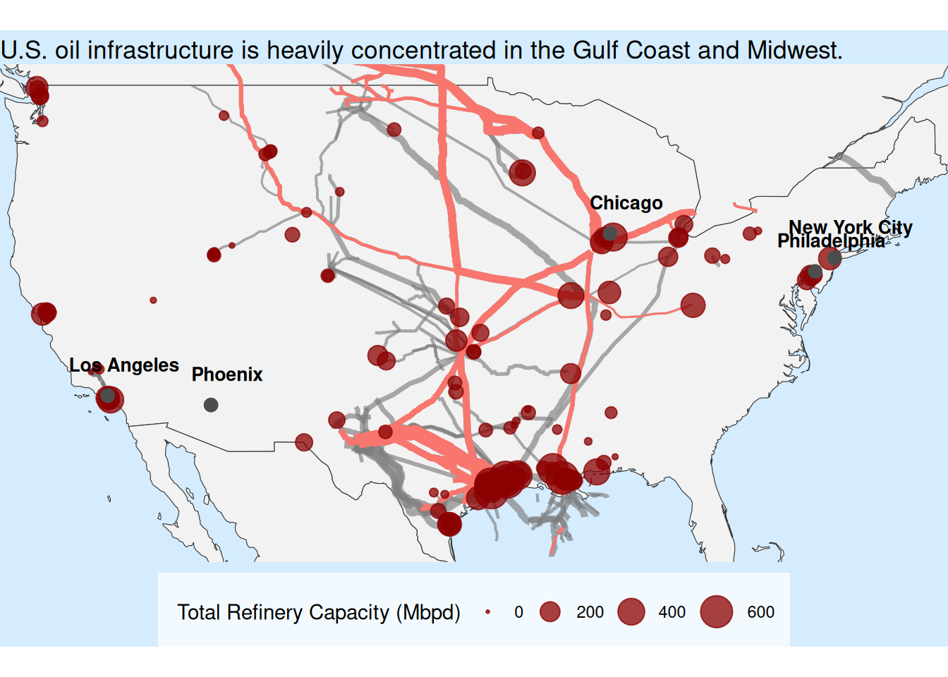
Next, we analyze domestic production geography by building a choropleth U.S. map visualization to show pipeline networks and refinery capacity. The map allows us to assess where crude oil capacity is concentrated and examine the distribution of infrastructure. By plotting this regional distribution, we will be able determine whether pipelines may create imbalances that influence the fuel market.
Analysis
(2-3 code blocks, 2 figures, text/code comments as needed) In this section, provide the code that generates your plots. Use scale functions to provide nice axis labels and guides. You are welcome to use theme functions to customize the appearance of your plot, but you are not required to do so. All plots must be made with {ggplot2}. Do not use base R or {lattice} plotting functions.
dgPallet <- c(
  "gasoline" = "#FFC20A",
  "diesel" = "#0C7BDC"
)
crude_adjusted_price <- bind_rows(
  read_csv("data/land1.csv") |>
    filter(
      duoarea %in%
        c(
          "NUS-ME0", # OPEC countries
          "NUS-MN0", # Non-OPEC countries
          "NUS-Z00" # Total US Average Land Cost (weighted average of all imported landing cost)
        )
    ),
  read_csv("data/spot_prices.csv") |>
    filter(
      duoarea %in%
        c(
          "ZEU", # BRENT (Europe)
          "YCUOK" # WTI (US)
        )
    )
) |>
  mutate(date = as.Date(paste0(period, "-01"))) |>
  left_join(cpi, by = "date") |>
  mutate(
    price = (value * cpi_ratio),
    units = "$/GAL",
    series_description = `series-description`
  ) |>
  select(date, duoarea, series_description, price, units)


brent_wti_spread <- crude_adjusted_price |>
  filter(duoarea %in% c("YCUOK", "ZEU")) |>
  pivot_wider(names_from = duoarea, values_from = price, id_cols = date) |>
  mutate(
    spread = ZEU - YCUOK,
    year = as.integer(format(date, "%Y"))
  )

p1 <- brent_wti_spread |>
  left_join(monthly_adjusted_price |> filter(grade == "all"), by = "date") |>
  drop_na(fuel) |>
  ggplot(aes(x = spread, y = price, color = fuel)) +
  scale_color_manual(values = dgPallet) +
  geom_point(alpha = 0.8, size = 3) +
  labs(
    title = "Integrated Markets Leads to Lower Consumer Price",
    x = "International-USA Crude Oil Differences ($/BBL)",
    y = "Real Price ($/GAL)",
    color = "Fuel Type"
  ) +
  theme_minimal() +
  geom_smooth(color = "transparent", alpha = 0.2, se = FALSE) +
  geom_smooth(color = "black", se = FALSE) +
  scale_x_continuous(labels = scales::label_dollar()) +
  scale_y_continuous(labels = scales::label_dollar())

p2 <- brent_wti_spread |>
  ggplot(aes(x = date)) +
  geom_col(aes(y = spread), fill = "#0DA925", width = 40) +
  geom_line(aes(y = YCUOK), color = "#FF7765", linewidth = 0.75) +
  geom_line(aes(y = ZEU), color = "grey30", linewidth = 0.75) +
  labs(
      x = "Date",
      y = "Price ($/BBL)",
      ) +
  scale_x_date(date_breaks = "3 years", date_labels = "%Y") +
  geom_label(
    x = as.Date("2024-09-01"),
    y = 110,
    label = "INT",
    fill = "grey30",
    color = "grey",
    label.r = unit(0.3, "lines")
  ) +
  geom_label(
    x = as.Date("2024-09-01"),
    y = 45,
    label = "USA",
    fill = "#FF7765",
    color = "white",
    label.r = unit(0.3, "lines")
  ) +
    scale_x_date(
        breaks = seq(as.Date("1995-01-01"),
                     max(brent_wti_spread$date),
                     by = "5 years"),
        date_labels = "%Y"
    ) +
scale_y_continuous(labels = scales::label_dollar()) +
theme_minimal()

wrap_plots(
  p1,
  p2,
  ncol = 1,
  heights = c(8, 2)
)
pipeline <- st_read("data/geo_data/oil_pipeline_2025.geojson") |>
  filter(!is.na(Capacity))
Reading layer `oil_pipeline_2025' from data source
`/home/pt337/proj-01-proud-panda/data/geo_data/oil_pipeline_2025.geojson'
using driver `GeoJSON'
Simple feature collection with 230 features and 8 fields (with 58 geometries empty)
Geometry type: MULTILINESTRING
Dimension: XY
Bounding box: xmin: -151.7245 ymin: 26.24753 xmax: -70.25983 ymax: 70.25504
Geodetic CRS: WGS 84top_OwnerID <- pipeline |>
group_by(OwnerEntityIDs) |>
summarise(
total = sum(Capacity)
) |>
slice_max(order_by = total, n = 10) |>
pull(OwnerEntityIDs)
pipeline_top <- pipeline |>
filter(OwnerEntityIDs %in% top_OwnerID)
refineries <- st_read("data/geo_data/petroleum-refineries.geojson") |>
filter(!is.na(AD_Mbpd))Reading layer `petroleum-refineries' from data source
`/home/pt337/proj-01-proud-panda/data/geo_data/petroleum-refineries.geojson'
using driver `GeoJSON'
Simple feature collection with 132 features and 22 fields
Geometry type: POINT
Dimension: XY
Bounding box: xmin: -158.0914 ymin: 21.30377 xmax: -74.22235 ymax: 70.32483
Geodetic CRS: WGS 84refineries <- refineries |>
mutate(
Total_Mbpd = rowSums(across(c(AD_Mbpd, Asph_Mbpd)), na.rm = TRUE)
)
city <- st_as_sf(
data.frame(
name = c(
"New York City",
"Los Angeles",
"Chicago",
"Phoenix",
"Philadelphia"
),
lon = c(-73.94, -118.41, -87.68, -112.09, -75.13),
lat = c(40.66, 34.02, 41.84, 33.57, 40.01)
),
coords = c("lon", "lat"),
crs = 4326
)
na_map <- ne_countries(
continent = "North America",
returnclass = "sf",
scale = "medium"
)
ggplot() +
geom_sf(data = na_map, fill = "gray95", color = "gray20") +
geom_sf(
data = pipeline,
aes(linewidth = Capacity_Mbpd),
color = 'gray50',
alpha = 0.65
) +
geom_sf(
data = pipeline_top,
aes(linewidth = Capacity_Mbpd,
# color = OwnerEntityIDs,
color = "green"
)
) +
guides(linewidth = "none", color = 'none') +
geom_sf(
data = refineries,
aes(size = AD_Mbpd),
color = 'darkred',
alpha = 0.75
) +
geom_sf(data = city, color = "gray30", size = 3) +
geom_sf_text(
data = city,
aes(label = name),
nudge_y = 1.5,
nudge_x = 1,
size = 3.5,
fontface = "bold"
) +
scale_linewidth_continuous(range = c(0.5, 5)) +
scale_size_continuous(range = c(0.5, 8)) +
labs(
size = "Total Refinery Capacity (Mbpd)"
) +
coord_sf(xlim = c(-125, -67), ylim = c(26, 50), expand = FALSE) +
labs(
title = "U.S. oil infrastructure is heavily concentrated in the Gulf Coast and Midwest."
) +
theme_void() +
theme(
legend.position = "bottom",
legend.direction = "horizontal",
plot.background = element_rect(fill = "#d4ecfdff", color = NA),
legend.background = element_rect(
fill = '#f3faffff',
color = NA
),
legend.margin = margin(10, 8, 8, 10)
)
Discussion
(1-3 paragraphs) In the Discussion section, interpret the results of your analysis. Identify any trends revealed (or not revealed) by the plots. Speculate about why the data looks the way it does.
Our first visualization suggests that U.S. fuel prices are influenced by a difference in the global and domestic crude oil prices. As we see the Brent-WTI spread increase, the price of retail fuel increases as well. The smoothing line helps to identify this upwards trend. Although the trend is somewhat more variable in lower Brent-WTI spreads, th eoverall trend is positive. The data may look this way because the price of retail fuel is strongly influenced by the international fuel market conditions.
The refinery and crude oil pipeline map gives us insight into the impact domestic production and distribution infrastructure plays in retail prices. Majority of crude oil processing and transportation are overwhelmingly centered around Gulf Coast and Midwest. The result of this is that both the East and West Coast, with some of the highest population and therefore demand for fuel, are relatively isolated for the domestric crude oil production. This means when including transportation cost, domestic oil may not be that much more competitive compared to international.
Presentation
Our presentation can be found here.
Data
Include a citation for your data here. See https://data.research.cornell.edu/data-management/storing-and-managing/data-citation/ for guidance on proper citation for datasets. If you got your data off the web, make sure to note the retrieval date.
Weekly Gas and Diesel
Jon Harmon, Data Science Learning Community the TidyTuesday(2025) dataset Repository : https://github.com/rfordatascience/tidytuesday/blob/main/data/2025/2025-07-01/weekly_gas_prices.csv
Brent and WTI index
EIA Petroleum & Other Liquids - Spot Prices Repository : https://www.eia.gov/dnav/pet/pet_pri_spt_s1_d.htm
US Petroleum Refinery Location and Capacity
HIFLD OPEN Petroleum Refineries from DOE and DHLS Repository : https://www.datalumos.org/datalumos/project/240514/version/V1/view
US Petroleum Pipelines Location and Capacity
Global Energy Monitor (GEM) Open Source Global Oil Infrastructure Tracker Repository: https://globalenergymonitor.org/projects/global-oil-infrastructure-tracker/
Average Consumer Price Index
Federal Reserve Bank of St. Louis (FRED) Repository : https://fred.stlouisfed.org/series/CPIAUCNS
References
List any references here. You should, at a minimum, list your data source.