── Attaching core tidyverse packages ──────────────────────── tidyverse 2.0.0 ──
✔ dplyr     1.1.4     ✔ readr     2.1.6
✔ forcats   1.0.1     ✔ stringr   1.6.0
✔ ggplot2   4.0.1     ✔ tibble    3.3.0
✔ lubridate 1.9.4     ✔ tidyr     1.3.2
✔ purrr     1.1.0
── Conflicts ────────────────────────────────────────── tidyverse_conflicts() ──
✖ dplyr::filter() masks stats::filter()
✖ dplyr::lag()    masks stats::lag()
ℹ Use the conflicted package (<http://conflicted.r-lib.org/>) to force all conflicts to become errorsMTA Underground Art Gallery
Introduction
The dataset used in this analysis originates from the Metropolitan Transportation Authority (MTA) Arts & Design program. The dataset is the MTA Permanent Art Catalog, which documents permanent public art installations across the New York City MTA system. This includes New York City Transit (NYCT), Long Island Rail Road (LIRR), Metro-North Railroad, and Staten Island Railway (SIR). The program’s mission is to create meaningful connections between sites and neighborhoods, and improve travel experiences for riders. While the artwork is site specific with diverse artwork running from mosaics and glasswork to bronze sculptures.
We chose this dataset because it allows us to explore the intersection of public art and transit infrastructure, two elements that define the daily life of millions of New Yorkers. While transit data is often analyzed through the lens of efficiency and engineering, this dataset provides a unique opportunity to view the system as a cultural map. The combination of temporal, categorical, and relational structure makes it well suited for examining patterns in artistic diversity and material usage over time and across subway lines.
Question 1: Lines vs. Artist Diversity
Introduction
The New York City Metropolitan Transportation Authority (MTA) transit system operates one of world’s largest underground museums. Those permanent art installations where serve as an aesthetic landmarks and ways for commuters to engage with public art during their daily routines. We want to explore about whether the physical complexity of a transit hub (defined by number of unique subway/rail lines) correlates with the “richness” of the artist diversity(defined by number of unique artists contributing to the station’s collection).
Our question: Does the complexity of a station (number of lines) drive higher artist diversity, and does this diversity vary significantly between different MTA agencies?
To answer this question, we need both datasets (mta_art & station_lines). Specifically, we are using station_name, line, and artist variables. We are interested in this question can reveals how the MTA allocates its cultural and creative resources across the city and if artist diversity is heavily concentrated only in massive transfer hub. Whether busier, more connected stations will attract a wider variety of artwork. Understanding this relationship can provide insights for urban planner and cultural program managers on how to distribute artistic resources, and how station design and connectivity might influence cultural representation.
Approach
To investigate whether transit hub complexity is associated with artistic diversity, we merge the mta_art dataset, which records artworks and their associated artists, with the station_lines dataset, which defines station connectivity. We pre-process the data by calculating the number of distinct transit lines serving each station and the number of unique artists represented at each station. These pre-processings allow us to directly compare structural complexity and artistic diversity at the station level. Our first visualization is a line graph with 95% confidence intervals, which summarizes the overall system-wide trend. Because the number of transit lines represents an ordered numeric measure of hub complexity, a line plot can effectively display how average artist diversity changes as complexity increases. Including the confidence intervals and sample size labels provides the precision of estimated means, particularly since the number of stations varies across complexity levels. Moreover, we overlay a dashed linear regression line to illustrate the overall trend and to assess whether there is a positive association.
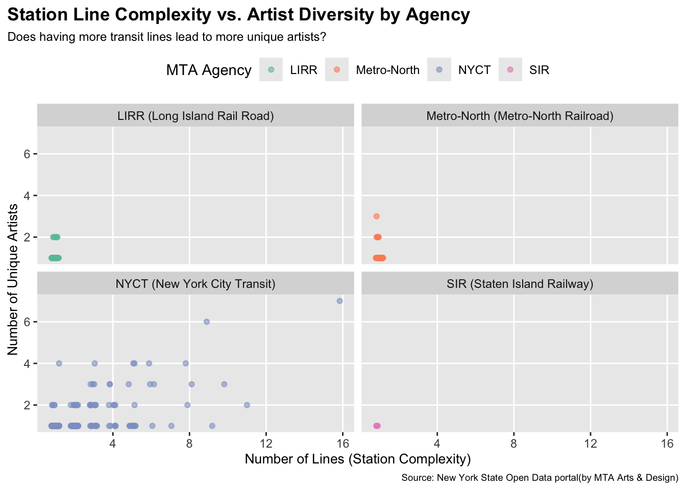
Our second graph goes deeper, where we create a faceted jitter plot with color mapping by agency. Through our EDA, we did notice an imbalance in data availability across agencies. So we also want to take that into consideration when determining the relationship between station complexity and artist diversity. Facet enables us to evaluate patterns within each agency separately while maintaining comparable scales. The use of color mapping further enhances and clarifies agency distinctions. We use jittering to reduce overplotting, where multiple stations can overlap at the exact same coordinates, making it harder for us to gain any insight. By adding small random noise to each point, it can better reveal the true density of the station at each level. Overall, these two plots provide both a summarized system-level trend and a more detailed agency-level view of the relationship between line complexity and artistic diversity.
Analysis
# To assess station complexity
station_complexity <- station_lines |>
  group_by(agency, station_name) |>
  summarize(
    num_lines = n_distinct(line),
    .groups = "drop"
  )

# Clean and separate multiple artists (comma-separated)
art_clean <- mta_art |>
  mutate(
    # remove anything inside parentheses
    artist = str_remove_all(artist, "\\s*\\(.*?\\)"),
    # replace " and/ & " with comma
    artist = str_replace_all(artist, "\\s*(and|&)\\s*", ","),
    artist = str_split(artist, ",")
  ) |>
  unnest(artist) |>
  mutate(artist = str_trim(artist)) |>
  filter(artist != "")

# To asses artist diversity (unique artist)
artist_diversity <- art_clean |>
  group_by(agency, station_name) |>
  summarize(
    artist_diversity = n_distinct(artist),
    .groups = "drop"
  )

# Link station complexity to art diversity for analysis
join_data <- inner_join(
  station_complexity,
  artist_diversity,
  join_by(agency, station_name)
)

# Calculate stats (CI) for error bar use
summary_stats <- join_data |>
  group_by(num_lines) |>
  summarize(
    mean_div = mean(artist_diversity),
    n = n(),
    se = sd(artist_diversity) / sqrt(n),
    .groups = "drop"
  ) |>
  mutate(
    lower = mean_div - 1.96 * se,
    upper = mean_div + 1.96 * se
  )

ggplot(summary_stats, aes(x = num_lines, y = mean_div)) +
  # Error Bars
  geom_errorbar(
    aes(ymin = lower, ymax = upper),
    width = 0.25,
    linewidth = 0.6,
    color = "steelblue"
  ) +
  geom_line(color = "steelblue", linewidth = 1) +
  geom_point(color = "steelblue", size = 2.5) +
  # Sample Size Labels
  geom_text(
    aes(label = paste0("n=", n)),
    vjust = -3,
    hjust = 0.6,
    size = 2.5,
    color = "grey30"
  ) +
  # Visualize the trend of diversity vs. complexity
  geom_smooth(
    data = join_data,
    aes(x = num_lines, y = artist_diversity),
    method = "lm",
    se = FALSE,
    color = "black",
    linetype = "dashed",
    linewidth = 0.5
  ) +
  scale_x_continuous(breaks = seq(1, 16, 1)) +
  scale_y_continuous(breaks = seq(0, 8, 1)) +
  labs(
    title = "Average Artist Diversity by Line Count",
    subtitle = "Points show mean diversity per number of lines\nDashed line = overall trend across all stations",
    x = "Number of Lines (Station Complexity)",
    y = "Mean Unique Artists (\u00b1 95% CI)",
    caption = "Sample size (n) indicates the number of stations at each complexity level."
  ) +
  theme(
    panel.grid.minor = element_blank(),
    plot.title = element_text(face = "bold"),
    plot.caption = element_text(size = 7),
    plot.subtitle = element_text(size = 9),
  )
`geom_smooth()` using formula = 'y ~ x'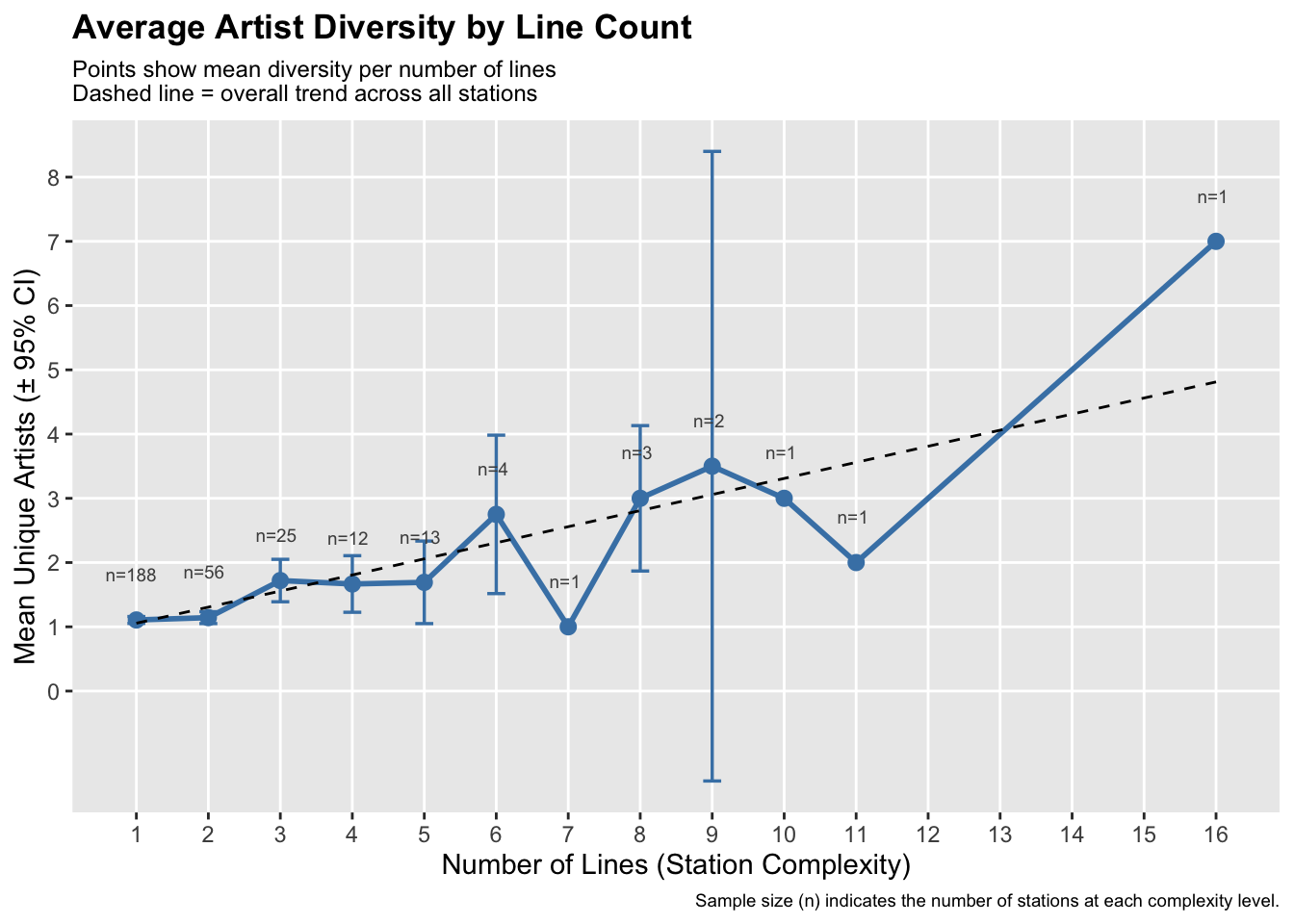
agency_labels <- c(
  "NYCT" = "NYCT (New York City Transit)",
  "LIRR" = "LIRR (Long Island Rail Road)",
  "Metro-North" = "Metro-North (Metro-North Railroad)",
  "SIR" = "SIR (Staten Island Railway)"
)
ggplot(join_data, aes(num_lines, artist_diversity, color = agency)) +
  geom_jitter(width = 0.2, height = 0, alpha = 0.6) +
  facet_wrap(~agency, labeller = labeller(agency = agency_labels)) +
  scale_color_brewer(palette = "Set2") +
  labs(
    title = "Station Line Complexity vs. Artist Diversity by Agency",
    subtitle = "Does having more transit lines lead to more unique artists?",
    x = "Number of Lines (Station Complexity)",
    y = "Number of Unique Artists",
    color = "MTA Agency",
    caption = "Source: New York State Open Data portal(by MTA Arts & Design)"
  ) +
  theme(
    plot.title = element_text(face = "bold"),
    plot.subtitle = element_text(size = 9),
    plot.caption = element_text(size = 7),
    plot.title.position = "plot",
    legend.position = "top",
    panel.grid.minor = element_blank(),
    axis.title.x = element_text(size = 10),
    axis.title.y = element_text(size = 10)
  )
Discussion
The first plot reveals a small positive association between station complexity and artist diversity across the entire MTA system. As the number of transit lines increases, the mean number of unique artists per station slightly rises. However, the visualization also highlights a significant decrease in data density at higher complexity stations. While a simpler station (serving 1 -2 lines) represents the vast majority of data (n=188 and 56). Moreover, stations with 8 or 9 lines show much higher variation, as evidenced by the widening 95% confidence intervals. This small positive correlation exists because a more complex hub has a larger physical space, such as transfer tunnels, which have more wall space or physical space for separate artists to contribute. The highly diverse station (16 lines) might suggest that MTA may intentionally treat it as a museum or reflect the importance of that station location, which has a much more diverse artist.
The faceted jitter plot clarifies that the relationship between connectivity and diversity is not uniform across the MTA system. Instead, it is primarily driven by New York City Transit (NYCT). For the other three agencies (LIRR, Metro-North, and SIR), stations rarely exceed two lines or two artists, resulting in complexity that does not necessarily drive diversity. In contrast, the NYCT facet shows a spread distribution. As stations become more complex, the range of artist diversity expands. While many high-complexity NYCT stations still only feature one or two artists, indicating that complexity alone does not guarantee higher diversity. This might suggest that the complexity and diversity link is unique to NYCT rather than suburban commuter rails. Such as the institutional differences across agencies and how NYCT operates primarily within dense urban areas with large transfer hubs and high passenger volume. Lead to having a larger investment for renovation. Moreover, several NYCT hubs are cultural landmarks, which might encourage the MTA Art & Design program to prioritize artwork display at those stations compared to just commuter routes.
Question 2: Material Usage Over Time
Introduction
Public artwork in transit systems is defined not only by where it appears but also by the materials used to construct it. Different materials influence durability, visibility, and how artwork interacts with station architecture. In this section we examine whether the materials used in MTA installations have changed across decades.
To answer this question we focus on two variables from the mta_art dataset: art_date, which records the year an artwork was installed, and art_material, which describes the materials used in the piece. Because the raw material descriptions vary widely, we group them into broader categories such as Glass / Mosaic, Metal, and Ceramic / Tile / Stone. These categories allow us to compare how material usage evolves across time.
Approach
To analyze material usage over time, we extract the decade from the art_date variable and clean the art_material text descriptions. Many artworks contain multiple materials listed together, so we split these descriptions into individual material tokens and classify each token into one of six broader material groups.
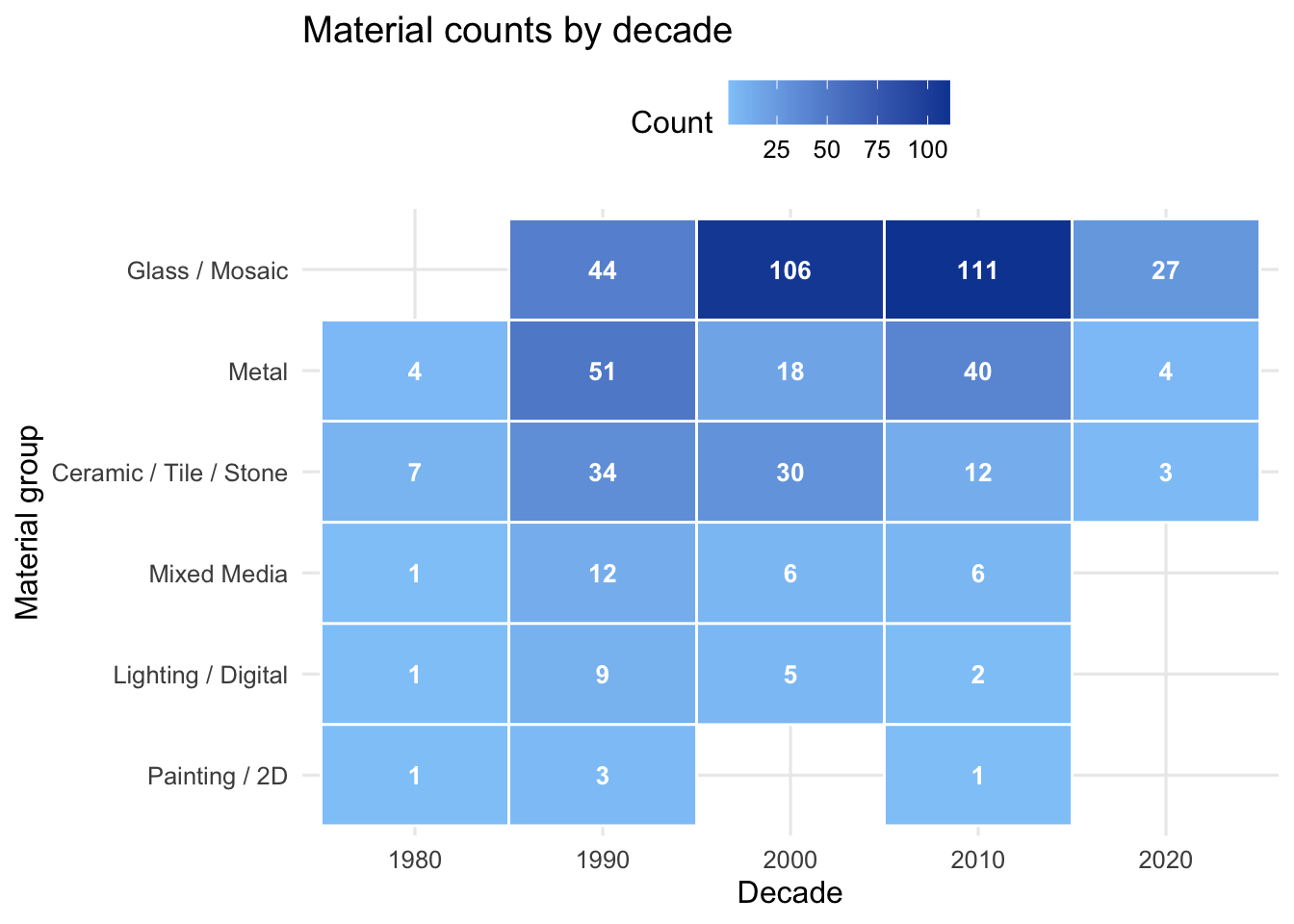
Our first visualization is a heatmap that shows the number of material tokens used in each decade for each material group. A heatmap is effective because it allows comparisons across two categorical dimensions at once, time and material type, while visually highlighting where counts are highest.
Our second visualization is a faceted line chart that shows artwork counts by agency over time within each material group. This chart helps reveal whether material trends differ between agencies. Faceting allows us to compare patterns within each material category while maintaining the same time axis across panels.
Analysis
library(dplyr)
library(stringr)
library(tidyr)
library(forcats)
library(ggplot2)

material_bucket <- function(x) {
  x <- str_to_lower(x)

  case_when(
    str_detect(
      x,
      "lighting|led|projection|software|electronic|computer|digital|sound"
    ) ~
      "Lighting / Digital",

    str_detect(x, "painting|oil|acrylic|mixed media|hand painted") ~
      "Painting / 2D",

    str_detect(
      x,
      "mosaic|glass|laminated|faceted|fused|tempered|mirror|crystal|glass block|glass brick"
    ) ~
      "Glass / Mosaic",

    str_detect(
      x,
      "ceramic|tile|terracotta|terra cotta|porcelain|glazed|stone|granite|marble|limestone|slate|terrazzo|concrete|brick|red clay"
    ) ~
      "Ceramic / Tile / Stone",

    str_detect(
      x,
      "steel|bronze|aluminum|aluminium|iron|copper|brass|zinc|metal|wrought|forged|cast"
    ) ~
      "Metal",

    TRUE ~
      "Mixed Media"
  )
}

mta_clean <- mta_art |>
  filter(!is.na(art_date), !is.na(art_material), art_material != "") |>
  mutate(
    decade = (art_date %/% 10) * 10,
    art_material_clean = art_material |>
      str_to_lower() |>
      str_replace_all("[\n\r]", " ") |>
      str_replace_all("\\(.*?\\)", "") |>
      str_replace_all("[^a-z0-9 ,;&-]", " ") |>
      str_squish()
  ) |>
  mutate(
    material_list = str_split(art_material_clean, "\\s*(,|&|\\band\\b)\\s*")
  ) |>
  unnest(material_list) |>
  mutate(material_list = str_squish(material_list)) |>
  filter(material_list != "") |>
  mutate(material_group = material_bucket(material_list))

# counts only (no proportions)
q2_summary <- mta_clean |>
  count(decade, material_group, name = "n")

q2_material_levels <- q2_summary |>
  group_by(material_group) |>
  summarise(total = sum(n), .groups = "drop") |>
  arrange(desc(total)) |>
  pull(material_group)

q2_summary <- q2_summary |>
  mutate(material_group = factor(material_group, levels = q2_material_levels))

material_palette <- c(
  "Lighting / Digital" = "#6C5CE7",
  "Painting / 2D" = "#E76F51",
  "Glass / Mosaic" = "#2A9D8F",
  "Ceramic / Tile / Stone" = "#8D6E63",
  "Metal" = "#264653",
  "Mixed Media" = "#A8A8A8"
)

# helper values for discussion (counts, no prop)
q2_glass_1980 <- q2_summary |>
  filter(decade == 1980, material_group == "Glass / Mosaic") |>
  summarise(val = sum(n), .groups = "drop") |>
  pull(val)

q2_glass_2020 <- q2_summary |>
  filter(decade == 2020, material_group == "Glass / Mosaic") |>
  summarise(val = sum(n), .groups = "drop") |>
  pull(val)
q2_heat <- q2_summary |>
mutate(material_group = fct_rev(material_group))
ggplot(q2_heat, aes(x = factor(decade), y = material_group, fill = n)) +
geom_tile(color = "white", linewidth = 0.5) +
geom_text(aes(label = n), color = "white", size = 3.5, fontface = "bold") +
scale_fill_gradient(low = "#90CAF9", high = "#0D47A1") +
labs(
x = "Decade",
y = "Material group",
fill = "Count",
title = "Material counts by decade"
) +
theme_minimal(base_size = 12) +
theme(
legend.position = "top",
panel.grid.minor = element_blank()
)
mta_by_decade <- mta_clean |>
  filter(agency %in% c("LIRR", "Metro-North", "SIR", "NYCT")) |>
  count(decade, material_group, agency, name = "count") |>
  mutate(material_group = factor(material_group, levels = q2_material_levels))

ggplot(mta_by_decade, aes(x = decade, y = count, color = agency)) +
  geom_line(linewidth = 1.1) +
  geom_point(size = 2, alpha = 0.7) +
  scale_color_brewer(palette = "Set2") +
  labs(
    title = "Artwork counts by agency over time (within material group)",
    x = "Decade",
    y = "Count of material tokens",
    color = "Agency"
  ) +
  theme_minimal(base_size = 12) +
  theme(
    plot.title = element_text(face = "bold"),
    panel.grid.minor = element_blank(),
    legend.position = "top",
    axis.text.x = element_text(angle = 45, hjust = 1, vjust = 1, size = 8)
  ) +
  facet_wrap(~material_group, ncol = 3)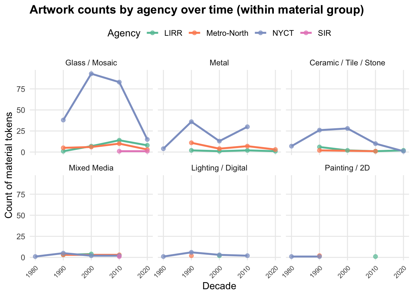
Discussion
Material usage varies across decades, with some materials appearing far more frequently than others. Glass and mosaic installations dominate the dataset and become especially common beginning in the 1990s. The heatmap shows that these materials increase substantially through the 2000s and remain common into the 2010s, suggesting they became a preferred medium for permanent transit artwork.
Other materials appear much less frequently. Ceramic, tile, and stone installations occur consistently but at lower counts, while metal artworks appear intermittently across decades, with fewer installations in the 2000s. Materials such as lighting, digital installations, and traditional painting appear only occasionally.
The faceted line chart also shows that most artworks come from New York City Transit (NYCT). NYCT dominates nearly every material category and shows the largest increases during the 1990s and early 2000s. In contrast, LIRR, Metro-North, and SIR contribute relatively few artworks and show smaller, more stable patterns over time. This difference likely reflects the larger scale and higher station density of the subway system compared to the commuter rail networks.
Presentation
Our presentation can be found here.
Data
Notes: Add full dataset citation with retrieval date and source (TidyTuesday / NY State Open Data).
References
Notes: List data source and any additional references used.