![]()
Powered by Poverty: Energy Access and Income in the United States
Powered by Poverty
The clean-energy transition is real. The geography is not fair.
30% U.S. capacity from renewables in 2024
10 / 11 highest-poverty states are majority-fossil
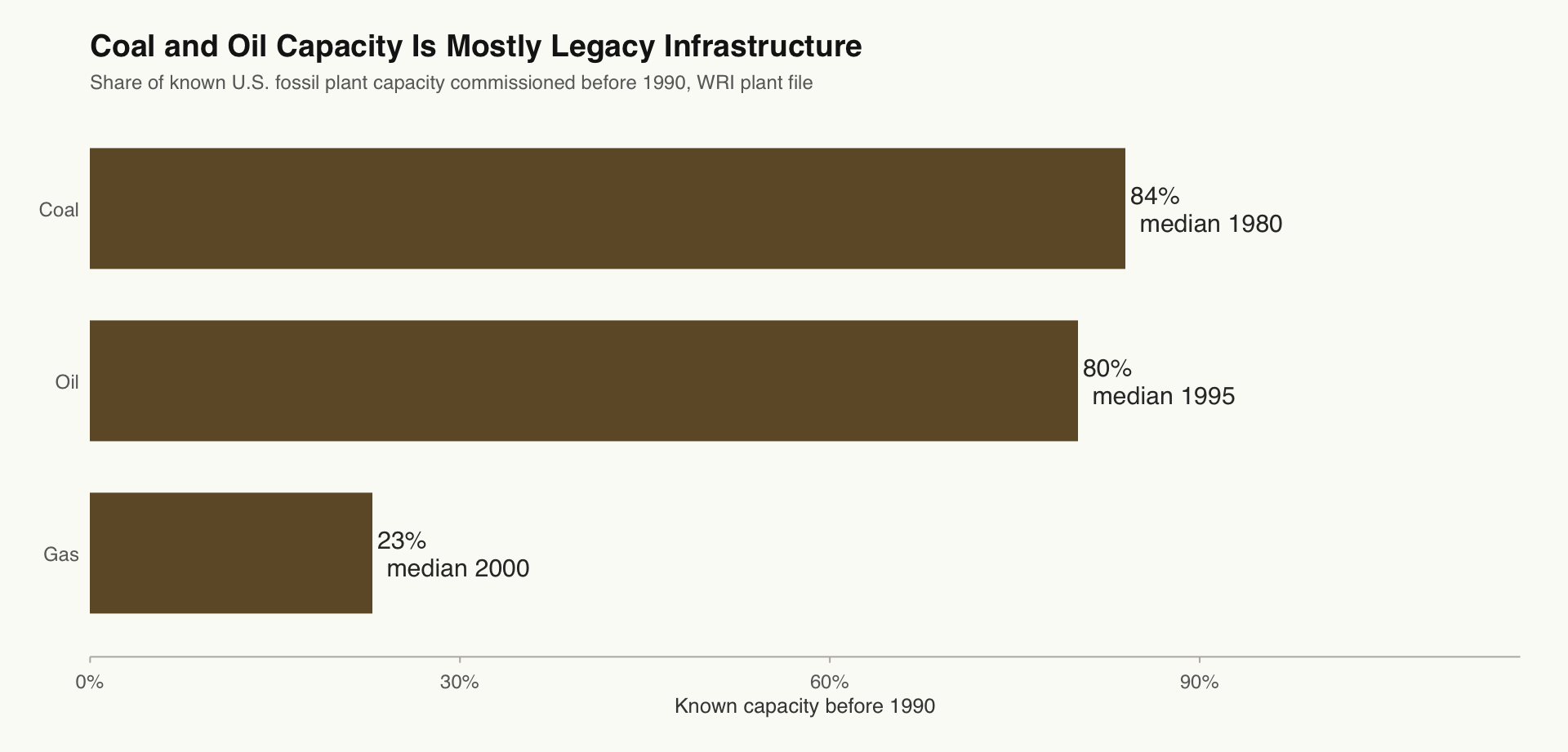
84% known coal capacity predates 1990
The U.S. grid has been changing for three decades. The question is whether that change reached everyone equally.
The Argument In One Sentence
National clean-energy progress hides a state-level split: the places with more poverty are often still more fossil-heavy, and coal/oil infrastructure is old enough that “legacy system” is measurable rather than rhetorical.
The 2024 map shows who is ahead. The next maps show why some states are still behind.
Scale Before Blame
Some high-emission states are also major industrial electricity states. EIA reports Texas as the top state for direct-use electricity in 2024 and Louisiana as the second-highest, which helps explain why their power systems are so large before we make any equity claim.
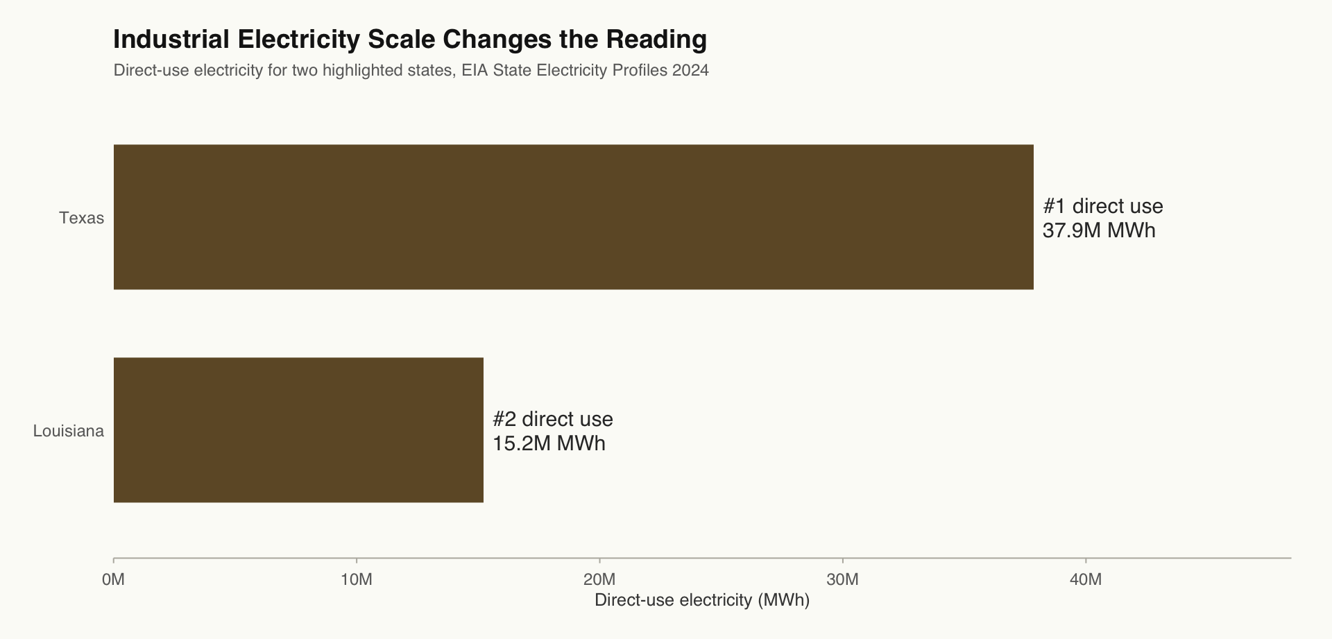
This is why the project separates system scale from equity exposure. Texas is the scale case: #1 in direct-use electricity and #1 in power-sector CO2. Louisiana is both an industrial scale case and a poverty case: #2 in direct-use electricity, 42 million metric tons of power-sector CO2, and one of the highest state poverty rates in the dataset.
New load growth adds another layer. DOE identifies data centers, AI, domestic manufacturing, and electrification as major drivers of rising U.S. electricity demand. That makes the equity question more urgent: the grid is not only cleaning up old demand, it is also being asked to power a more electricity-intensive economy.
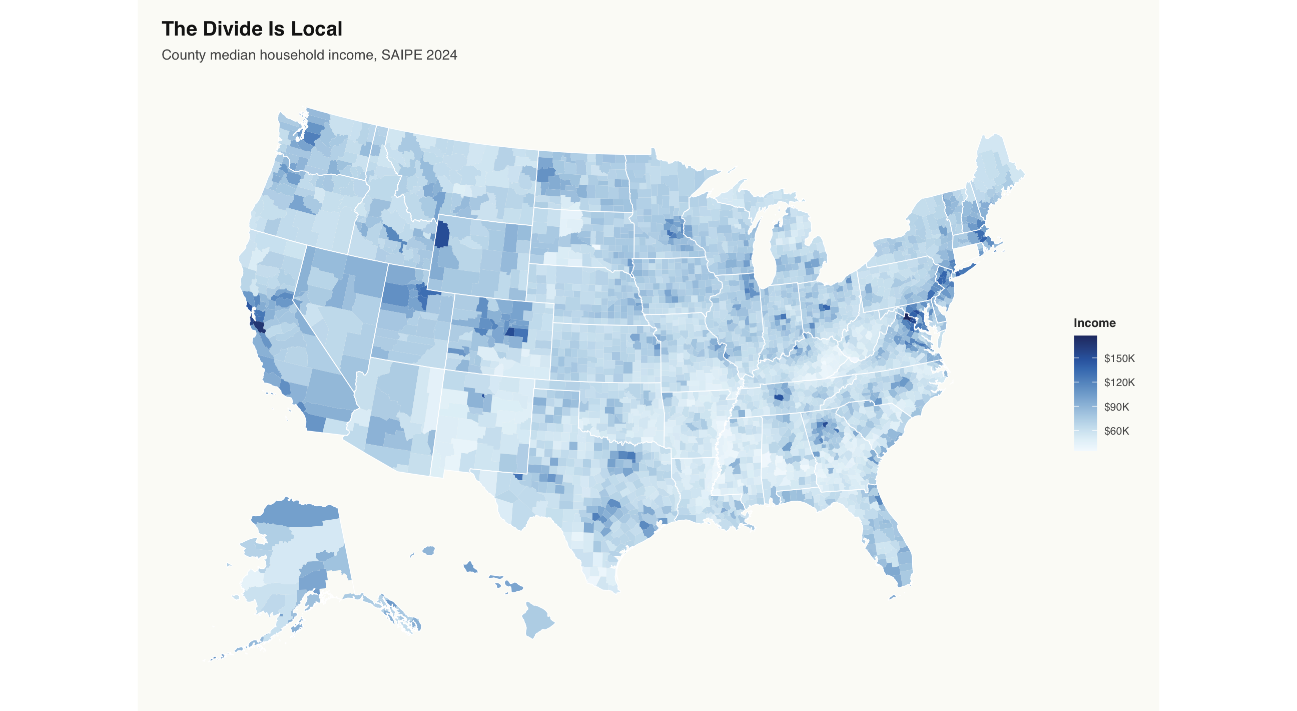
State averages are where the story begins. The real divide runs county by county.
State Averages Hide Local Reality
A state average flattens everything inside it. Within the same state, counties can sit on opposite ends of the income distribution.
State outlines stay visible so local patterns are easier to read against the geographic context.
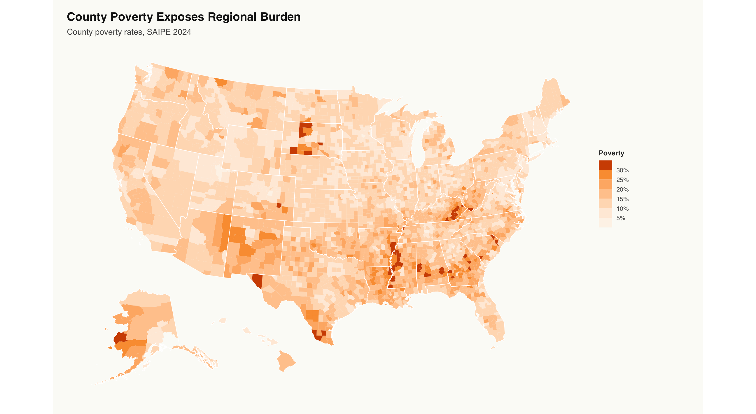
The Poverty Belt
County poverty is not randomly scattered. The rural South, Appalachia, and parts of the Southwest come up again and again, even when state borders are visible.
These are the communities with the fewest resources to absorb rising energy costs, aging infrastructure, or investment that arrives late.
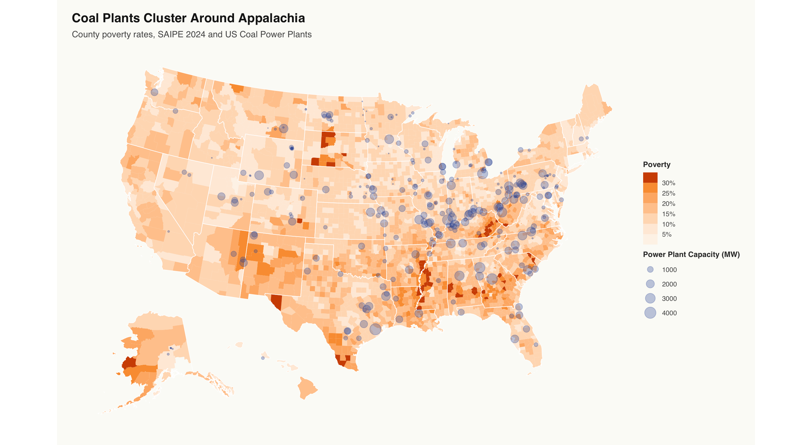
Coal and Appalachia
Coal plants are not confined to one place, but the Appalachian cluster is visible. That matters because the region also contains many counties with high poverty, making it a clear example of overlapping economic vulnerability and legacy fossil infrastructure.
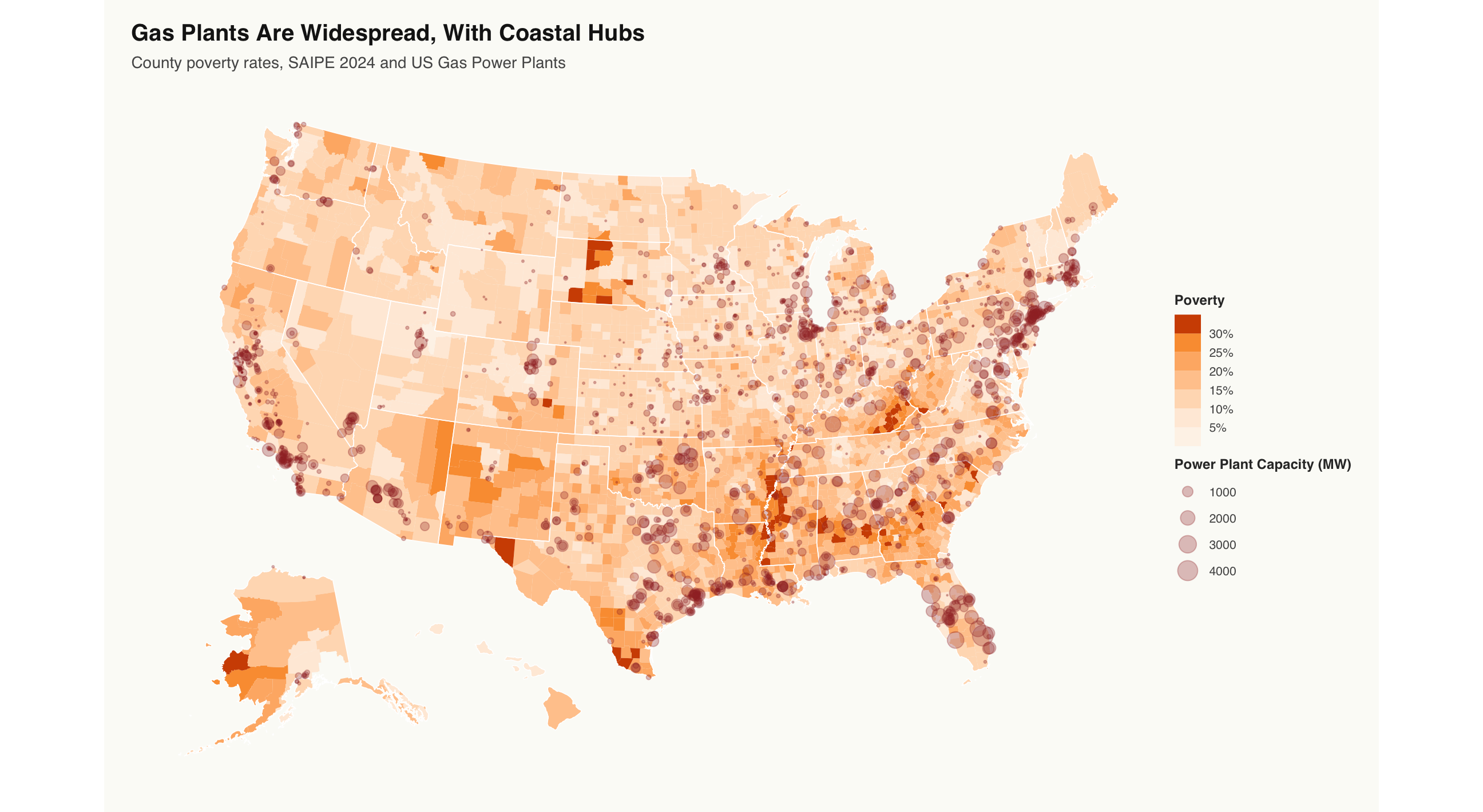
Dominance of Gas
Gas plants are numerous throughout the US, with more than 1,800 spread across the coasts and eastern states.
Here the point layer complicates the story instead of confirming a simple claim. Gas plant locations appear less tied to poverty itself and more tied to infrastructure geography, including proximity to water for cooling and dense regional demand.
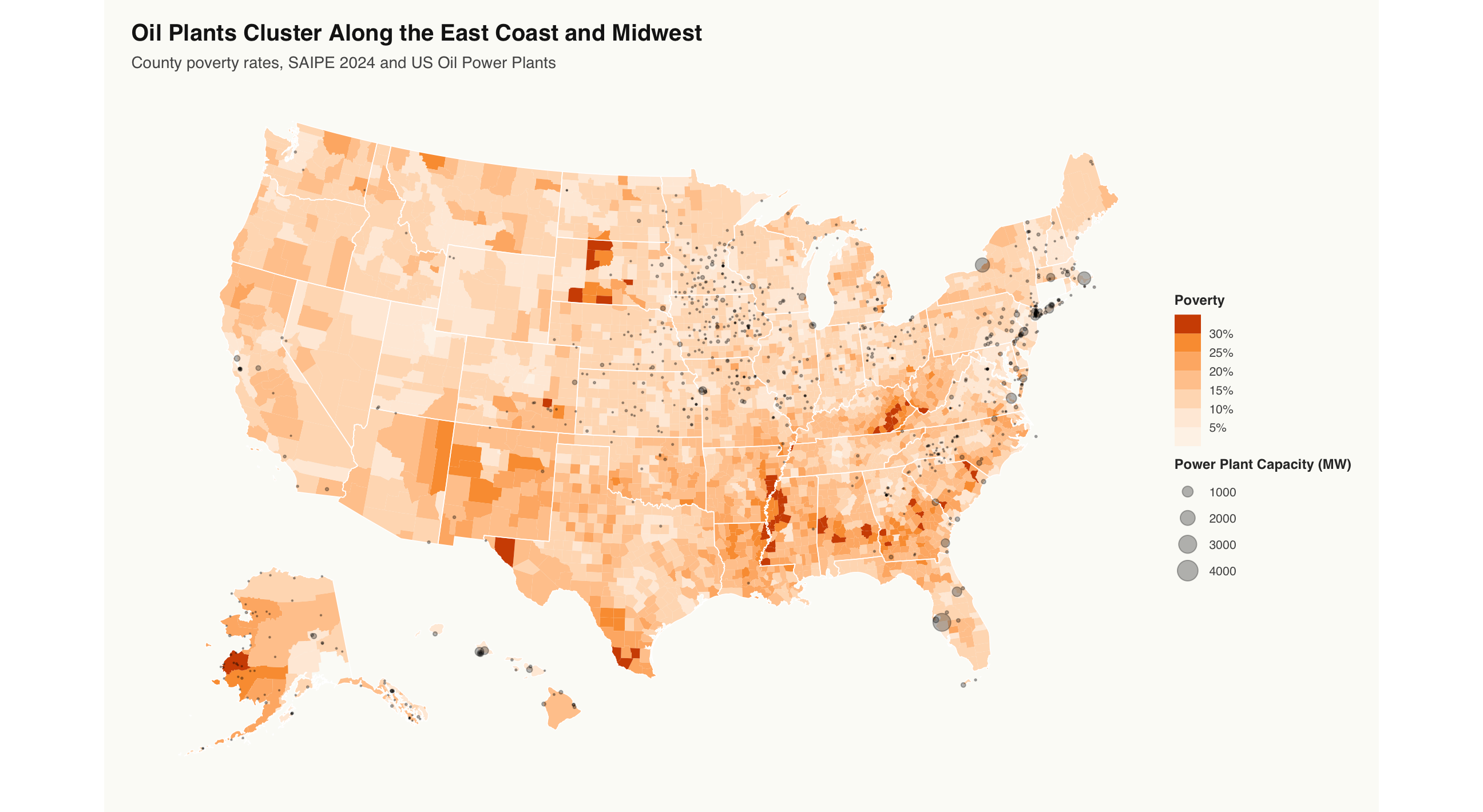
Midwest and Coastal Oil
Oil plants cluster in the East Coast and Midwest, where county poverty is often more moderate than in the South and Appalachia.
Poverty, fuel type, demand, geography, and history do not move together in one simple pattern. The geography of fossil infrastructure is shaped by more than poverty alone.
Compare Fossil Plant Geography
The fuel-specific scrolls isolate coal, gas, and oil. This combined view lets the reader compare those patterns directly: hover a fuel type to dim the others and see where each fossil system is concentrated.
When the plants were built
84% of known U.S. coal capacity was commissioned before 1990. Median commissioning year: 1980. Oil is similar at 80%.
The patterns are measurable. The relationship is not strict. But it is consistent enough to ask who is still waiting.
A cleaner grid is not automatically an equitable grid.
This project combines EIA electricity data with Census SAIPE income and poverty data to make one point visible: energy transition maps and poverty maps should be read together.
The evidence is not causal, and it is not the final word. But it is strong enough to shape the next question.
When public and private clean-energy investment expands, which communities are first in line?