U.S. Airline Delays Analysis
Elegant buneary
Topic and motivation
Topic:
Our project explores the delays in different airlines over the years.
This is achieved through interactive visualizations where users can choose different airlines and the frequency of delays over the years.
Motivation:
People have often experienced inconvenience because of flight delays. They may get stranded, or get delayed for any important event that they are attending.
Many a number of times, flights travelling from JFK have been delayed.
Hence, we want to analyse the frequency of such delays, and which airline showcases the highest frequency of delays.
Presentation Video Play in Youtube
The Data
The dataset used for the analysis of flight data in the United States is a comprehensive collection of statistics related to flights, delays, carriers, and airports.
This analysis-ready dataset was originally collected from the U.S. Department of Transportation’s Bureau of Transportation Statistics (BTS) and is part of the CORGIS (Collection of Really Great, Interesting, and Situated Datasets) project.
The dataset provides valuable insights into the aviation industry and its impact on passengers’ travel experiences.
The dataset used for the analysis of flight data in the United States has undergone a series of cleaning and preprocessing steps to ensure it is analysis-ready.
Highlights from EDA
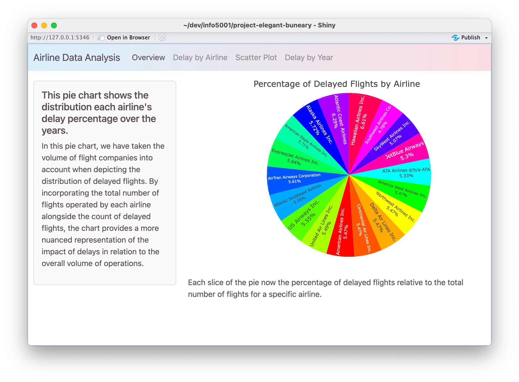
This pie chart shows the percentage of delayed flights by airline. We can see a pretty average distribution of delays across the airlines. However, we can observe that the airline with the highest percentage of delays is Hawaiian Airlines Inc. The airline with the lowest percentage of delays is Southwest Airlines Co. which only takes up 4.78% of the total delays.
Inference/modeling/other analysis
Our Shiny app provides a dynamic interface to explore intriguing patterns and trends within the U.S. airline industry.
▶️ Join us in live demonstration in Shiny app
Inference/modeling/other analysis
Just a recap, the scatter plot unveils a recurring trend, showcasing elevated flight delays during the summer months of June and July, as well as in December, irrespective of the airline.
This highlights a seasonal aspect that warrants closer examination.
Additionally, the line graph brings to light a compelling narrative — in 2007, there was a notable surge in flight delays, followed by a gradual decline in subsequent years.
These visualizations encapsulate just a glimpse of the invaluable insights awaiting your exploration in our Shiny app.
Conclusion and Future Work
Our exploration into the airline industry provides valuable insights to trends in delays over the years.
For future work, we could provide complex visualisations showcasing the relationship between the delays of airlines and the reason behind those delays.