library(tidyverse)
library(janitor)
library(sf)
library(mapview)
library(shiny)
library(leaflet)Visualizing the Network of NYC Public Computer Centers
Exploration
Objectives
The goal of the project is to create an interactive, map-based visualization that shows the distribution of public computer centers across the five boroughs of New York City.
In addition to obtaining an understanding of the computer centers’ geographic locations, the users will be able to filter based on different services offered (i.e. productivity tools and technology related courses), and accessibility considerations (i.e. wheel-chair accommodations and assistive technology offerings) enabling users to easily identify and access computer centers best suited for their needs.
Data collection and cleaning
Have an initial draft of your data cleaning appendix. Document every step that takes your raw data file(s) and turns it into the analysis-ready data set that you would submit with your final project. Include text narrative describing your data collection (downloading, scraping, surveys, etc) and any additional data curation/cleaning (merging data frames, filtering, transformations of variables, etc). Include code for data curation/cleaning, but not collection.
In this step, we load the raw data from a CSV file named “Public_Computer_Center.csv” into the PCC_raw variable. The information from this dataset will be used to understand the geographic distribution of public computer centers across New York City’s five boroughs.
#load raw
PCC_raw <- read.csv("data/Public_Computer_Center.csv")
Here, we clean the column names of the dataset using the clean_names() function, and store the result in the PCC_clean variable. Consistent column names will enable users to filter and interact with the data more effectively when searching for computer centers that match their specific needs.
#standardize names of columns
PCC_clean <- PCC_raw|>
  clean_names()
This code snippet replaces specific language values in the “languages_offered” column with standardized names. Users can filter computer centers by the languages they provide, ensuring that language accessibility aligns with their requirements.
#standardize languages_offered
PCC_clean <- PCC_clean |>
  mutate(languages_offered =str_replace_all(languages_offered, "English only", "English")) |>
  mutate(languages_offered =str_replace(languages_offered, "Chinese \\(TraditioNal\\)", "Chinese")) |>
  mutate(languages_offered =str_replace(languages_offered, "Korean\\)", "Korean"))
Here, a custom replace_function is defined to standardize certain values in all columns of the dataset. Users can filter based on the status to find centers that are currently open and accessible.
replace_function <- function(x) {
  str_replace_all(x, c("Not operating" = "Not Operating", "Temporarily closed" = "Temporarily Closed"))
}
PCC_clean <- PCC_clean |>
  mutate(across(everything(), replace_function))
In this step, we select specific columns and rename them for clarity and consistency. By renaming columns to more intuitive names, users can better identify and filter computer centers based on the services offered.
#renaming
PCC_clean <- PCC_clean |>
  select(-c(last_col(5):last_col(), location_name, calendar_year, address_prefix, address_street, address_suffix, address_number, object_identification_number, oversight_agency)) |>
  rename(
    productivity_tools = productivity_tools_ex_using_word_excel_powerpoint_adobe_acrobat_etc,
    job_readiness = job_readiness_ex_resume_help_job_search_etc,
    education = education_ex_personal_growth_k_12_supports_reading_research_etc,
    creative_expression = creative_expression_ex_making_art_videos_blogs_websites_etc,
    media_and_entertainment = media_and_entertainment_ex_consuming_producing_etc,
    certifications = certifications_ex_in_software_in_housing_in_professional_areas_etc
  )
This code filters out rows where the “operating_status” is not “Not Operating.” This ensures that users can easily identify and access computer centers that are open and available for use.
#remove locations not operating
PCC_clean <- PCC_clean|>
  filter(operating_status != "Not Operating")
Here, specific columns are selected and deleted from the dataset. This step supports the project objectives by focusing on the relevant attributes that users can filter based on, such as services offered and accessibility considerations.
#remove borough, state, and technology_related_courses columns
PCC_clean <- PCC_clean |>
  select(-borough, -technology_related_courses, -state)
This step updates specific columns to replace certain values with “Information not provided.” Users can identify centers that lack specific information on services or accessibility, enabling them to make informed decisions.
#replace " ", N/A and Not sure
columns_to_update <- c(
  "languages_offered",
  "affordability_connectivity_program",
  "education",
  "assistive_technology",
  "creative_expression",
  "digital_literacy",
  "media_and_entertainment",
  "certifications"
)
# Update
PCC_clean <- PCC_clean|>
  mutate(across(all_of(columns_to_update), function(x) replace(x, x %in% c("N/A", " ", "Not sure"), "Information not provided"))) |>
  mutate(latitude = as.numeric(latitude)) |>
  mutate(longitude = as.numeric(longitude))
Here, rows in the “languages_offered” column are separated into multiple rows using a semicolon separator. Users who have language-specific requirements can find centers that can cater to their language preferences.
#split languages_offered into separate rows
PCC_clean <- PCC_clean|>
  separate_rows(languages_offered, sep = ";")

saveRDS(PCC_clean, file = "_shiny/cleaned_data/cleaned_data_file.rds")
Summary: From the website https://data.cityofnewyork.us/Social-Services/Citywide-Public-Computer-Centers/sejx-2gn3 , we exported the data that was published by NYCOpenData and uploaded it to the data folder. Then with some code, we have cleaned the data. First, we changed the names to snake_case with the function clean_names. Then we removed some columns that we may not need with the select function. At last, we renamed some columns with a long and useless column name manually.
Each code step ultimately supports the project’s objectives of creating an interactive, map-based visualization that allows users to filter and access public computer centers based on their specific needs, such as services offered and accessibility considerations.
Data Description
Row and Column:
object_identification_number: This column represents the unique identification number of each PPC during this data collection process.
oversight_agency: This column represents the name of the city agency responsible for overseeing the center.
operating_status: This column could verify the PCC’s operating status: open, temporarily closed, or not operating.
city: This column represents the city in which the center is located.
state: This column represents the state in which the center is located.
borough: This column represents the name of the Borough that PCC resides in.
postcode: This column represents the zip code in which the center is located.
wheelchair_accessible: This column represents an indication of whether the facility is wheelchair accessible or not.
assistive_technology: This column represents the assistive technology available status of the center.
languages_offered: This column represents any resources or services provided at the center in languages other than English.
technology-related Courses: This column represents what kind of technology-related courses and services are available at this location.
affordability_connectivity_program: This column represents whether the center supports Affordability Connectivity Program (ACP) awareness or enrollment.
productivity_tools: This column represents whether the center offers productivity tools-related courses(ex: Using Word, Excel, Powerpoint, Adobe Acrobat, etc.).
job_readiness: This column represents whether the center offers job readiness-related courses(ex: resume help, job search, etc.).
education: This column represents whether the center offers such courses (ex: personal growth, k-12 supports, reading research, etc.).
creative_expression: This column represents whether the center offers creative expression-related courses(ex: making art, videos, blogs, websites, etc.).
media_and_entertainment: The column represents whether the center offers media and entertainment-related service (ex: consuming, producing, etc.).
certifications: The column represents whether the center offers certifications-related courses (ex: in software, in housing, in professional areas, etc.).
digital_literacy: The column represents whether the center offers digital literacy-related courses.
latitude: The column represents the latitude coordinate of the center location.
longitude: The column represents the longitude coordinate of the center location.
Who funded this dataset?
- New York City’s Office of Technology and Innovation (OTI) funded the creation of this dataset to track the current status of Public Computer Centers in NYC.
Reason for creating the dataset:
- The Office of Technology and Innovation (OTI) in New York City would like to know where and how the city supports this kind of public access to the Internet.
What processes might have influenced what data was observed and recorded and what was not?
- We identify some similar columns that may affect our observations. For example, there is some overlapping content in Media and Entertainment (ex: consuming, producing, etc.) and Creative Expression (ex: making art, videos, blogs, websites, etc.). We cannot be sure that each PCC’s answer to this content is accurate.
What preprocessing was done, and how did the data come to be in the form that you are using?
Delete some columns that are not important to the objectives of this project and are repeated many times. For example, columns such as “Communicity District”, “Council District”, and “Full Address”.
Convert the first letter of all column names to lowercase letters and use “_” to connect different words in different column names. The purpose of this behavior is to enhance the usability and readability of the data.
Through data cleaning, we only focus on the PCC data in operation. Therefore, we removed PCC information with operation status “Not Operating” in our dataset.
We removed missing data and data marked “NA” and “Not Sure” into a unified “Information not provided” format.
We split languages_offered into separate rows so that we can more clearly analyze PCC’s support for different ethnic groups in subsequent projects.
We split technology_related_courses into separate rows so that we can pay more attention to the functionality and services of different PCCs in subsequent projects.
Data Limitations
Subjectivity: The dataset fails to provide a clear description for its columns, which may result in misinterpretations. For instance, it is difficult to judge what constitutes tools for “creative expression” and “technologically related courses: without clear definitions and perimeters, different individuals may understand these terms differently.
Data quality: Several columns contain mere “yes, no, partially.” The lack of detailed insights may hinder our ability to conduct in-depth analysis and understand how users experience these computer centers.
Temporal Limitations: Since the dataset does not reflect real-time information, the status of a center may have changed since the data was collected. This can prevent users from obtaining up-to-date information to best inform their decisions.
Geographical Limitations: The dataset focuses specifically on New York City, as a result, the information may not be representative of public computer centers in other locations.
Bias: Funded by New York City’s Office of Technology and Innovation, the data collection process may have been biased as the office may attempt to exaggerate the availability of resources to how the data was collected and presented to the public.
Lack of Metadata: The dataset provides no documentation on the data collection process, which can make it difficult to interpret and account for necessary assumptions/biases.
Exploratory data analysis
Perform an (initial) exploratory data analysis. With this visualization, we explore the operational status of the Public Computer Center in New York City using cleaning data. According to data from October 2023, there are approximately 450 PCCs operating in NYC. There are about 50 PCCs with an operating status of “Temporarily Closed”. Users can easily understand which PCCs are currently operational, temporarily closed, or have other status. This information helps users identify and access PCCs that are currently open and available, aligning with the project’s objective of enabling users to find operational centers.
Color Palette Reference: http://rstudio-pubs-static.s3.amazonaws.com/5312_98fc1aba2d5740dd849a5ab797cc2c8d.html
#operating status bar chart
operating_status_counts <- PCC_clean|>
  group_by(operating_status)|>
  summarize(count = n())|>
  arrange(desc(count))
ggplot(operating_status_counts, aes(x= operating_status, y= count, fill= operating_status))+
  geom_bar(stat = "identity")+
  labs(title= "Operating Status of PCCs",
       x= "Operating Status",
       y= "Count",
       fill = "Operating Status")+
  scale_fill_brewer(palette = "Accent")+
  theme_minimal()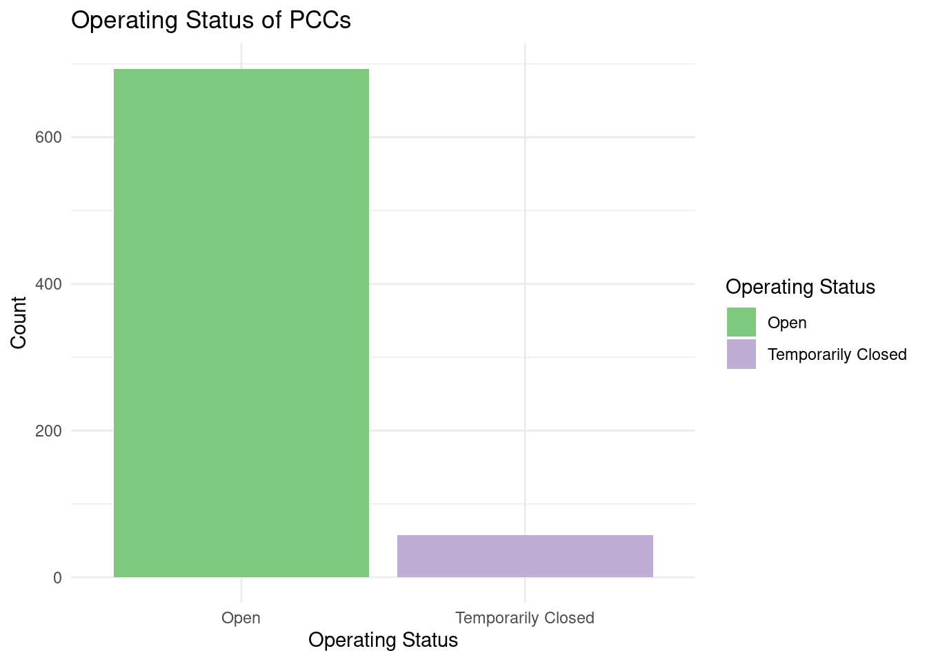
#This step, though commented out, aims to calculate the counts of PCCs in each city. Understanding the distribution of PCCs across different cities is valuable for users seeking centers in specific areas, supporting the objective of helping users locate PCCs in their desired city.

#city counts

#city_counts <- PCC_clean|>
  #group_by(city) |>
  #summarize(count = n())

#ggplot(city_counts,
       #aes(x = reorder(city, count),
         #  y = count)) +

  #geom_bar(stat = "identity",
  #         position = "dodge",
  #         fill = "skyblue") +
  #coord_flip()+
  #labs(title = "Number of PCCs in Each City",
 #      x = "Count",
  #     y = "City") +
  #theme_minimal() +
 # theme(
    #  axis.text.y = element_text(size = 5))
Through this bar chart, we explored the language support situation of PCC in New York. We can find that among all PCCs in New York, English, Spanish, Chinese, and Russian are the top four languages with the highest support. We speculate that the results displayed by this data are related to the number of immigrants of different ethnic groups in NYC.
#top 4 languages chart
languages_offered_counts <- PCC_clean |>
  group_by(languages_offered) |>
  summarize(count = n()) |>
  arrange(desc(count)) |>
  head(4)

ggplot(languages_offered_counts,
       aes(x = reorder(languages_offered, count), y = count,
           fill = languages_offered)) +
  geom_bar(stat = "identity") +
  coord_flip() +
  labs(title = "Top 4 Languages Offered at PCCs",
       x = "Count",
       y = "Languages Offered") +
  scale_fill_brewer(guide = "none") +
  theme_minimal()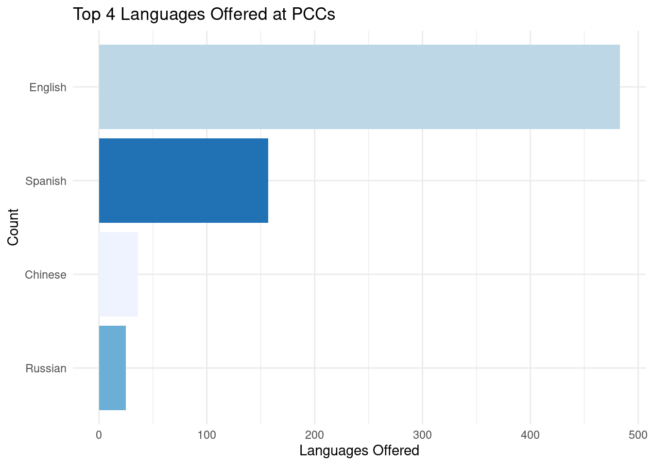
Through this visualization, we use clean data to explore the geographical division of Public Computer Centers in New York City. We can find that Brooklyn, Bronx, New York, Queens, and Manhattan are the cities with the most PCCs. In other words, we can infer that Brooklyn does a good job of supporting the accessibility of computing resources to city residents.
#accessibility bar chart
accessibility_counts <- PCC_clean |>
  group_by(wheelchair_accessible, assistive_technology)|>
  summarize(count = n())
`summarise()` has grouped output by 'wheelchair_accessible'. You can override
using the `.groups` argument.ggplot(accessibility_counts,
aes(x = wheelchair_accessible, fill = assistive_technology, y = count)) +
geom_bar(stat = "identity", position = "dodge") +
labs(title = "Accessibility of Computer Centers",
x = "Wheelchair Accessible",
y = "Count",
fill = "Assistive Technology") +
scale_fill_brewer(palette = 4)+
theme_minimal()
This visualization illustrates the distribution of PCCs across NYC neighborhoods, with a focus on the top 5 neighborhoods. Users can quickly identify which neighborhoods have a higher concentration of PCCs, helping them find centers near their location or preferred neighborhoods, supporting the project’s goal of locating nearby PCCs.
#neighborhood distribution
neighborhood_counts <- PCC_clean |>
  group_by(city) |>
  summarize(count = n()) |>
  arrange(desc(count))
top_5_neighborhoods <- head(neighborhood_counts, 5)
ggplot(top_5_neighborhoods, aes(x = reorder(city, count), y = count)) +
  geom_bar(stat = "identity") + coord_flip() +
  labs(title = "Distribution of Public Computer Centers Across NYC Neighborhoods",
       x = "Count", y = "Neighborhood") +
  theme_minimal()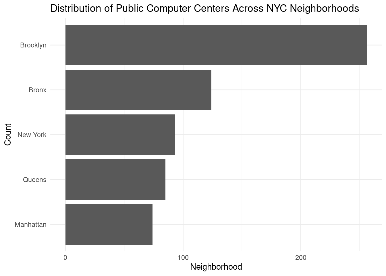
This step explores the relationship between digital literacy and wheelchair accessibility in different boroughs. It helps users understand the accessibility and digital literacy landscape across boroughs, allowing them to make informed choices when selecting a PCC. It supports the project’s objective of enabling users to identify PCCs best suited to their specific needs.
#accessibility vs. digital literacy
accessibility_distribution <- PCC_clean|>
  group_by(city, wheelchair_accessible, digital_literacy) |>
  summarise(
    count_accessible = sum(wheelchair_accessible == "Yes"))
`summarise()` has grouped output by 'city', 'wheelchair_accessible'. You can
override using the `.groups` argument.ggplot(accessibility_distribution,
aes(x = wheelchair_accessible,
y = city,
color = digital_literacy,
size = count_accessible)) +
geom_point() +
labs(title = "Digital Literacy vs. Wheelchair Accessibility",
x = "Wheelchair Accessible",
y = "Borough",
size = "Number of Wheelchair Accessible Centers",
color = "Digital Literacy") +
theme_minimal() 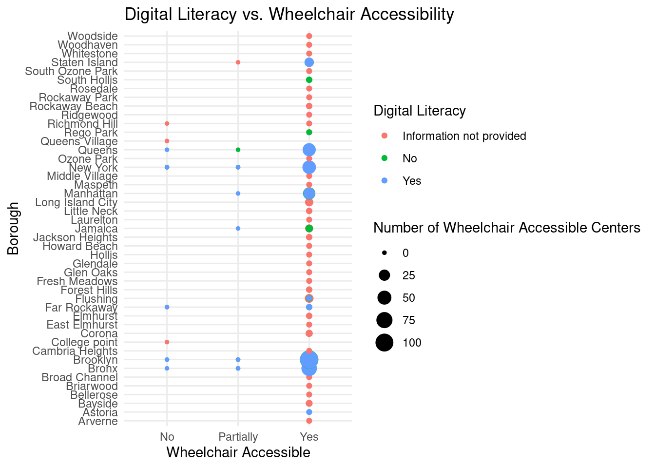
Through this visualization, we explored the application of “sf”package in geographic-based information visualization in our project. We use this visualization to explore the location of all PCCs in the dataset on a map of New York City. This step converts data into spatial objects with latitude and longitude information to create a map-based visualization. It enables users to view the geographic distribution of PCCs across the city, facilitating the project’s primary goal of creating an interactive map-based visualization.
#spatial objects preparation
PCC_nyc_sf <- st_as_sf(x = PCC_raw,
            coords = c("Longitude","Latitude"),
            crs = 4326) |>
            st_transform(crs = 2263)

mapview_PCC_nyc <- PCC_nyc_sf |>
  mapview(
    col.regions = "green",
    legend = T,
    layer.name = "PCC in NYC",
    alpha = 0.8
  )

mapshot(mapview_PCC_nyc,
        file = "./images/mapview_PCC_nyc.png")

mapview_PCC_nyc
Through this visualization, we used clean data to explore the application of sf package in geographic-based information visualization in our project. Unlike the previous visualization, we hope to add a filter to this visualization to observe the geographical location of PCCs that support Chinese services on the New York City map. Creating a dedicated map view for PCCs offering Chinese language services caters to users with specific language preferences. It helps these users quickly locate PCCs that offer services in Chinese, aligning with the project’s goal of providing tailored information to meet user needs.
#chinese language map
library(mapview)

PCC_Zh_sf <- st_as_sf(x = filter(PCC_clean, languages_offered == "Chinese"),
            coords = c("longitude","latitude"),
            crs = 4326) |>
            st_transform(crs = 2263)

mapview_PCC_Zh_sf <- PCC_Zh_sf |>
  mapview(
    col.regions = "red",
    legend = T,
    layer.name = "PCC with Chinese service in NYC",
    alpha = 0.8
  )

mapshot(mapview_PCC_Zh_sf,
        file = "./images/mapview_Chinese_PCC_nyc.png")
mapview_PCC_Zh_sf
Questions for reviewers
List specific questions for your peer reviewers and project mentor to answer in giving you feedback on this phase.
How can the team combat the long installation/rendering time?
Do you believe there is enough data to be able to properly train our model? If so, what do you think would be an important thing to consider when doing so?
Is it necessary to include more variables and draw a correlation ourselves based on the available data?
Are our displays of the data the best/most effective or do you think there is a better method that could lead to a better visualization?