── Attaching packages ─────────────────────────────────────── tidyverse 1.3.2 ──
✔ ggplot2 3.4.2     ✔ purrr   1.0.0
✔ tibble  3.2.1     ✔ dplyr   1.1.2
✔ tidyr   1.2.1     ✔ stringr 1.5.0
✔ readr   2.1.3     ✔ forcats 0.5.2
── Conflicts ────────────────────────────────────────── tidyverse_conflicts() ──
✖ dplyr::filter() masks stats::filter()
✖ dplyr::lag()    masks stats::lag()
── Attaching packages ────────────────────────────────────── tidymodels 1.0.0 ──

✔ broom        1.0.2     ✔ rsample      1.1.1
✔ dials        1.1.0     ✔ tune         1.1.1
✔ infer        1.0.4     ✔ workflows    1.1.2
✔ modeldata    1.0.1     ✔ workflowsets 1.0.0
✔ parsnip      1.0.3     ✔ yardstick    1.1.0
✔ recipes      1.0.6

── Conflicts ───────────────────────────────────────── tidymodels_conflicts() ──
✖ scales::discard() masks purrr::discard()
✖ dplyr::filter()   masks stats::filter()
✖ recipes::fixed()  masks stringr::fixed()
✖ dplyr::lag()      masks stats::lag()
✖ yardstick::spec() masks readr::spec()
✖ recipes::step()   masks stats::step()
• Use suppressPackageStartupMessages() to eliminate package startup messages

Rows: 517 Columns: 21
── Column specification ────────────────────────────────────────────────────────
Delimiter: ","
chr  (4): Pollster, AAPOR/Roper, Banned by 538, 538 Grade
dbl (17): Rank, Pollster Rating ID, Polls Analyzed, Predictive Plus-Minus, M...

ℹ Use `spec()` to retrieve the full column specification for this data.
ℹ Specify the column types or set `show_col_types = FALSE` to quiet this message.Pollster ratings analysis
Report
Introduction
Polls play a crucial role in election cycles, but their accuracy can be highly variable. To gain a better understanding of the factors that contribute to accurate polling, we analyzed the Pollster Ratings dataset from FiveThirtyEight. The data was obtained by FiveThirtyEight themselves and was last updated in March of 2023. Many of the variables we analyzed like bias are derived by formulas used by FiveThirtyEight as well. The main motivation behind using this dataset was to gain a better understanding of what factors play a role in the accuracy of polls. In other words, what variables act as indicators of polling accuracy? Our research question was thus: is there a relationship between the number of polls a pollster conducted and analyzed, and the accuracy of said polls? The results of our analysis could help inform pollsters of the best practices that can improve the reliability of polling data, ultimately helping us make more informed decisions.
Data description
What are the observations (rows) and the attributes (columns)?
Each observation (row) represents each individual pollster that FiveThirtyEight included in its evaluation. The attributes of each observation are:
Rank: Rank in FiveThirtyEight’s evaluation.
Pollster: The name of the pollster.
Pollster Rating ID: The ID given to each Pollster in the evaluation.
Polls Analyzed: The number of polls analyzed by each pollster.
Predictive Plus-Minus: A custom metric based on key factors. These factors include the difference between the poll results and the actual election margin, the performance of other pollsters in the same races, the methodological quality of the polling practices used by the pollster, and the extent to which the pollster appears to be following the results of other polls, known as herding.
538 Grade: The grade given to the pollster by FiveThirtyEight.
Races Called Correctly: The proportion of races called correctly by the pollster.
Misses Outside MOE: The proportion of polls taken that were outside of the margin of error for the pollster.
Bias: The bias of each pollster. Pollster bias can arise from a variety of factors, including sampling errors, non-response bias, question wording and order, as well as the mode of data collection (e.g. telephone, online). Biased results can mislead individuals, campaigns, and other stakeholders, especially when decisions are made based on poll results.
House Effect: How much each pollster tends to favor one party or the other.
Average Distance from Polling Average (ADPA): The average distance of a pollster’s polls from the polling average.
Herding Penalty: The penalty for showing too little variation from previous polls taken in the same race.
Why was this dataset created?
This dataset was created to evaluate and grade the many pollsters that poll political races in the United States, to make it so that people can more easily gauge the accuracy of polls coming from each pollster. FiveThirtyEight is owned by ABC News, so they fund most, if not everything that FiveThirtyEight does.
What processes might have influenced what data was observed and recorded and what was not?
Some processes that might have influenced what data was observed and recorded and what was not include the preconceptions and reputations of pollsters, the prominence of the pollsters, and whether the pollsters’ data was able to be used in FiveThirtyEight’s calculations.
What preprocessing was done, and how did the data come to be in the form that you are using?
The data was filtered to only include certain columns so that the data wouldn’t be too unwieldy to process. Many columns have similar data so not all of them are necessary for data analysis.
Data analysis
Analysis of Polls Analyzed vs. Bias
Scatterplot visualization of polls_analyzed and the absolute value of bias :
Warning: Removed 44 rows containing missing values (`geom_point()`).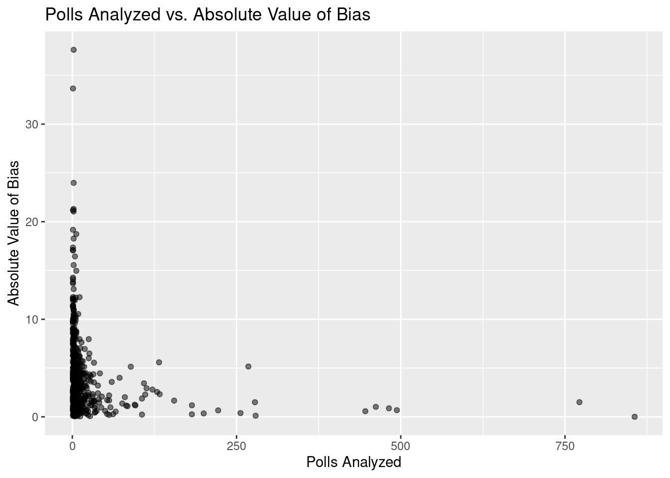
Scatterplot visualization of the log of polls_analyzed and the log of the absolute value of bias with a trend line overlaid:
`geom_smooth()` using formula = 'y ~ x'Warning: Removed 44 rows containing non-finite values (`stat_smooth()`).Warning: Removed 44 rows containing missing values (`geom_point()`).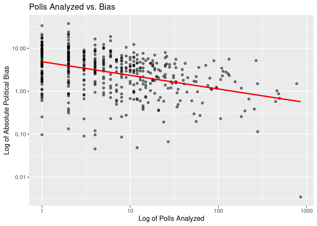
# A tibble: 2 × 5
  term                estimate std.error statistic  p.value
  <chr>                  <dbl>     <dbl>     <dbl>    <dbl>
1 (Intercept)            1.58     0.0784     20.2  7.79e-66
2 log(polls_analyzed)   -0.318    0.0337     -9.41 2.14e-19
# A tibble: 1 × 12
r.squared adj.r.squared sigma statistic p.value df logLik AIC BIC
<dbl> <dbl> <dbl> <dbl> <dbl> <dbl> <dbl> <dbl> <dbl>
1 0.158 0.157 1.06 88.6 2.14e-19 1 -698. 1401. 1414.
# ℹ 3 more variables: deviance <dbl>, df.residual <int>, nobs <int>Linear regression fit for the log of polls_analyzed and the log of the absolute value of bias with summary statistics:
# A tibble: 2 × 5
term estimate std.error statistic p.value
<chr> <dbl> <dbl> <dbl> <dbl>
1 (Intercept) 1.58 0.0784 20.2 7.79e-66
2 log(polls_analyzed) -0.318 0.0337 -9.41 2.14e-19# A tibble: 1 × 12
r.squared adj.r.squared sigma statistic p.value df logLik AIC BIC
<dbl> <dbl> <dbl> <dbl> <dbl> <dbl> <dbl> <dbl> <dbl>
1 0.158 0.157 1.06 88.6 2.14e-19 1 -698. 1401. 1414.
# ℹ 3 more variables: deviance <dbl>, df.residual <int>, nobs <int>Positive values indicate a bias towards Democrats while negative values indicate a bias towards Republicans. Because we are not studying how political party affects the relationship between bias and polls_analyzed, we manipulated bias to become the absolute value of its existing values.
A scatterplot was first created comparing the absolute value of bias and polls_analyzed. This chart indicated that it would be necessary to take the logarithm of both variables in order to fit a linear regression model. A new scatterplot was creatted and the linear regression was then performed, predicting the log of the absolute value of bias from the log of polls_analyzed. Below is the equation of the trend line for the relationship:
\[ \widehat{log(|bias|)} = 1.583 - 0.3175\times log(polls \ analyzed) \]
The trend line displayed in the scatterplot and the linear fit show that for every additional increase of 1 in the log of the number of polls a pollster analyzes, the logarithm of the expected bias of the pollster decreases by 0.3175.
Analysis of Predictive Plus-Minus vs. Bias
Summary of weighted least squares regression fit for predictive_pm and bias:
Call:
lm(formula = predictive_pm ~ bias, data = ppm_vs_bias, weights = weights)
Weighted Residuals:
Min 1Q Median 3Q Max
-1.6269 -1.0055 0.9517 0.9874 1.1166
Coefficients:
Estimate Std. Error t value Pr(>|t|)
(Intercept) 0.4562895 0.0016388 278.4 <2e-16 ***
bias 0.0133947 0.0005192 25.8 <2e-16 ***
---
Signif. codes: 0 '***' 0.001 '**' 0.01 '*' 0.05 '.' 0.1 ' ' 1
Residual standard error: 0.998 on 471 degrees of freedom
Multiple R-squared: 0.5856, Adjusted R-squared: 0.5847
F-statistic: 665.5 on 1 and 471 DF, p-value: < 2.2e-16Scatterplot visualization of predictive_pm and bias:
Warning: Removed 44 rows containing missing values (`geom_point()`).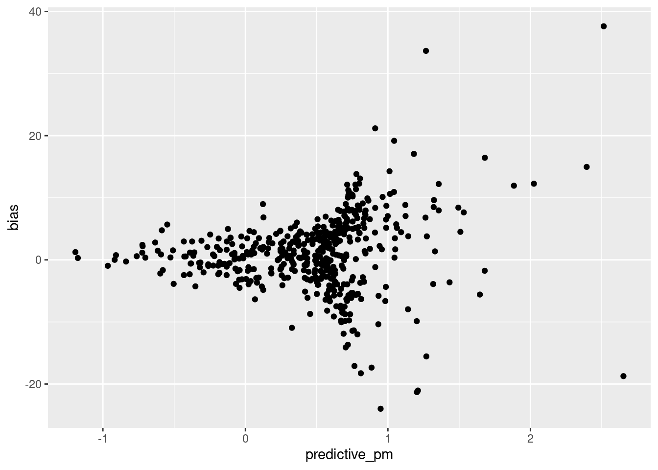
Mean and standard deviation data for predictve_pm:
[1] 0.4847703[1] 0.4946012Analysis of Polls Analyzed vs. Grade
Scatterplot visualization of polls_analyzed and numeric_grade with a trend line overlaid:
Rows: 517 Columns: 21
── Column specification ────────────────────────────────────────────────────────
Delimiter: ","
chr (4): Pollster, AAPOR/Roper, Banned by 538, 538 Grade
dbl (17): Rank, Pollster Rating ID, Polls Analyzed, Predictive Plus-Minus, M...
ℹ Use `spec()` to retrieve the full column specification for this data.
ℹ Specify the column types or set `show_col_types = FALSE` to quiet this message.
`geom_smooth()` using formula = 'y ~ x'Warning: Removed 7 rows containing non-finite values (`stat_smooth()`).Warning: Removed 7 rows containing missing values (`geom_point()`).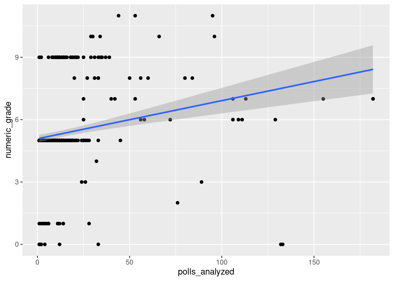
Linear regression fit for numeric_grade and polls_analyzed:
# A tibble: 2 × 5
term estimate std.error statistic p.value
<chr> <dbl> <dbl> <dbl> <dbl>
1 (Intercept) 5.08 0.0897 56.6 1.18e-218
2 polls_analyzed 0.0183 0.00344 5.33 1.47e- 7Before we can analyze the data, we first have to transform the letter grades into numbers, which we do as shown in the code above. Here, we create a new variable called numeric_grade which puts higher rated grades as greater integers, so A+ is the highest at 12 and F is the lowest at 0. From this we can visualize the data with a scatter plot. We see a weak positive relationship between polls analyzed and a majority of the polls falling under 50 polls analyzed. We note that we cut around 24 points as they were considered outliers, having analyzed upwards of 200 polls which we considered as being outliers.
Fitting a linear model onto the data, we get that the slope is .024 and the intercept is 5.08. This means that on average analyzing 0 wills will net the pollster a grade of B/C, and an increase in one poll analyzed is associated with an increase in grade by .024. The intercept does not make sense here as a pollster that analyzes 0 polls will likely receive an F grade, or a numeric grade of 0. We believe this to be a result of a large sum of the polls analyzing less than 25 polls and receiving a numeric grade of ~5.
Evaluation of significance
Analysis of Polls Analyzed vs. Bias
Bootstrap test and 95% confidence interval for log of Polls Analyzed vs. log of Abs Bias
# A tibble: 1 × 12
  r.squared adj.r.squared sigma statistic  p.value    df logLik   AIC   BIC
      <dbl>         <dbl> <dbl>     <dbl>    <dbl> <dbl>  <dbl> <dbl> <dbl>
1     0.158         0.157  1.06      88.6 2.14e-19     1  -698. 1401. 1414.
# ℹ 3 more variables: deviance <dbl>, df.residual <int>, nobs <int>Warning: Removed 44 rows containing missing values.# A tibble: 1 × 2
lower_ci upper_ci
<dbl> <dbl>
1 -0.404 -0.245The linear model predicting the log of absolute value of bias from polls analyzed produced an adjusted r-squared value of 0.157. This means that only 15.7% of the variation in the log of abs_bias can be explained by the linear model. Clearly, this linear model is a poor predictor of bias from the number of polls analyzed.
To further evaluate the significance of the relationship between polls analyzed and bias, we performed a bootstrap test between the log of polls_analyzed and log of abs_bias, with 1000 reps. We then calculated a 95% confidence interval from the results of the bootstrap test, which says that for every additional poll a pollster takes, we expect the absolute bias to change by a value between -0.331 (e^-0.4.014 - 1) and 0.275 (e^0.2429- 1). This is in line with the slope of -0.3175 that we previously calculated from the regression model. However, -0.331 to 0.275 is an interval of 0.606, which is a wide interval in the context of the data. This indicates that there is a substantial amount of uncertainty about the true relationship between polls_analyzed and abs_bias, and furthers the conclusion from the previously. It may be that the linear model to predict bias from polls analyzed is poor because the relationship between the two variables is not particularly significant.
Analysis of Predictive Plus-Minus vs. Bias
This scatterplot shows a relationship between the predictive plus-minus scores assigned by 538, and the bias of a pollster. Pollsters with less bias are given a more negative (better) predictive score. This graph and the previous graph indicate bias as a potential variable which reveal a correlation between number of polls analyzed and accuracy of polls. Predictive plus-minus is also indicated as a potentially viable variable, and is explored next.
Interestingly, the scatterplot shows heteroskedasticity. We can observe that as Predictive Plus-Minus score increases, bias increases somewhat exponentially in both directions. Since normal linear and logistic regressions would not work with heteroskedasticity, we can use a weighted least squares regression.
Analysis of Polls Analyzed vs. Grade
95% confidence interval of boostrapped correlation:
Warning: Removed 7 rows containing missing values.# A tibble: 1 × 2
lower upper
<dbl> <dbl>
1 0.0949 0.360Histogram of bootstrapped correlation with 95% confidence interval:
`stat_bin()` using `bins = 30`. Pick better value with `binwidth`.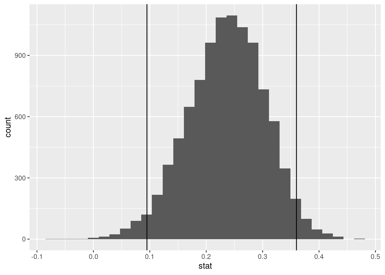
To test significance, we ran a bootstrap sampling (set seed of 123) 10,000 times. The bootstrap calculated the correlation of each test, and then found the upper and lower quantiles for a 5% significance level. Since the interval does not contain 0, this means that we are 95% confident that the variables of polls_analyzed and 538 Grade are positively correlated.
Interpretation and conclusions
Analysis of Polls Analyzed vs. Bias
From our evaluation of significance, it became clear that the relationship between the number of polls analyzed and the bias of a pollster do not a have strong correlation. The linear regression model predicting the logarithm of absolute bias from the logarithm of polls analyzed shows a general relationship, where the bias tends to decrease as the number of polls increased. However, the model accounted for less than 20% of the variation in the data, and our 95% confidence interval obtained from bootstrapping also showed a wide degree of uncertainty. From this, we conclude that political bias, as a measure of poll accuracy, has a weak correlation with the number of polls analyzed. There is a high degree of risk in expecting pollsters with higher numbers of polls analyzed to necessarily have lower political bias.
Analysis of Predictive Plus-Minus vs. Bias
The multiple R-squared of 0.5856 and adjusted R-squared of 0.5847 from a weighted least squares model indicate how well the model fits the data. In this case, approximately 58.56% of the variance in Predictive Plus-Minus scores is explained by the bias in the WLS model.
The adjusted R-squared takes into account the number of predictors in the model. In this case, the adjusted R-squared of 0.5847 indicates that the model has a good fit and is not overfitting the data.
Analysis of Polls Analyzed vs. Grade
In the boostrapped 95% confidence interval for correlation that we performed, we found that the 95% confidence interval for correlation is between 0.0949 and 0.36. Because 0 is not in the confidence interval, we can say that the correlation between polls_analyzed and grade is positive.
Limitations
Analysis of Predictive Plus-Minus vs. Bias
The greatest limitations stem from the data’s heteroskedasticity. It makes it very hard to produce a workable model that would produce actual significance. With regard to the WSL model, the adjusted R-squared is very close to the multiple R-squared because we are only using one predictor, meaning adjusted R-squared may not be the best indicator of how good the model is.
Analysis of Polls Analyzed vs. Grade
From our results of analyzing significance, we again conclude that the variables of polls_analyzed and 538 Grade are positively correlated and an increase in number of polls analyzed is associated with higher grades on average. However, the upper quantile correlation is 0.36, which means that in the best cases, the two variables’ correlation is not that strong.
Acknowledgments
We utilized FiveThirtyEight’s pollster-ratings dataset to perform all of our analyses.