library(tidyverse)
library(readr)
library(skimr)
library(scales)Home Owners’ Loan Corporation (HOLC) Grades and their Relationship to Racial Demographics
Exploratory data analysis
Research question(s)
Research question(s). State your research question (s) clearly.
How does the presence of a certain race in a given zone affect the HOLC grade (degree of desirability) of that area?
Data collection and cleaning
Have an initial draft of your data cleaning appendix. Document every step that takes your raw data file(s) and turns it into the analysis-ready data set that you would submit with your final project. Include text narrative describing your data collection (downloading, scraping, surveys, etc) and any additional data curation/cleaning (merging data frames, filtering, transformations of variables, etc). Include code for data curation/cleaning, but not collection.
Setup
Loaded the packages we need for collecting and cleaning the data.
Cleaning the data
Below we imported the raw data into a new data frame where we used separate() to make a column made up of city, state into two new columns containing the city and state respectively.
metro_grades <- read_csv("data/metro-grades.csv") |>
  separate(
    col = metro_area,
    into = c("metro_area_city", "metro_area_state"),
    sep = "\\,"
  )
Rows: 551 Columns: 28
── Column specification ────────────────────────────────────────────────────────
Delimiter: ","
chr (2): metro_area, holc_grade
dbl (26): white_pop, black_pop, hisp_pop, asian_pop, other_pop, total_pop, p...
ℹ Use `spec()` to retrieve the full column specification for this data.
ℹ Specify the column types or set `show_col_types = FALSE` to quiet this message.metro_grades <- metro_grades |>
mutate(metro_area_region = case_when(
str_detect(string = metro_area_state,
pattern = "ME|VT|NH|MA|CT|FI|NY|NJ|PA") ~ "Northeast",
str_detect(string = metro_area_state,
pattern = "ND|SD|NE|KS|MN|IA|MO|WI|IL|IN|MI|OH") ~ "Midwest",
str_detect(string = metro_area_state,
pattern = "DE|MD|VA|WV|NC|SC|GA|FL|KY|TN|AL|MS|AR|LA|OK|TX") ~ "South",
str_detect(string = metro_area_state,
pattern = "WA|OR|CA|MT|ID|WY|NV|UT|CO|AZ|NM|HI|AK") ~ "West"
)) |>
relocate(metro_area_region, .after = metro_area_state)Data description
Have an initial draft of your data description section. Your data description should be about your analysis-ready data.
- What are the observations (rows) and the attributes (columns)?
Every row represents a metropolitan area in the US and there are 552 rows.
The columns include the name of the metropolitan area (metro_area), the state it is located in (metro_state), the HOLC grade (holc_grade), the white population (white_pop), the black population (black_pop), the hispanic population (hisp_pop), the asian population (asian_pop), other (other_pop), and total population (total_pop). The data also contains columns including the percentage of every race and lqs and surrounding area.
- Why was this dataset created?
This dataset was created as a resource to document redlining in the early 1900s. It’s relevant today as it can be used by educators and researchers in examining the effects of redlining on neighborhoods across the US. FiveThirtyEight is a data journalism site that compiles and shares these crucial resources.
- Who funded the creation of the dataset?
It is likely that FiveThirtyEight or supporters of its mission funded the creation of this dataset. Anyone interested in access to these resources could have been part of funding this public project, due to FiveThirtyEight’s place in journalism.
- What processes might have influenced what data was observed and recorded and what was not?
Processes that might have influenced what data was observed and what was not comes from what groups or individuals are more likely to answer Census data, and whether these results are completely accurate to the areas measured. In addition, it is also affected by what maps on redling that 538 was able to get from the University of Richmond’s mapping Inequality, and whether they have them for all major cities.
- What preprocessing was done, and how did the data come to be in the form that you are using?
Preprocessing that was done was to capture the important census data and census blocks, filtering out census blocks that either are not in major cities or are not represented in the redlining data they had, then being able to align them with the data that they have from the 2020 Census. The data came to be in the form that we are using by the following: they found the population and demographic data from each census block, and then lined up these figures with the redlining data for each city, lining out each census block into a certain category that lines up with the redlining data, either “A”, “B”, “C”, or “D”. From there, they were able to calculate both the total population and demographic information of each redlining category.
- If people are involved, were they aware of the data collection and if so, what purpose did they expect the data to be used for?
Yes, the people involved in this data collection were likely aware of the data collection, mostly due to the fact that much of the data that involves human response comes from the 2020 Census, where the respondents gave their addresses and their demographic data (including what race they were). They likely expected this to just be used for government-related purposes and analysis.
Data limitations
Identify any potential problems with your dataset.
Limitation 1: This dataset collects the majority of its data from both micropolitan and metropolitan areas in the US. This offers a better glimpse of the general relationship between racial demographics and HOLC grades of a wide range of urban areas in the country. However, a potential limitation that this presents is that it may not accurately reflect variations of the same relationship in more rural or suburban areas of the US, which may have notably different demographics.
Limitation 2: Our data about the HOLC grades of each area was collected by the HOLC between 1935 - 1940, but the data on population, and race of residents was taken from the 2020 US census. This means that our data analysis can show how redlining from the 30s and 40s impacts the populations living in those zones today, but we cannot determine anything about contemporary changes that may have occurred in these areas that may affect the desirability of living in these areas today.
Limitation 3: The dataset also contains data about the population numbers of surrounding areas, as well as the percentage of White, Black, Hispanic, Asian and other races in these surrounding regions. This is a limitation because it’s unclear what the surrounding areas consist of and there is no way of knowing if they are all similar in size or scale. For some HOLC zones, there may be many surrounding cities and towns that can affect the provided demographics, while some may be in more secluded areas and have few surrounding areas to collect data from. This can result in inconsistent representations of racial demographics and HOLC grade relationships of what is considered a “surrounding area” in each instance.
Exploratory data analysis
Perform an (initial) exploratory data analysis.
Summary Statistics
The summary statistics of each different population percentage across every metropolitan area.
metro_grades |>
  select(pct_white:pct_other) |>
  summary(metro_grades)
pct_white pct_black pct_hisp pct_asian
Min. : 3.77 Min. : 0.310 Min. : 1.100 Min. : 0.090
1st Qu.:39.27 1st Qu.: 5.865 1st Qu.: 4.625 1st Qu.: 0.995
Median :59.01 Median :13.390 Median : 8.800 Median : 2.010
Mean :55.45 Mean :19.983 Mean :15.541 Mean : 3.231
3rd Qu.:74.71 3rd Qu.:28.440 3rd Qu.:19.885 3rd Qu.: 3.910
Max. :94.12 Max. :85.400 Max. :93.900 Max. :31.390
pct_other
Min. : 0.880
1st Qu.: 4.520
Median : 5.550
Mean : 5.793
3rd Qu.: 6.950
Max. :17.730 Summary statistics for each population percentage with the metropolitan area HOLC ratings of A, B, C, and D. Where A is “Best”, B is “Still Desirable”, C is “In Decline”, and D is “Hazardous”.
HOLC Rating A:
metro_grades |>
  filter(holc_grade == "A") |>
  select(pct_white:pct_other) |>
  summary(metro_grades)
pct_white pct_black pct_hisp pct_asian
Min. :11.29 Min. : 0.310 Min. : 1.540 Min. : 0.310
1st Qu.:68.53 1st Qu.: 2.373 1st Qu.: 3.770 1st Qu.: 1.232
Median :77.54 Median : 5.105 Median : 5.380 Median : 1.920
Mean :73.78 Mean : 8.888 Mean : 8.949 Mean : 3.100
3rd Qu.:83.04 3rd Qu.:11.425 3rd Qu.:10.360 3rd Qu.: 3.902
Max. :94.12 Max. :65.930 Max. :74.850 Max. :17.700
pct_other
Min. : 1.780
1st Qu.: 4.110
Median : 5.085
Mean : 5.288
3rd Qu.: 6.138
Max. :13.280 HOLC Rating B:
metro_grades |>
  filter(holc_grade == "B") |>
  select(pct_white:pct_other) |>
  summary(metro_grades)
pct_white pct_black pct_hisp pct_asian
Min. : 6.63 Min. : 1.190 Min. : 1.600 Min. : 0.180
1st Qu.:50.03 1st Qu.: 6.638 1st Qu.: 4.840 1st Qu.: 1.062
Median :62.86 Median :12.390 Median : 7.825 Median : 2.100
Mean :59.94 Mean :16.613 Mean :14.273 Mean : 3.296
3rd Qu.:72.12 3rd Qu.:23.457 3rd Qu.:17.385 3rd Qu.: 4.325
Max. :90.97 Max. :76.270 Max. :90.770 Max. :31.390
pct_other
Min. : 1.040
1st Qu.: 4.625
Median : 5.590
Mean : 5.879
3rd Qu.: 6.990
Max. :15.460 HOLC Rating C:
metro_grades |>
  filter(holc_grade == "C") |>
  select(pct_white:pct_other) |>
  summary(metro_grades)
pct_white pct_black pct_hisp pct_asian
Min. : 6.99 Min. : 1.85 Min. : 1.83 Min. : 0.140
1st Qu.:33.69 1st Qu.: 8.70 1st Qu.: 6.33 1st Qu.: 0.950
Median :48.43 Median :19.96 Median :11.26 Median : 2.220
Mean :48.65 Mean :23.01 Mean :18.89 Mean : 3.427
3rd Qu.:63.34 3rd Qu.:31.32 3rd Qu.:27.13 3rd Qu.: 3.750
Max. :87.65 Max. :83.36 Max. :88.33 Max. :24.380
pct_other
Min. : 1.190
1st Qu.: 4.680
Median : 5.790
Mean : 6.025
3rd Qu.: 7.280
Max. :15.220 HOLC Rating D:
metro_grades |>
  filter(holc_grade == "D") |>
  select(pct_white:pct_other) |>
  summary(metro_grades)
pct_white pct_black pct_hisp pct_asian
Min. : 3.77 Min. : 1.21 Min. : 1.100 Min. : 0.090
1st Qu.:22.55 1st Qu.:11.90 1st Qu.: 5.965 1st Qu.: 0.635
Median :39.85 Median :28.44 Median :11.690 Median : 1.685
Mean :39.39 Mean :31.44 Mean :20.077 Mean : 3.104
3rd Qu.:53.08 3rd Qu.:43.30 3rd Qu.:28.152 3rd Qu.: 3.770
Max. :86.17 Max. :85.40 Max. :93.900 Max. :23.710
pct_other
Min. : 0.880
1st Qu.: 4.395
Median : 5.605
Mean : 5.981
3rd Qu.: 7.380
Max. :17.730 Visualizations
White Population:
ggplot(data = metro_grades, mapping = aes(x = holc_grade, y = pct_white)) +
  geom_boxplot() +
  scale_y_continuous(labels = label_percent(scale = 1)) +
  labs(
    title = "Percent of White People by HOLC Grade",
    subtitle = "Across the Country",
    x = "HOLC grade",
    y = "Percent White",
    caption = "HOLC = Home Owners' Loan Corporation"
  ) +
  theme_minimal()
Black Population:
ggplot(data = metro_grades, mapping = aes(x = holc_grade, y = pct_black)) +
  geom_boxplot() +
  scale_y_continuous(labels = label_percent(scale = 1)) +
  labs(
    title = "Percent of Black People by HOLC Grade",
    subtitle = "Across the Country",
    x = "HOLC grade",
    y = "Percent Black",
    caption = "HOLC = Home Owners' Loan Corporation"
  ) +
  theme_minimal()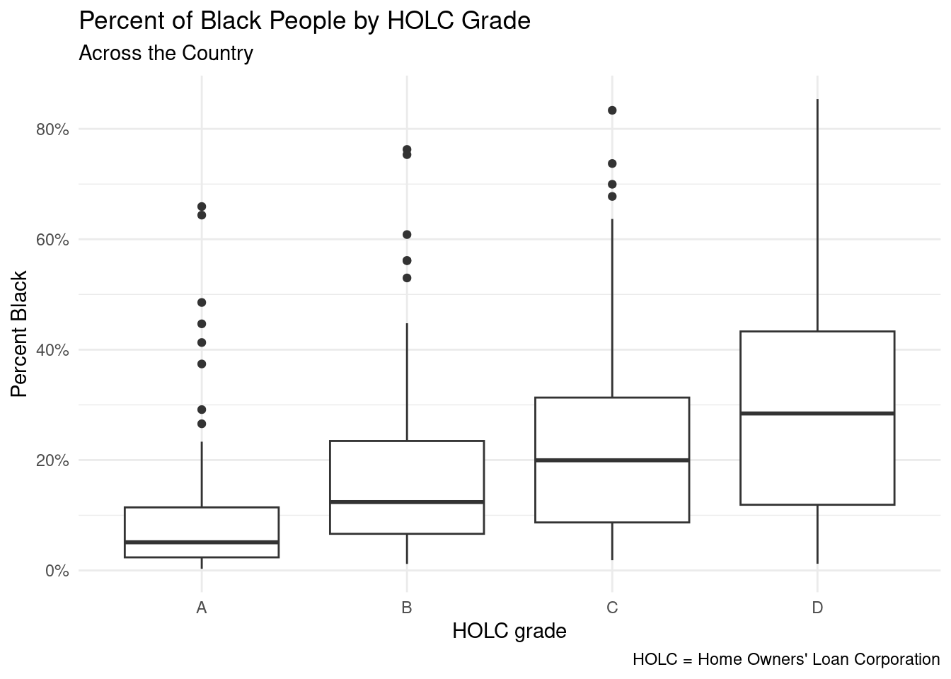
Hispanic/Latino Population:
ggplot(data = metro_grades, mapping = aes(x = holc_grade, y = pct_hisp)) +
  geom_boxplot() +
  scale_y_continuous(labels = label_percent(scale = 1)) +
  labs(
    title = "Percent of Hispanic/Latino People by HOLC Grade",
    subtitle = "Across the Country",
    x = "HOLC grade",
    y = "Percent Hispanic/Latino",
    caption = "HOLC = Home Owners' Loan Corporation"
  ) +
  theme_minimal()
Asian Population:
ggplot(data = metro_grades, mapping = aes(x = holc_grade, y = pct_asian)) +
  geom_boxplot() +
  scale_y_continuous(labels = label_percent(scale = 1)) +
  labs(
    title = "Percent of Asian People by HOLC Grade",
    subtitle = "Across the Country",
    x = "HOLC grade",
    y = "Percent Asian",
    caption = "HOLC = Home Owners' Loan Corporation"
  ) +
  theme_minimal()
Remaining Population (other):
ggplot(data = metro_grades, mapping = aes(x = holc_grade, y = pct_other)) +
  geom_boxplot() +
  scale_y_continuous(labels = label_percent(scale = 1)) +
  labs(
    title = "Percent of \"Other\" People by HOLC Grade",
    subtitle = "Across the Country",
    x = "HOLC grade",
    y = "Percent \"Other\"",
    caption = "HOLC = Home Owners' Loan Corporation"
  ) +
  theme_minimal()
Questions for reviewers
List specific questions for your peer reviewers and project mentor to answer in giving you feedback on this phase.
How can we address the potential confounding variables that may affect the relationship between race and HOLC grades?
Is our hypothesis question specific and interesting enough to yield potentially interesting results?
Is the dataset representative enough of the US as a whole, given that it only covers micropolitan and metropolitan areas? How might this affect the generalizability of the results?
Can you suggest any additional analyses or visualizations that could help to better understand the relationships between race and HOLC grade in the dataset?
Are there any ethical considerations that should be taken into account when conducting research on redlining and its effects on communities? How can we ensure that the research is conducted in a responsible and respectful manner?