
Home Owners’ Loan Corporation (HOLC) Grades and their Relationship to Racial Demographics
Report
Introduction
The Home Owners’ Loan Corporation (HOLC) was a federal agency that played a salient role in influencing the growth of American cities and neighborhoods. In 1933, Home Owners’ Loan Corporation’s (HOLC) began a national campaign to stabilize the housing market during the Great Depression and grade communities based on their perceived risk of mortgage lending. During its 20-year presence and involvement, HOLC created hundreds of these maps around the United States and this method, which came to be known as redlining, had far-reaching consequences for economic inequality in the United States.
In order to score a community, HOLC representatives would gather information on a neighborhood’s demographics, property values, and other factors, to assign the community a letter grade from “A” (lowest risk) to “D” (the highest risk). Areas that were judged to be high-risk were offered unfavorable terms or denied loans, while areas that were classified as low-risk received the most favorable lending terms.
To investigate the effects of race on the HOLC grading score, we ask the question: Is there a relationship between the racial markup of a city and the HOLC grade it receives? We analyze the data on racial makeup of areas in various cities and compare this to the HOLC assigned to those cities. We find a statistically significant relationship between race and HOLC grading: cities with greater proportion of white residents were more likely to receive greater grades, whereas, cities with high percentage of minorities (black and hispanic) were more likely to receive lower grades. This trend reinforces that, indeed, individuals of color had disproportionate access to mortgage lending and other benefits, which in turn, increased economic insecurity.
Data Description
The dataset was created and funded by the editors at the opinion poll analysis website, FiveThirtyEight, using 2020 Census data. It matched the Census data with redlining maps and HOLC grades created by the Home Owners’ Loan Corporation from 1935 to 1940, as provided by the Mapping Inequality Project.
Here, we find that the dataset has 30 columns, which entail the metro area of a case, its state, its region within the United States, the HOLC grade, as well as several different metrics that are divided into the 5 different racial categories, including: the total population of a certain racial group in the area, the percent of a racial group within the area, the location quotient of a racial group in the area, the surrounding area’s total population of a racial group, and the surrounding area’s percent population of a racial group. This means that the dataset pays extra attention to certain population subsets. In addition, each observation/row (in which there are 551) represents a certain case which has a designated metro area and HOLC grade assigned to it, containing all the data about the population that resides within both that metropolitan area and HOLC grade.
Much of the processes that affect the data are determined by the accuracy of both the 2020 Census, which may have issues undercounting or overcounting American citizens, as well as the accuracy of FiveThirtyEight to match old redlining maps with modern neighborhoods and area codes. These boundaries and places where people currently live have likely changed in the 80+ years since those maps were first made for redlining. This also goes to the fact that most people involved in the study were not aware that this data would be used in this dataset, as they were simply answering the decennial Census.
Finally, the creators of this dataset preprocessed the data in order to find the percentages and other statistics surrounding each racial group’s prevalence in a metro area with a certain HOLC grade. This was done most likely to easily compare the disparities highlighted by these statistics.
Data Analysis
Summaries
Starting with the populations given a HOLC grade of A (Best), we find summary statistics of each race and the percent of the population in an A zone. Focusing on the medians of each race, the data (which can be found in the appendices) says that the percent of White people within a HOLC grade of A from every metropolitan area in the United States is 77.54%. The percent of Black people within a HOLC grade of A is only 5.11%. The percent of Hispanic people is 5.38%, for Asian people the percent is 1.92%, and for all other racial populations the percent within an A grade is 5.09%.
Moving on to populations given a HOLC grade of B (Desirable), we find the summary statistics of each race and the percent of the population in a B zone. Again focusing on medians, the data (which can be found in the appendices) says that the percent of White people within a HOLC grade of B from every metropolitan area in the United States is 62.86%. The percent of Black people within a HOLC grade of B is 12.39%. The percent of Hispanic people is 7.83%, for Asian people the percent is 2.1%, and for all other racial populations the percent within a B grade is 5.59%.
Now, with populations given a HOLC grade of C (Declining), we find the summary statistics of each race and the percent of the population in a C zone. Focusing on medians, the data (which can be found in the appendices) says that the percent of White people within a HOLC grade of C from every metropolitan area in the United States is 48.43%. The percent of Black people within a HOLC grade of C is 19.96%. The percent of Hispanic people is 11.26%, for Asian people the percent is 2.22%, and for all other racial populations the percent within a C grade is 5.79%.
Finally, this time with populations given a HOLC grade of D (Hazardous), we find the summary statistics of each race and the percent of the population in a D zone. Yet again focusing on medians, the data (which can be found in the appendices) says that the percent of White people within a HOLC grade of D from every metropolitan area in the United States is 39.85%. The percent of Black people within a HOLC grade of D is 28.44%. The percent of Hispanic people is 11.69%, for Asian people the percent is 1.69%, and for all other racial populations the percent within a D grade is 5.61%.
Plots
Below are boxplots of the data that contain information about the percentages of people (of a singular race) that fall within each HOLC grade: A, B, C, and D.
The visualization below looks at the data of White people across the country and the percent by which they fall under the different HOLC grades. It is shown that there is a high median percentage of White people classified with the A grade. For each following HOLC grade (B, C, and D) the median percentage of White people falls lower.
This next visualization below looks at the data of Black people across the country and the percent by which they fall under the different HOLC grades. It is shown that there is a low median percentage of Black people classified with the A grade. For each following HOLC grade (B, C, and D) the median percentage of White people rises with the highest median percentage falling under the D grade.

The next plot shown below looks at the data of Hispanic and Latino people across the country and the percent by which they fall under the different HOLC grades. It is shown that there is a low median percentage of Hispanic and Latino people classified with the A grade. For each following HOLC grade (B, C, and D) the median percentage of Hispanic and Latino people rise (but only slightly).

The following visualization below looks at the data of Asian people across the country and the percent by which they fall under the different HOLC grades. It is shown that there is a low median percentage of Asian people classified with the A grade. For each following HOLC grade (B, C, and D) the median percentage of Asian people remains about the same.

The final visualization below looks at the data of all other racial/ethnic groups across the country and the percent by which they fall under the different HOLC grades. It is shown that there is a low median percentage of these groups classified with the A grade. For each following HOLC grade (B, C, and D) the median percentage rises slightly for B and remains about constant for C and D.

Logistic Regression Model
For this section, we change holc_grades into a binary variable in order to perform a logistic regression, as well as to help allow us to isolate the two most differential HOLC grades and not complicate our model by bringing in “B” and “C”, which may have very similar results to “A” and “D,” and make it harder to interpret.
When creating a logistic regression model to find the relationship between HOLC grade and the percentage of White people within an area, we find that the chances of the HOLC grade being “D” decreases as percentage White increases. The intercept (log odds that the HOLC grade is “A” given 0 percent of White people in an area) is not very useful in this case, as there are little to no areas in this dataset with 0 percent of any race. In addition, the model shows that for every 1 percent increase in White people in the area, the log odds of holc_grade being “D” decreases by 0.0889, or, when considering for log, around 8.5 percent, demonstrating a clear negative relationship between the percentage of White people and the chances an area’s HOLC grade will be “D”.
# A tibble: 2 × 5
  term        estimate std.error statistic  p.value
  <chr>          <dbl>     <dbl>     <dbl>    <dbl>
1 (Intercept)   5.24     0.632        8.30 1.07e-16
2 pct_white    -0.0890   0.00992     -8.97 2.96e-19
When creating a logistic regression model to find the relationship between HOLC grade and the percentage of Black people within an area, we find that the chances of the HOLC grade being “D” increases as percentage Black increases. The intercept (log odds that the HOLC grade is “A” given 0 percent of Black people in an area) is not very useful in this case, as there are little to no areas in this dataset with 0 percent of any race. In addition, the model shows that for every 1 percent increase in Black people in the area, the log odds of holc_grade being “D” increases by 0.0933, or, when considering for log, around 9 percent, demonstrating a clear positive relationship between the percentage of Black people and the chances an area’s HOLC grade will be “D”.
# A tibble: 2 × 5
  term        estimate std.error statistic  p.value
  <chr>          <dbl>     <dbl>     <dbl>    <dbl>
1 (Intercept)  -1.56      0.225      -6.93 4.27e-12
2 pct_black     0.0933    0.0126      7.39 1.52e-13
When creating a logistic regression model to find the relationship between HOLC grade and the percentage of Hispanic people within an area, we find that the chances of the HOLC grade being “D” increases as percentage Hispanic increases. The intercept (log odds that the HOLC grade is “A” given 0 percent of Hispanic people in an area) is not very useful in this case, as there are little to no areas in this dataset with 0 percent of any race. In addition, the model shows that for every 1 percent increase in Hispanic people in the area, the log odds of holc_grade being “D” increases by 0.0583, or, when considering for log, around 6 percent, demonstrating a clear positive relationship between the percentage of Hispanic people and the chances an area’s HOLC grade will be “D”.
# A tibble: 2 × 5
  term        estimate std.error statistic    p.value
  <chr>          <dbl>     <dbl>     <dbl>      <dbl>
1 (Intercept)  -0.756     0.185      -4.09 0.0000428
2 pct_hisp      0.0583    0.0120      4.87 0.00000113
When creating a logistic regression model to find the relationship between HOLC grade and the percentage of Asian within an area, we find that there is likely very little relationship between HOLC grade and percent Asian. The intercept (log odds that the HOLC grade is “A” given 0 percent of Asian people in an area) is not very useful in this case, as there are little to no areas in this dataset with 0 percent of any race. In addition, the model shows that for every 1 percent increase in Asian people in the area, the log odds of holc_grade being “D” increases by 0.0003, or, when considering for log, nearly 0 percent, demonstrating very little relationship between HOLC grade and percent Asian.
# A tibble: 2 × 5
  term         estimate std.error statistic p.value
  <chr>           <dbl>     <dbl>     <dbl>   <dbl>
1 (Intercept) -0.000967    0.161   -0.00602   0.995
2 pct_asian    0.000312    0.0343   0.00909   0.993
When creating a logistic regression model to find the relationship between HOLC grade and the percentage of people who identify as another race within an area, we find that the chances of the HOLC grade being “D” increases as percentage of people who identify as other increases. The intercept (log odds that the HOLC grade is “A” given 0 percent of people who identify as another race in an area) is not very useful in this case, as there are little to no areas in this dataset with 0 percent of any race. In addition, the model shows that for every 1 percent increase in people who identify as another race in the area, the log odds of holc_grade being “D” increases by 0.162, or, when considering for log, around 18 percent, demonstrating a clear positive relationship between the percentage of people who identify as another race and the chances an area’s HOLC grade will be “D”.
# A tibble: 2 × 5
  term        estimate std.error statistic p.value
  <chr>          <dbl>     <dbl>     <dbl>   <dbl>
1 (Intercept)   -0.911    0.363      -2.51 0.0120
2 pct_other      0.162    0.0612      2.65 0.00802
Evaluation of Significance
In this section, we analyze the significance of differences between the percentage of those of each racial group by HOLC grade. Through this, we analyzed 5 different racial categories, “White,” “Black,” “Hispanic,” “Asian,” and “Other.” In doing so, we measured the difference in the mean percent that each racial category made up between different HOLC grades. However, in order to simplify our model, we decided to focus on the two HOLC grades which are meant to represent the highest-grade areas and the lowest-grade areas, corresponding to categories “A” and “D.”
As stated before, we filter out HOLC grades A and D in order to focus our model on the differences between the two most stratified HOLC groups, when redlining districts were first drawn many years ago. This allows us to minimize the complications that might have occurred when including the two middle HOLC grades, which may have been similar enough to A and D as to not show as much of a difference.

Here, we make a two-sided test based on the hypothesis and alternate hypothesis that
\(H_0 : \mu_A - \mu_D = 0 ~ percent\)
The null hypothesis being that there is no difference in the mean percentage of those who identify as White living in HOLC grade A and living in HOLC grade D.
\(H_A : \mu_A - \mu_D \neq 0 ~ percent\)
The alternative hypothesis being that there is a difference in the mean percentage of those who identify as White living in HOLC grade A and living in HOLC grade D.
Here, we find that the difference in means of the percentage of White people living in HOLC grade A and HOLC grade D (using a point estimate) is around 34 percent, basically giving a p-value of 0. Since we are using best practices and a significance level of 0.05, we can most likely safely reject the null hypothesis and conclude that there is a significant difference between the mean percentage of White people living in areas with HOLC grade A versus HOLC grade D, where White people most likely take up a larger percent of those living in areas with HOLC grade A.

Here, we make a two-sided test based on the hypothesis and alternate hypothesis that \(H_0 : \mu_A - \mu_D = 0 ~ percent\)
The null hypothesis being that there is no difference in the mean percentage of those who identify as Black living in HOLC grade A and living in HOLC grade D.
\(H_A : \mu_A - \mu_D \neq 0 ~ percent\)
The alternative hypothesis being that there is a difference in the mean percentage of those who identify as Black living in HOLC grade A and living in HOLC grade D.
Here, we find that the difference in means of the percentage of Black people living in HOLC grade A and HOLC grade D (using a point estimate) is around -22 percent, basically giving a p-value of 0. Since we are using best practices and a significance level of 0.05, we can most likely safely reject the null hypothesis and conclude that there is a significant difference between the mean percentage of Black people living in areas with HOLC grade A versus HOLC grade D, where Black people most likely take up a much smaller percent of those living in areas with HOLC grade A than in D.

Here, we make a two-sided test based on the hypothesis and alternate hypothesis that
\(H_0 : \mu_A - \mu_D = 0 ~ percent\)
The null hypothesis being that there is no difference in the mean percentage of those who identify as Hispanic living in HOLC grade A and living in HOLC grade D.
\(H_A : \mu_A - \mu_D \neq 0 ~ percent\)
The alternative hypothesis being that there is a difference in the mean percentage of those who identify as Hispanic living in HOLC grade A and living in HOLC grade D.
Here, we find that the difference in means of the percentage of Hispanic people living in HOLC grade A and HOLC grade D (using a point estimate) is around -11 percent, basically giving a p-value of 0. Since we are using best practices and a significance level of 0.05, we can most likely safely reject the null hypothesis and conclude that there is a significant difference between the mean percentage of Hispanic people living in areas with HOLC grade A versus HOLC grade D, where Hispanic people most likely take up a smaller percent of those living in areas with HOLC grade A than in D.
Here, we make a two-sided test based on the hypothesis and alternate hypothesis that
\(H_0 : \mu_A - \mu_D = 0 ~ percent\)
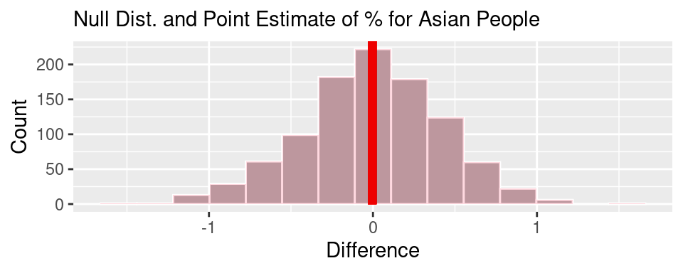
The null hypothesis being that there is no difference in the mean percentage of those who identify as Asian living in HOLC grade A and living in HOLC grade D.
\(H_A : \mu_A - \mu_D \neq 0 ~ percent\)
The alternative hypothesis being that there is a difference in the mean percentage of those who identify as Asian living in HOLC grade A and living in HOLC grade D.
Here, we find that the difference in means of the percentage of Asian people living in HOLC grade A and HOLC grade D (using a point estimate) is around 0 percent, giving a very high p-value of around 0.992. Since we are using best practices and a significance level of 0.05, we will most likely not reject the null hypothesis and conclude that there is no significant difference between the mean percentage of Asian people living in areas with HOLC grade A versus HOLC grade D.

Here, we make a two-sided test based on the hypothesis and alternate hypothesis that
\(H_0 : \mu_A - \mu_D = 0 ~ percent\)
The null hypothesis being that there is no difference in the mean percentage of those who identify as another race living in HOLC grade A and living in HOLC grade D.
\(H_A : \mu_A - \mu_D \neq 0 ~ percent\)
The alternative hypothesis being that there is a difference in the mean percentage of those who identify as another race living in HOLC grade A and living in HOLC grade D.
Here, we find that the difference in means of the percentage of people who identify as other living in HOLC grade A and HOLC grade D (using a point estimate) is around -0.69 percent, giving a p-value of around 0.006. Since we are using best practices and a significance level of 0.05, we will most likely reject the null hypothesis and conclude that there is a significant difference between the mean percentage of people who identify as another race living in areas with HOLC grade A versus HOLC grade D.
Interpretation and Conclusions
Over the course of our data analysis, we found that there was a clear relationship between dominant racial make up in an area and the HOLC grade the area receives. For example, our summaries show that the median percentage of White people in areas that received an A grade is much higher than in areas that received a D grade. Meanwhile, the median percentage of Black and Hispanic people in areas with a D grade is significantly higher than in areas with an A grade. These findings suggest that the HOLC grading system played a hand in reinforcing structures of racial segregation and inequality. Our analysis findings line up with previous findings on redlining in the US. It has been found that areas HOLC categorized as “hazardous” often had large percentages of people of color, especially Black and Hispanic residents, as well as those who identify as another race. Often, these areas were excluded from many benefits that white areas had access to, for example, government-backed mortgage lending, thus resulting in decreased property value and a lack of economic stability.
When considering the factors that play into the HOLC grade a metropolitan area is given, we see a trend where redlining negatively affects many of the demographics in the “hazardous” areas. White residents are much more likely to live in areas which have been marked by HOLC grade A, which benefit from socioeconomic conditions and resources that those living in areas with HOLC grade D. On the other hand, those who identify as Black, Hispanic, or another race are seen to much more likely live in areas with HOLC grade D, which were deemed “Hazardous” areas which historically have had much less resources and lower socioeconomic conditions than in areas with HOLC grade A. These relationships between race and HOLC grade from redlining may have contributed to racial inequality in America.
For Asian residents, there was no correlation between percentage and the area’s HOLC grade. However, this does not take away from the larger issue of the HOLC system reinforcing racial inequality, and may be because Asian Americans hold significantly smaller populations than other groups in certain metro areas.
Our analysis results hold important implications for racial segregation and inequality that the US has had, historically. The HOLC grading system was an important part of federal housing in the 1930s, with it’s effects still being seen in communities and areas to this day. Alongside other discriminatory practices in the past, these issues add to the disparities in wealth, education and health attainment between White people and people of color that persist today.
Acknowledgments
By pinpointing the effects of racial discrimination in housing, we uncover the systemic inequality that adds to a plethora of issues. This highlights the need for intervention aiming to reduce the disparities in access to affordable housing or combating discrimination in the housing market. These efforts would be crucial for creating great social mobility, economic opportunity and racial equality in the US.
Source of our dataset: our dataset (metro-grades.csv) was uploaded by Github user ryanabest. The population and race/ethnicity data was collected from the 2020 US Decennial Census to support the article, https://projects.fivethirtyeight.com/redlining-slug-tk/) that discusses the history of redlining.
Additional research on redlining: to gain more background on how the HOLC grading system was established and to supplement our statistical understanding of redlining with knowledge of its historical and social consequences, we read an article from the New York Times (https://www.nytimes.com/2021/08/17/realestate/what-is-redlining.html) that helped us translate our analyses into conclusions that can be applied to the real world.
Limitations
One of the major biases in our project is that we often expect our data analysis to yield a certain result due to the negative history surrounding redlining. This influenced the kind of research questions we asked. As a result, our project is better-equipped to answer questions about the correlation between the racial makeup of an area and HOLC grades, rather than investigate what other factors might have been at play.
Another limitation is that it is not possible to sample the entire US, as the majority of the data we worked with comes from a handful of micropolitan and metropolitan areas. While this offers a better idea of how different urban areas can display a relationship between racial demographics and HOLC grades, it may not be an accurate reflection of how this relationship manifests in the rural and suburban areas of the US.