Project Wondrous Starmie
Report
Introduction
This section includes an introduction to the project motivation, data, and research question. What is the context of the work? What research question are you trying to answer? What are your main findings? Include a brief summary of your results.
In March of 2020, the World Health Organization declared the emergence of the COVID-19 outbreak as a “pandemic”, thereby signaling a momentous international public health crisis. Subsequently, a range of social, economic, and political repercussions spread across the nation, as entire states imposed strict quarantine measures and lockdowns in an effort to contain the spread of the virus. Among these issues, the intersection between mask-wearing and an individual’s right to personal autonomy and privacy became a highly politicized topic, serving as a divisive point of conflict within the nation. In light of these developments, this research explores the complexity of these public health measures and region-level political affiliation. More specifically, this paper invesigates the relationship between a state’s political alignment with Democratic or Republican policies and its residents’ relative willingness to wear a mask.
- Need: What are your main findings? Include a brief summary of your results.
Data description
This should be inspired by the format presented in Gebru et al, 2018. Answer any relevant questions from sections 3.1-3.5 of the Gebru et al article, especially the following questions:
The present research paper utilized a data set collected from the New York Times (Source: https://github.com/nytimes/covid-19-data/tree/master/mask-use), a prominent American newspaper renowned for its objective coverage of domestic and international news across a range of fields, including politics, business, culture, science, and technology. The primary objective of this data set was to enhance public awareness and understanding of the COVID-19 pandemic, with its potential applications spanning medical and public health research, policymaking, data analysis, and local news media. The data set contains information on COVID-19 related factors, with each observation representing a distinct county in the United States and each column denoting attributes associated with the frequency of mask-wearing among residents, categorized as “Never,” “Rarely,” “Sometimes,” “Frequently,” and “Always.” The initial raw data collected from participants was then transformed into ratios, and subsequently inputted into a csv file, which was made available for our use. It is important to note that certain limitations may affect the accuracy of the data collected, including a participant willingness to participate, surveyor appearance, and time of day/year in which data was collected. However, it is noteworthy that all participants were fully informed of the data collection process and the eventual public release of the data, and no private information was obtained.
To address our specific research question, we reformatted the data by consolidating the county observations into a new column designated “State”. Additionally, we included a supplementary column that specifies the political affiliation (i.e., red or blue) of each state, determined by mapping the elements of a list containing state abbreviations to the corresponding state color, based on the 2020 US election results (source: https://www.governing.com/assessments/what-painted-us-so-indelibly-red-and-blue).
Data analysis
Use summary functions like mean and standard deviation along with visual displays like scatterplots and histograms to describe data.
Warning in stat_bin(bins = 30, quietly = TRUE): Ignoring unknown parameters:
`quietly`
Warning in stat_bin(bins = 31, quietly = TRUE): Ignoring unknown parameters:
`quietly``stat_bin()` using `bins = 30`. Pick better value with `binwidth`.Warning: Removed 1 rows containing non-finite values (`stat_bin()`).Warning: Removed 1 rows containing non-finite values (`stat_bin()`).Warning: Removed 2 rows containing missing values (`geom_bar()`).
Removed 2 rows containing missing values (`geom_bar()`).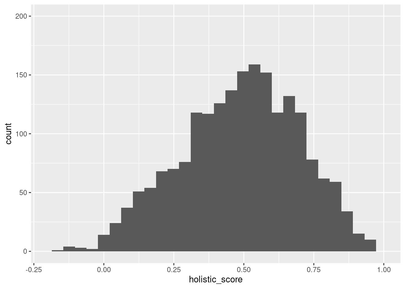
`stat_bin()` using `bins = 30`. Pick better value with `binwidth`.Warning: Removed 2 rows containing missing values (`geom_bar()`).
Removed 2 rows containing missing values (`geom_bar()`).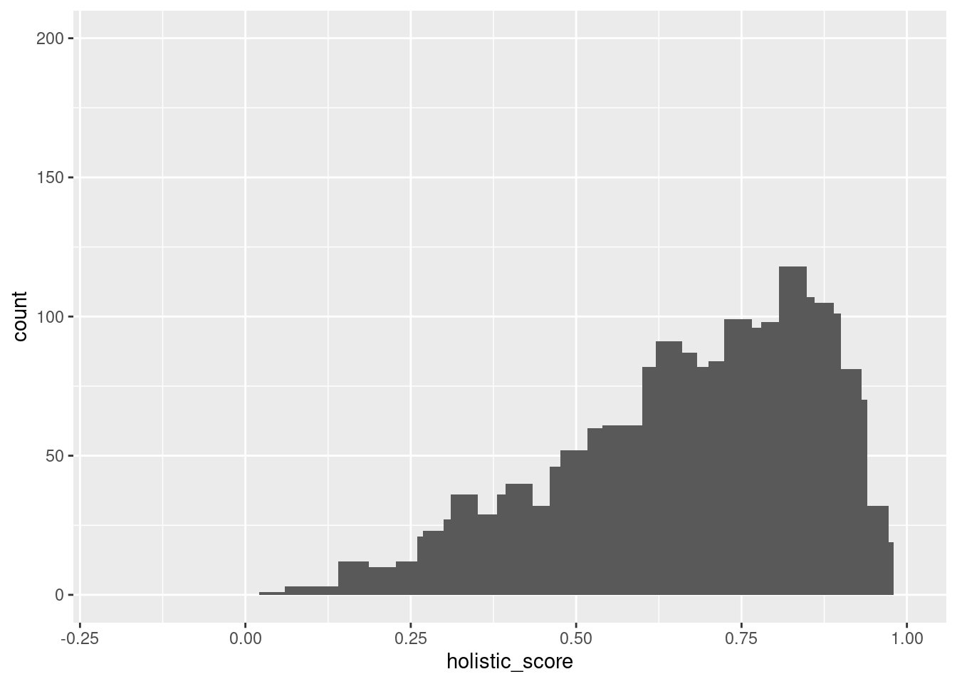
`stat_bin()` using `bins = 30`. Pick better value with `binwidth`.Warning: Removed 1 rows containing non-finite values (`stat_bin()`).Warning: Removed 1 rows containing non-finite values (`stat_bin()`).Warning: Removed 2 rows containing missing values (`geom_bar()`).
Removed 2 rows containing missing values (`geom_bar()`).`stat_bin()` using `bins = 30`. Pick better value with `binwidth`.Warning: Removed 2 rows containing missing values (`geom_bar()`).
Removed 2 rows containing missing values (`geom_bar()`).Provide at least one model showing patterns or relationships between variables that addresses your research question. This could be regression or clustering, or something else that measures some property of the dataset.
# A tibble: 2 × 5
  term         estimate std.error statistic   p.value
  <chr>           <dbl>     <dbl>     <dbl>     <dbl>
1 (Intercept)     0.486   0.00458     106.  0
2 binary_state    0.183   0.00758      24.1 4.37e-118
\[ holistic\_score = 0.4861795 + 0.1827743 \times binary\_state \]
To explore the relationship between mask-wearing willingness and the political leaning of the state, we used a linear regression model to investigate this relationship. The equation above is what we obtained. In terms of variables, the holistic score is the average score that measures an individual’s willingness to wear a mask in public, while the binary state variable is a binary variable that takes a value of 0 if the county is located in a red state, and 1 if the county is located in a blue state. The intercept tells us that the expected value of the holistic score when the binary state variable is equal to 0, or when the county is located in a red state, is on average, 0.486. The slope coefficient can be interpreted as the expected holistic score increases, on average, by approximately 0.182, if the county is in a blue state, which has a value of 1, in comparison to a red state. This difference in mean mask-wearing willingness is further corroborated in the sections below.
Evaluation of significance
Use hypothesis tests, simulation, randomization, or any other techniques we have learned to compare the patterns you observe in the dataset to simple randomness.
Null hypothesis: There is no significant difference in mean mask-wearing willingness (indicated by election_data$Score) between counties in blue and red states.
Alternative hypothesis: There is a significant difference in mean mask-wearing willingness (indicated by election_data$Score) between counties in blue and red states.
    Welch Two Sample t-test

data:  holistic_score by state_color
t = 24.75, df = 2581.7, p-value < 2.2e-16
alternative hypothesis: true difference in means between group blue and group red is not equal to 0
95 percent confidence interval:
 0.1682936 0.1972549
sample estimates:
mean in group blue  mean in group red
         0.6689538          0.4861795
[1] 1.562459e-121Interpretation and conclusions
What did you find over the course of your data analysis, and how confident are you in these conclusions? Detail your results more so than in the introduction, now that the reader is familiar with your methods and analysis. Interpret these results in the wider context of the real-life application from where your data hails.
From the first code chunk of histogram, we can find that there are two histograms representing the distribution of holistic store variables divided into states that are either red or blue. The histograms give us a visual representation of any potential differences. IN this case, they seem to have a similar location of the peak, both located near 0.2 holistic score. However, the differences are that the red state has more data and the mode is located a little less than 0.2. On the other hand, from the second code, we can know that the holistic score variable can be clustered into four groups, so we can see those distributions in the following scatter plot. We can also observe the mean and standard deviation of the “wear score” (people who wore masks) and “not_wear_score” (not wearing masks) variables and the percentage of states that are red or blue for each cluster.
In the case of the visualization of the scatter plot, we can see that most of the data points are scattered into 2 and 3 of the clusters, and less on the 1 and 4 who have the lowest or the highest holistic score. This means that 1 has the highest number of people wearing masks, and 4 having the lowest. Knowing that counties have the balance of people with differing opinions, it is safe to know that mode people are in the middle section of the graph.
Knowing the general spread of the red and blue state through histogram and the preferences scored in terms of holistic scores and clusters, we cannot fully conclude the red and blue distribution, because as we know from the histogram, there are much more people populated in the red section, thus the percentages of the people are not adequately proportioned. These results show that having more or less numbers do not give an automatic result to test the hypothesis, but more proportions and variables are required to figure out the causation as well as the correlation among numerous potential variables.
Limitations
What are the limitations of your study? What are the biases in your data or assumptions of your analyses that specifically affect the conclusions you’re able to draw?
Despite the strengths of this data set, there are several important limitations that must be considered to that can influence the validity of the stated conclusions.
One of the primary limitations of this data set is the vast demographic, regional, and cultural differences between each state. Each state has its unique political, economic, and social context, and these factors can significantly influence people’s responses to COVID-19. For example, states with higher populations of low-income residents may have fewer resources to manage the pandemic, leading to different responses compared to states with more significant resources. Additionally, cultural differences between states may affect how seriously individuals take the virus and how they respond to public health measures. Without accounting for these differences, the dataset’s findings may not be representative of the entire population at hand. However, it would be difficult to quantify all of these differences in one study as there would be too many factors to isolate a single independent variable.
Another limitation of the data set is the dates on which the data was collected. The research collected the data between July 2nd -14th, 2020, which was a time when the public opinion about COVID-19 was evolving rapidly. The level of uncertainty surrounding the virus led to different reactions on how seriously it should be regarded, and these reactions definely evolved as more information was obtained about the virus. Thus, if the data collection dates were during a more (or less) serious time, the dataset’s results could have vastly differed. While this issue cannot be combated, as the data was already collected, it may help if the research question is specified within the scope of the date’s in question. Therefore, the conclusions made can be valid generalizations for this time period.
The third limitation of this data set is the researcher’s ability to quantify the “in-between” or uncertain variables. In this data set, these variables include the categories of “Rarely,” “Sometimes,” and “Frequently.” It is unclear how the participants viewed these categories, and their subjective interpretation may have influenced their responses. Without a clear understanding of how participants viewed these categories, it is difficult to compare responses accurately. To help combat this issue, the responses were grouped together by mask wearing (Frequently & Sometimes) or non-mask wearing (Never & Rarely) and subtracted from each other to create a holistic score mask wearing score. This grouping helps lessen the ambiguity of these “in-between” responses.
In summary, a data set exploring the relationship between political affiliation and mask-policy responses to COVID-19 faces several limitations, including demographic, regional, and cultural differences, issues with the dates on which the data was collected, and the researcher’s ability to quantify uncertain variables. To ensure the accuracy of the findings, these limitations must be considered and accounted for during data analysis.