Colorado Avalanches vs Vancouver Canucks

Data you need to understand to
become an amateur NHL commentator

Author

Cozy-Quilts
Kevin Chang, Aishwarya Khubchandani,
Jasmine Pearson, Shreya Tuli

Published

May 11, 2026

Introduction

This project uses 2022–23 NHL regular-season shot-event data to tell a short visual story about what makes hockey offense dangerous. Because hockey is a spatial game, the dataset helps us compare where shots come from, how dangerous they are, and how expected goals, or xG, reveals shot quality rather than just shot quantity.

  • Source: 2022–23 NHL regular-season shot-event data accessed through hockeyR
  • Dataset: Cleaned local file stored as data/nhl_shots_clean.csv
  • Unit of analysis: One row per shot-related event, including shots on goal, missed shots, and goals

Our Product & Why Website?

We created a multipage Quarto website because our project works best as a guided visual story rather than a single static report. The structure is designed for hockey fans and beginner sports analytics readers, with an overview page, four main graphs, a case study, and an FAQ that helps explain key terms.

  • Format: Multipage Quarto website with a guided narrative flow
  • Structure: Welcome landing page, NHL overview page, case study page, and FAQ
  • Inspiration: Baby Boom in Seven Charts
  • Our Website

Q1: What offensive styles do NHL teams have?

median_shots <- median(team_summary$shots, na.rm = TRUE)
median_quality <- median(team_summary$avg_xg_per_shot, na.rm = TRUE)

team_summary_plot <- team_summary |>
  mutate(
    style_group = case_when(
      shots >= median_shots &
        avg_xg_per_shot >= median_quality ~ "High volume, high danger",
      shots >= median_shots &
        avg_xg_per_shot < median_quality ~ "High volume, lower danger",
      shots < median_shots &
        avg_xg_per_shot >= median_quality ~ "Lower volume, high danger",
      TRUE ~ "Lower volume, lower danger"
    ),
    focus_team = event_team %in% c("Colorado Avalanche", "Vancouver Canucks")
  )

team_summary_plot |>
  ggplot(aes(x = shots, y = avg_xg_per_shot)) +

  # quadrant shading
  annotate(
    "rect",
    xmin = median_shots,
    xmax = Inf,
    ymin = median_quality,
    ymax = Inf,
    alpha = 0.08,
    fill = "#00b140"
  ) +
  annotate(
    "rect",
    xmin = median_shots,
    xmax = Inf,
    ymin = -Inf,
    ymax = median_quality,
    alpha = 0.06,
    fill = "#236192"
  ) +
  annotate(
    "rect",
    xmin = -Inf,
    xmax = median_shots,
    ymin = median_quality,
    ymax = Inf,
    alpha = 0.06,
    fill = "#6f263d"
  ) +

  # median lines
  geom_vline(
    xintercept = median_shots,
    linetype = "dashed",
    linewidth = 0.5,
    color = "#667085"
  ) +
  geom_hline(
    yintercept = median_quality,
    linetype = "dashed",
    linewidth = 0.5,
    color = "#667085"
  ) +

  # all teams in gray
  geom_point(
    aes(size = total_xg),
    alpha = 0.45,
    color = "gray35"
  ) +

  # highlight Avalanche and Canucks
  geom_point(
    data = team_summary_plot |> filter(focus_team),
    aes(size = total_xg, color = event_team),
    alpha = 0.95
  ) +

  # labels for selected teams
  ggrepel::geom_text_repel(
    data = team_summary_plot |>
      filter(
        focus_team |
          event_team %in%
            c(
              "Edmonton Oilers",
              "New Jersey Devils",
              "Florida Panthers",
              "Calgary Flames",
              "Pittsburgh Penguins"
            )
      ),
    aes(label = event_team, color = event_team),
    size = 3,
    max.overlaps = Inf,
    show.legend = FALSE
  ) +

  scale_color_manual(
    values = c(
      "Colorado Avalanche" = "#6F263D",
      "Vancouver Canucks" = "#00205B"
    ),
    na.value = "gray35"
  ) +
  scale_y_continuous(labels = percent_format(accuracy = 0.1)) +
  labs(
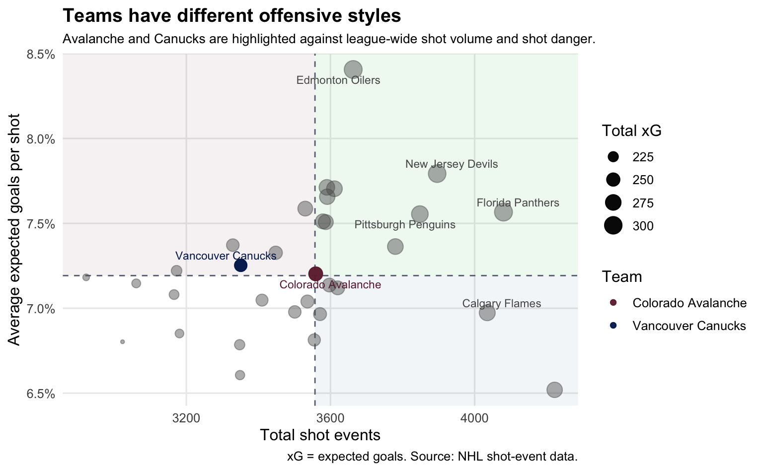
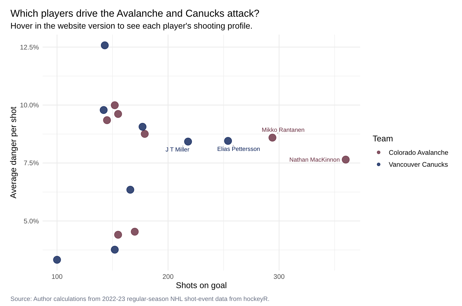
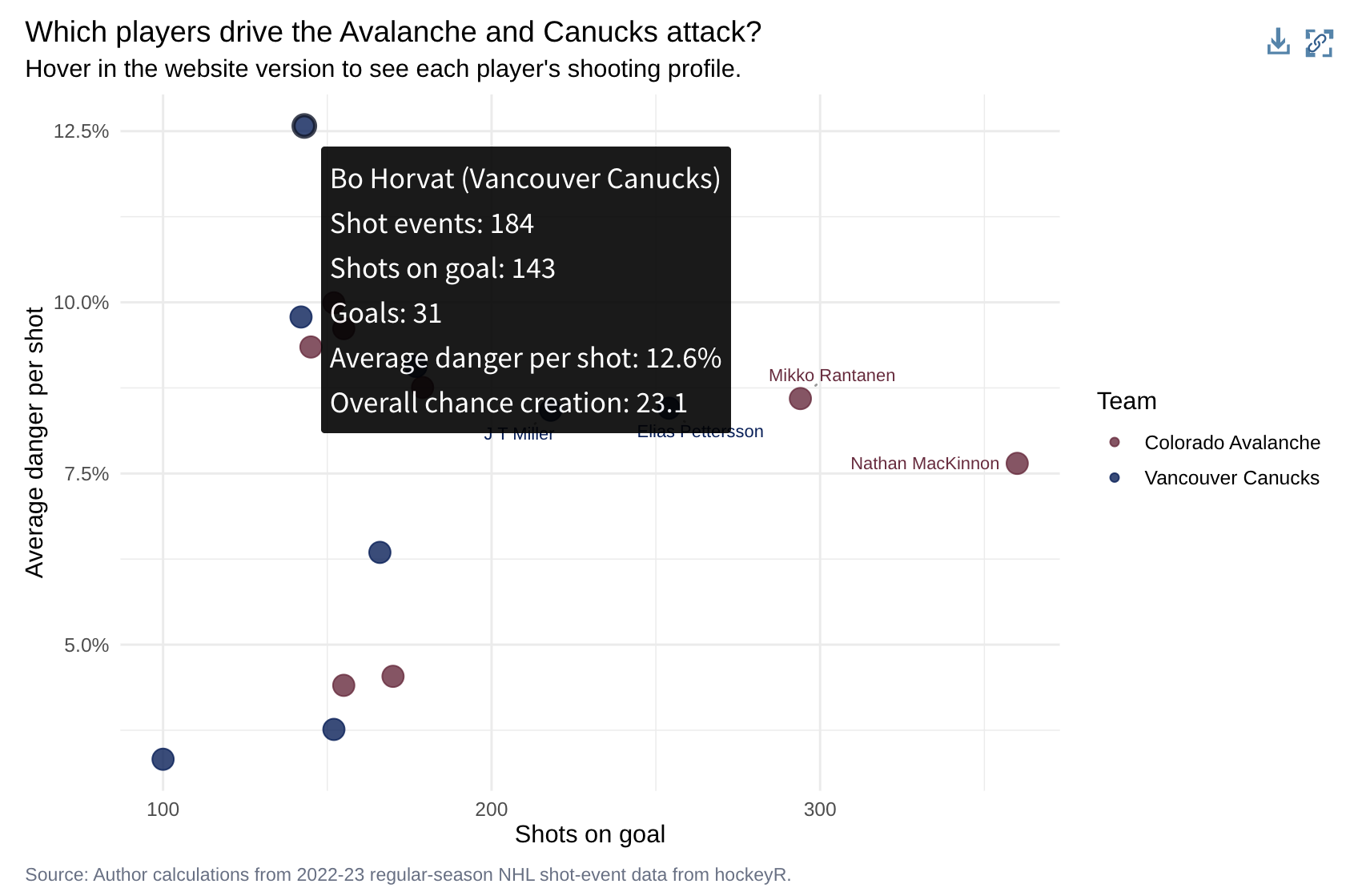
    title = "Teams have different offensive styles",
    subtitle = "Avalanche and Canucks are highlighted against league-wide shot volume and shot danger.",
    x = "Total shot events",
    y = "Average expected goals per shot",
    size = "Total xG",
    color = "Team",
    caption = "xG = expected goals. Source: NHL shot-event data."
  ) +
  theme_minimal(base_size = 12) +
  theme(
    legend.position = "right",
    plot.title = element_text(face = "bold"),
    plot.subtitle = element_text(size = 10),
    panel.grid.minor = element_blank()
  )

Q2: Where do dangerous shots come from?

sportyR::geom_hockey(league = "NHL") +
  geom_bin_2d(
    data = shots_explore,
    aes(x = x_attack, y = y_attack),
    binwidth = c(5, 5),
    alpha = 0.65
  ) +
  coord_fixed(xlim = c(0, 100), ylim = c(-42.5, 42.5)) +
  scale_fill_viridis_c(
    option = "C"
  ) +
  labs(
    title = "Where do NHL shots come from?",
    subtitle = "Shots are folded into one attacking zone",
    x = NULL,
    y = NULL,
    fill = "Shot count",
    caption = 'Source: NHL'
  ) +
  theme_minimal(base_size = 14) +
  theme(
    plot.margin = margin(2, 2, 2, 2)
  )
sportyR::geom_hockey(league = "NHL") +
  stat_summary_2d(
    data = shots_explore,
    aes(x = x_attack, y = y_attack, z = xg),
    fun = mean,
    binwidth = c(5, 5),
    alpha = 0.75
  ) +
  coord_fixed(
    xlim = c(0, 100),
    ylim = c(-42.5, 42.5)
  ) +
  scale_fill_viridis_c(
    option = "C",
    labels = scales::percent_format(accuracy = 0.1)
  ) +
  labs(
    title = "Where are shots most dangerous?",
    subtitle = "Average xG is highest closer to the net and around central ice.",
    caption = 'xG = expected goals, Source: NHL',
    x = NULL,
    y = NULL,
    fill = "Average xG"
  ) +
  theme_minimal(base_size = 14) +
  theme(
    plot.margin = margin(2, 2, 2, 2)
  )
Coordinate system already present.
ℹ Adding new coordinate system, which will replace the existing one.

Coordinate system already present.
ℹ Adding new coordinate system, which will replace the existing one.

  • Volume does not always mean danger: brightest shot count cluster near the net ≠ highest xG
  • Highest xG areas appear around middle of the attacking zone

Q3: How does each team attack differently?

offense_base_plot <- sportyR::geom_hockey(league = "NHL") +
  geom_segment(
    data = offense_path_summary,
    aes(
      x = x_bin,
      y = y_bin,
      xend = 89,
      yend = 0,
      linewidth = events
    ),
    color = "#8cb4d9",
    alpha = 0.35,
    lineend = "round",
    show.legend = FALSE
  ) +
  geom_point(
    data = offense_path_summary,
    aes(
      x = x_bin,
      y = y_bin,
      size = 2,
      fill = event_team
    ),
    shape = 21,
    color = "white",
    stroke = 0.5,
    alpha = 0.9
  ) +
  facet_grid(view ~ event_team) +
  theme(
    panel.border = element_rect(color = "gray", fill = NA, linewidth = 1),
    panel.spacing = unit(1, "lines")
  ) +
  coord_fixed(
    xlim = c(0, 100),
    ylim = c(-42.5, 42.5)
  ) +
  scale_fill_manual(
    values = c(
      "Colorado Avalanche" = "#6F263D",
      "Vancouver Canucks" = "#00205B"
    ),
    guide = "none"
  ) +
  scale_size_continuous(
    range = c(3, 7),
    labels = NULL
    #name = "How often this spot appears"
  ) +
  scale_linewidth_continuous(range = c(0.6, 1.8), guide = "none") +
  labs(
    title = "How the Avalanche and Canucks most often attack",
    subtitle = "Each puck travels from a common shooting area toward the net.",
    x = NULL,
    y = NULL,
    caption = paste(
      "Source: Author calculations from 2022-23 regular-season NHL shot-event",
      "data from hockeyR; rink geometry from sportyR."
    )
  ) +
  theme(
    axis.text = element_blank(),
    axis.ticks = element_blank(),
    strip.text = element_text(face = "bold"),
    legend.position = "bottom"
  ) +
  guides(size = "none") +
  coord_cartesian(xlim = c(50, 100), ylim = c(-20, 20))
Coordinate system already present.
ℹ Adding new coordinate system, which will replace the existing one.
Coordinate system already present.
ℹ Adding new coordinate system, which will replace the existing one.
offense_anim_plot <- offense_base_plot +
  geom_point(
    data = offense_animation,
    aes(x = x, y = y, group = path_id),
    inherit.aes = FALSE,
    shape = 21,
    fill = "black",
    color = "white",
    stroke = 0.4,
    size = 2.6
  ) +
  transition_reveal(progress) +
  ease_aes("linear")


if (knitr::is_html_output()) {
  render_gif_for_html(
    offense_anim_plot,
    filename = "avalanche-canucks-offense.gif"
  )
} else {
  offense_base_plot
}

Q4: How do players perform differently?

Q4: How do players perform differently?

Conclusion & Limitations

Shot count alone does not explain NHL offense. Strong offense is about where shots come from and which players create them.

Limitations:

  • One season only: 2022-23 regular season

  • xG is an estimate, not a perfect measure of danger

  • Does not fully capture screens, passes, rebounds, goalie movement, or defensive pressure

  • Team style can change across seasons because of roster, coaching, and injuries

Next step: Compare more seasons and add team/player filters so users can explore any matchup.

Thank you!