Data Analysis of Severe Crimes Committed in New York City
Report
Introduction
Violence and increasing crime rates have perpetuated our media and television in recent years. With the number and severity of crimes sharply, our team wanted to investigate this rising trend in detail, more specifically in the case of New York City. Especially as Cornell students who often travel to New York City during breaks, we thought that the findings of the project can provide meaningful insights to us. Using data provided by the NYPD, we conducted spatial analysis, to identify which places within New York City can be considered the most dangerous and if there is a specific demographic which can be identified as ‘most dangerous’ based on characteristics like gender, age and race. Our report identified the top three regions of NYC that are considered the most “dangerous”
Data description
The dataset was initially provided and funded by the NYPD, manually extracted every quarter and reviewed by the Office of Management Analysis and Planning, because they wanted to allow the public to “explore the nature of police enforcement activity”. The NYPD publicly posts New York state’s arrest incidents, so people are aware of the data collection. People expect the data to be used by law enforcement agencies to identify patterns of criminal activity, allocate resources, and make strategic decisions related to public safety. Additionally, members of the general public might have an interest in using the data to better understand crime trends in their neighborhoods
Each row represents an arrest record that occurred in New York City from 2020. The columns represent the details of the arrest we thought might be important for our analysis such as the demographics of the offender, the degree of crime, and details of the location it occurred. We acknowledged that our dataset may have been influenced by under reporting due to the unequal distribution of police officers throughout the city, which imposed a limitation on the accuracy of our results.
The cleaned dataset (arrest_clean) contains a total of 186784 rows and 17 columns. We pre-processed the dataset so that we could easily visualize the geographic distribution of crimes by offense level in a given area. These steps included dropping rows that contain NA and irrelevant information, factoring columns, and renaming columns for easier analysis.
| grid_cell | avg_lat | avg_long | min_lat | max_lat | min_long | max_long | num_severe_crimes | common_boro |
|---|---|---|---|---|---|---|---|---|
| 1 | 40.51107 | -74.24833 | 40.49939 | 40.51349 | -74.25253 | -74.23722 | 119 | Staten Island |
| 2 | 40.52176 | -74.23743 | 40.51414 | 40.52809 | -74.24808 | -74.23495 | 13 | Staten Island |
| 3 | 40.53187 | -74.24066 | 40.52839 | 40.53882 | -74.24226 | -74.23745 | 3 | Staten Island |
| 30 | 40.50742 | -74.22696 | 40.50183 | 40.50876 | -74.23428 | -74.22266 | 6 | Staten Island |
| 31 | 40.52740 | -74.23043 | 40.52474 | 40.52792 | -74.23380 | -74.22717 | 12 | Staten Island |
To prepare our data for spatial analysis, we separated the latitudes and longitudes to 1 x 1.05 mi^2 rectangular area grids, resulting in a total of 345 grids. Then we created a new grouped dataframe called arrest_grouped, and generated summary statistics of the average latitude and longitude, as well as the total number of crimes and the common borough of each “grid”.
Data analysis
The arrest_grouped tibble shows summary statistics of each “grid” of New York. It includes the average latitude, longitude, and most importantly the number of severe crimes there were in that area. To get a better understanding of the results, we created a visualization of the results plotting the average latitude and longitude of each “grid” and representing the size of each point with the number of severe crimes so we can eyeball which areas of New York are dangerous.
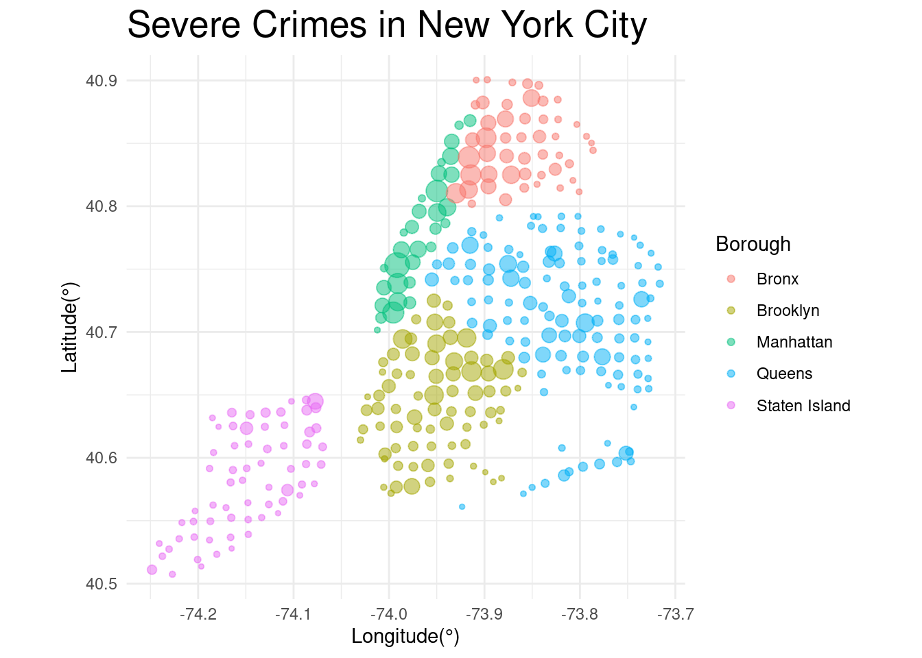
As shown on the plot, we can observe that the Manhattan and Bronx borough contained a higher concentration of grids with larger points. This means that these borough had many regions that are considered “dangerous”. However, to actually identify the exact geographic locationis of the most dangerous areas, we needed to conduct more tests and generate confidence intervals.
Evaluation of Significance
To compare the patterns observed in the dataset to simple randomness, a simulation was utilized by generating bootstrap samples of 1000 observations each to calculate the mean of criminal count for each bootstrap sample. This approach provides insight into whether the observed patterns are by chance alone.
| lower_ci | upper_ci |
|---|---|
| 210.543 | 290.7348 |
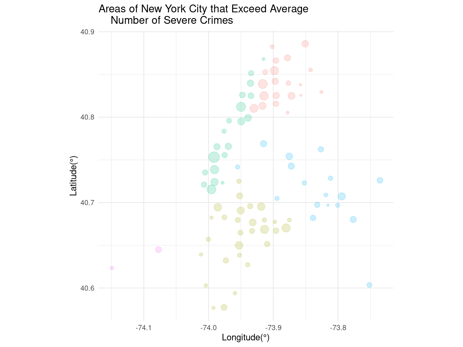
To evaluate the statistical significance of the crime report, a confidence interval can be calculated for the criminal count across all areas. By identifying areas that fall beyond the 95% confidence interval, it becomes possible to determine the locations that deviate significantly from the norm. This approach provides a quantitative assessment of the degree to which each area differs from the expected count.
| grid_cell | avg_lat | avg_long | min_lat | max_lat | min_long | max_long | num_severe_crimes | common_boro |
|---|---|---|---|---|---|---|---|---|
| 154 | 40.62348 | -74.14926 | 40.61602 | 40.62971 | -74.15663 | -74.14022 | 364 | Staten Island |
| 272 | 40.64496 | -74.07724 | 40.64472 | 40.64509 | -74.07889 | -74.07703 | 778 | Staten Island |
| 356 | 40.60293 | -74.00414 | 40.60206 | 40.61435 | -74.01823 | -74.00224 | 355 | Brooklyn |
| 358 | 40.63921 | -74.01155 | 40.62991 | 40.64431 | -74.02109 | -74.00232 | 342 | Brooklyn |
| 364 | 40.72110 | -74.00696 | 40.71718 | 40.73130 | -74.01287 | -74.00208 | 640 | Manhattan |
Locations with criminal counts exceeding the upper bound of the 95% confidence interval can be considered as dangerous. Therefore, we filtered locations with criminal counts exceeding 400.795. The dataset shows that there are 88 locations that can be considered as dangerous, meaning roughly a quarter of the grids of NYC are easily exposed to severe crimes. Now, we wanted to answer the second half of our question, which was what demographic groups are most likely to commit crimes in such areas.
Interpretation and conclusions
| min_lat | max_lat | min_long | max_long | num_severe_crimes | common_boro |
|---|---|---|---|---|---|
| 40.74589 | 40.76022 | -74.00199 | -73.98276 | 2666 | Manhattan |
| 40.80388 | 40.81824 | -73.96224 | -73.94385 | 1871 | Manhattan |
| 40.83284 | 40.84728 | -73.92433 | -73.90507 | 1804 | Bronx |
With the 95% confidence interval, we then filtered the arrest_grouped dataframe to locate the top three “grids” with the highest number of severe crimes committed since 2020. The table above shows the geographic details of these locations. After mapping the average latitude and longitude of the points on Google Maps, we found out that the first grid corresponded with the area right next to Madison Square Garden, the second grid corresponded with the area near the Central Harlem Region, and the third grid corresponded with the block next to Claremont Park.
After identifying the most dangerous areas of NYC, we then conducted a logistic regression on each of these grids to identify the most dangerous demographic groups for each of these areas.
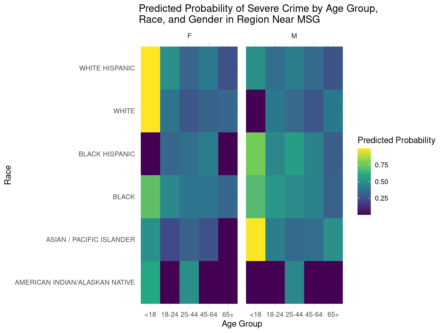
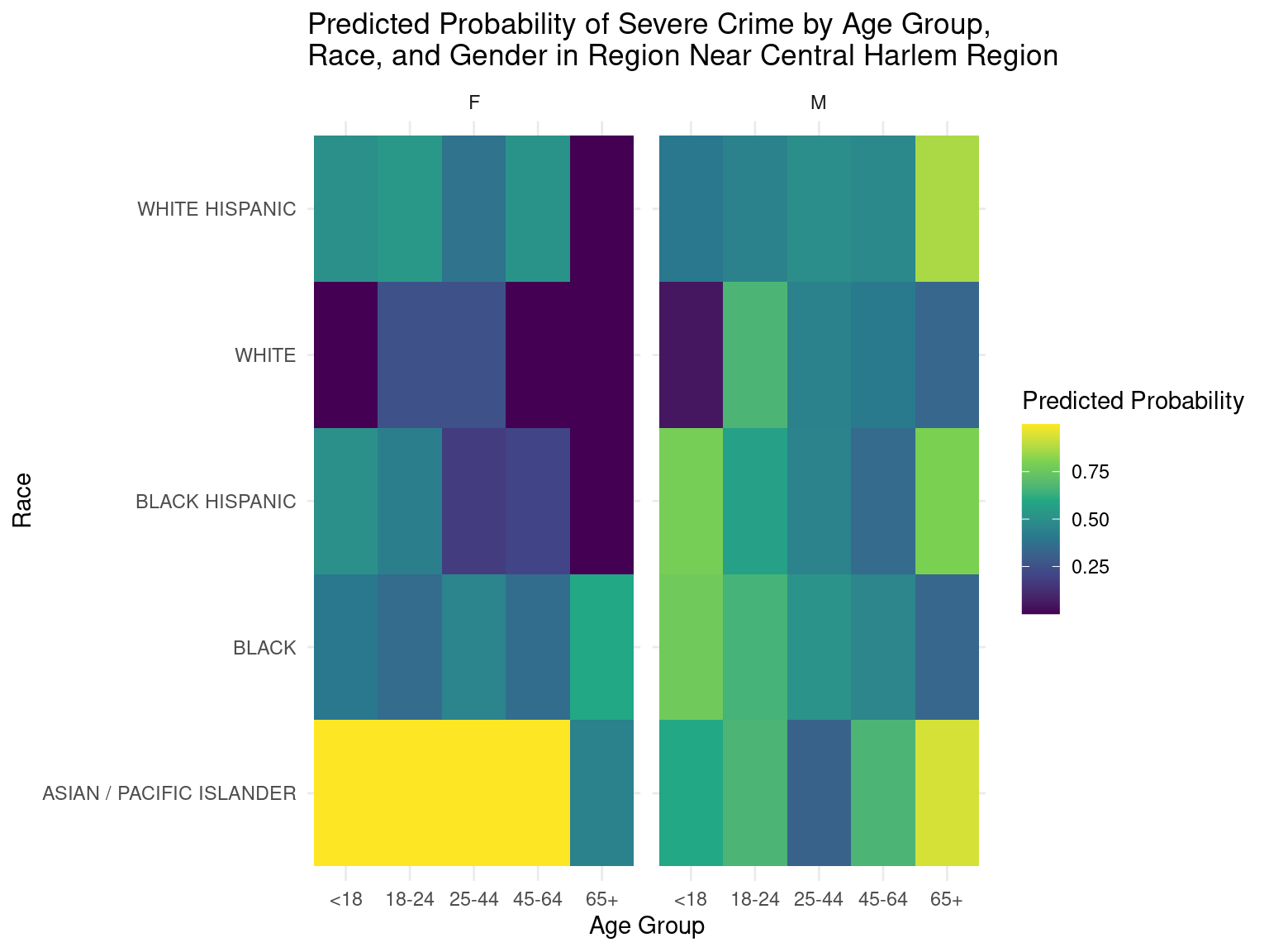
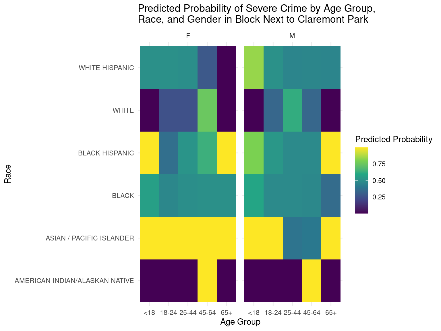
Based on the heatmaps, it can be deduced that the predicted probabilities of severe crime in certain regions can be determined by observing the color codes depicted in the legends. The lighter colors in particular represent higher predicted probabilities of severe crime in the respective age groups, races, and genders, while darker colors represent lower predicted probabilities of severe crime in the respective age groups, races, and genders.
These predicted probabilities are just numbers generated by the model and do not directly translate to the actual probabilities of these demographics committing the crime. Instead, these numbers should just be used as a standard of comparison between different demographic groups to gain insight on which group is more or less likely to commit a severe crime. Also, there were some demographic groups where the initial population size was small, which may have led to predictions that were inaccurate.
It is quite difficult to generate conclusions that certain demographic groups were the most dangerous just from these heatmaps, but we felt that these heatmaps provided a good start for studies that are interested in particular demographic groups.
This data is also especially relevant to us Cornell Students. Whenever we go to NYC, we can be more vigilant in these areas and around these demographic groups. This data analysis is also relevant from a policy stand point. Policy makers can target these specific areas by increasing number of police patrols to help decrease the crime rate.
Limitations
However, our data analysis does have several limitations. Firstly, the data we analyzed was from 2020, where the Covid 19 pandemic meant quarantining and other restrictions were at its peak. As such it may not be representative of the overall trend in other years unaffected by the pandemic. Similarly, during our analysis, we defined severe crime as a felony. However, there are currently over 60 different types of other, specific crime not included in our analysis. By combining both severe and specific crimes in our analysis, we can get a more holistic and accurate understanding of which places in NYC are the more dangerous.
Additionally, we acknowledge that the number of crimes may be correlated with the population of the area, but we did not have the appropriate data to include this in our analysis. By incorporating population data into our analysis, we could have generated a more informative measurement and a confidence interval that takes population into account
There is also the general limitation of under-reporting. Many crimes are not reported to law enforcement. This may lead to an inadequate representation of the actual scale of crime that exists in a specific area of the map. Another limitation is bias. Crime reports may be biased based on factors such as race or gender.
Acknowledgments
We would like to thank the Office of Management Analysis and Planning who carefully constructed this dataset using data provided by the NYPD. Additionally, we would like to thank our TA, Scarlett Wang who gave us feedback on our work as well as our peers in the Phenomenal Buneary and Squirtle teams who reviewed our draft report and gave us constructive feedback.
During our development process, we also utilized Stack Overflow questions to address any issues with our code.