In the demonstration, we utilized World Development Indicator (WDI) data from the World Bank collection to illustrate the Bar Chart Race application’s functionality with datasets containing temporal elements. Below is an overview of the data cleaning process:
This is what the raw dataset looks like.
library(readr)library(tidyverse)
── Attaching core tidyverse packages ──────────────────────── tidyverse 2.0.0 ──
✔ dplyr     1.1.2     ✔ purrr     1.0.2
✔ forcats   1.0.0     ✔ stringr   1.5.0
✔ ggplot2   3.4.3     ✔ tibble    3.2.1
✔ lubridate 1.9.2     ✔ tidyr     1.3.0
── Conflicts ────────────────────────────────────────── tidyverse_conflicts() ──
✖ dplyr::filter() masks stats::filter()
✖ dplyr::lag()    masks stats::lag()
ℹ Use the conflicted package (<http://conflicted.r-lib.org/>) to force all conflicts to become errors
Attaching package: 'scales'

The following object is masked from 'package:purrr':

    discard

The following object is masked from 'package:readr':

    col_factor
#importing world development indicatorsWDIData <-read_csv("data/WDIData.csv")
New names:
Rows: 392882 Columns: 68
── Column specification
──────────────────────────────────────────────────────── Delimiter: "," chr
(4): Country Name, Country Code, Indicator Name, Indicator Code dbl (63): 1960,
1961, 1962, 1963, 1964, 1965, 1966, 1967, 1968, 1969, 1970, ... lgl (1): ...68
ℹ Use `spec()` to retrieve the full column specification for this data. ℹ
Specify the column types or set `show_col_types = FALSE` to quiet this message.
• `` -> `...68`
WDIData
# A tibble: 392,882 × 68
   `Country Name` `Country Code` `Indicator Name` `Indicator Code` `1960` `1961`
   <chr>          <chr>          <chr>            <chr>             <dbl>  <dbl>
 1 Africa Easter… AFE            Access to clean… EG.CFT.ACCS.ZS       NA     NA
 2 Africa Easter… AFE            Access to clean… EG.CFT.ACCS.RU.…     NA     NA
 3 Africa Easter… AFE            Access to clean… EG.CFT.ACCS.UR.…     NA     NA
 4 Africa Easter… AFE            Access to elect… EG.ELC.ACCS.ZS       NA     NA
 5 Africa Easter… AFE            Access to elect… EG.ELC.ACCS.RU.…     NA     NA
 6 Africa Easter… AFE            Access to elect… EG.ELC.ACCS.UR.…     NA     NA
 7 Africa Easter… AFE            Account ownersh… FX.OWN.TOTL.ZS       NA     NA
 8 Africa Easter… AFE            Account ownersh… FX.OWN.TOTL.FE.…     NA     NA
 9 Africa Easter… AFE            Account ownersh… FX.OWN.TOTL.MA.…     NA     NA
10 Africa Easter… AFE            Account ownersh… FX.OWN.TOTL.OL.…     NA     NA
# ℹ 392,872 more rows
# ℹ 62 more variables: `1962` <dbl>, `1963` <dbl>, `1964` <dbl>, `1965` <dbl>,
#   `1966` <dbl>, `1967` <dbl>, `1968` <dbl>, `1969` <dbl>, `1970` <dbl>,
#   `1971` <dbl>, `1972` <dbl>, `1973` <dbl>, `1974` <dbl>, `1975` <dbl>,
#   `1976` <dbl>, `1977` <dbl>, `1978` <dbl>, `1979` <dbl>, `1980` <dbl>,
#   `1981` <dbl>, `1982` <dbl>, `1983` <dbl>, `1984` <dbl>, `1985` <dbl>,
#   `1986` <dbl>, `1987` <dbl>, `1988` <dbl>, `1989` <dbl>, `1990` <dbl>, …
Upon importing the data, the initial step involves restructuring the dataset to include a ‘year’ variable derived from the raw dataset using the pivot_longer() function:
Warning: 1 parsing failure.
row col expected actual
 64  -- a number  ...68
WDIData
# A tibble: 25,144,448 × 6
   `Country Name`  `Country Code` `Indicator Name` `Indicator Code`  year values
   <chr>           <chr>          <chr>            <chr>            <dbl>  <dbl>
 1 Africa Eastern… AFE            Access to clean… EG.CFT.ACCS.ZS    1960     NA
 2 Africa Eastern… AFE            Access to clean… EG.CFT.ACCS.ZS    1961     NA
 3 Africa Eastern… AFE            Access to clean… EG.CFT.ACCS.ZS    1962     NA
 4 Africa Eastern… AFE            Access to clean… EG.CFT.ACCS.ZS    1963     NA
 5 Africa Eastern… AFE            Access to clean… EG.CFT.ACCS.ZS    1964     NA
 6 Africa Eastern… AFE            Access to clean… EG.CFT.ACCS.ZS    1965     NA
 7 Africa Eastern… AFE            Access to clean… EG.CFT.ACCS.ZS    1966     NA
 8 Africa Eastern… AFE            Access to clean… EG.CFT.ACCS.ZS    1967     NA
 9 Africa Eastern… AFE            Access to clean… EG.CFT.ACCS.ZS    1968     NA
10 Africa Eastern… AFE            Access to clean… EG.CFT.ACCS.ZS    1969     NA
# ℹ 25,144,438 more rows
Following this, data types are refined, converting the ‘year’ variable to an integer and ‘country_name’ and ‘indicator_id’ to factors. The focus is narrowed down to four essential columns for the chart:
# A tibble: 25,144,448 × 4
   country_name                indicator_id    year values
   <fct>                       <fct>          <int>  <dbl>
 1 Africa Eastern and Southern EG.CFT.ACCS.ZS  1960     NA
 2 Africa Eastern and Southern EG.CFT.ACCS.ZS  1961     NA
 3 Africa Eastern and Southern EG.CFT.ACCS.ZS  1962     NA
 4 Africa Eastern and Southern EG.CFT.ACCS.ZS  1963     NA
 5 Africa Eastern and Southern EG.CFT.ACCS.ZS  1964     NA
 6 Africa Eastern and Southern EG.CFT.ACCS.ZS  1965     NA
 7 Africa Eastern and Southern EG.CFT.ACCS.ZS  1966     NA
 8 Africa Eastern and Southern EG.CFT.ACCS.ZS  1967     NA
 9 Africa Eastern and Southern EG.CFT.ACCS.ZS  1968     NA
10 Africa Eastern and Southern EG.CFT.ACCS.ZS  1969     NA
# ℹ 25,144,438 more rows
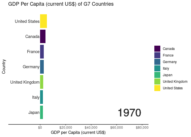
After selecting the columns, we decided on we would only look into GDP per capita. Therefore, we filtered only indicator_id == 'NY.GDP.PCAP.CD'. And for this demo, we looked into the G7 countries using country_name %in% c("Canada", "France", "Germany", "Italy", "Japan", "United States", "United Kingdom". Also, to shrink the file size furtherly, we examined only year >= 1970.
# A tibble: 371 × 5
# Groups:   year [53]
   country_name   indicator_id    year values  rank
   <fct>          <fct>          <int>  <dbl> <int>
 1 United States  NY.GDP.PCAP.CD  1970  5234.     1
 2 Canada         NY.GDP.PCAP.CD  1970  4136.     2
 3 France         NY.GDP.PCAP.CD  1970  2870.     3
 4 Germany        NY.GDP.PCAP.CD  1970  2761.     4
 5 United Kingdom NY.GDP.PCAP.CD  1970  2348.     5
 6 Italy          NY.GDP.PCAP.CD  1970  2107.     6
 7 Japan          NY.GDP.PCAP.CD  1970  2056.     7
 8 United States  NY.GDP.PCAP.CD  1971  5609.     1
 9 Canada         NY.GDP.PCAP.CD  1971  4535.     2
10 Germany        NY.GDP.PCAP.CD  1971  3192.     3
# ℹ 361 more rows
In the data wrangling phase, we reshaped the raw dataset using the pivot_longer function, renamed columns for clarity, converted categorical variables to factors, and filtered for GDP per capita. We also prepared the data for visualization by adjusting the “year” column. In the future, we aim to automate this process to enhance user convenience and efficiency.
#filtering for gdp per capitaWDIData <- WDIData |>filter(indicator_id =='NY.GDP.PCAP.CD')#converting year column to get it ready for gganimateWDIDataTest <- WDIData |>mutate(year =as.integer(year) )
Animation
Code for Animated Bar Chart Race and Exploratory Shiny Application
# Code for generating animated bar chart race using gganimatelibrary(ggplot2)library(gganimate)library(scales)#Creating a bar chart race for the G7 countriesranked_by_year <- WDIDataTest |>filter(country_name %in%c("Canada","France","Germany","Italy","Japan","United States","United Kingdom" ) ) |>group_by(year) |>filter(year >=1970) |>arrange(year, -values) |>mutate(rank =1:n())#creating a custom theme to without gridlinescustom_theme <-theme_classic() +theme(axis.text.y =element_blank()) +theme(axis.ticks.y =element_blank()) +theme(axis.line.y =element_blank())#creating the base plot for each frameranked_by_year |>ggplot() +aes(xmin =0, xmax = values)+aes(ymin = rank -0.45, ymax=rank +0.45, y = rank) +facet_wrap(~ year) +geom_rect() +aes(fill = country_name) +scale_fill_viridis_d() +scale_x_continuous(limits =c(0, 80000) ) +geom_text(col ="gray13",hjust ="right",aes(label = country_name),x =-500) +scale_y_reverse() +labs(fill =NULL) +labs(x="GDP per Capita (current US$)",y ="Country",title ="GDP Per Capita (current US$) of G7 Countries") + custom_theme -> ranked_by_year_plot#stitching each frame using gganimateranked_by_year_animated <- ranked_by_year_plot +facet_null() +scale_x_continuous(limits =c(-20000, 80000), breaks =c(0, 20000, 40000, 60000, 80000), labels =label_dollar() ) +geom_text(x =70000, y =-7, aes(label =as.character(year)), size =10, col ="grey18") +aes(group = country_name) + gganimate::transition_time(year)
Scale for x is already present.
Adding another scale for x, which will replace the existing scale.
#controlling the frame per second rateanimate(ranked_by_year_animated, fps =8)
Future Development Roadmap
Automated Data Wrangling
We plan to implement an automated data wrangling feature in future updates. The goal is to streamline the process for users who upload their own datasets. Instead of requiring users to conform to a specific format, the Bar Chart Race Creator will intelligently handle various data structures. The application will identify temporal elements, handle missing values, and automatically transform data to fit the requirements for animated bar chart races. This enhancement aims to empower users with minimal data manipulation expertise to seamlessly generate dynamic visualizations.
Additional Visualization Options
To broaden the scope and versatility of the Bar Chart Race Creator, we envision introducing additional visualization options in upcoming releases. This includes extending support for various chart types beyond bar charts, such as line charts or area charts. Users will have the flexibility to choose the visualization style that best suits their data and storytelling preferences. Moreover, advanced customization features, such as color gradients, annotation layers, and interactive elements, will be integrated. These enhancements will cater to users seeking more nuanced and expressive visualizations for their time-series data.
User Feedback Integration
User feedback is invaluable in refining and evolving the Bar Chart Race Creator. In future updates, we will establish a systematic feedback mechanism to collect user insights and suggestions. A feedback portal or in-app survey will be implemented to encourage users to share their experiences, report issues, and propose feature enhancements. The development team will actively engage with user feedback, prioritizing impactful improvements and addressing any identified pain points. This iterative approach ensures that the Bar Chart Race Creator remains responsive to user needs and preferences.
Integration of Initial Shiny Application Design
The initial design and layout of the Shiny application prioritize functionality over aesthetics. In subsequent updates, we plan to enhance the visual appeal and user interface (UI) design while preserving the intuitive user experience. The integration of a polished and visually engaging UI will include thoughtful design elements, clear navigation pathways, and improved aesthetics. We recognize the importance of balancing functionality with a visually appealing interface to provide users with a seamless and enjoyable experience. This integration will be guided by user-centric design principles, ensuring that the application remains accessible and efficient for a diverse user base.