Bar chart race; what, why, how?
Growing amount of time-series data available for analysis
Yet few tools support creation of animated charts that use time dimension for displaying changes in data dynamically
Recognizing the growing demand for this compelling format, our project focuses on developing a Shiny application in R, designed to simplify the creation of bar chart races
Our application addresses the challenge of making visually striking and informative animations accessible to users who may not have coding expertise
Highlights from EDA
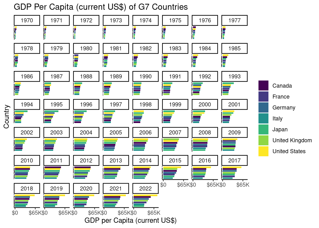
After data wrangling, we facet each year as the base plot for each frame.
── Attaching core tidyverse packages ──────────────────────── tidyverse 2.0.0 ──
✔ dplyr     1.1.2     ✔ purrr     1.0.2
✔ forcats   1.0.0     ✔ stringr   1.5.0
✔ ggplot2   3.4.3     ✔ tibble    3.2.1
✔ lubridate 1.9.2     ✔ tidyr     1.3.0
── Conflicts ────────────────────────────────────────── tidyverse_conflicts() ──
✖ dplyr::filter() masks stats::filter()
✖ dplyr::lag()    masks stats::lag()
ℹ Use the conflicted package (<http://conflicted.r-lib.org/>) to force all conflicts to become errors

Attaching package: 'scales'


The following object is masked from 'package:purrr':

    discard


The following object is masked from 'package:readr':

    col_factor


New names:
Rows: 392882 Columns: 68
── Column specification ────────────────────────────────────────────────────────
Delimiter: ","
chr  (4): Country Name, Country Code, Indicator Name, Indicator Code
dbl (63): 1960, 1961, 1962, 1963, 1964, 1965, 1966, 1967, 1968, 1969, 1970, ...
lgl  (1): ...68

ℹ Use `spec()` to retrieve the full column specification for this data.
ℹ Specify the column types or set `show_col_types = FALSE` to quiet this message.
Warning: 1 parsing failure.
row col expected actual
 64  -- a number  ...68
Scale for x is already present.
Adding another scale for x, which will replace the existing scale.
User-Driven Exploration and Analysis
Data-Driven Narratives:
- Powerful storytelling tool, users observe trends in their data.
Technical Aspects:
- Data manipulation and gganimate for creating visually appealing transitions.
Interactive Features:
- Users can customize features of their visualization
Animation Example
Generated using our Shiny Application

Conclusions + Future Work
Our App facilitates transformation of static data -> appealing & interactive narrative.
User-Friendly Web Interface: Shiny App.
Seamless user experience, future work - optimizing the animation speed (multi-threading).
Enhance the processing efficiency.
Create a community around the website- users can share visualizations, insights, + collaborate on projects.
Future Work Concept