Project Elegant Starmie
Report
Introduction
Despite the growing amount of time-series data available for analysis, very few applications and tools (including R, MS Excel, Tableau, etc.) readily support the creation of animated charts that use time as a dimension for showing changes in data dynamically.
Recognizing the growing demand for this compelling format, this project focuses on developing a Shiny application in R, designed to simplify the creation of bar chart races. This application aims to address the challenge of making these visually striking and informative animations more accessible to users who may not have extensive coding expertise.
Potential Applications
The potential applications of the Bar Chart Race Creator are diverse and impactful. It can be employed across various domains, including business, academia, journalism, and public policy. For businesses, the tool provides a compelling way to present financial or performance trends over time. In academia, researchers can use it to visually communicate the evolution of scientific data. Journalists can leverage it to tell data-driven stories, while policymakers can employ it to illustrate the changes in key indicators over different periods. The versatility of the tool positions it as a valuable asset across a spectrum of fields.
Justification of approach
The approach chosen for this project centers on the development of a Shiny application, leveraging R’s capabilities. Shiny is well-suited for creating interactive web applications, making it an ideal platform for a user-friendly tool. By focusing on simplicity and accessibility, the Bar Chart Race Creator aims to empower users to craft visually striking and informative animations without requiring advanced coding skills. This approach aligns with the goal of democratizing the creation of dynamic visualizations and addressing the current gap in available tools.
Data description
The Bar Chart Race Creator is designed to seamlessly integrate with time-series data in CSV format, providing users with the flexibility to upload datasets that contain a temporal element. While users can input their own datasets, for the purposes of this project, the tool is pre-configured with the World Bank Data of World Development Indicators (WDI). This dataset offers a comprehensive collection of global economic, social, and environmental indicators over time.
After imported and took a quick look at the WDI data, we were drawn by the GDP per capita (current US$), because it’s one of the most widely used and known for the public. Therefore, we filter(indicator_id == 'NY.GDP.PCAP.CD') to get the GDP per capita value. Since there are numbers of countries listed in WDI data, we decided to do only Group of Seven countries (Canada, Germany, Italy, Japan, United Kingdom and United States). Not only because they are also a well-know intergovernmental economy and politics group, but also the width and height of the plot generated by these seven countries that we pictured would fit perfectly for the demo.
Design process
Data Preprocessing: The initial step involves preparing the raw data for visualization. In the case of the Bar Chart Race Creator, this includes handling the World Bank data or user-uploaded CSV files. Data preprocessing tasks may include cleaning, filtering, and transforming the data to ensure it aligns with the requirements of the bar chart race visualization. Time-related elements are particularly crucial, and the tool should intelligently handle different date formats and frequencies.
Data Manipulation: Following preprocessing, the data is manipulated to derive the necessary information for constructing the bar chart race. Aggregation, filtering, and sorting are performed to organize the data based on user preferences. The tool should offer options for users to select indicators, countries, and time periods, ensuring flexibility and customization in the final visualization.
Building Static Plots: Static plots are generated for each time point in the dataset. These plots represent individual frames of the bar chart race. The design should allow for customization of plot aesthetics, such as color schemes and annotations, to enhance the visual appeal and interpretability of the animation.
Stitching Plots Together with
transition_states(): Thetransition_states()function from the gganimate package is utilized to smoothly transition between static plots, creating the illusion of movement over time. This step involves specifying the time variable and defining the transition duration. The goal is to create a fluid and visually engaging animation that effectively communicates the evolving trends in the data.Rendering with gganimate: The animated sequence of plots is then rendered using the gganimate package. Parameters such as frame rate and animation duration are fine-tuned to optimize the viewing experience. The resulting animation captures the dynamic nature of the data, allowing users to observe changes in indicators across countries and regions over the selected time period.
Integration with Shiny App for User Interface: The final step involves integrating the animated bar chart race into a Shiny web application.
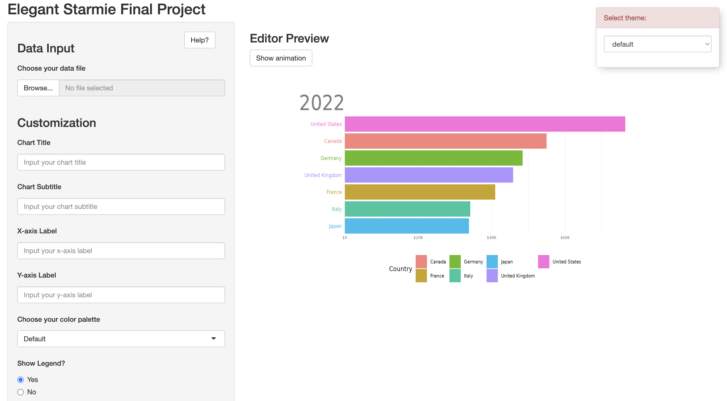
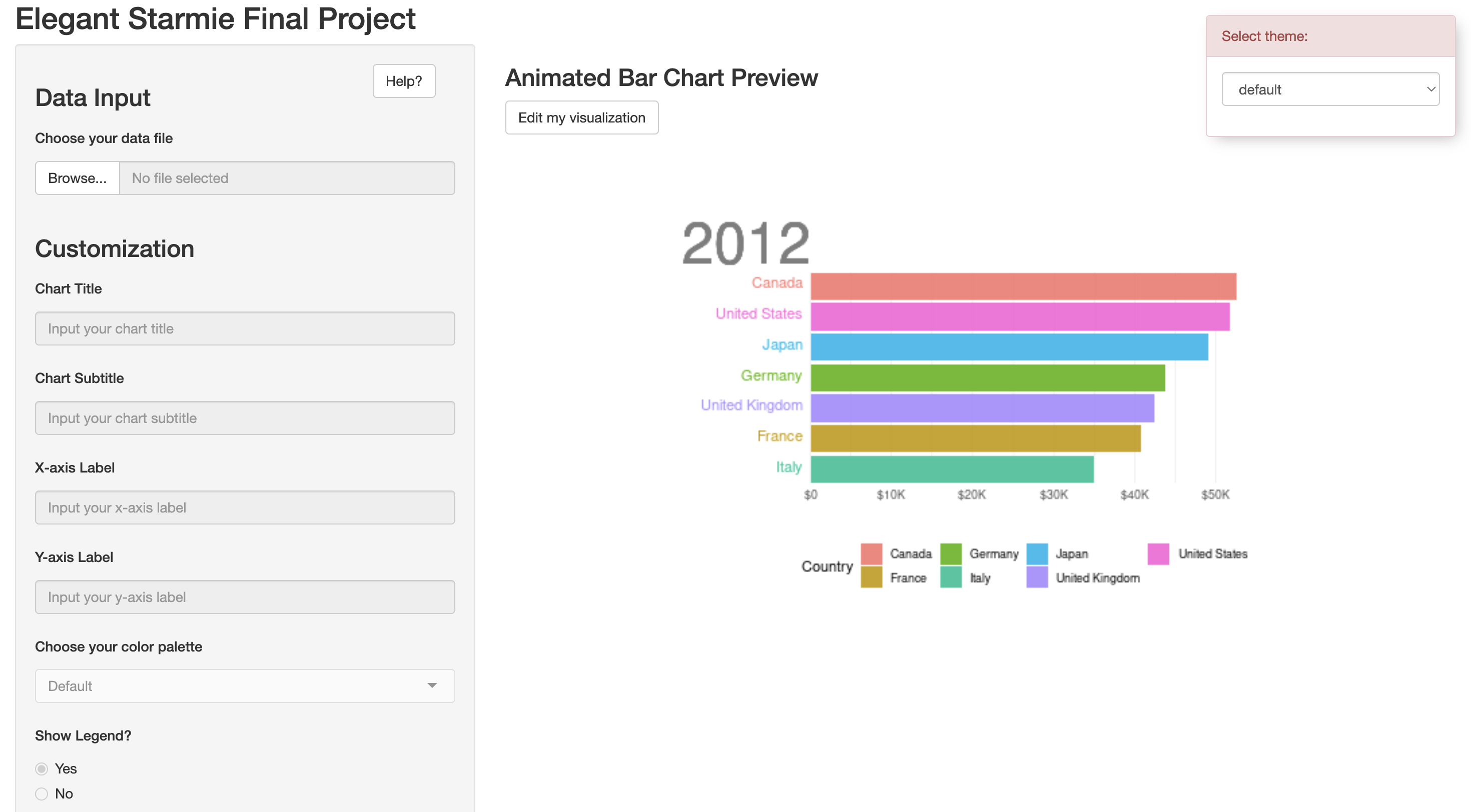
UI: The user interface shows two windows side by side. The left hand side of the application is the customization panel where the user can choose to input text and select various attributes to alter the aesthetics of the visualization. To the right, the user will see a preview of the bar chart. The user is able to toggle between seeing a static version and animated version of the visualization. It was also important to make sure that the state of the application was effectively communicated to the user. Due to the time consuming nature of rendering the animation, without any visuals, an unsuspecting user may assume that the application is not working. To solve this issue, we added a loading animation using the shinycssloaders package, to make it clear that the application is working on rendering the animation. We also allow the user to change the theme of the site, giving them some control over their editing environment.
Server: The server side of the application handles all of the inputs. For the text inputs on the left, the text that is entered into the fields are extracted and displayed on the graph in their appropriate areas. For the drop down select and radio button inputs, based on the selection, we use a switch case to route to the correct attribute. For example, if a user were to choose ‘Viridis’ for their color palette, the switch case would set the color palette of the graph to scale_fill_viridis. In addition, we use the shinyjs package to disable inputs while the user is previewing the animated chart. This prevents the user from making changes while looking at the animated portion of the graph as if the user were to change the title, the program would rerender the entire visualization every single time a small change was made, which does not provide a good user experience. The shinyjs package also allowed us to hide and show elements upon interaction, which we used to toggle between the static and animated graphs. The hiding and showing is triggered using the action buttons, which is also handled in the server.
Limitations
The Bar Chart Race tool may not cater to highly specialized or advanced customization requirements; however, we tried to strike a balance of choice. We aimed to have enough customization options so that the user would not feel overwhelmed, yet felt that their customization wants were satisfied. Additionally, the tool’s performance could be influenced by the size and complexity of the dataset, since animation and rendering in this case is computationally expensive. We tried mitigating the latter by optimizing data handling and animation generation through pre-processing as mentioned above.
We would like to highlight that while our prototype requires users to input data in a certain, clean format. We foresee our future application to perform wrangling by itself and present a few ‘clean’/tidy data options that a user can select from, as our target audience is those groups that may have minimal expertise in data handling and/or programming in general.
Please refer to appendices for the future development roadmap.
Technical Challenges and Solutions
The development of the Bar Chart Race Creator was not without its technical challenges. Handling time-series data, optimizing animation rendering, and ensuring a seamless user experience were among the primary hurdles. The use of the gganimate package introduced computational intensity during rendering, requiring careful consideration for performance optimization. The adopted strategies, including pre-processing and potential future parallel processing, demonstrate a commitment to overcoming these challenges. The iterative nature of the development process allowed for continuous refinement and adaptation to technical complexities. As a result, due to time constraints, we currently have the provision to choose only a sample dataset.
Acknowledgments
This project builds upon the contributions of the broader data visualization and Shiny communities. Acknowledgment is extended to those who have shared knowledge and feedback that have shaped the development of the Bar Chart Race Creator.
We would also like to thank our Professor, Benjamin Soltoff, for his unwavering support, guidance and enthusiasm throughout the course of this project and semester. Additionally, we also extend our thanks to the teams that reviewed our project as part of the peer review exercises conducted twice during this semester.