The objective of our project is to develop a Bar Chart Race Creator module that simplifies the process of generating bar chart races to effectively visualize and communicate complex trends and changes in data over time. We aim to create a user-friendly web application that allows users to create dynamic bar chart race visualizations for a wide range of data types and variables. By doing this, we hope to enable data analysts, researchers, and professionals from various fields to easily identify trends, anomalies, and changes in their time-series and categorical data.
Using Shiny
To make this an interactive web application, we will be using Shiny, an R package used to build web apps. Some features of our web application will be that users will be able to import their own data sets and customize certain aspects the visualization, such as the color palette, axis titles, chart title, and whether or not they want to show the legend, etc. Basically common characteristics of a chart that a user may want to customize. This web application will also need to be reactive, and based on the user’s choices in the customization section, update the preview of the bar chart race. For example, if the user decides to change the title of their visualization or the color palette, instead of clicking a “save” button after every single alteration, the preview will update automatically once the desired characteristic is changed. This can be achieved through Shiny control widgets. Our project will also leverage the fact that Shiny allows us to use custom HTML, Javascript, and CSS files, in addition to the R functions it provides, to create our web application. This will allow for us to use familiar web development tools to implement a design that is user-friendly and aesthetically pleasing. In regards to designing the application, we will use common app design patterns to create designs that are intended to be easy-to-use. We may also perform additional user-testing to receive feedback that we can use to improve our design.
Using gganimate
One crucial aspect of implementing the Bar Chart Race interface is the use of efficient animation techniques, particularly utilizing the gganimate package in R for creating dynamic bar chart races. While gganimate can provide visually compelling results, it can be CPU-intensive to render each frame, potentially leading to laggy animations if not handled properly.
Here’s how we plan to address this concern:
Optimized Data Handling: To mitigate CPU-intensive rendering, we will optimize data handling and animation generation. This includes pre-processing data which we will be talking about in the next section to reduce computational overhead and ensure smooth transitions between frames.
Frame Rate Control: We will provide options for users to control the frame rate of the animation. Allowing users to adjust frame rate settings can help balance the quality of the animation with its resource demands. Users may choose a lower frame rate for less resource-intensive rendering, or a higher frame rate for smoother animations.
Parallel Processing: We will explore the use of parallel processing techniques to distribute the computational load across multiple CPU cores, potentially speeding up animation rendering. This can be particularly helpful when dealing with large datasets or complex animations. We plan to use future and furrr packages to implement parallel processing techniques for distributing computational tasks across multiple CPU cores. These packages make it easier to work with parallelism in R. Here is a short example.
library(future)library(future.apply)plan(multisession) # Set the parallelization plan# Parallelize a loop using future_lapplyfuture_lapply(1:10, function(i) {# Your computation for each iteration})
Resource Allocation Testing: Before deploying the web application, we will conduct thorough testing to assess resource requirements and demands. This includes testing on various hardware configurations and cloud-based hosting platforms to ensure that the allocated resources can handle the demand efficiently. This will help us identify any potential bottlenecks and optimize resource allocation.
Efficiency Monitoring: Continuous monitoring of resource usage will be implemented to identify any performance issues. This will include tracking CPU and memory utilization during animation rendering and addressing any spikes or inefficiencies.
Although these are just different options we are considering, we will be focusing mostly on the first two for the basic functionality of the module.
Data collection and cleaning
We take the following steps in the data collection and cleaning process.
Data Import: The process begins with importing usable datasets from external sources using R libraries like readr and tidyverse. In this example, the “WDIData.csv” dataset is read into the R environment.
Data Transformation: The data is transformed to make it more amenable for analysis. This transformation includes:
Pivoting: Using the pivot_longer function to reshape the data from wide to long format, separating the ‘year’ and ‘values’ columns.
Variable Renaming: Renaming columns for clarity, such as renaming “Indicator Code” to “indicator_id” and “Country Name” to “country_name.”
Data Cleaning: Categorical variables like ‘country_name’ and ‘indicator_id’ are factorized to represent them more efficiently in R. The dataset is further pruned to focus on specific indicators, as indicated by filtering for ‘NY.GDP.PCAP.CD,’ which corresponds to GDP per capita.
Data Preparation: To prepare the data for animation with gganimate, the ‘year’ column is converted to integers. This ensures that the year variable is in a suitable format for creating animated visualizations.
── Attaching core tidyverse packages ──────────────────────── tidyverse 2.0.0 ──
✔ dplyr     1.1.2     ✔ purrr     1.0.2
✔ forcats   1.0.0     ✔ stringr   1.5.0
✔ ggplot2   3.4.3     ✔ tibble    3.2.1
✔ lubridate 1.9.2     ✔ tidyr     1.3.0
── Conflicts ────────────────────────────────────────── tidyverse_conflicts() ──
✖ dplyr::filter() masks stats::filter()
✖ dplyr::lag()    masks stats::lag()
ℹ Use the conflicted package (<http://conflicted.r-lib.org/>) to force all conflicts to become errors
library(ggplot2)library(gganimate)library(gapminder)#importing world development indicatorsWDIData <-read_csv("data/WDIData.csv")
New names:
Rows: 392882 Columns: 68
── Column specification
──────────────────────────────────────────────────────── Delimiter: "," chr
(4): Country Name, Country Code, Indicator Name, Indicator Code dbl (63): 1960,
1961, 1962, 1963, 1964, 1965, 1966, 1967, 1968, 1969, 1970, ... lgl (1): ...68
ℹ Use `spec()` to retrieve the full column specification for this data. ℹ
Specify the column types or set `show_col_types = FALSE` to quiet this message.
• `` -> `...68`
Warning: 1 parsing failure.
row col expected actual
 64  -- a number  ...68
#snake_case and factoring dataWDIData <- WDIData |>rename(indicator_id ="Indicator Code",country_name ="Country Name" ) |>mutate(country_name =as.factor(country_name),indicator_id =as.factor(indicator_id) ) |>select(country_name, indicator_id, year, values)#filtering for gdp per capitaWDIData <- WDIData |>filter(indicator_id =='NY.GDP.PCAP.CD')#converting year column to get it ready for gganimateWDIDataTest <- WDIData |>mutate(year =as.integer(year) )
Data description -> Short Animated Bar Chart Demo
The analysis-ready dataset includes historical GDP changes for multiple countries over time. It comprises the following variables:
Country: The name of the country or region.
Year: The year for which the data is recorded.
GDP Change: The percentage change in GDP compared to the previous year.
This dataset will be used to create dynamic bar chart races that illustrate the evolution of GDP changes and inflation rates for different countries.
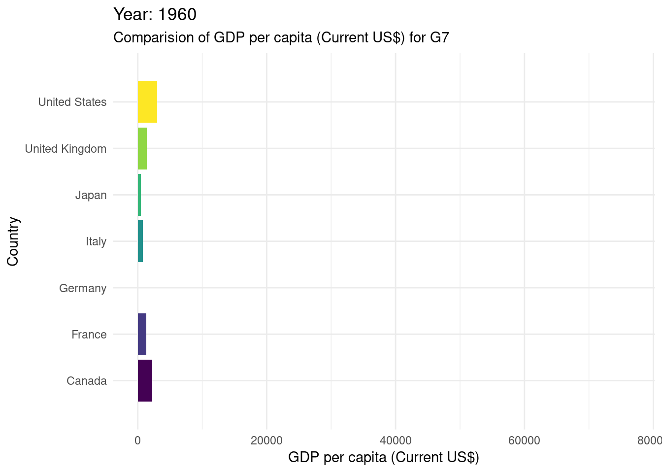
# gganimate#creating a bar chart race for the G7 countriesWDIDataTest |>filter(country_name %in%c("Canada", "France", "Germany", "Italy", "Japan", "United States", "United Kingdom" ) ) |>ggplot(mapping =aes(x = values, y = country_name, fill = country_name)) +geom_bar(stat ="identity", show.legend =FALSE) +transition_states(year) +labs(title ="Year: {closest_state}") +scale_fill_viridis_d() +theme_minimal() +view_follow(fixed_x =TRUE) +labs(subtitle ="Comparision of GDP per capita (Current US$) for G7",x ="GDP per capita (Current US$)",y ="Country" )
Warning in lapply(row_vars$states, as.integer): NAs introduced by coercion
It’s essential to acknowledge potential limitations of the dataset we’re using here. In this case specifically we can see that there is missing data for years 1960-1990. Additionally, the analysis may be sensitive to external factors that affect GDP changes and inflation rates, such as economic policies, global events, or data collection methods.
Exploratory data analysis
Perform an (initial) exploratory data analysis.
In the exploratory data analysis phase, we will create initial visualizations and statistics to gain insights into the dataset. This will include summary statistics, time series plots, and finally making an simple demo of animated bar chart to touch water into what we will be doing for the rest of the project.
Exploratory Shiny Application
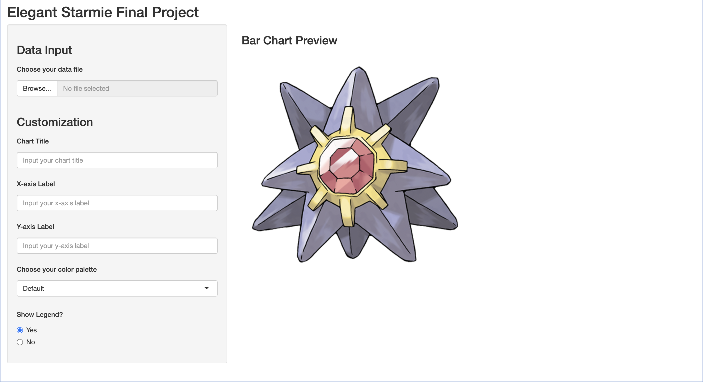
For this exploration, we have also created a test Shiny application (pictured below). To start, we experimented with the various example applications provided by the Shiny package, as well as read the documentation available online. Once somewhat familiar with Shiny, we designed a test application using the R functions provided by the package. We mainly focused on working with the control widgets and figuring out how to implement those to our liking. We have come up with a sidebar layout design, where the left-hand side of the application is where the user is able to customize their visualization, and on the right would be a preview of the bar chart (placeholder image of Starmie there for now). While the R functions are convenient and quite simple to implement, we also have started to experiment with implementing this design using HTML, Javascript, and CSS.
As we continue working on this project, we will focus on developing this web application in a “functionality first, design second” manner, meaning that we will ensure that the web application is functional and behaves in the way that we want before moving onto making it look nice. We plan to display the bar chart race output on the right-hand side of the application, and include a play button so that the bar chart race is not constantly running, and the user can see their customization changes more clearly. As previously mentioned in this document, we also plan to perform some user-testing to collect real feedback in regards to the visual affordances of our design. Questions we would want to answer through user-testing may be of the following: “Are the intended instructions clear” or “Are there any parts of the graph that the user should also be able to customize”.
Questions for reviewers
s the objective of the project clearly defined and does it address the need for simplifying the creation of bar chart races for dynamic data visualization?
Are the data collection and cleaning steps well-documented and do they ensure the dataset’s quality and readiness for analysis?
Does the data description provide a clear understanding of the dataset’s variables and their relevance to the project’s goals?
Are the potential limitations of the dataset adequately acknowledged?
Do the initial exploratory data analysis visualizations and statistics align with the project’s objectives?