Chapter 46 Sample Allocation Model Visualization
The Sample Allocation Model Visualization allows you to display the likelihood that CWD is present in each sub-administrative area, surveillance quotas based on optimal control, and a comparison of optimal control properties between the current budget against alternative budgets.
46.1 Creating a Sample Allocation Model Visualization
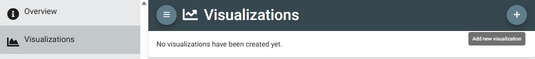
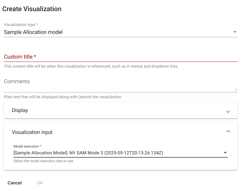
To create a corresponding visualization once a model has been successfully executed, go to the “Visualizations” page from the left hand navigation bar. Click the plus sign in the top right corner, select “Sample Allocation model” from the drop down of visualization types, add a title for the visualization, and select the specific model execution to visualize from the drop down under “Visualization input”. Additional comments or display parameters can also can added, optionally. For additional details about the visualizations, refer to the Visualization Output section from the Sample Allocation Model documentation.
Title (required): Create a title for your visualization to help you keep track of your visualizations. It will appear in the visualization dashboard, so it should be both descriptive and concise. You may use characters, numbers, and symbols.
Comments: Add additional comments for future reference. These comments will be displayed above the visualization.
Display: These options control how visualizations are presented in the visualization dashboard.
Weight is used to order visualizations. Visualizations with lower weight values will be presented in the dashboard above those with higher weight values. This value defaults to 9999 (the lowest position on menus).
Display on visualization dashboard for all users is used to control whether non-administrative users should be shown this visualization. If you want all users to be able to view this visualization, check the box. If you would prefer that this visualization be available only to Provider Administrators in your agency, do not check this box. This value defaults to un-selected, so must be selected if you want others to see this visualization.
Tag category is used to display the visualization under the selected heading on the dashboard. See the section under Introducing Visualizations for details.
If provided, the Thumbnail will be used as the preview image of the visualization on the dashboard.
Visualization input (required): Select from the drop-down menu which executed SAM model data and results you want to use to create this visualization.
Click OK to create the visualization.
46.2 Viewing the Sample Allocation Model Visualization
Select the thumbnail from the Visualizations dashboard. A map showing the model results will be displayed. Depending on the mode you ran, you can select layers showing various aspects of the results by sub-administrative areas:
Current likelihood of disease presence (Mode 1);
Current likelihood of disease presence and surveillance prescriptions (Mode 2);
Current likelihood of disease presence, surveillance prescriptions, and cost analysis (Mode 3).
A table summarizing model data and results by sub-administrative area appears below the map.
Changes to inputs for the visualization can be made by clicking on the edit icon (pencil) at the top right of the visualization. The visualization will be automatically updated.
For additional details about the visualizations, refer to the Visualization Output section from the Sample Allocation Model documentation.